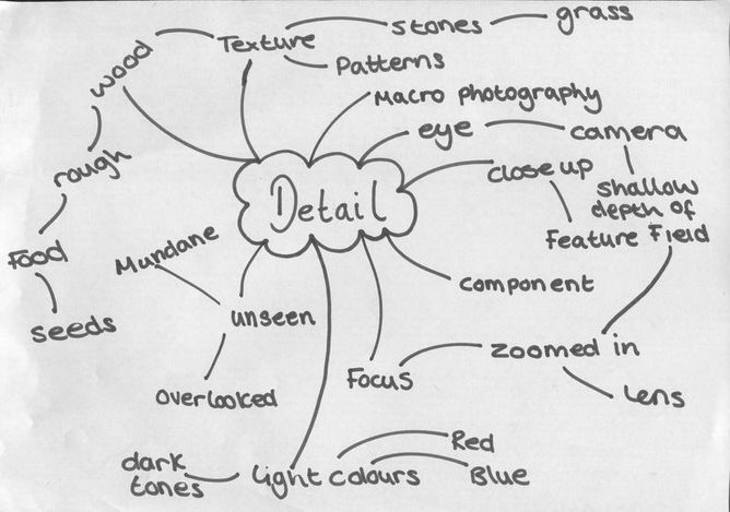
Personal project: detail
|
detail
ˈdiːteɪl/ noun noun: detail; plural noun: details
|
|
I chose detail because I think that there is many photo opportunities in this theme because its isn't limited to just one category which makes it an extremely open theme. Also you can create a range of photos that can focus on many different objects. I can also use many techniques and processes.
I chose this theme because I am interested in images that contain a lot of detail. There is a lot of ways to experiment to see what works. This helps me think about different ideas and lets me experiment to see what work and what doesn't. Also detail is really interesting because it captures things that you would not be able to see in real life with you naked eye. Taking a picture of something in detail allows you to look at it for a long time whereas you wouldn't be able to in real life.
I chose this theme because I am interested in images that contain a lot of detail. There is a lot of ways to experiment to see what works. This helps me think about different ideas and lets me experiment to see what work and what doesn't. Also detail is really interesting because it captures things that you would not be able to see in real life with you naked eye. Taking a picture of something in detail allows you to look at it for a long time whereas you wouldn't be able to in real life.
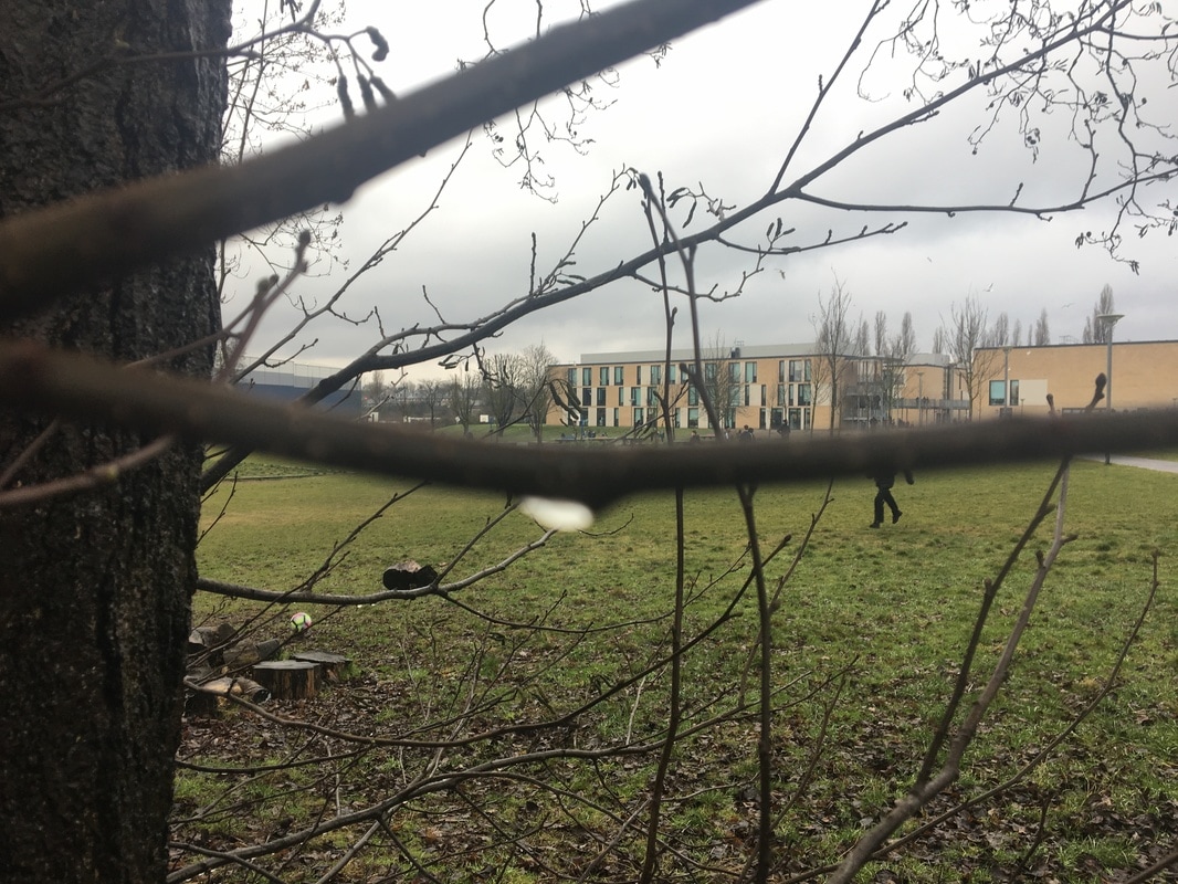
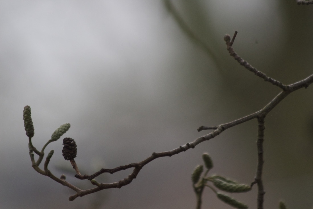
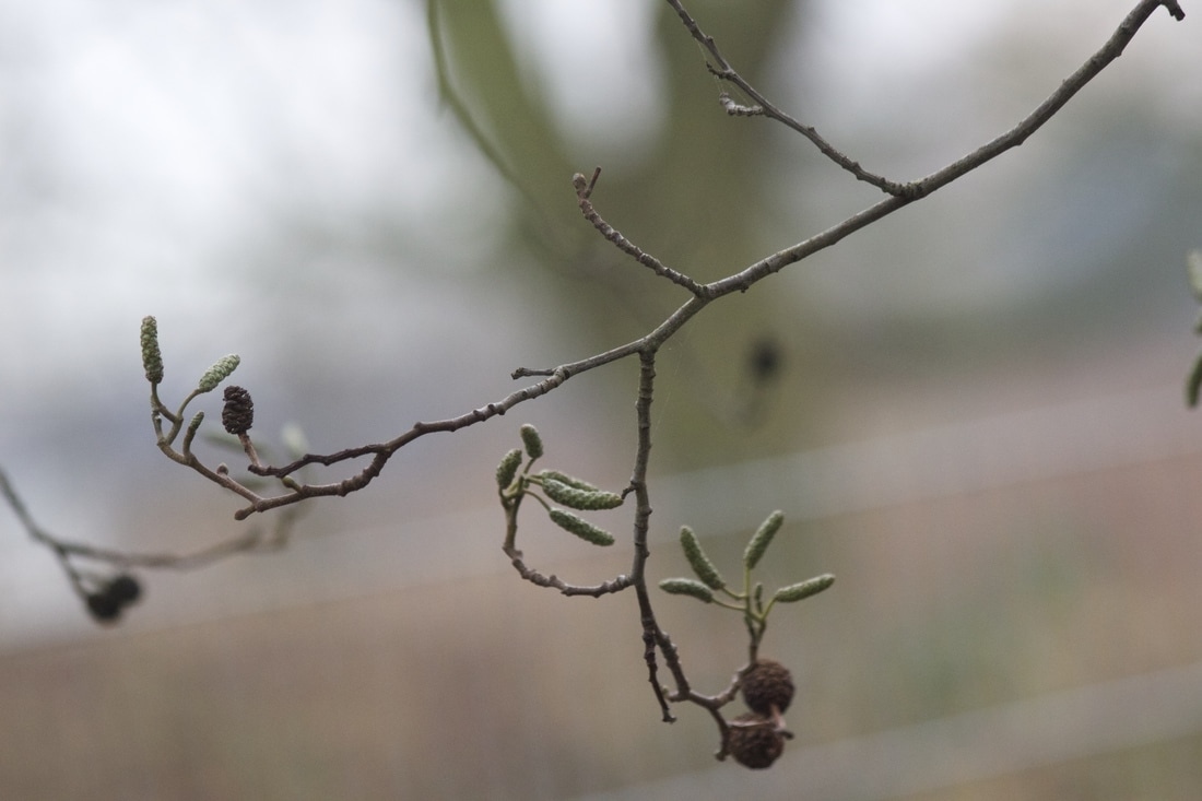
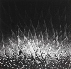
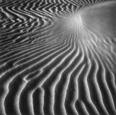
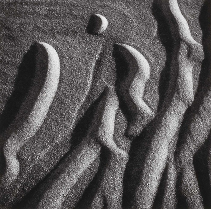
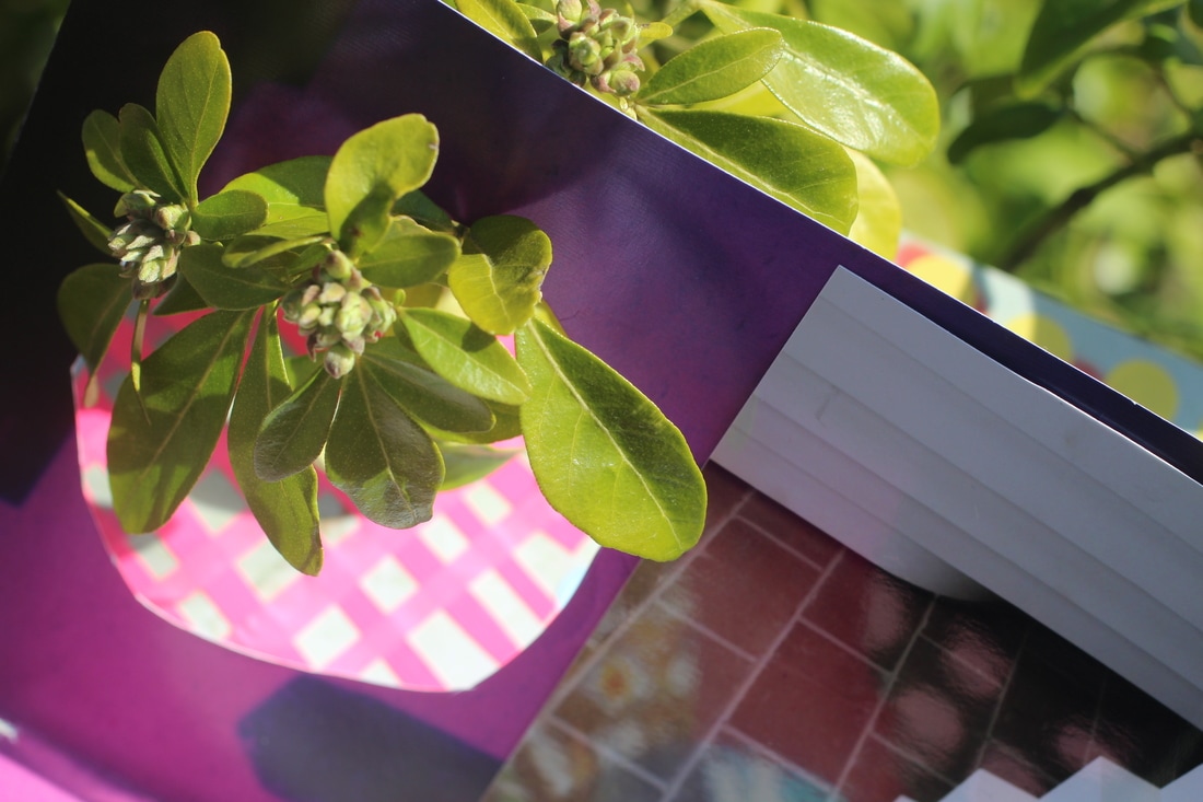
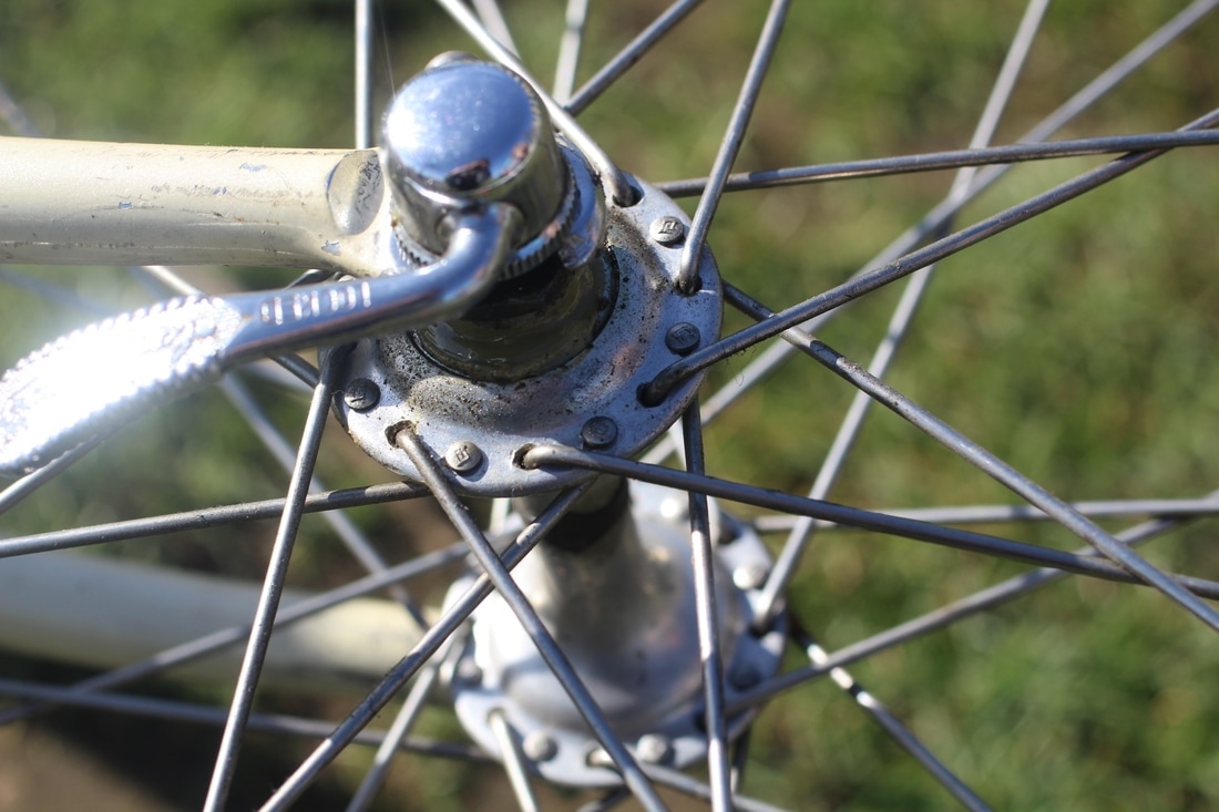
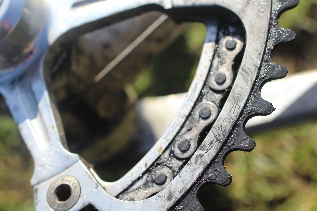
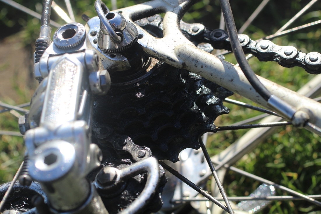
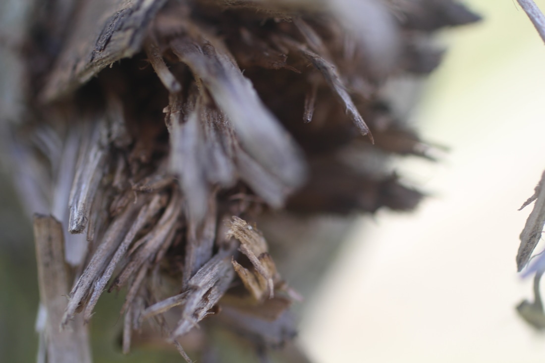
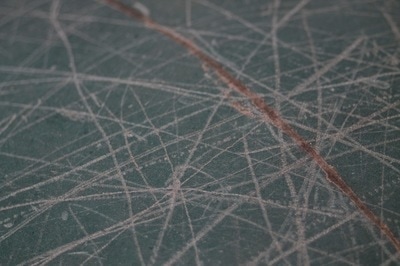
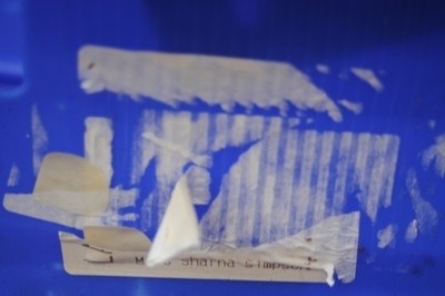
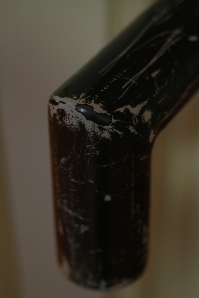
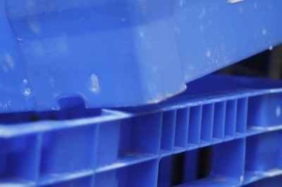
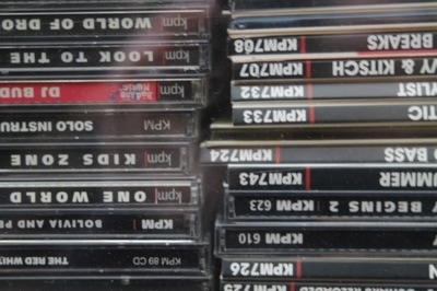
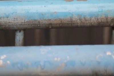
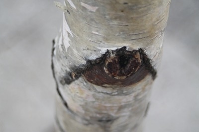
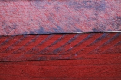
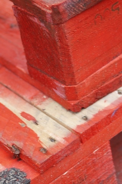
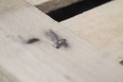
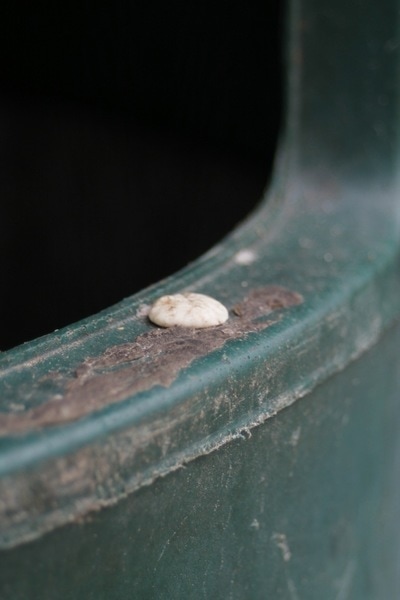
These are my first set of pictures that I took around my school and I really like how some of them came out.

|
|
|
EBI
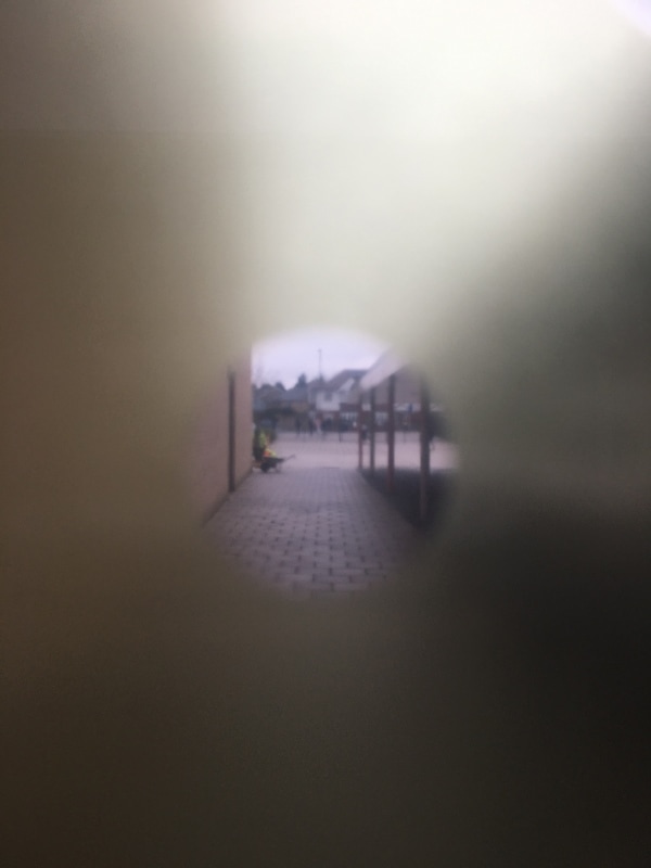
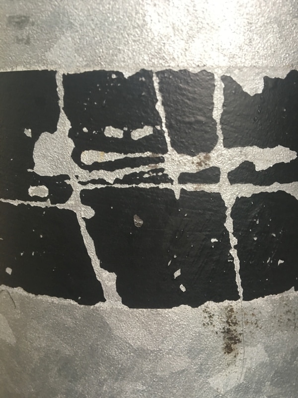
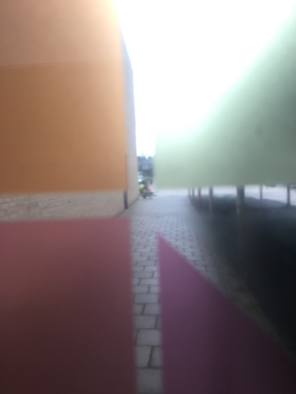
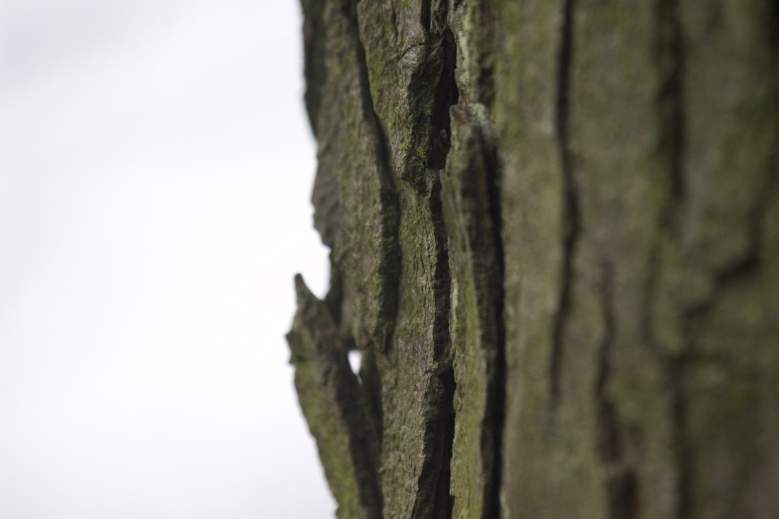
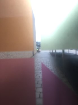
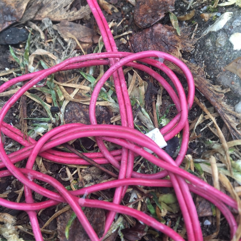
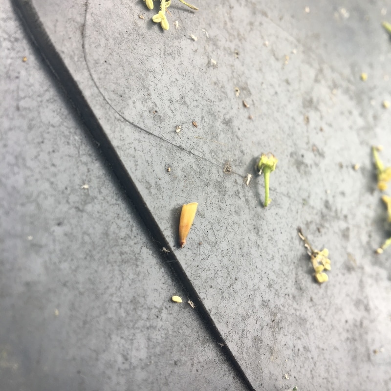
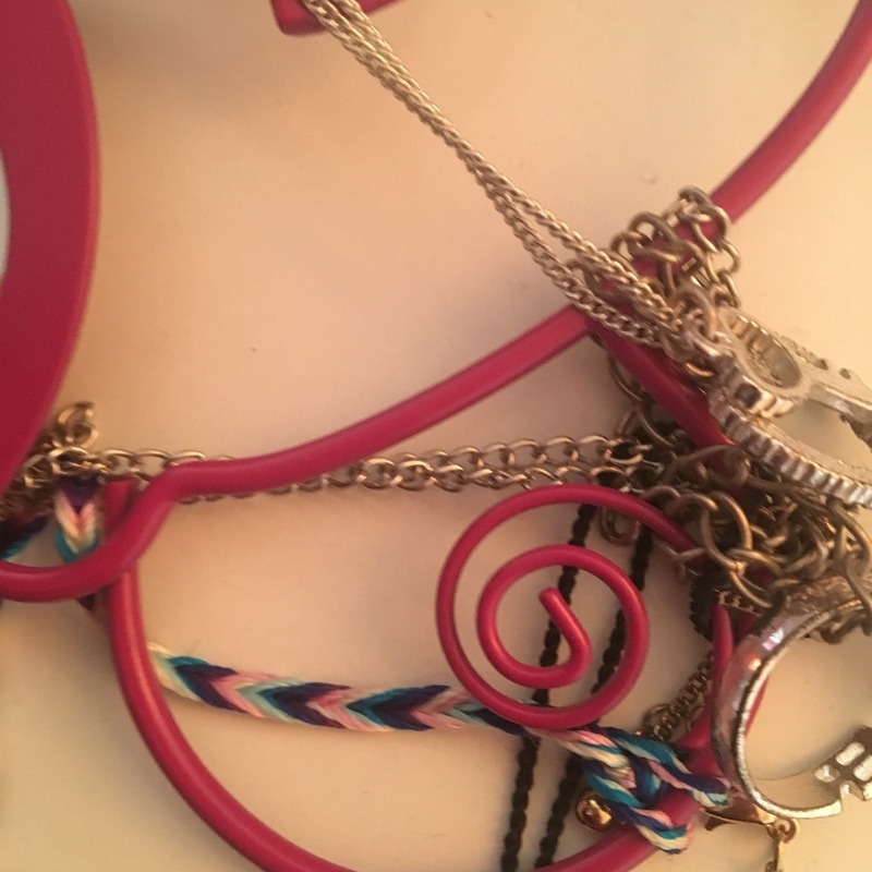
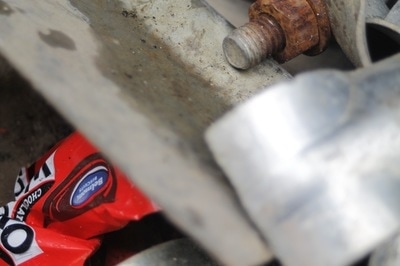
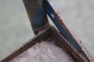
Personally I think that this is the worst picture I took because I don't like the way it looks. This is because the shapes are not straight. Also because I took this photo with my phone i think that the photos quality is not good. If I was to do this again I would use a camera and make the shapes straight, I would then focus on whats in the background and not on the shapes. This was my original idea. |
WWW
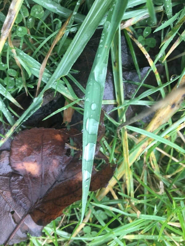
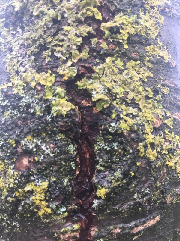
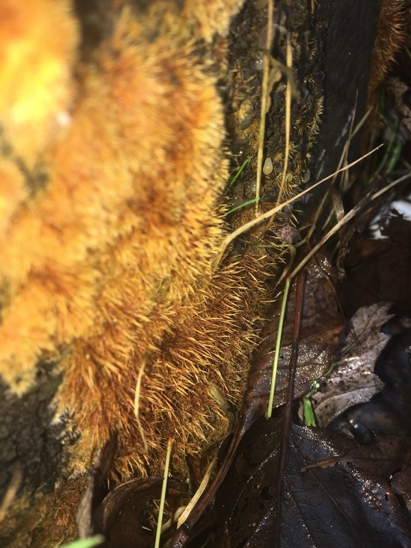
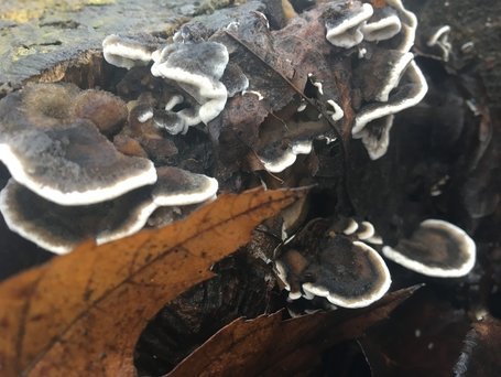
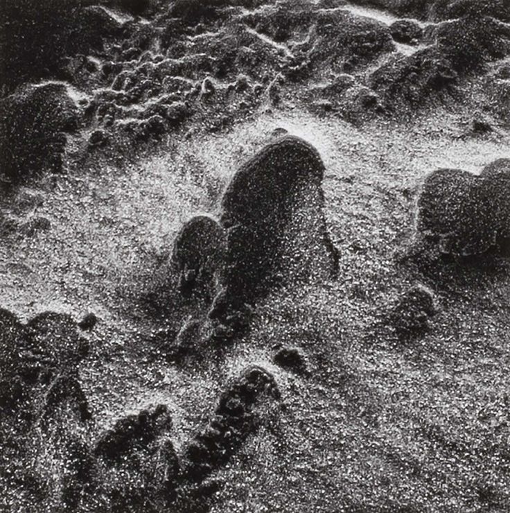
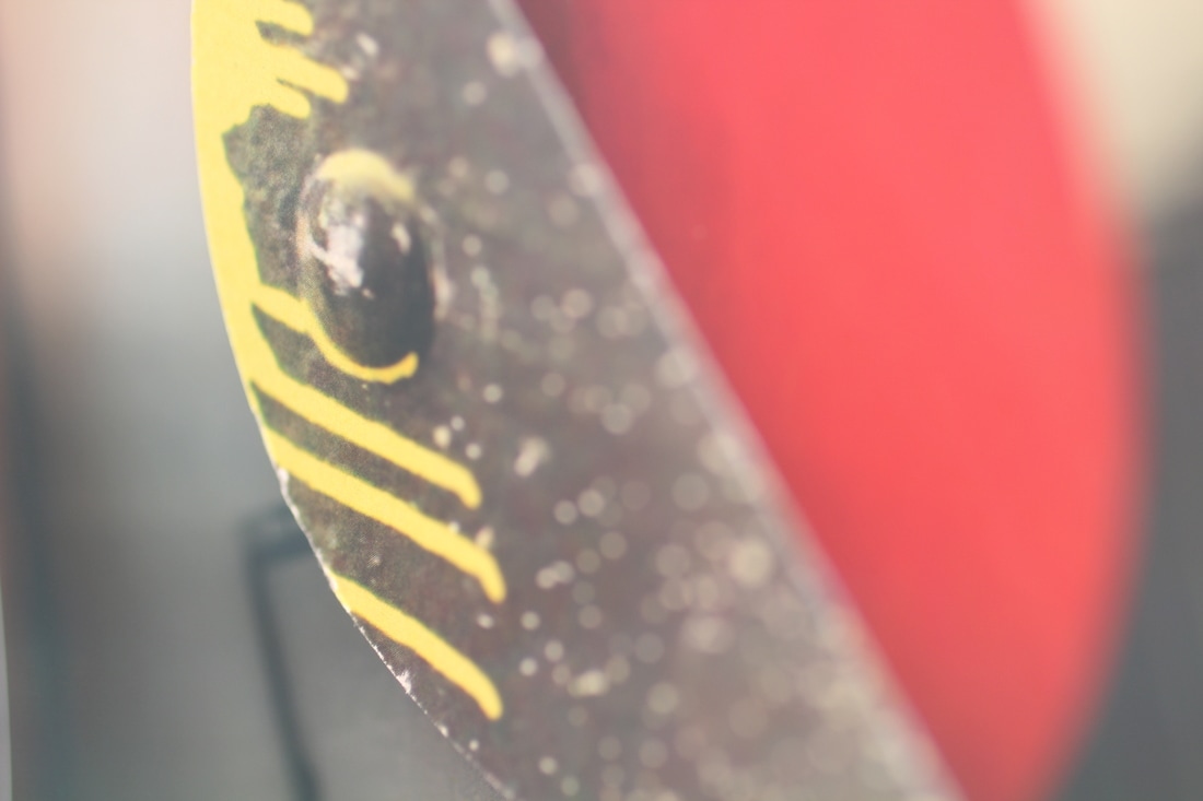
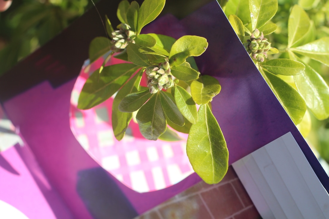
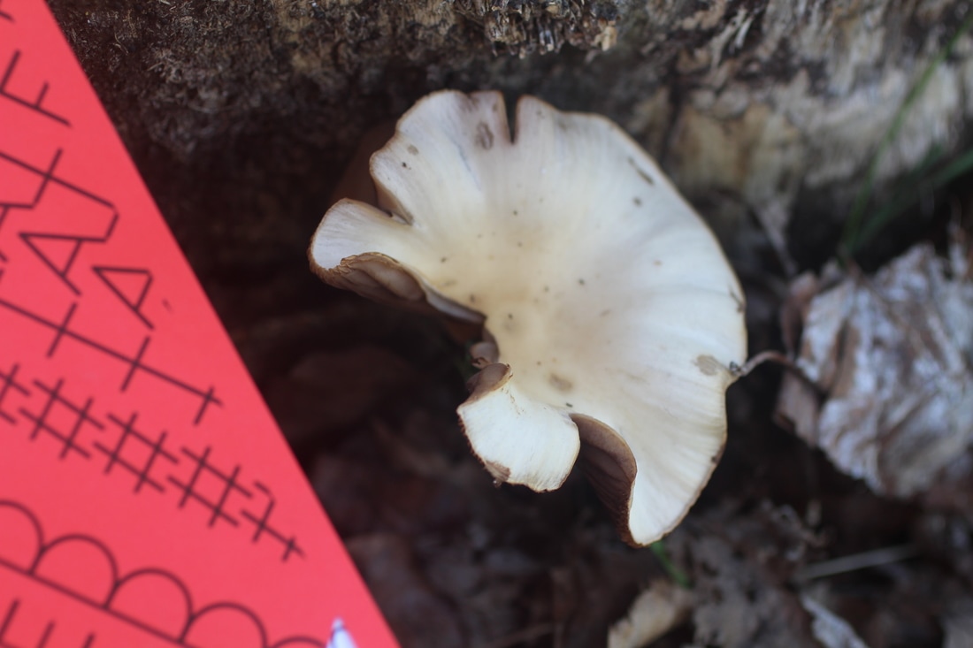
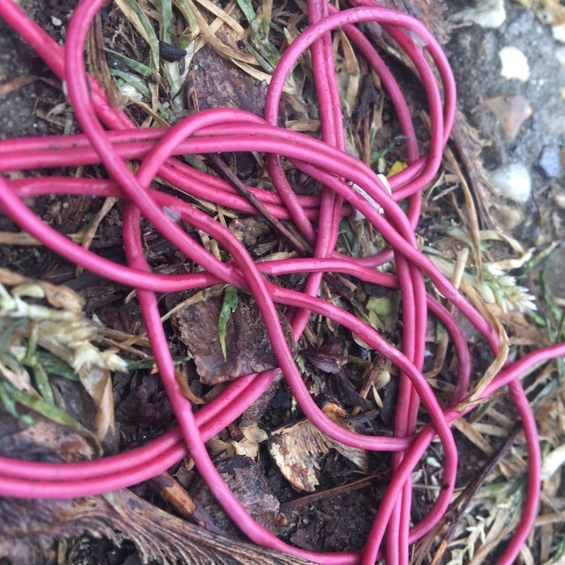
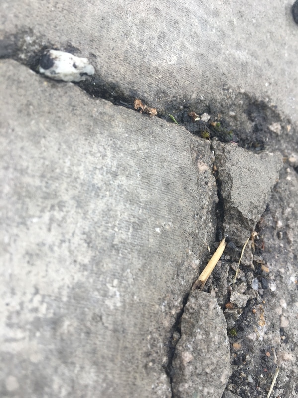
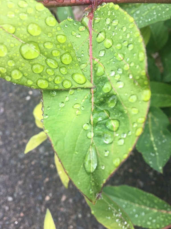
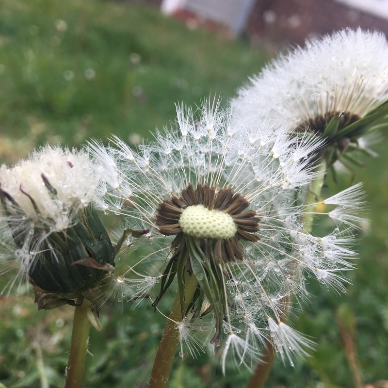
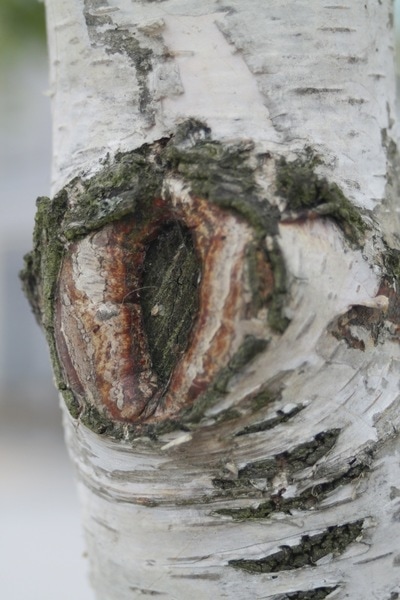
This is one of my favorite pictures that I took. This is because I really think it relates to this theme, for example if detail is 'overlooked' and 'close up' things then this picture really ties into it. I like how you can see a clear cut white edge and how the leaf is coming into the photo through the left bottom corner, this makes the image look more natural. If I was to take this photo again I would have used a camera, as this was taken with my phone, to get a more HD photo. |
Research: JO WHALEY
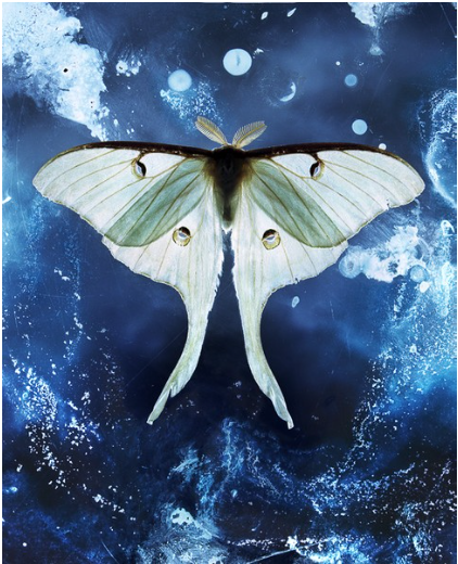
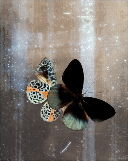
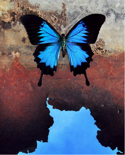
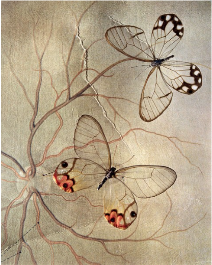
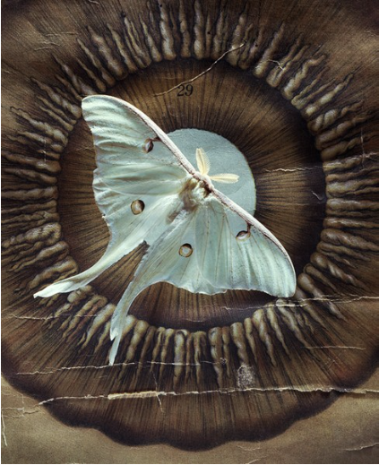
Whaley originally studied to become a painter and later took a day job as a scenic artist for the San Francisco Opera and other Bay Area theatrical companies. I really like Whaleys work because she focuses mainly on insects which really interest me. I also think her pictures are really beautiful because it gives people the opportunity to see things they might never see in real life. For example in her images of butterflies you can see all the details, textures and lines in the body. You would never be able to see that in real life. I would really like to create some pictures like hers. Here is some of my favorite pictures of hers.
Research: HENRY TROUP
Henry Troup is a photographer who takes similar photos that emphasises detail through the grainy textures in his photos as you can see from the pictures below. I like his work as the lines and textures in his images are really detailed and look really clear and crisp. His work also looks really satisfying as the lines are really sharp and clear. Most of his pictured are in black and white also, this makes the shadows and light much more interesting to look at.
Henry Troup is a photographer who takes similar photos that emphasises detail through the grainy textures in his photos as you can see from the pictures below. I like his work as the lines and textures in his images are really detailed and look really clear and crisp. His work also looks really satisfying as the lines are really sharp and clear. Most of his pictured are in black and white also, this makes the shadows and light much more interesting to look at.
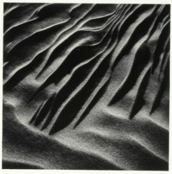
These are some photos I took on my phone using Henry Troups photos as inspiration.

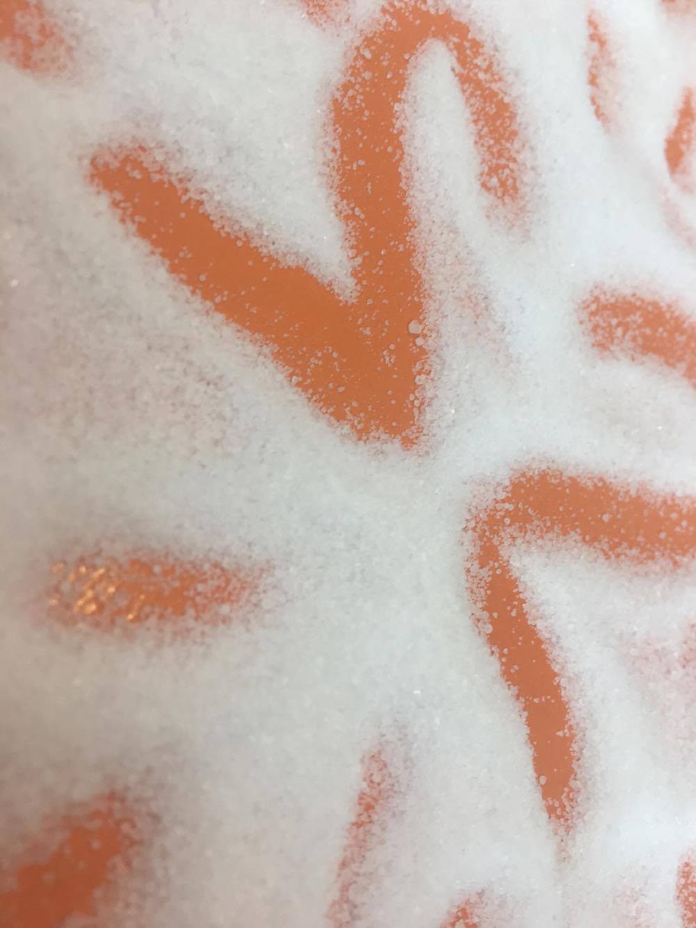
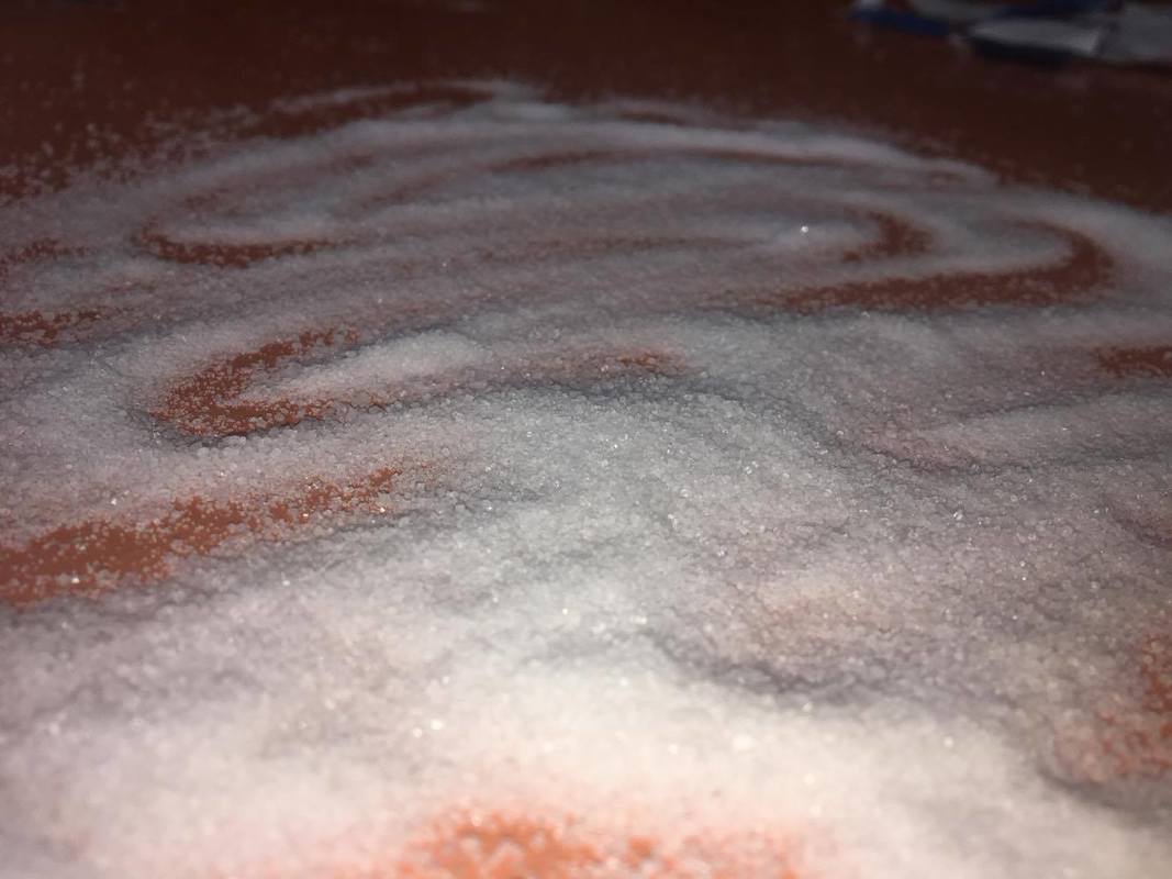
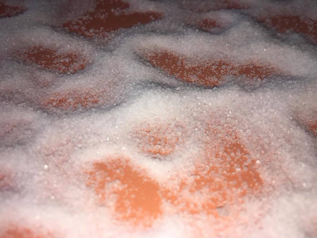
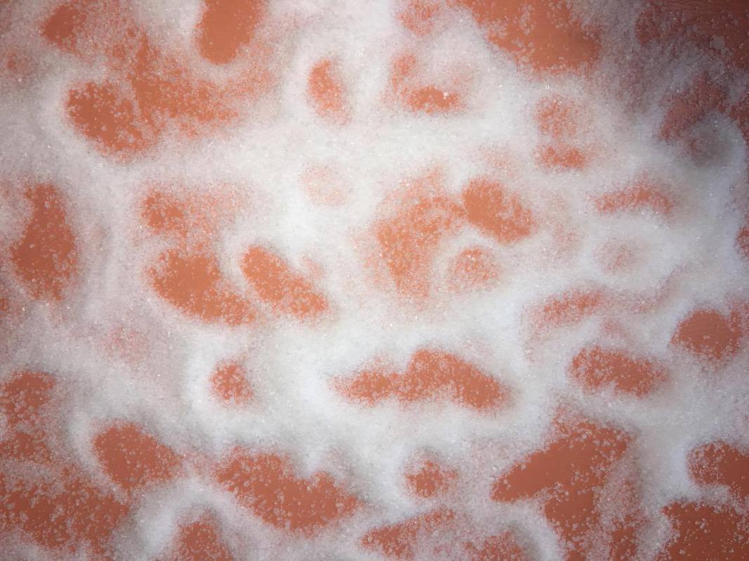
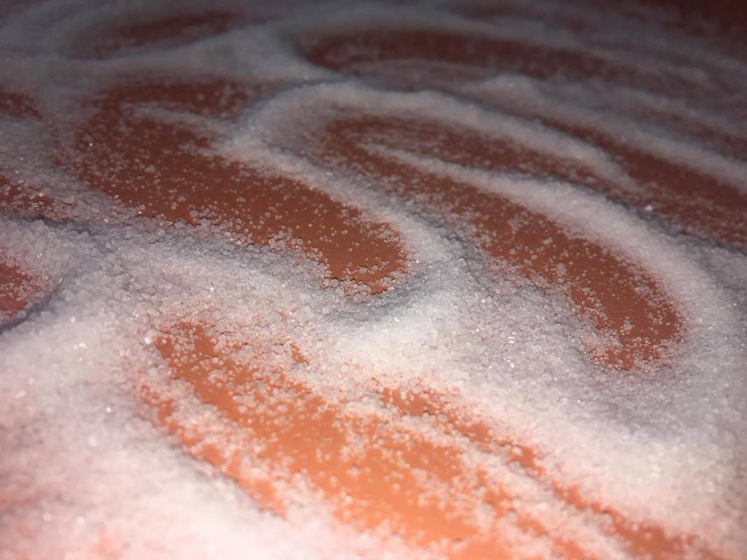
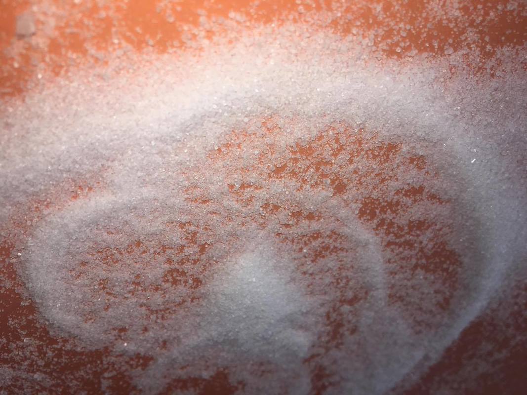
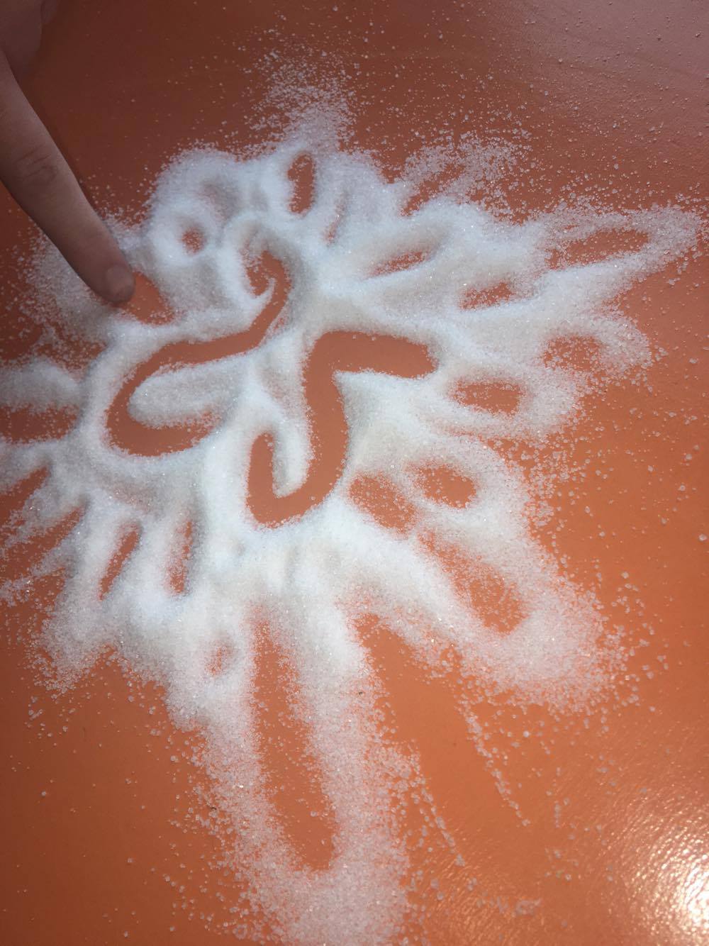
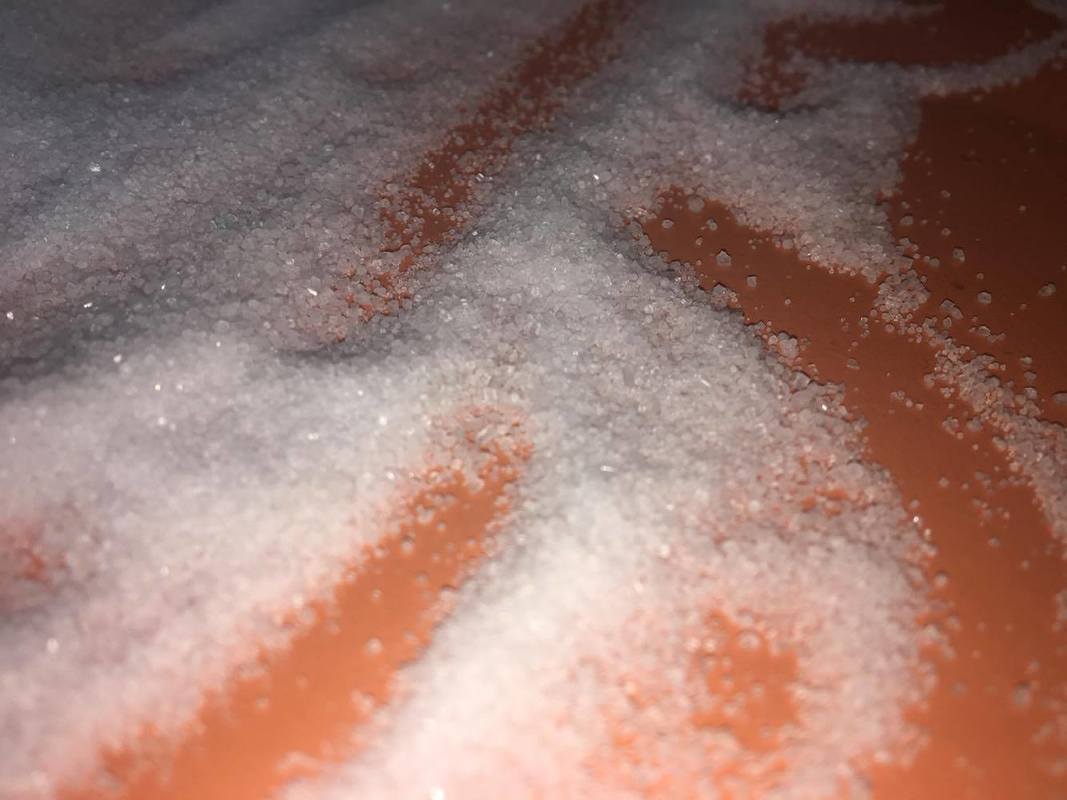
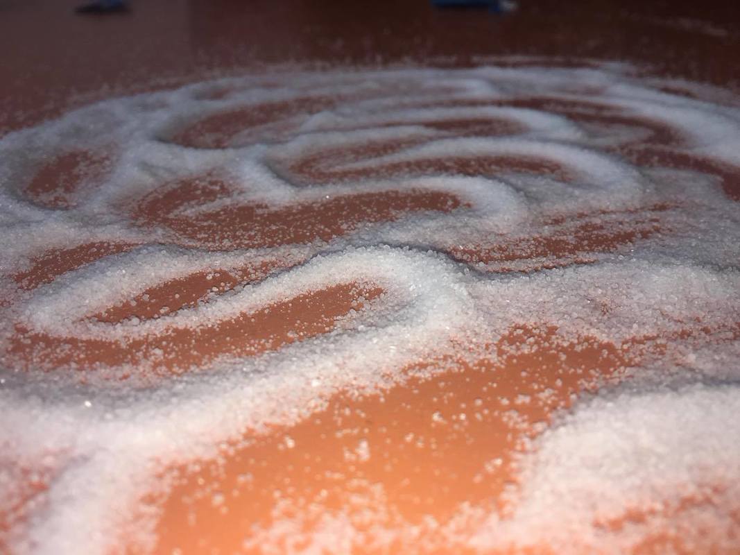
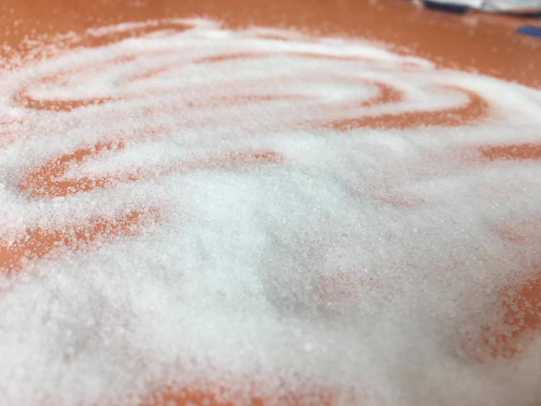
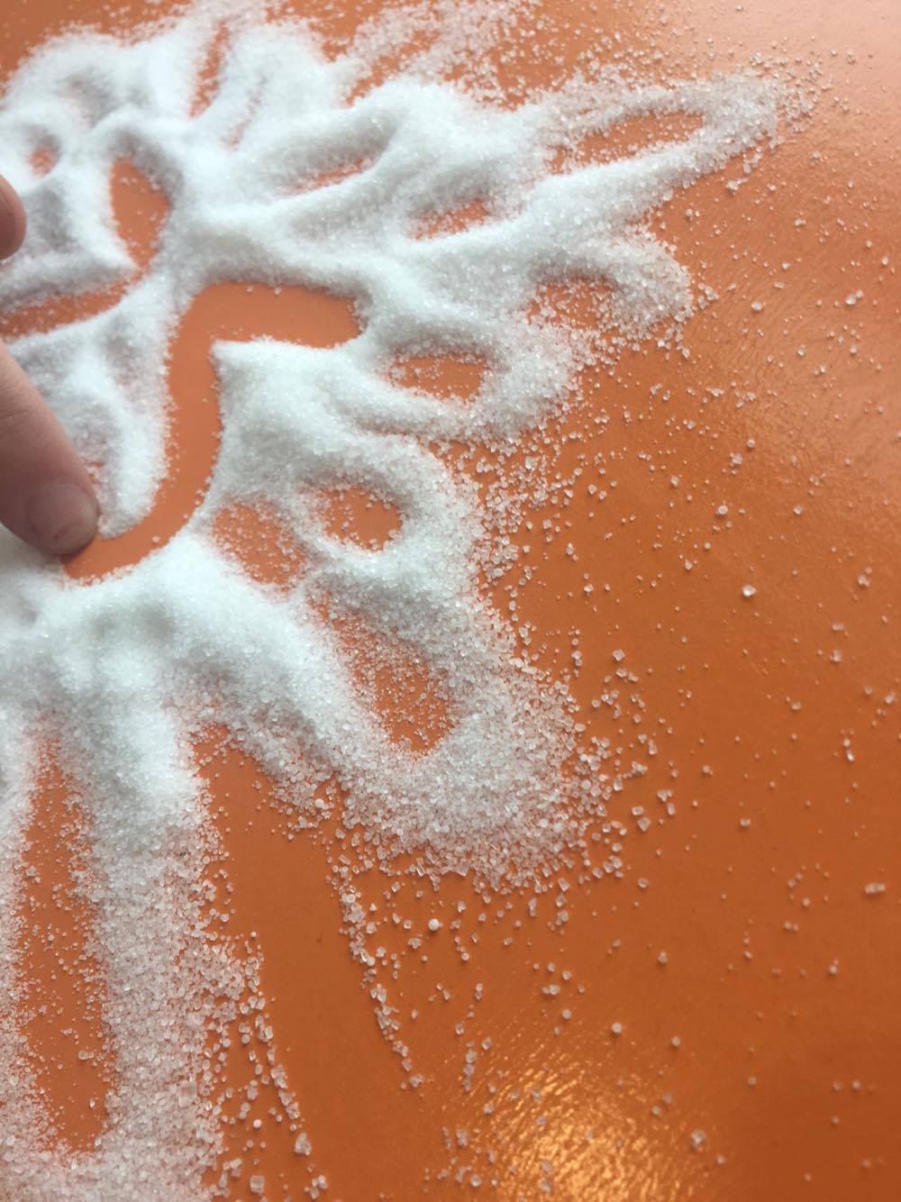
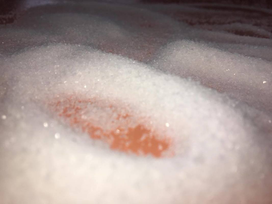
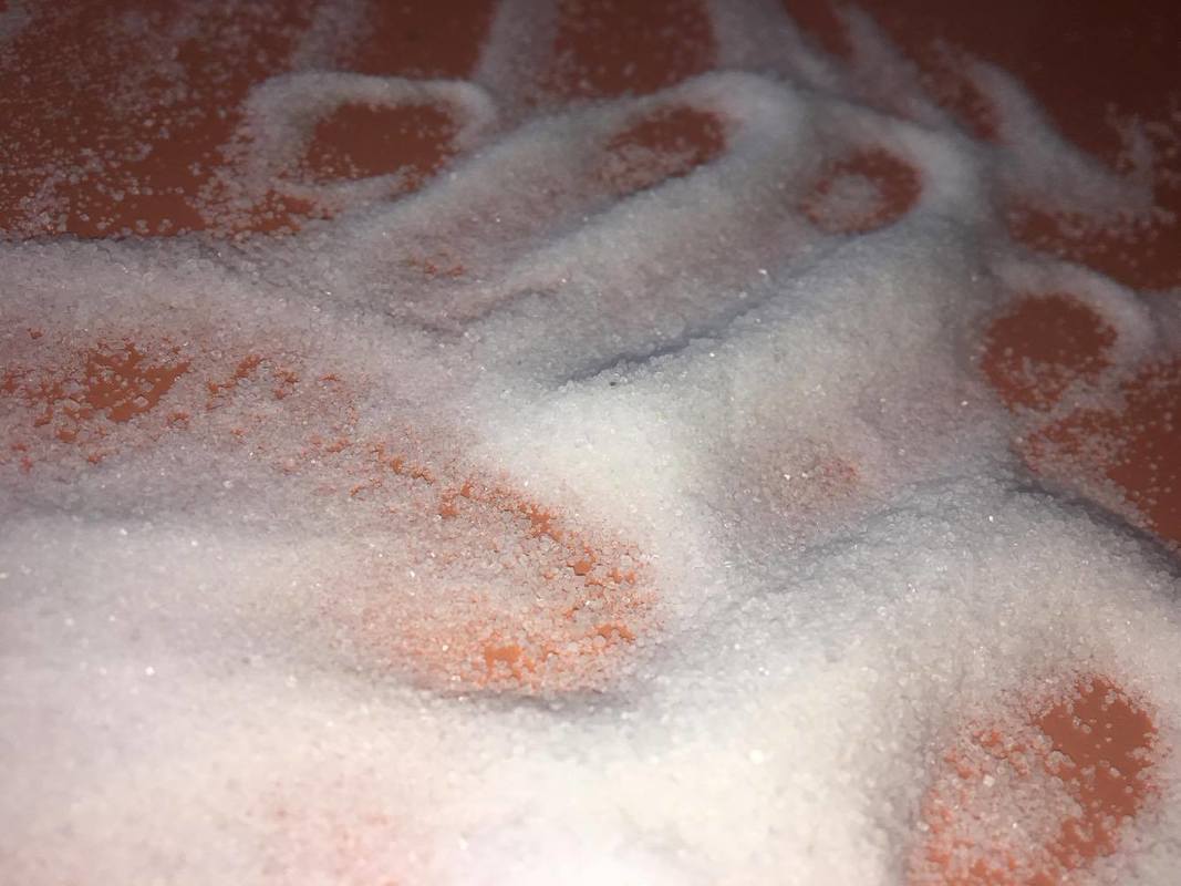
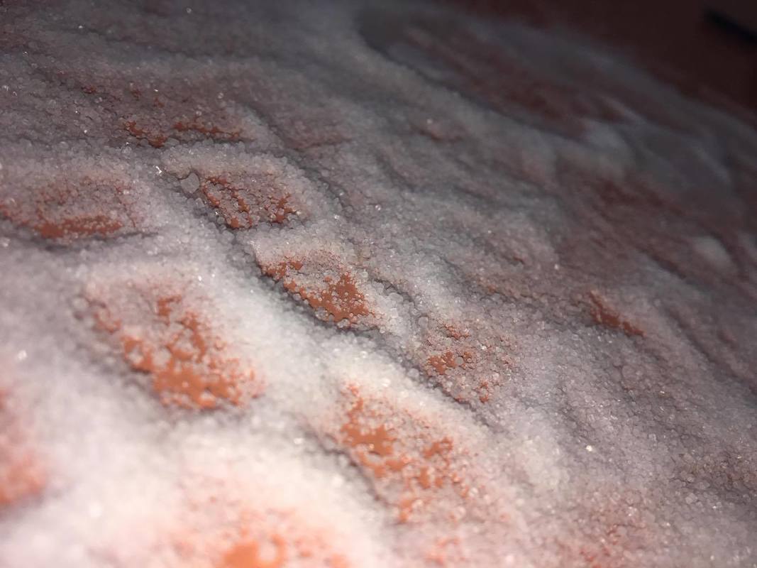
Unfortunately, I am not pleased with the outcomes of these photos. I think this because I had to use salt and sugars to create it. I would have liked to create mire complex lines and shapes. I would have also liked to captures the textures in the photo so therefore I think these photos would have turned out better if I used a camera and the micro lens. I don't like how they look man made and would have liked tem to loo more natural, I also don't like the orange background that they have, so If I was to do this again I would use a different background.
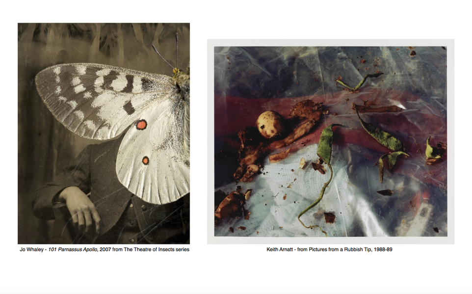
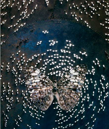
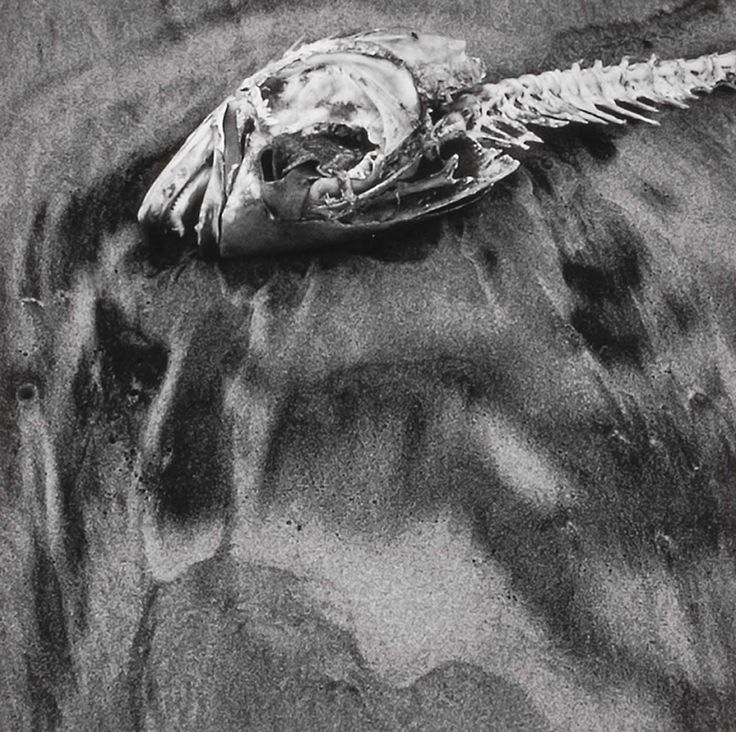
In the first photograph I can see an image that has a sepia effect on it, there has clearly been a picture taken of a person, most likely a male due to the clothes that they are wearing. However, the top proportion of him (his face and chest) has been covered by half of a butterfly, which has been tilted a bit to the left. In the second photograph I can see a close up of some decaying food and leafs that are onto of a see through surface. I can also see some rubbish like a tissue for example that is underneath the clear surface. There is also a red piece of material that really catches you eye as it is a pop of colour on the image.
If I could use a series of adjectives to describe the special qualities of photograph one, I would use surreal,layered, organised and simple. For the second image I would use disgusting, dull, chaotic and disorganised.
When looking at the first image by Jo Whaley I can recognise a portrait of a male figure who's face is being covered by half of a butterflies body. The butterfly is quite dull and grey which isn't a contrast to the background as that is quite dull also. I know that the image behind the butterfly is in a sepia effect. In the second photograph by Keith Amatt I can recognise all the rubbish and decaying food for example I can see a tissue and lots of old, bruised and moulding fruit. I can also dead plants which are laying on top on a clear material.
To take these pictures I think that the photographer used a camera, In the first image I that he took a portrait of a man or maybe even found it, as it looks like an old picture. Then I think he took another photo of a butterfly and layered it on top. In the second image I think that the photographer zoomed very far into his subject maybe with a micro lens and then took the photo
These affect the way I view them as it makes them look more interesting, especially the first one. This is because its very unusual and it makes you question it a lot more. Also the effect used on the first image makes it seem old and dated.
The photo by Jo Whaley reminds me of many of her others as it has a butterfly in it and her photos have a running theme with insects and butterflies.
In the first photo the lines are very distinctive as the outline of the butterfly has a very clear shape. There are also some lines in the background that make the photo look worn and aged. There is also a clear silhouette of the man. In the second photo there aren't as many clear lines, however, there is some on the clear material in the background of the photo. In the second photo there are really interesting shapes made by the old fruit and rubbish that has been left. In the first image the colours are very dull which is why the small pop of orange is very bight and eye catching. There are a small amount of colours in the second photo too, however, there is more than the first one. There's a lot of textures on the second photo as the old rotting food and leaves look like they have a rough texture. In these photos the photographers have captured light in different ways, fro example Jo Whaleys photo is quite dark and dull and most of the light in the image is from the butterfly that has been edited onto the photo. Whereas Arnetts photo has not been edited and therefore he has used natural light. The brightest part of the image is at the bottom of the photo and it gets darker towards the top, this could be because of the white tissue that is underneath the clear material.
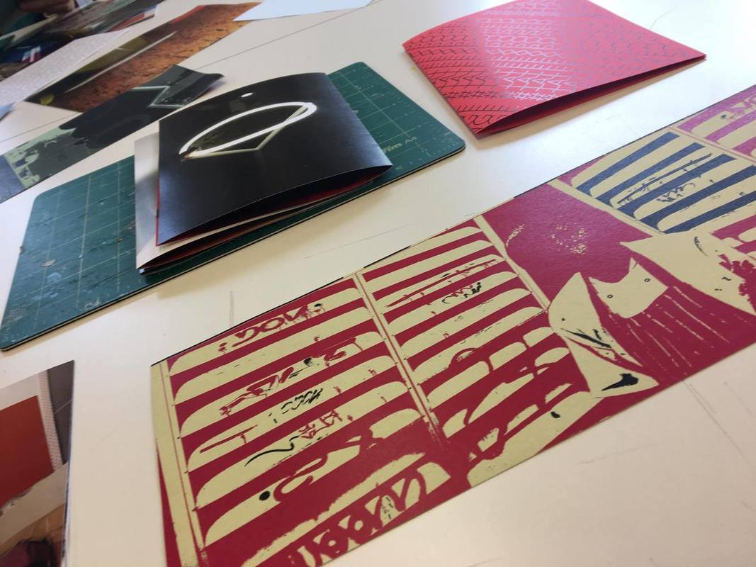
Experiment: Photo Fanzines
THE PROCESS:


WHAT I DID.....
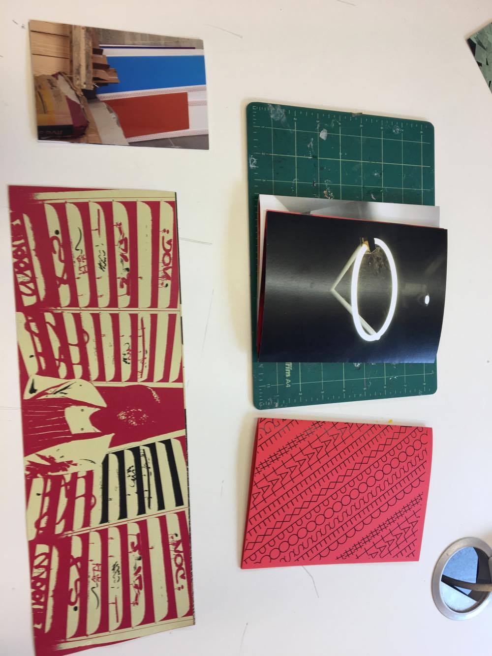
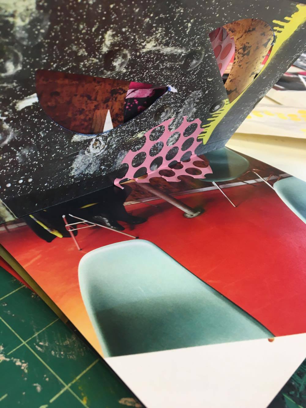
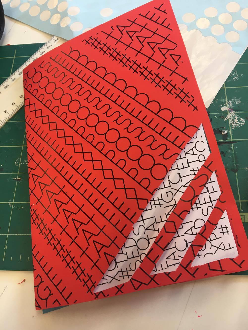
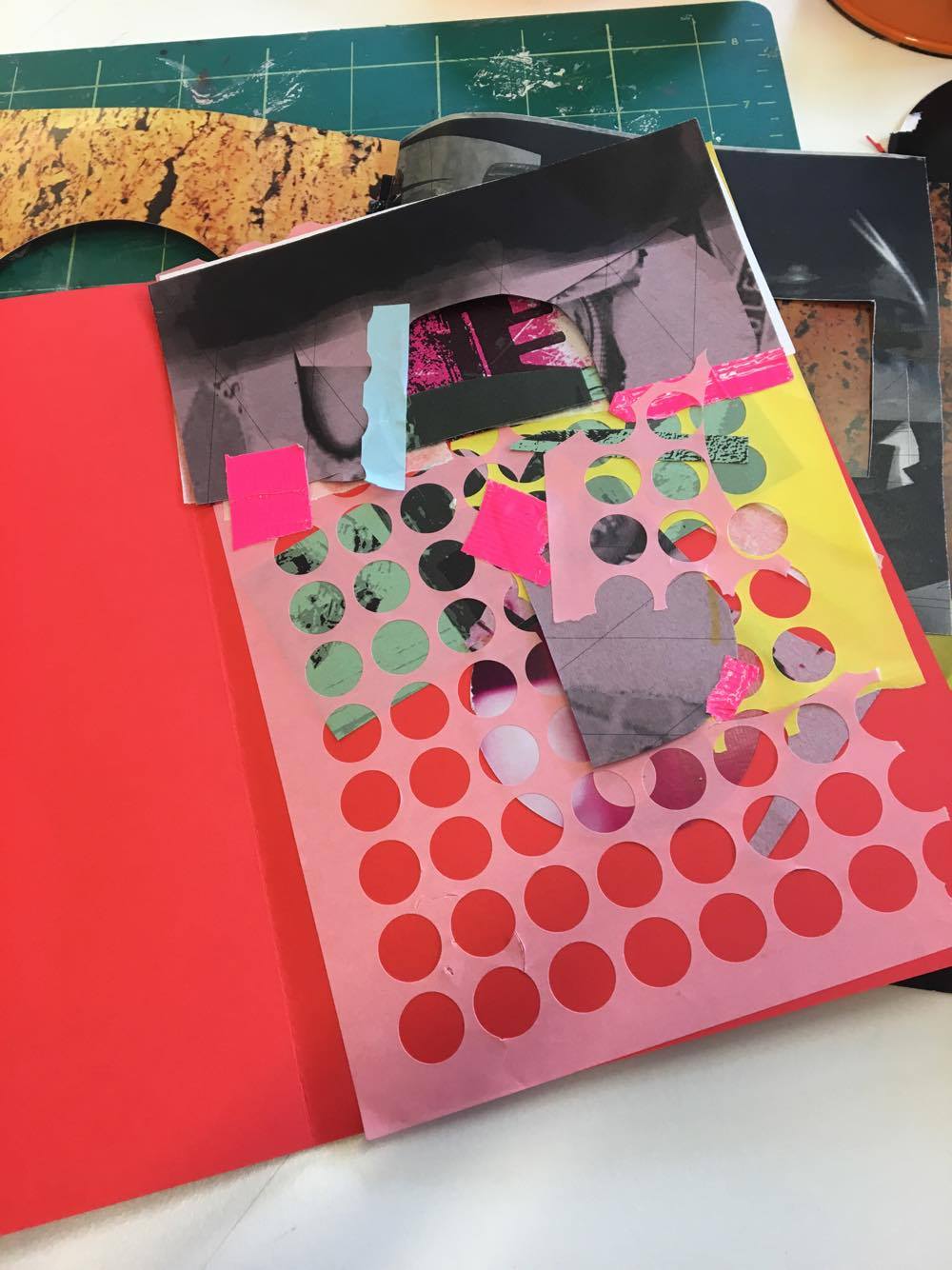
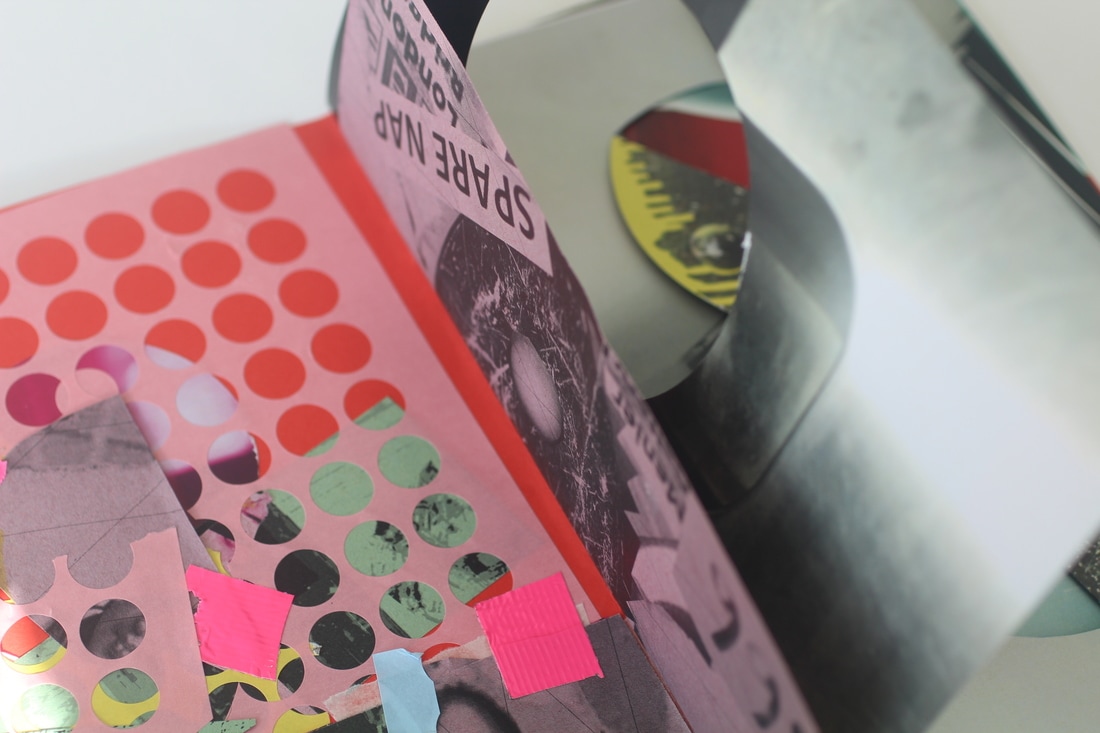
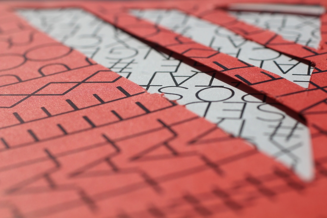
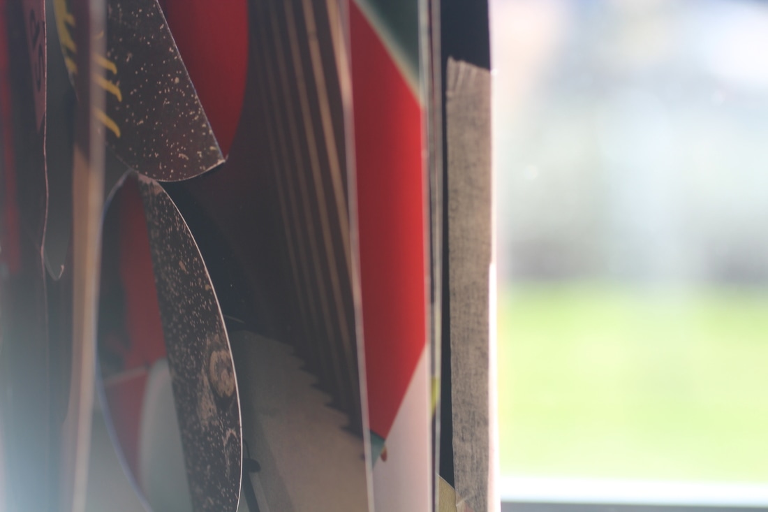
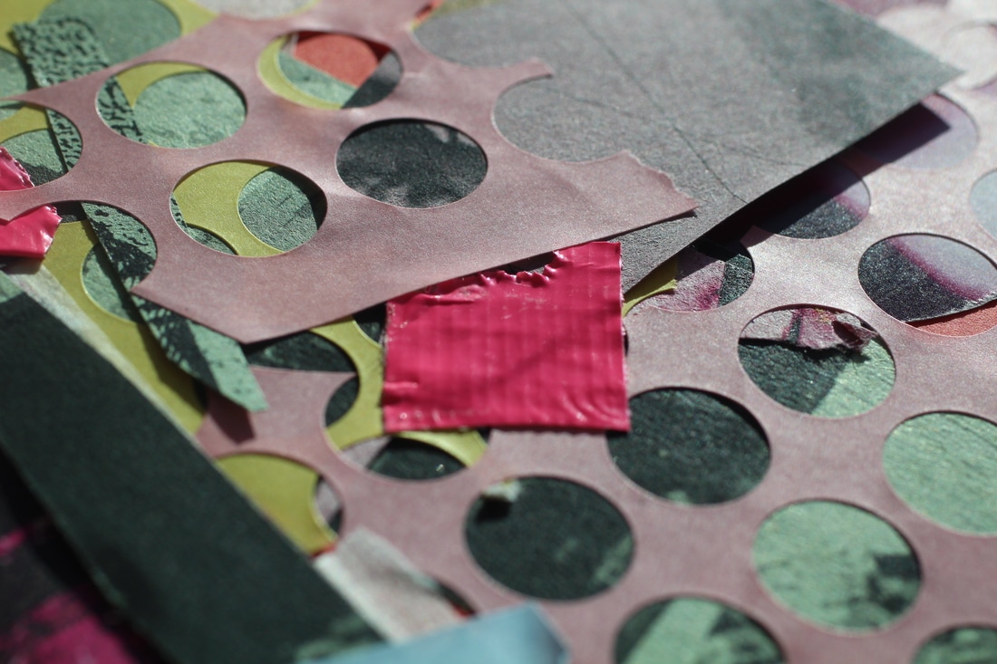
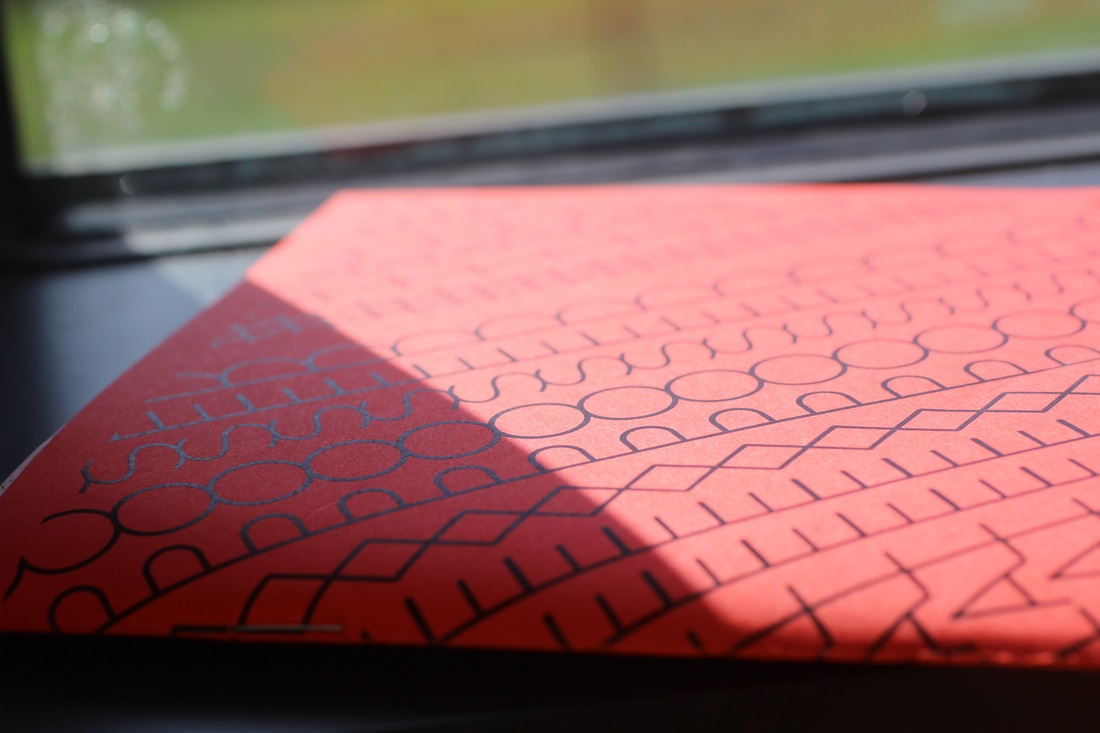
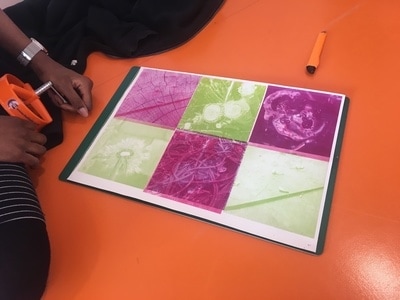
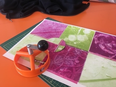
1. I was given lots of photos to choose from, I then chose the ones that I thought would look good together and would make a interesting composition. I was went for a colour theme of pink.
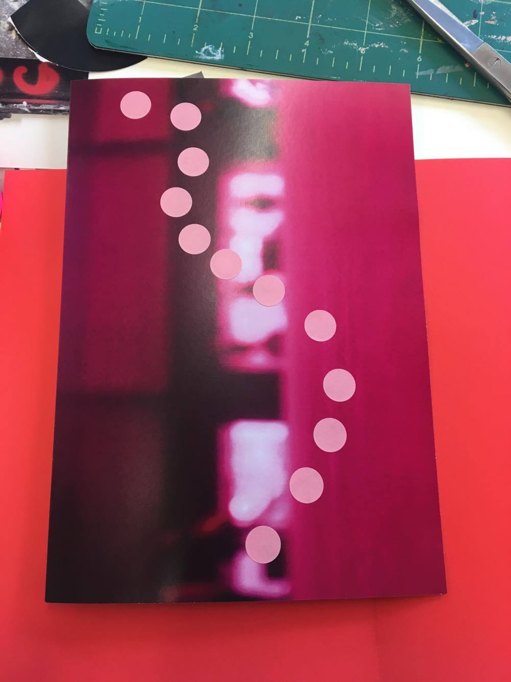
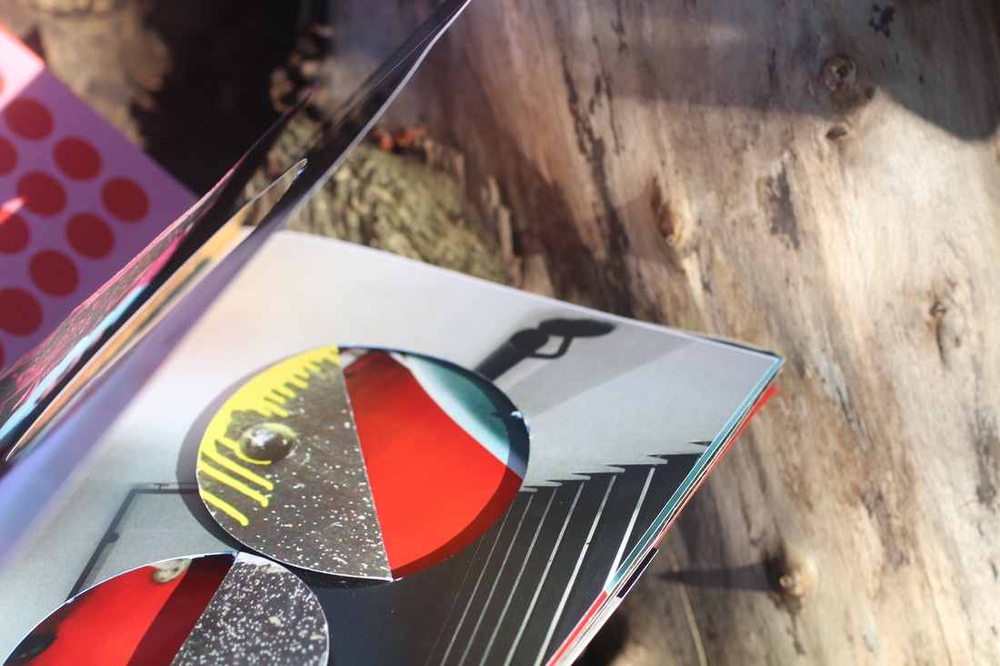
2. I then started to work on the front cover of my book, I cut a triangle in it at first and then two trapezium shapes into it. My original idea was to leave them like that revelling what was underneath, however, I then chose to put another white cover underneath it because I liked how the colours contrasted.
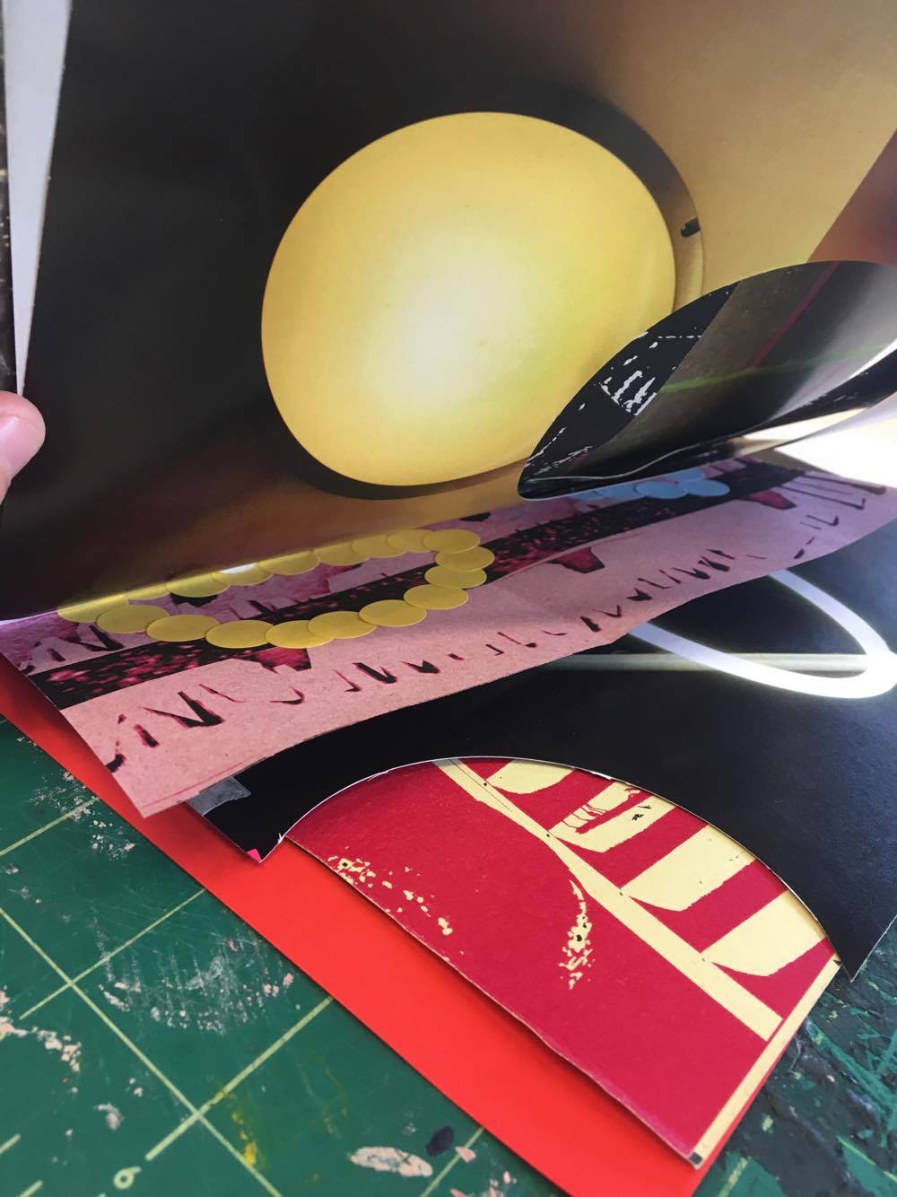
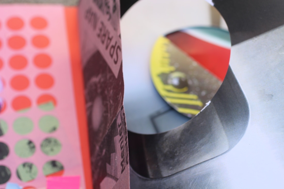
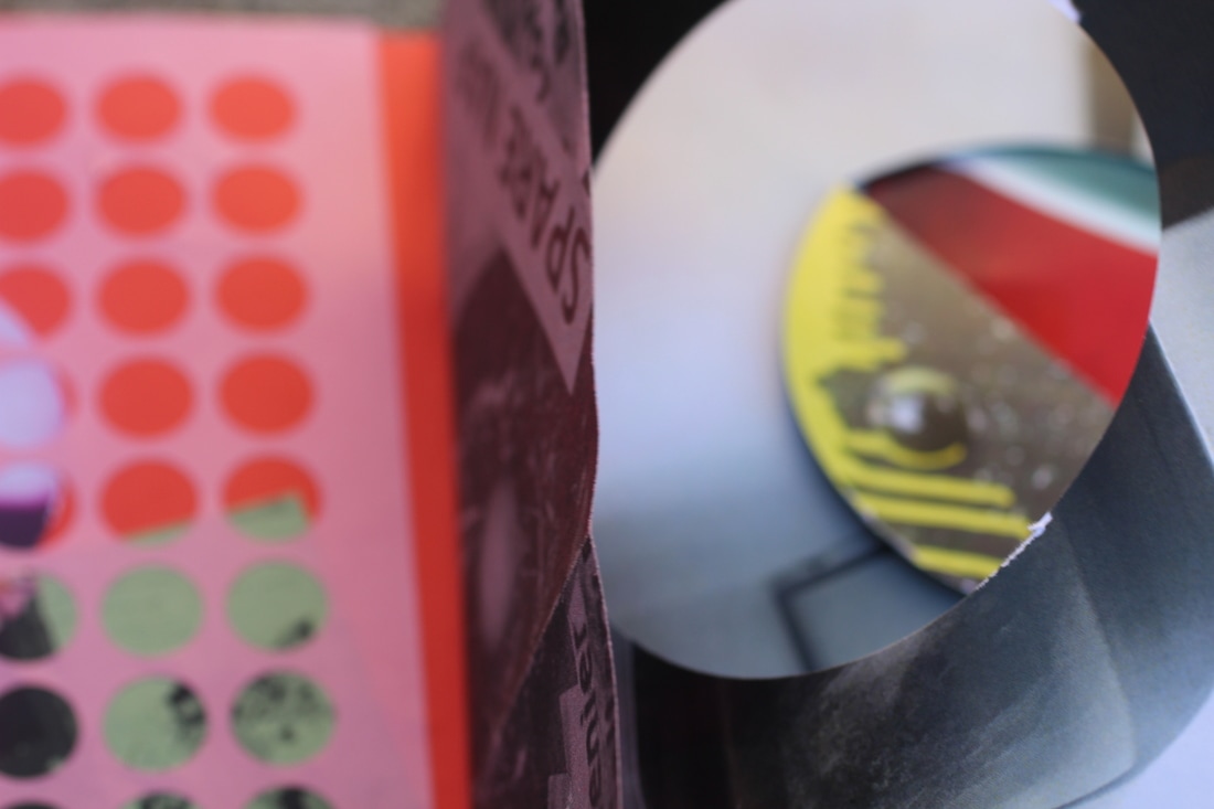
3. I then cut two semi circles out of my first page and folded back the other half of the circle, this reviles a bright red colour to the page which brightens it up as it was dull and grey.
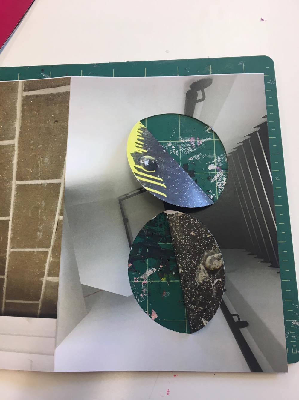
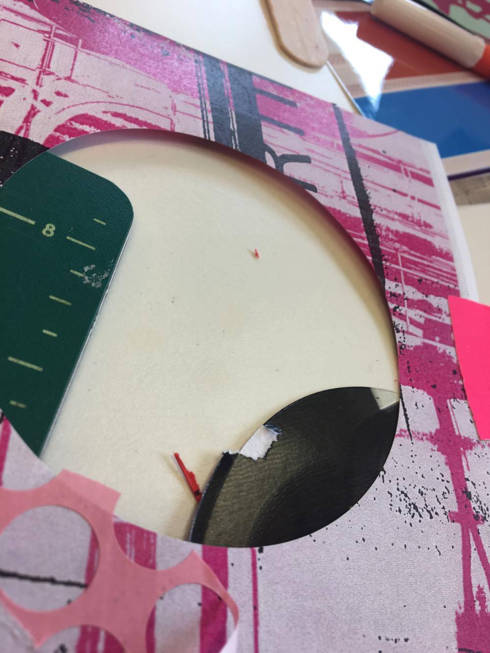
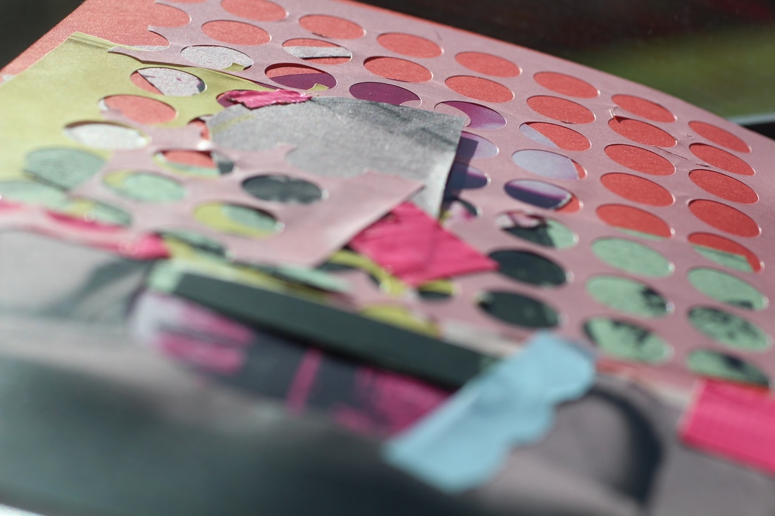
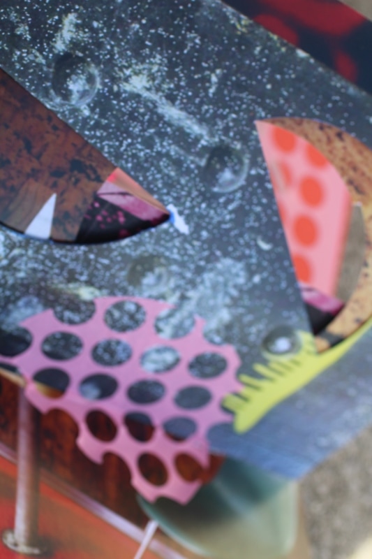
4. I then started cutting random shapes into the card and pictures to create different and interesting shapes.
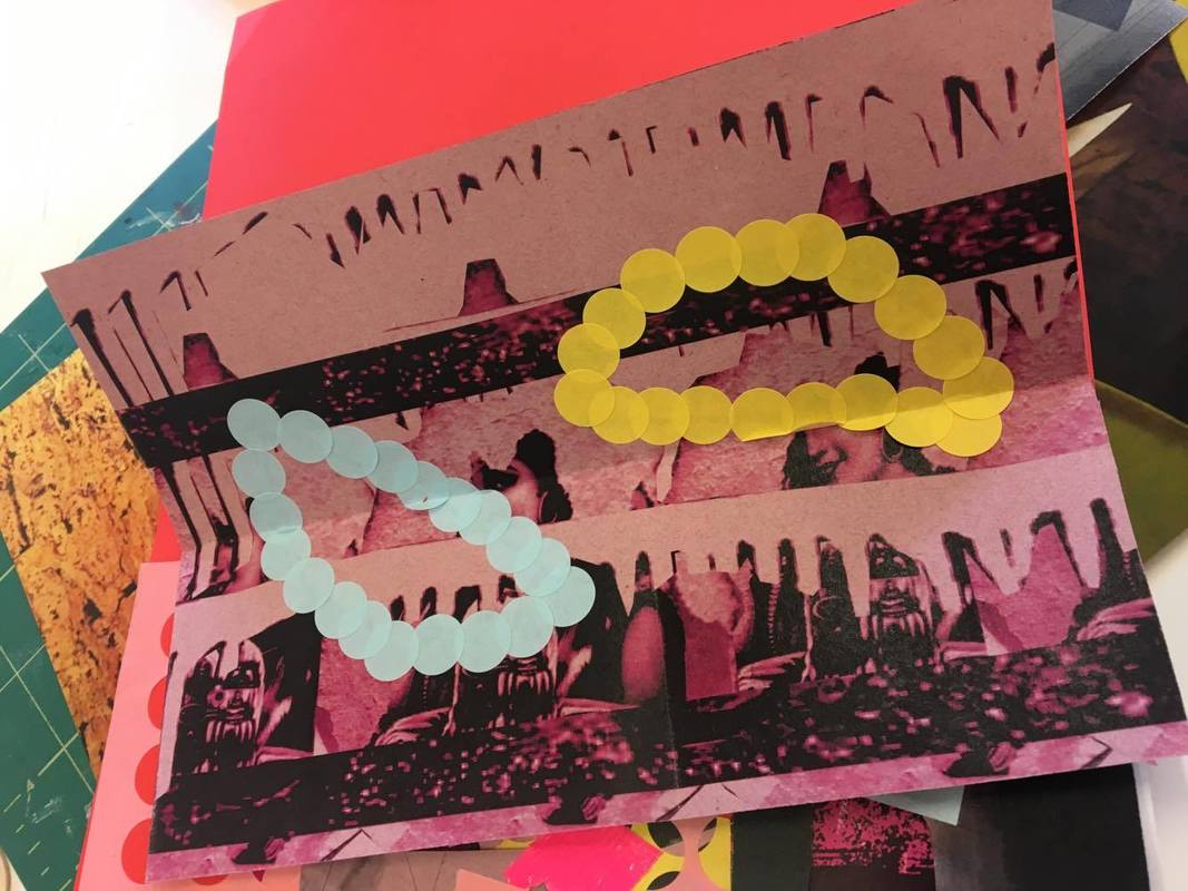
5. After that I started to play around with the stickers. I stuck some in lines and shapes and then I peeled of the actual sticky side of the stickers which made lots of small circles. I they layered them up to make a chaotic and fascinating montage.
6. After I was happy with how my book looked I then stapled it together to create a book.
1. I was given lots of photos to choose from, I then chose the ones that I thought would look good together and would make a interesting composition. I was went for a colour theme of pink.
2. I then started to work on the front cover of my book, I cut a triangle in it at first and then two trapezium shapes into it. My original idea was to leave them like that revelling what was underneath, however, I then chose to put another white cover underneath it because I liked how the colours contrasted.
3. I then cut two semi circles out of my first page and folded back the other half of the circle, this reviles a bright red colour to the page which brightens it up as it was dull and grey.
4. I then started cutting random shapes into the card and pictures to create different and interesting shapes.
5. After that I started to play around with the stickers. I stuck some in lines and shapes and then I peeled of the actual sticky side of the stickers which made lots of small circles. I they layered them up to make a chaotic and fascinating montage.
6. After I was happy with how my book looked I then stapled it together to create a book.
HERES SOME MORE PHOTOS...
PHOTOSHOOT ONE


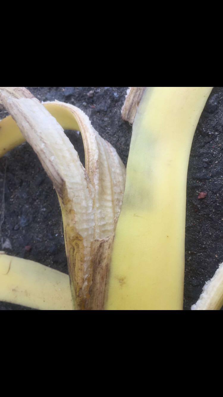
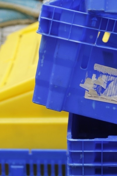
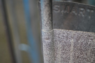
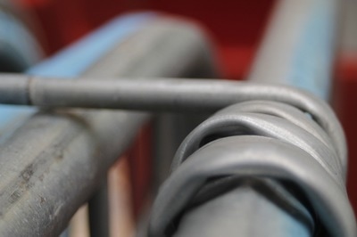
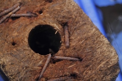
I took these photos on my phone around my local area. I used my normal camera lens on my phone however I did some photos in the square formatt. I am happy about how these came out as I feel like the have a lot detail in them. I also photographed some objects in my house, however, I got very close to them so it was unclear what the object is. This also allows you to see the detail of the object.
|
|
WWW
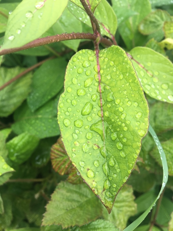
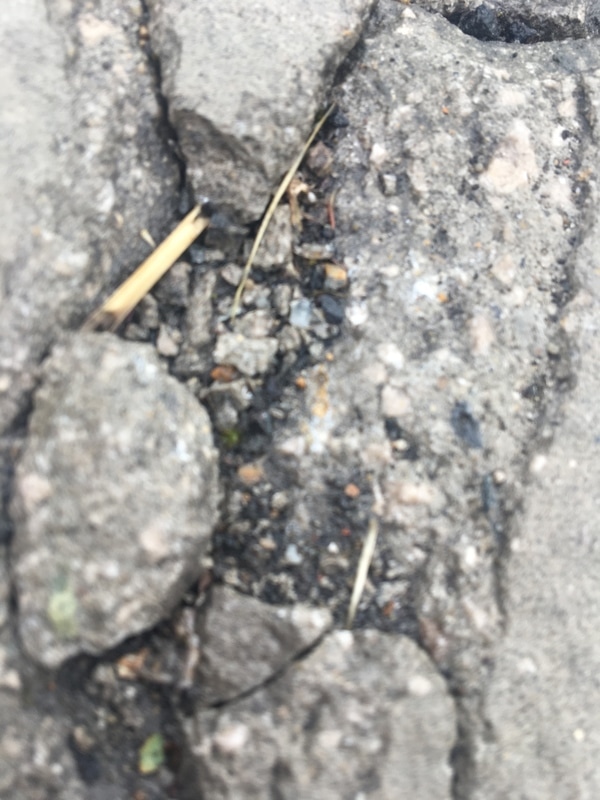
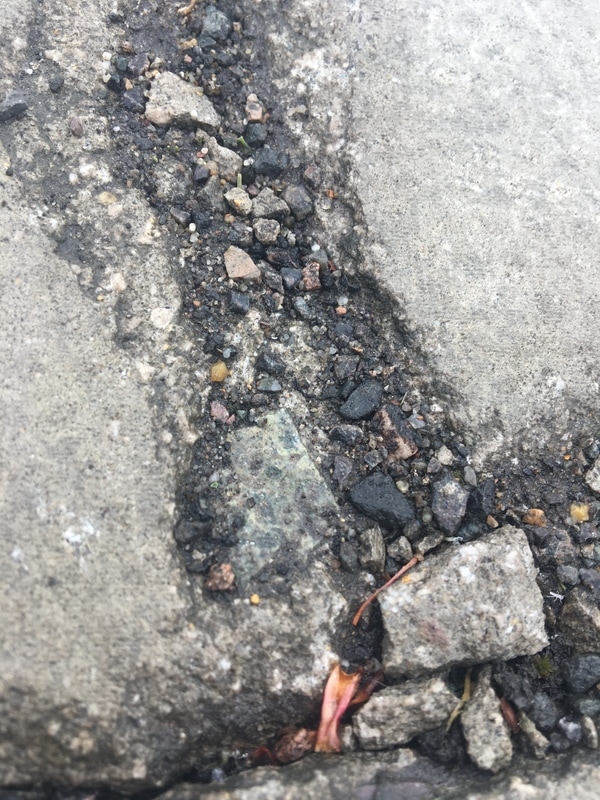
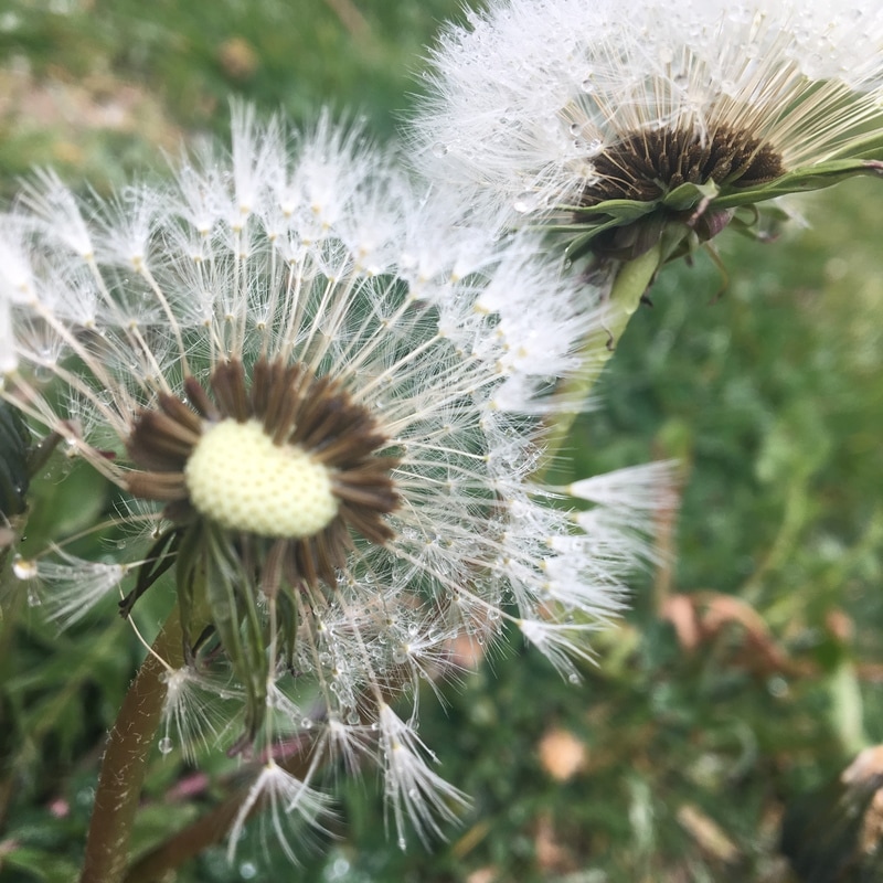
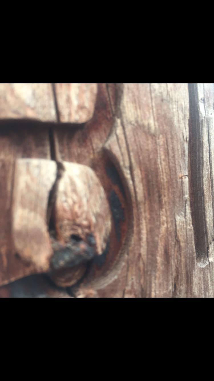
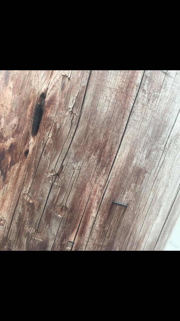
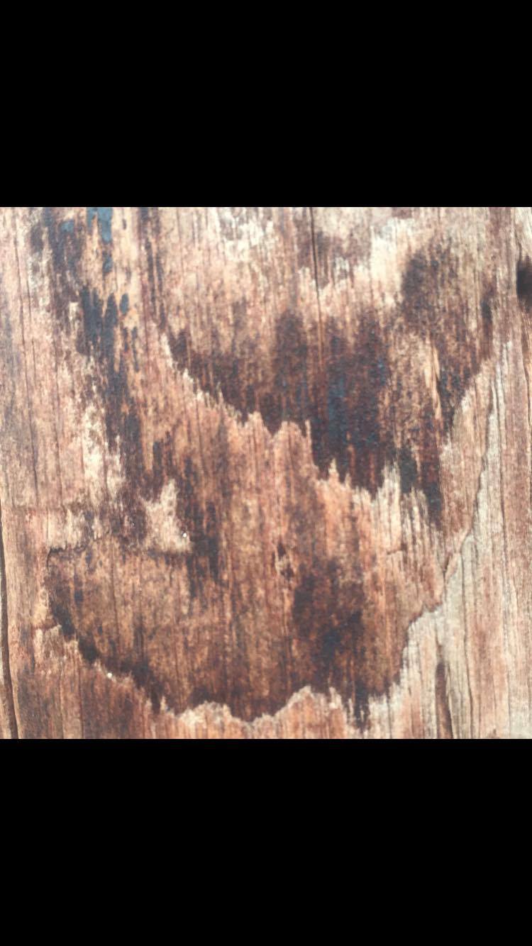
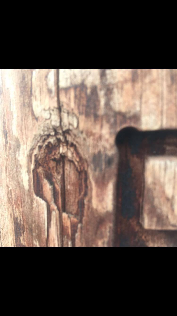
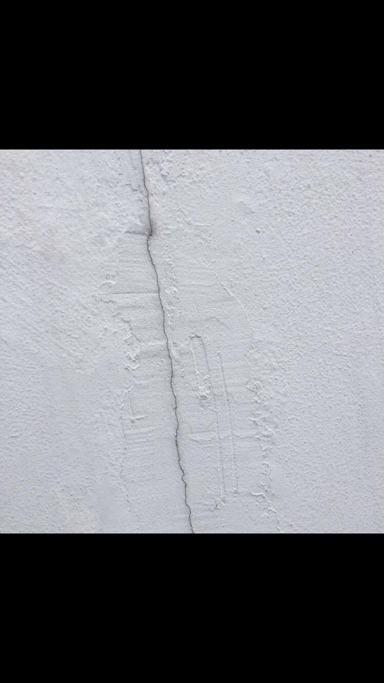
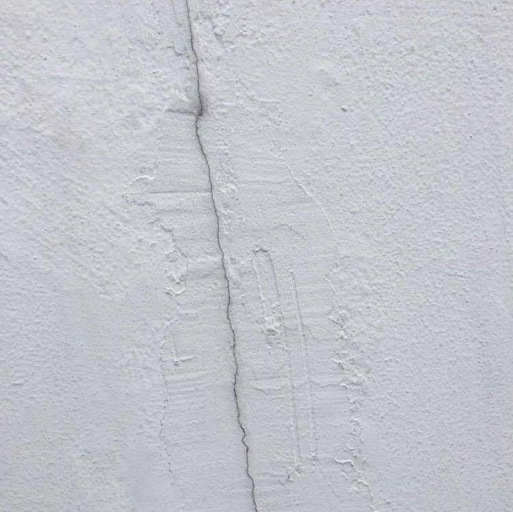
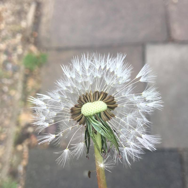
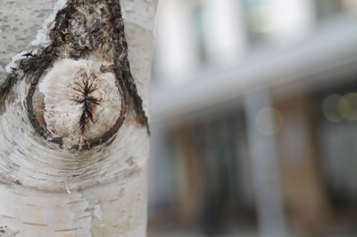
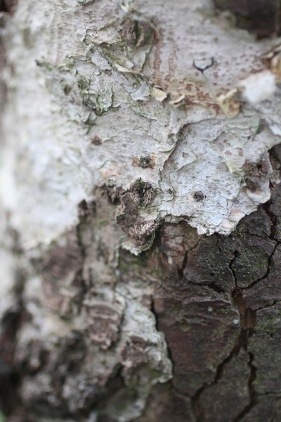
These two photographs are my favourite photos that I took because i really like the detail in them. For example the first one is quite simple, however, the line in the crack that is going through the middle of the wall makes the image look a lot more interesting. You can also see the textures on the wall which I really like. In the second image you can see each strand of the flower which I like. I also like how the background is blurred compared to the flower which is in focus and centred in the middle of the picture. |
|
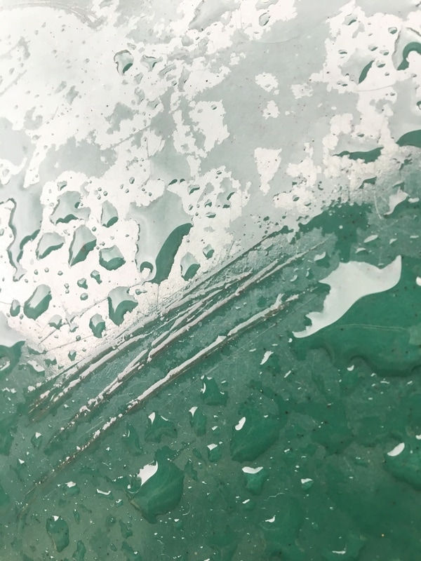
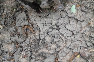
EBI I am not as pleased with these two images because they are not in focus. Also in my opinion i don't think they are very interesting. They don't have a lot of detail due to them not being in focus and therefore are not the best images for my theme. I don't like how both images have something out of focus in the foreground which makes the rest on the image look blurry. |
|

PHOTOSHOOT TWO

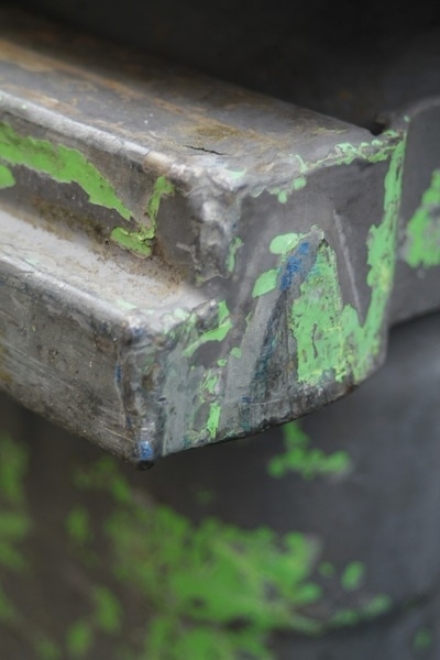


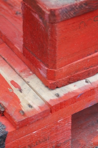
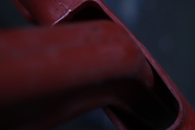
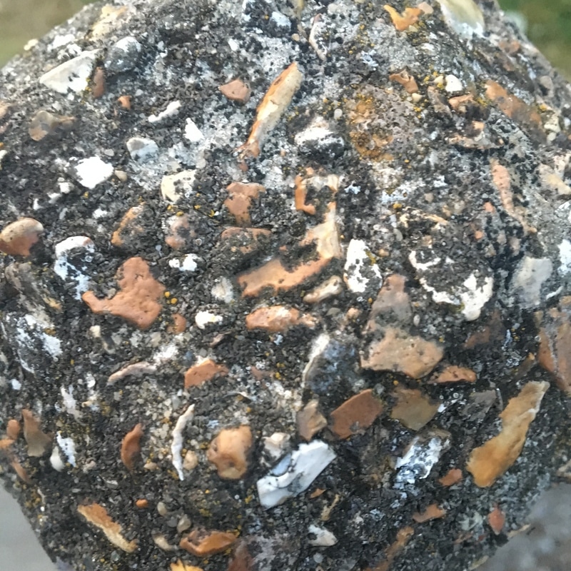
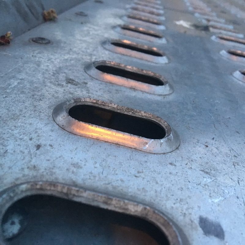
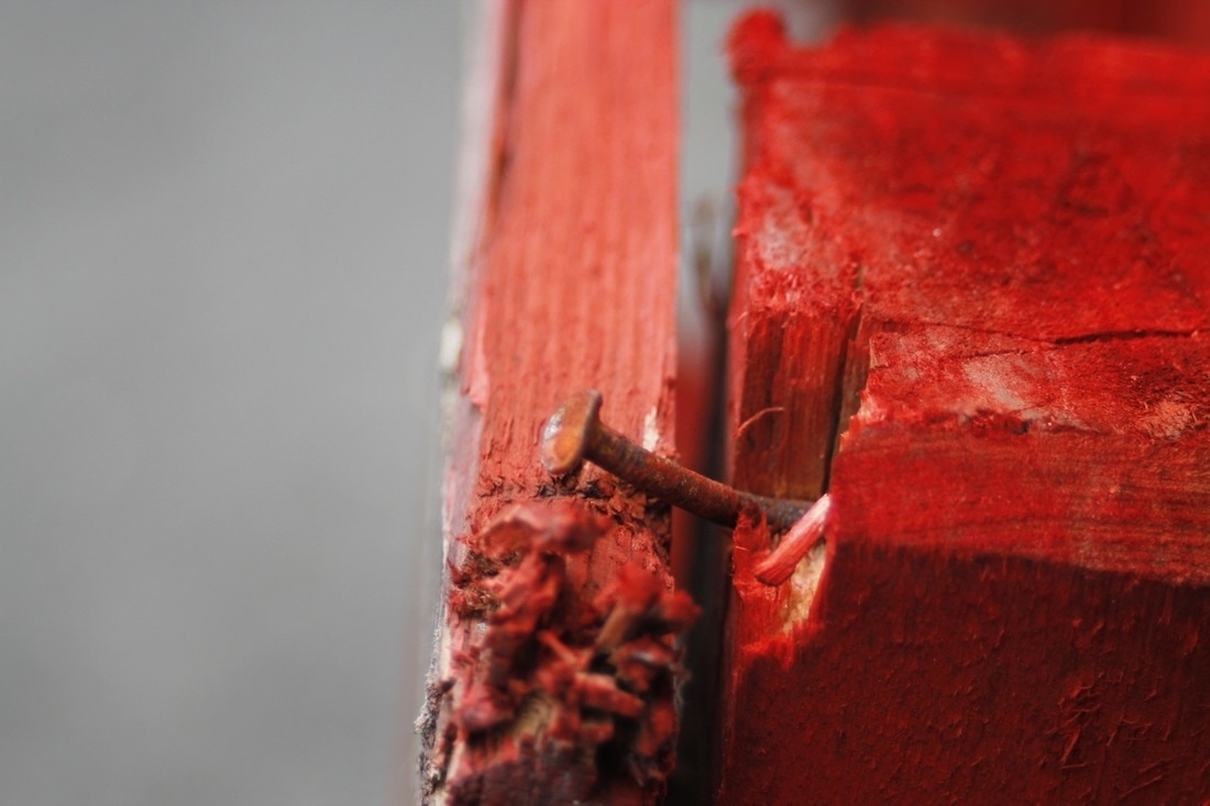
These are some pictures I took around my school using the DSLR camera and the macro lens. I'm really happy with my outcomes because I think that there is a lot of detail in them.
|
|
WWW
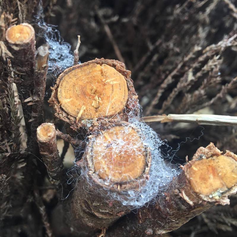
These are my two favourite pictures from my second photoshoot. I really like them because there is a lot of detail in both. For example in the first one you can see that there is texture and colour which make the picture more interesting. There is also lots of lines and tones which I really like because the image would be boring with out them. I also like how you would not normally notice things like this and therefore this image really fit in with my theme of detail. I also like the second image because of the bright colours that are in it. There is also a lot go tones and texture in it which make the image look really real. Another reason I like it is because you would not normally see things like this, so I have captured entail again. |

|
EBI
From my second photoshoot these are the photos that I am least happy with because I don't like how they have been photographed. This is because they don't show much in detail and also could look like and ordinary photo. I think that I could have focused that camera on smaller things in the image to create more detail within the image. |
|
my final piece: process
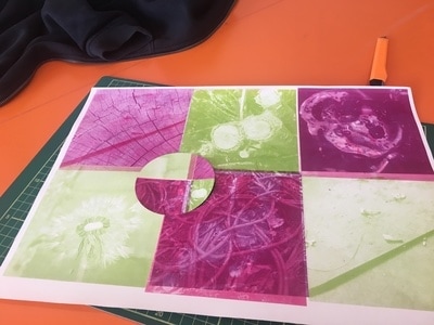
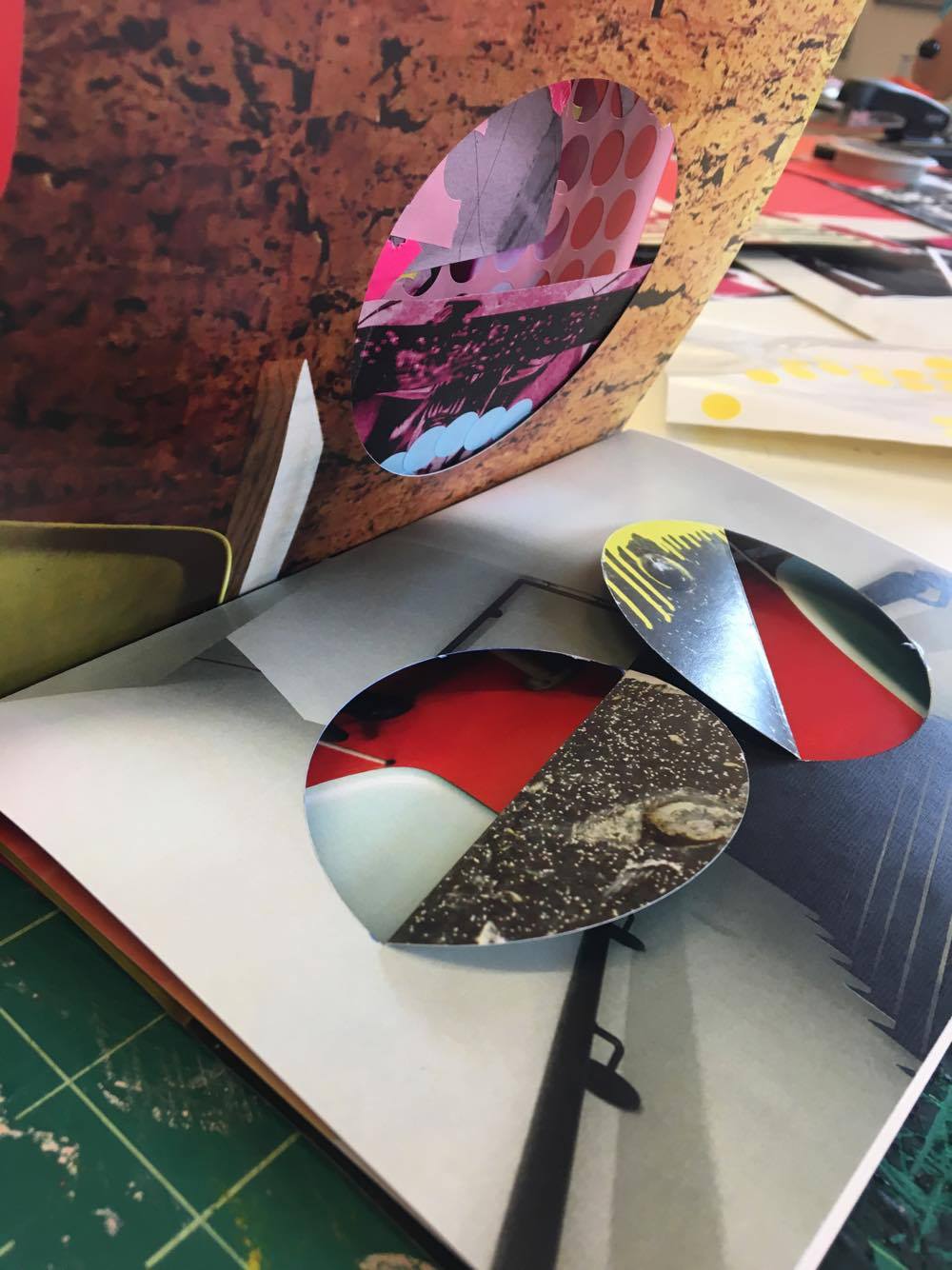
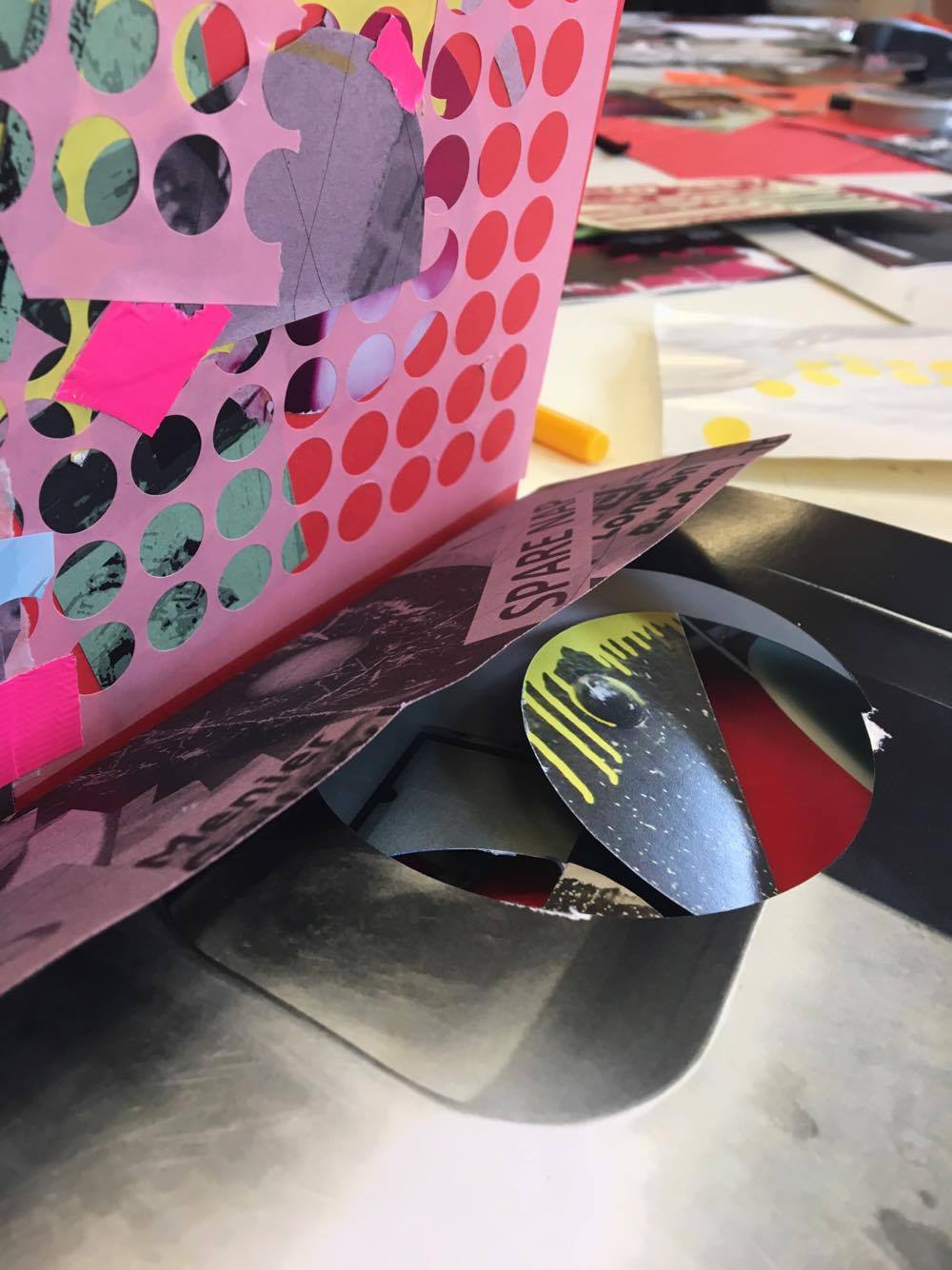
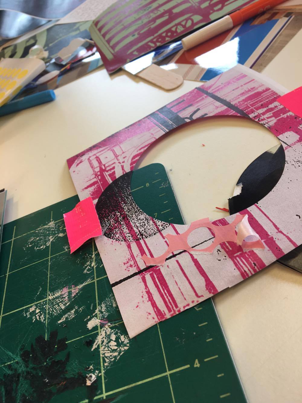
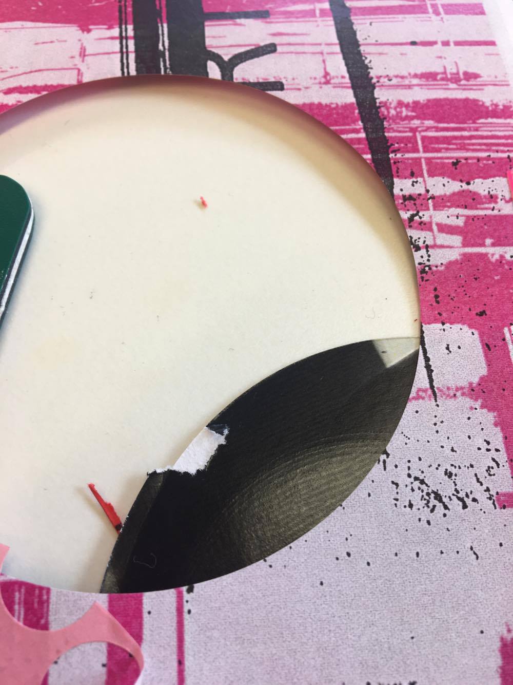
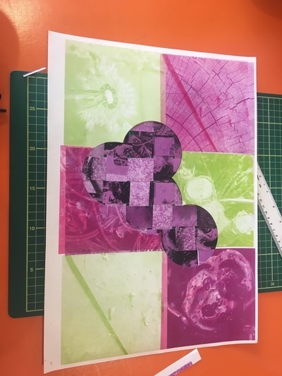
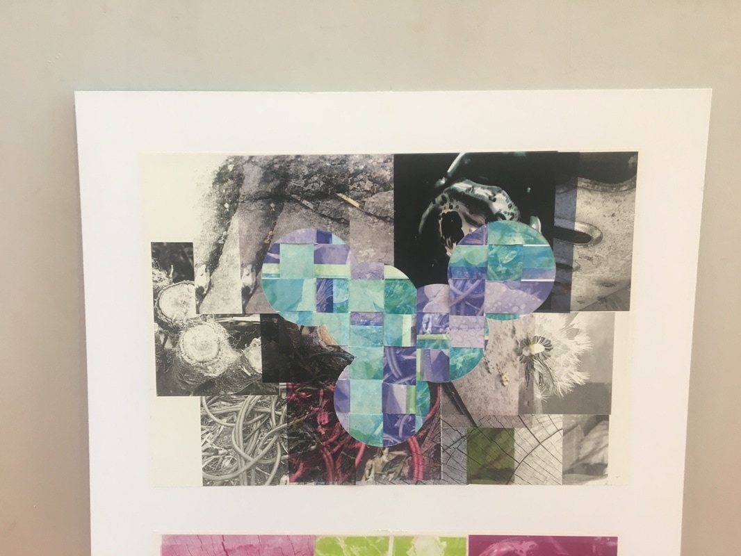
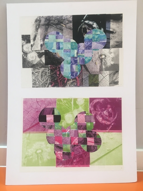
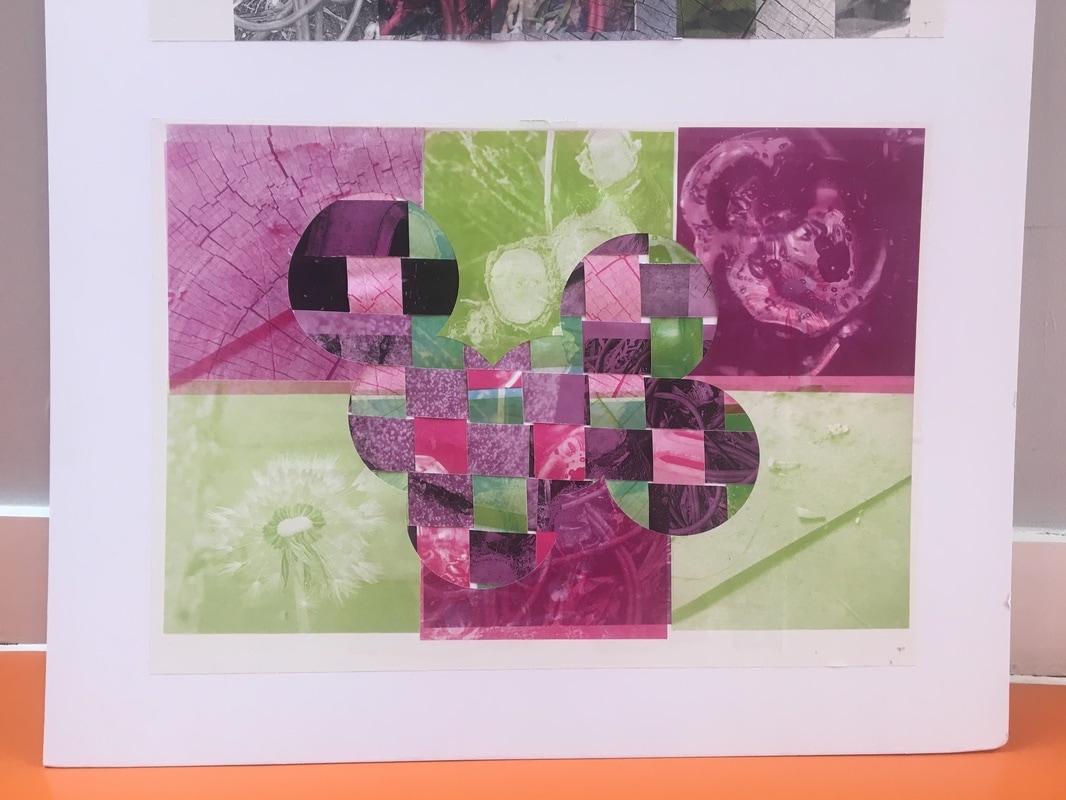
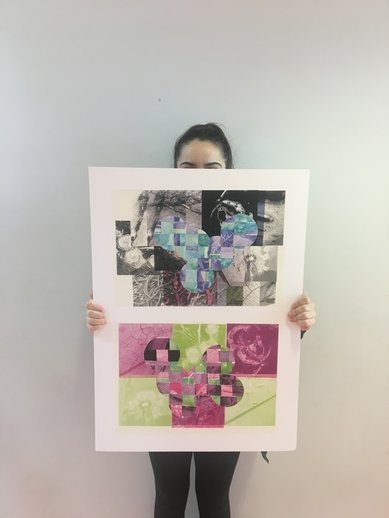
I started by printing some of my images that I took in squares on A4 paper. I then printed them in the photocopier onto A3 paper in different colours (pink,green,purple,blue and red) and filled up the paper. I did this repeatedly to create different images and compositions, however, I only used my favourites in my final piece. I then experimented by cutting circles into them and changing the way that they go.
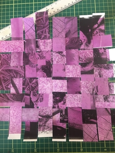
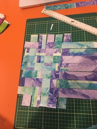
After that I stared to experimenting with another one of my images. I cut it into strips and with a knife and then weaved them together. However I realised that it could look a lot better if i incorparted another colour into it. I really like this idea because when you do this you can see detail in each square. I then cut up another one of my images, however, I weaved it in with another photo which is another colour so that in each square there is something different to look at.
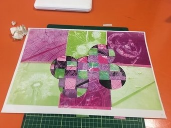
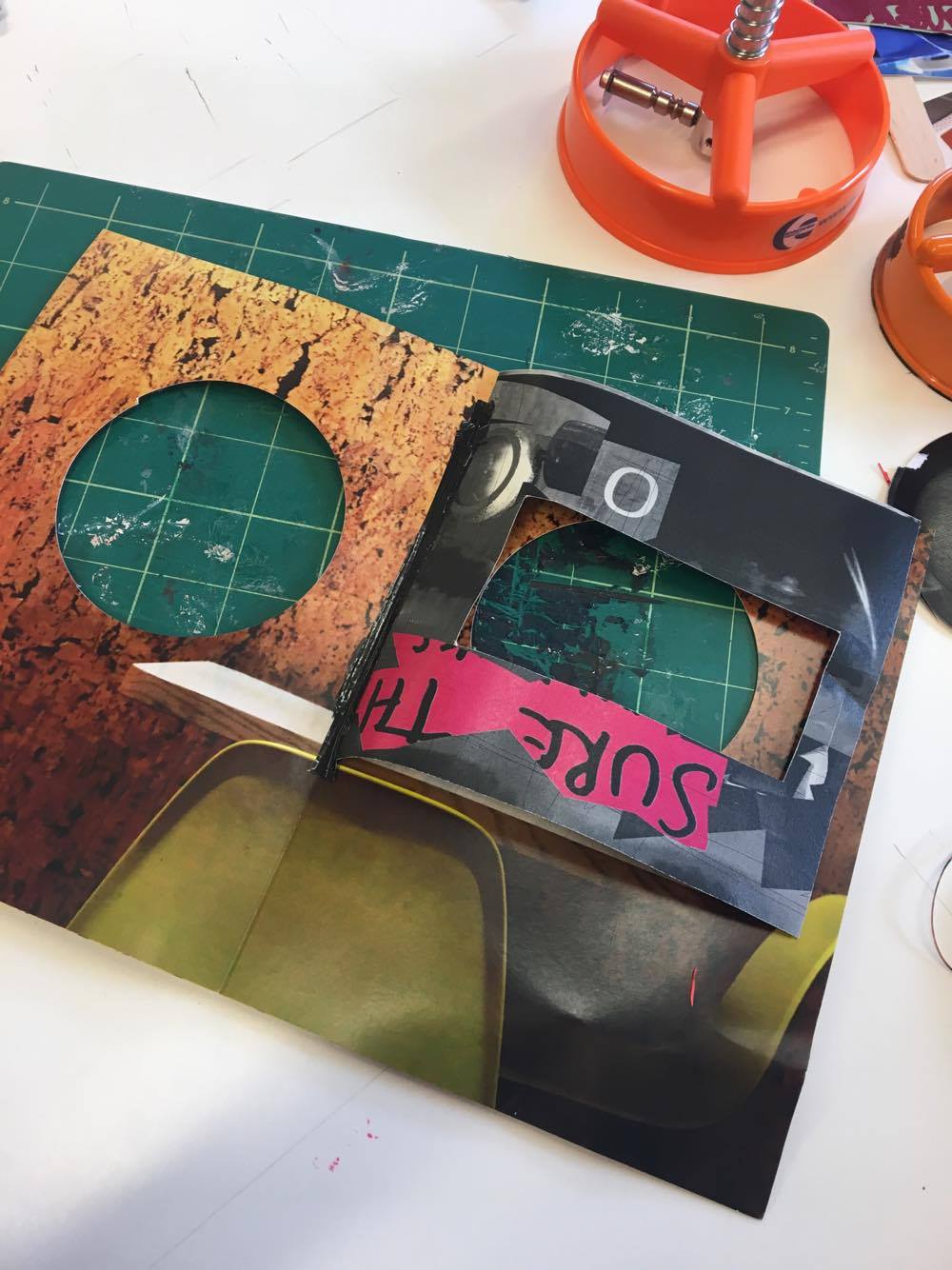
I then cut holes into my original image in random places with a circle cutter. Then I put the weave that I made underneath it so that the holes revel it. I really like this idea as you can see detail in the original image and in each square from the weave. I then repeated this for another one of my photos.
MY FINAL PIECE
The theme I chose was 'Detail.' This was because I thought that it would be really interesting to research and develop my ideas about this theme. Although detail may be seen as an easy theme to choose, personally I found it very difficult as everything has detail which allowed there to be a verity of things that I could have photographed and I struggled to just pick one.
When I first choose this theme my ideas where very limited as I didn't grasp the concept that everything has detail. My first ideas where about the focus of the camera and zoom. However, as I have gone through this process I have learned that differently and that I am able to capture everything that has detail as its in everything. In this process I have focused in making detailed images with just a camera and no effects air photoshop, for example. However at the very end I started to experiment with different ideas and I am really pleased with my final outcome. I have looked at many different photographers like Jo whaley and Henry Troup and have been inspired by their work. For example Jo Whaley edits her images so that there is lots of lines and shapes in here work and thats what I have done. Also Armett who just photographs objects up close and uses natural light and lots of colours, I also did that in my final piece. Henry Troup shows lots of textures in his work which I really liked and wanted to portray in my final piece.
I used a lot of different experiments in this process with lots of different images in lots of different sizes and colours. I made a lot of different montages in order to find which one I liked best to which one I should stick with. I also took a lot of inspiration from different photographers and took their work into consideration when making my images. I didn't use any media techniques, however, I did use the photocopier to print my images in different colours and sizes. I used a weaving technique to create part of my final outcome and then stuck it under another one of my photos. I did this process twice to create two images and used the same materials. I have refined and developed my ideas through out this process by firstly printing my pictures out and then photocopying them on to a A3 paper all together in different colours. I then cut up my image with the circle cutter and then cut up another on of my images in strips. After that I weaved the image in with another one and stuck it underneath the image that had circle cut into it. This adds colour to the image which creates a contrast between them. I took some photos on my normal phone camera and some on DSLR camera with a macro lens. I have recorded my ideas and processes on my website to show how I have created my final piece.
My final piece is personal to me because I worked really hard to create it. I also took pictures of personal belongings in my house in a lot of detail. I would like any viewer of my work to understand the balance of complementary colours, the contrast between straight and curved lines, the arrangement of forms (partly organised and deliberate and partly as a result of chance placement), the combination of various layers and the way that the images as a whole explore the theme of detail. I am really pleased with both outcomes. I feel as though I have been able to persist in the development of my work. I have also been imaginative in the way that I have connected different elements of the creative process together. Finally, I have learned some new techniques which have resulted in a pleasing outcome.
