|
Personal Project: Abstract
adjective ˈabstrakt/
|
|
|
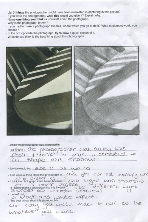
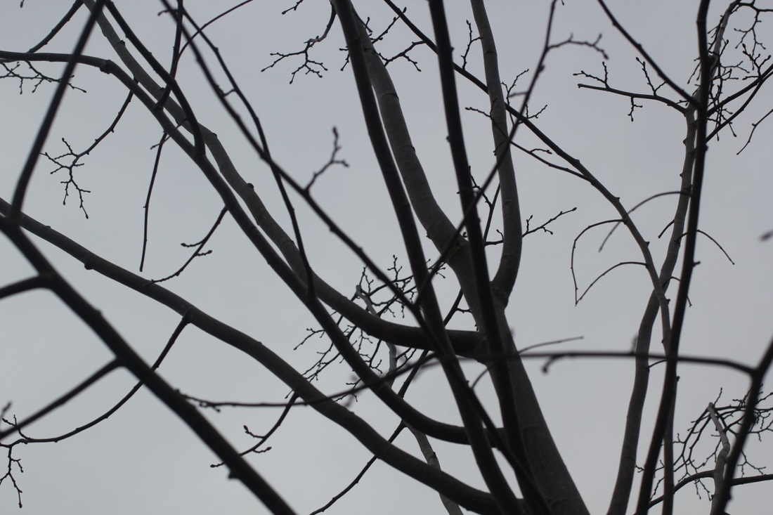
The Formal Elements Focus: Which areas appear clearest or sharpest in the photograph? Which do not? Light: Which areas of the photograph are brightest? Are there any shadows? Does the photograph allow you to guess the time of day? Is the light natural or artificial? Harsh or soft? Reflected or direct? Line: Are there objects in the photograph that act as lines? Are they straight, curvy, thin, thick? Do the lines create direction in the photograph? Do they outline? Do the lines show movement or energy? Repetition: Are there any objects, shapes or lines which repeat and create a pattern? Shape: Do you see geometric (straight edged) or organic (curvy) shapes? Which are they? Space: Is there depth to the photograph or does it seem shallow? What creates this appearance? Are there important negative (empty) spaces in addition to positive (solid) spaces? Is there depth created by spatial illusions i.e. perspective? Texture: If you could touch the surface of the photograph how would it feel? How do the objects in the picture look like they would feel? Value/Tone: Is there a range of tones from dark to light? Where is the darkest value? Where is the lightest? |
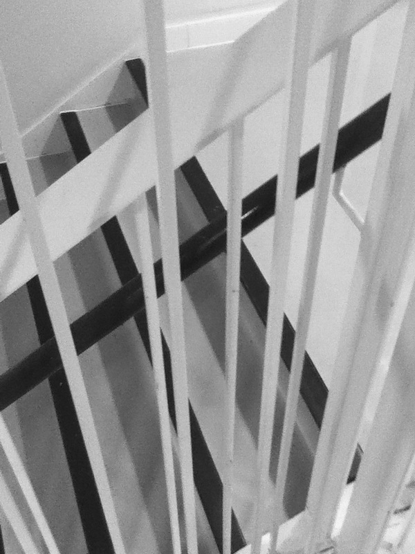
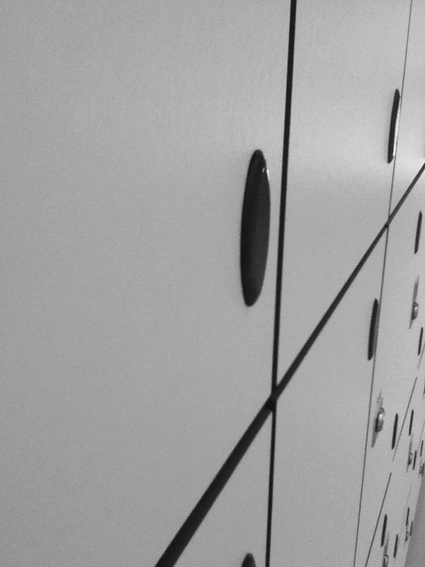
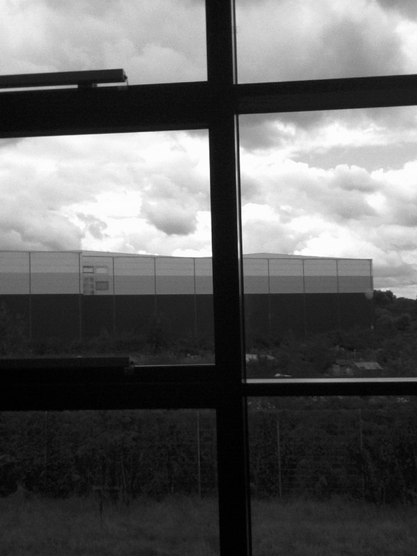
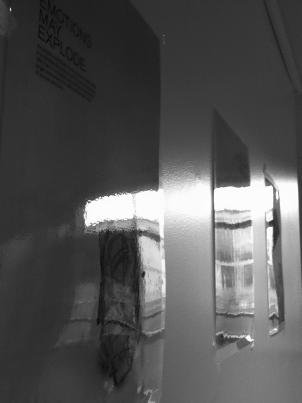
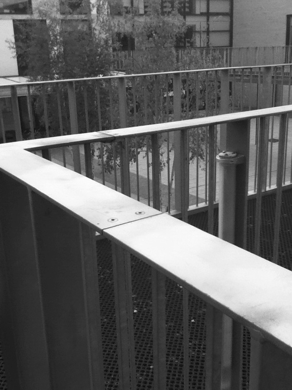
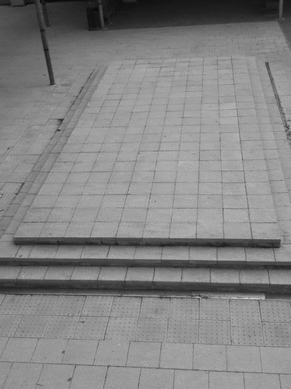
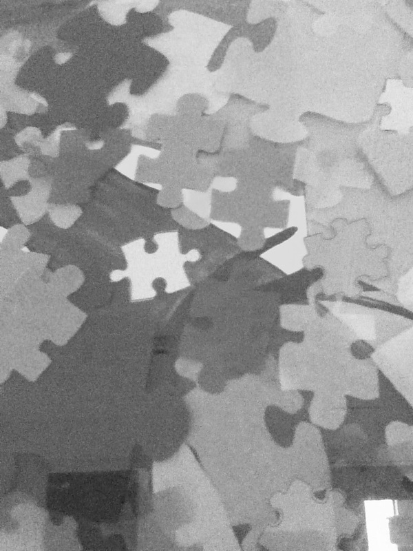
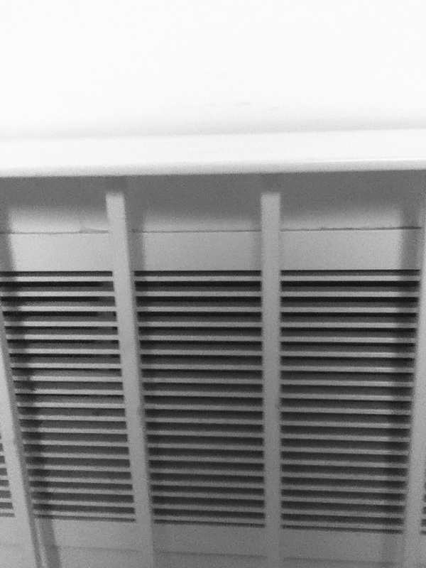
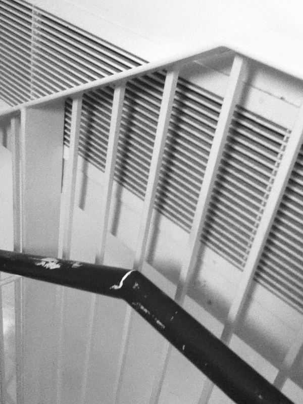
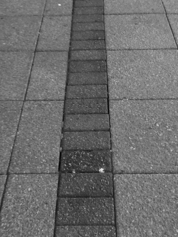
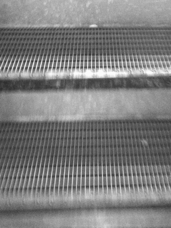
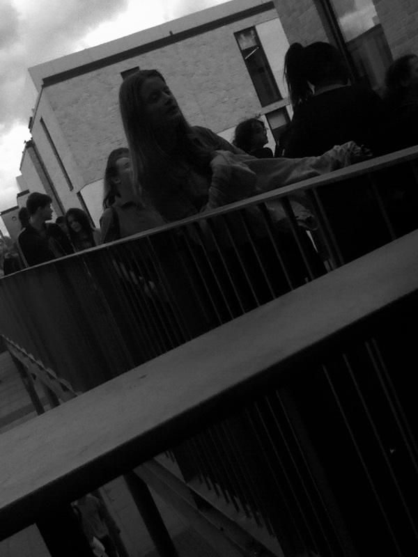
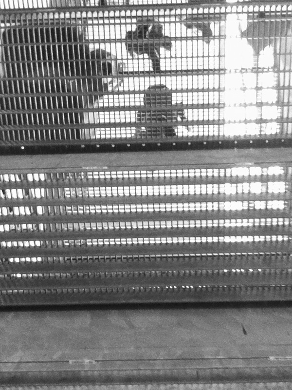
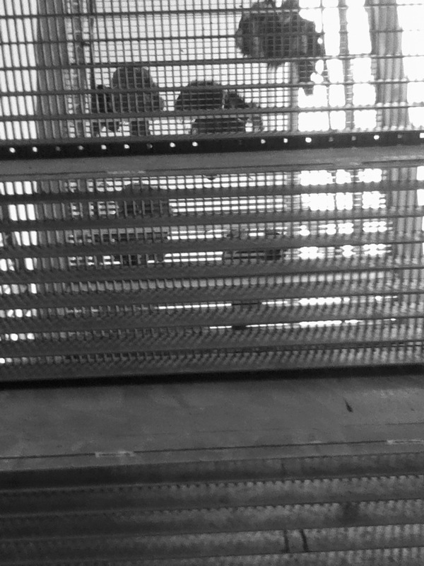
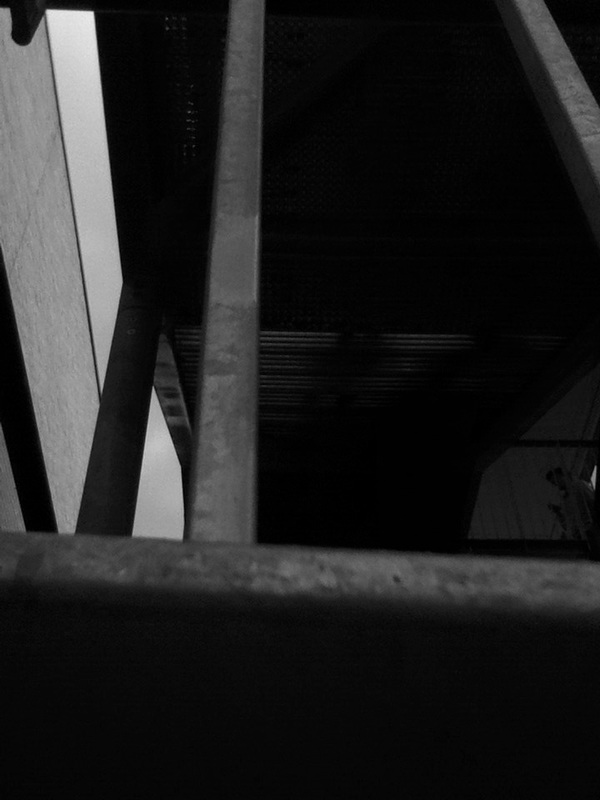
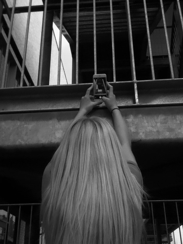
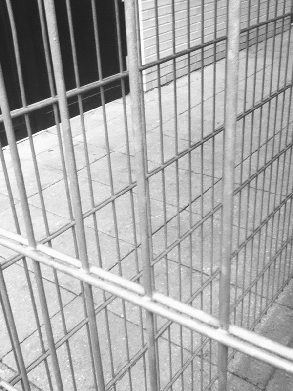
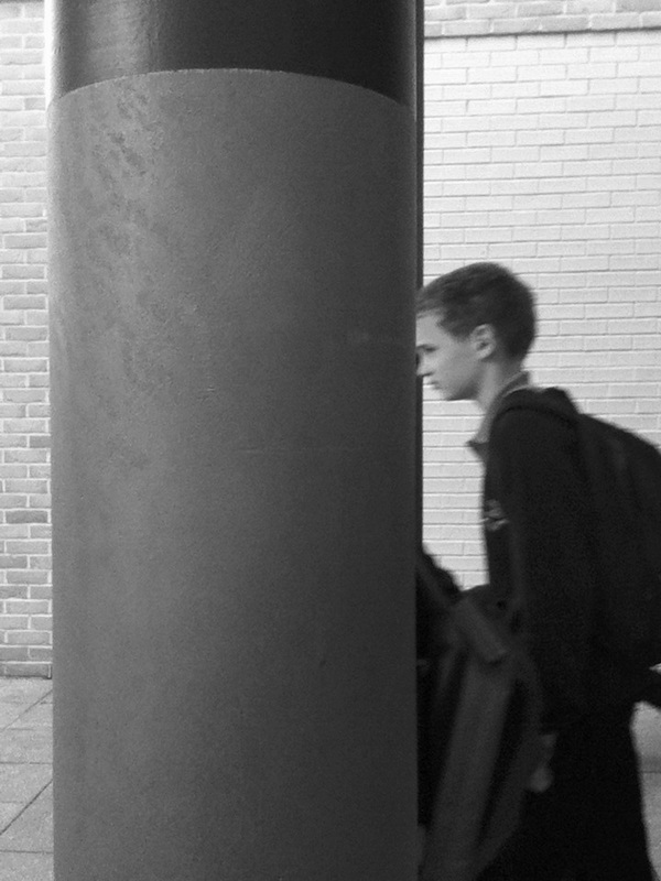
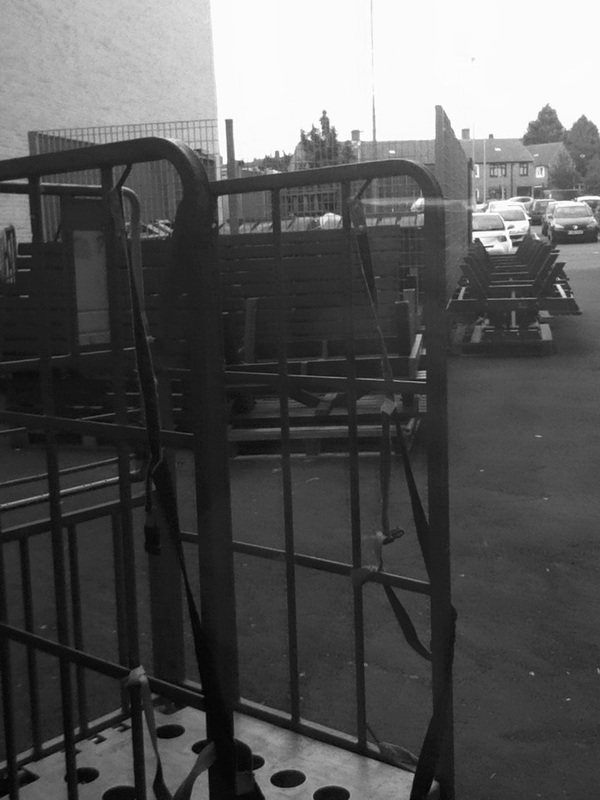
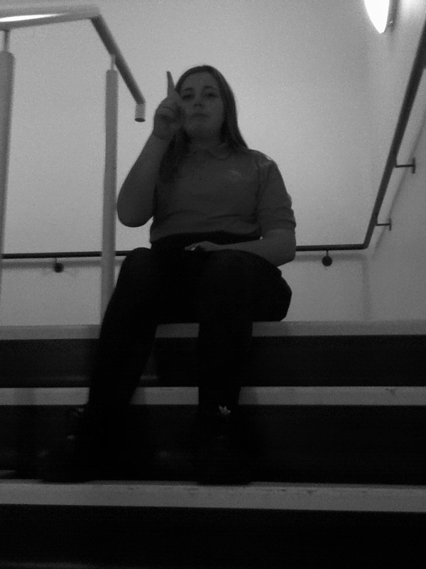
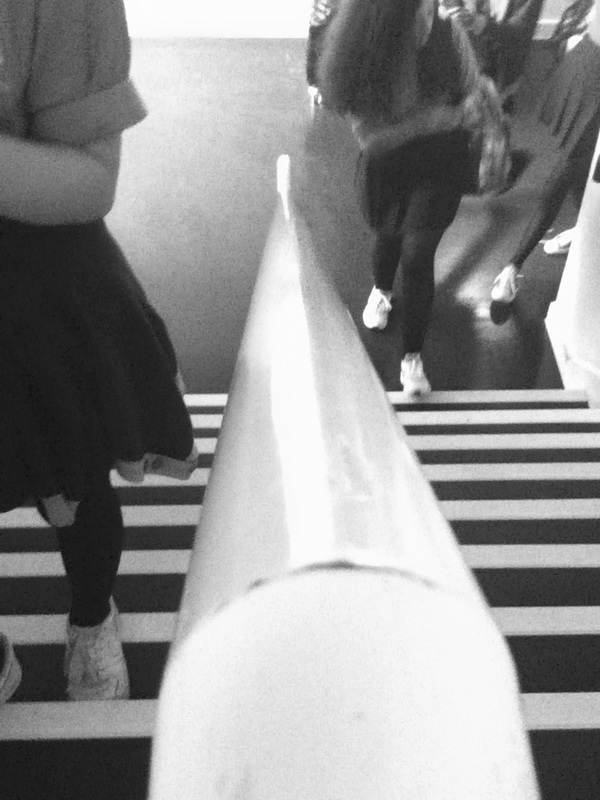
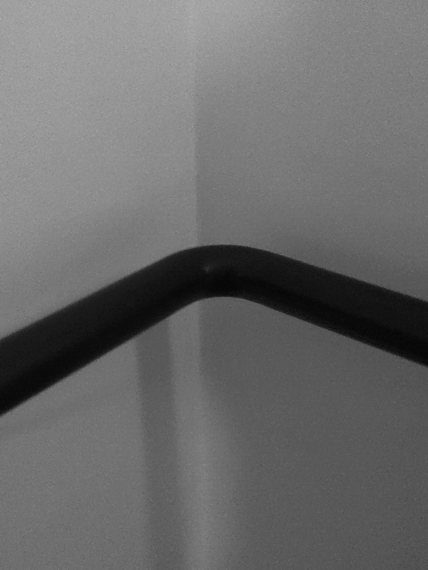
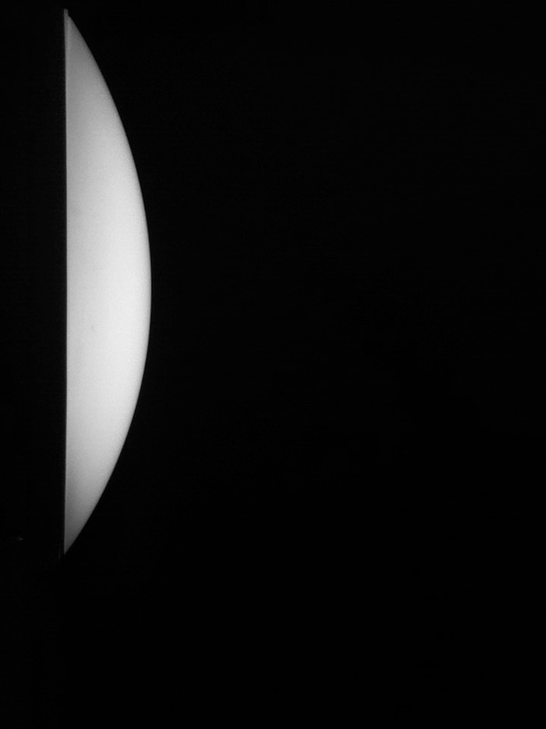
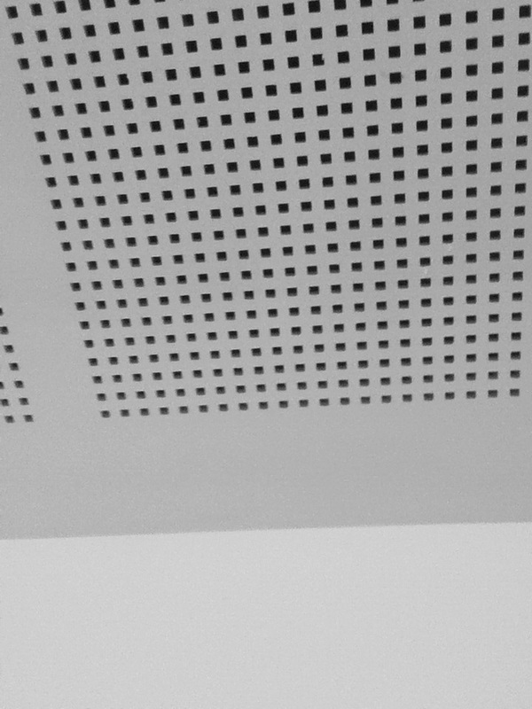
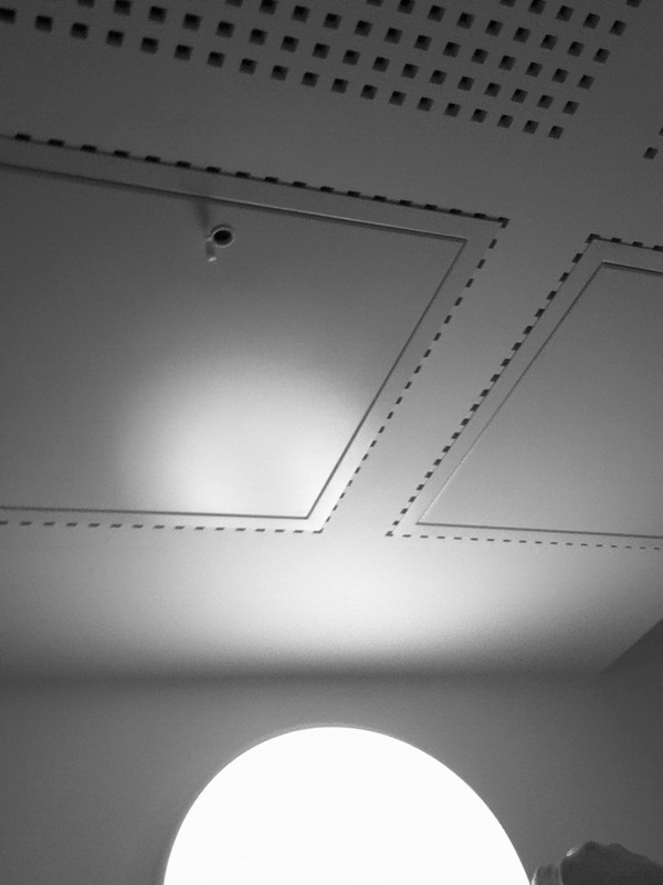
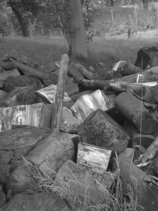
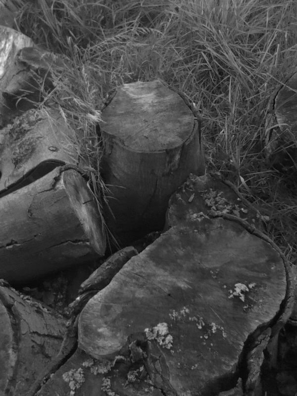
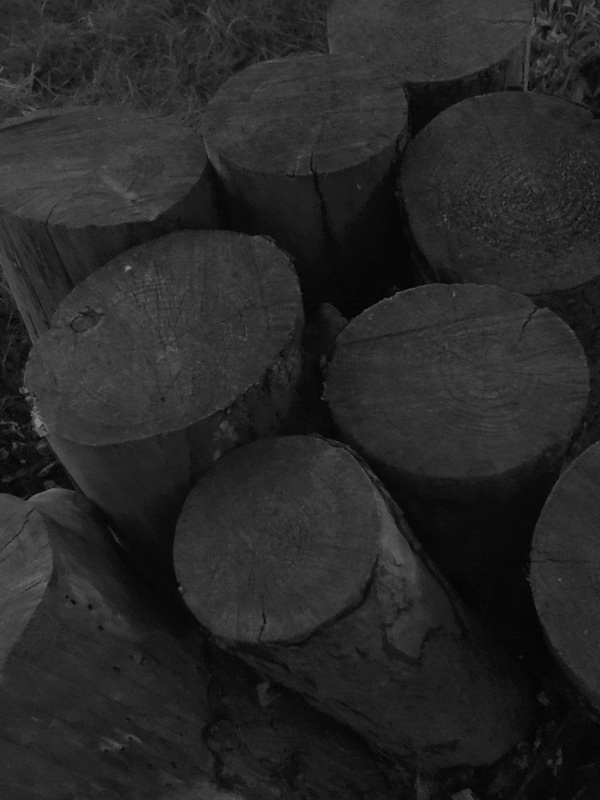
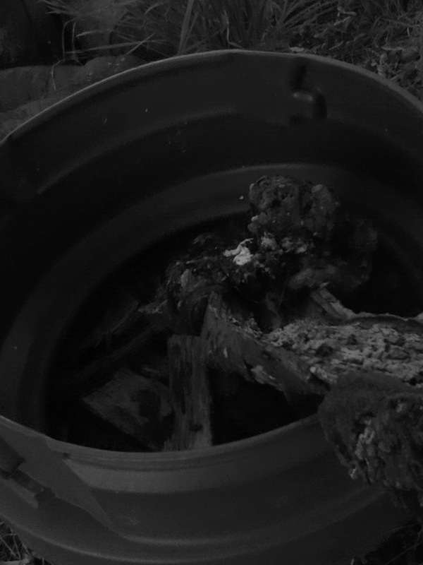
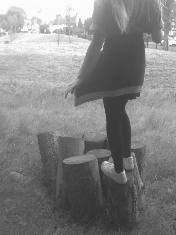
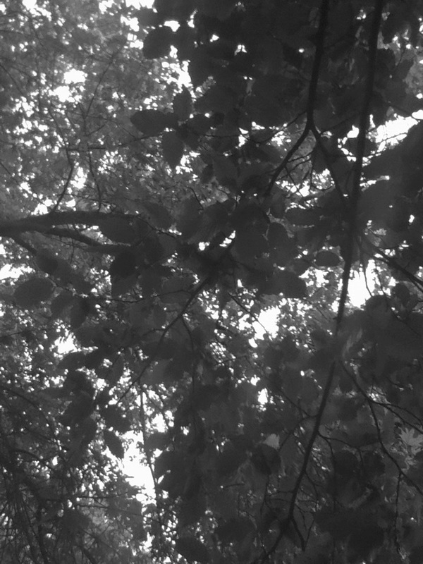
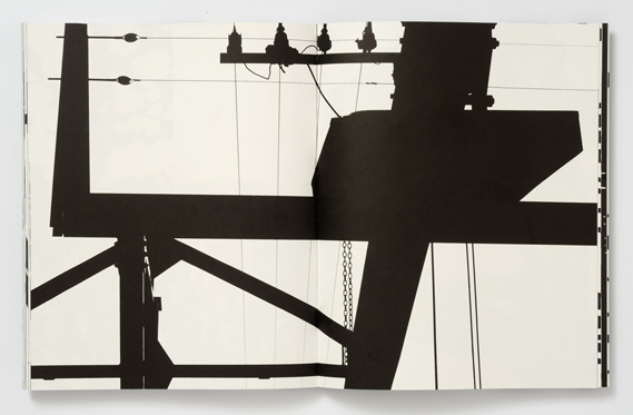
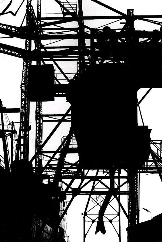
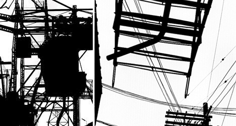
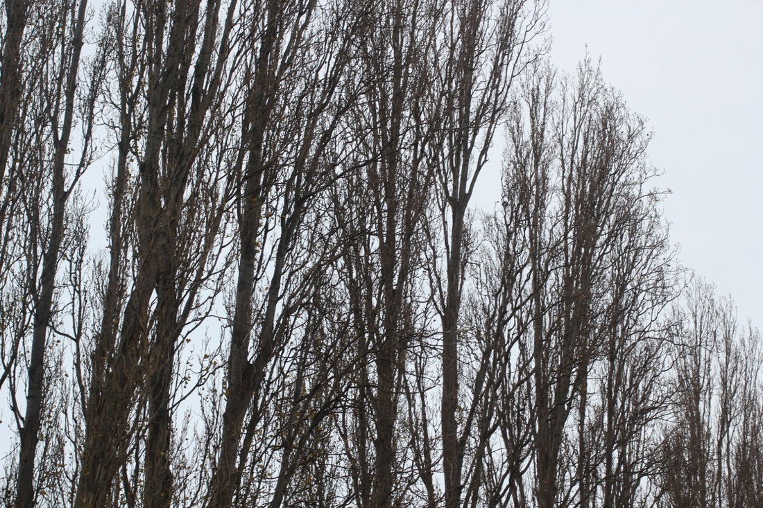
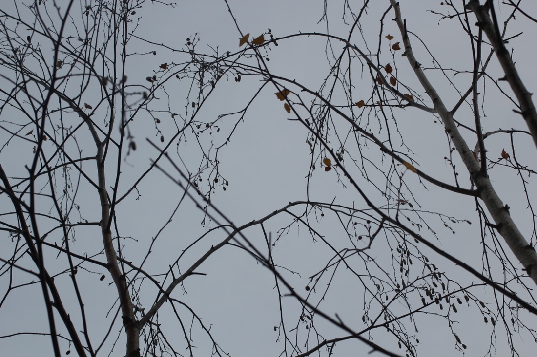
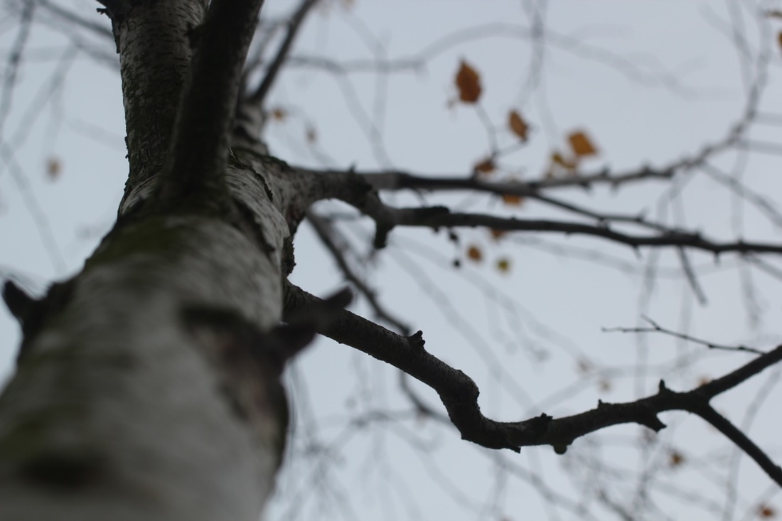
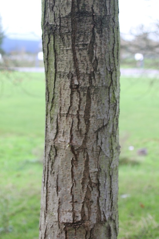
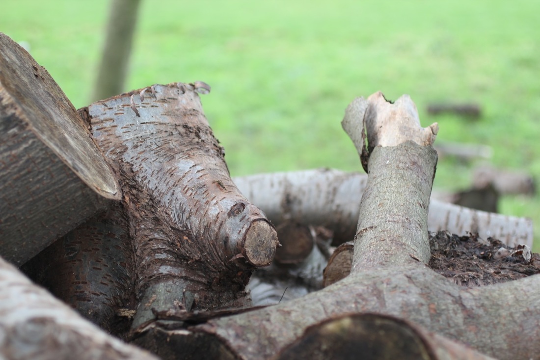
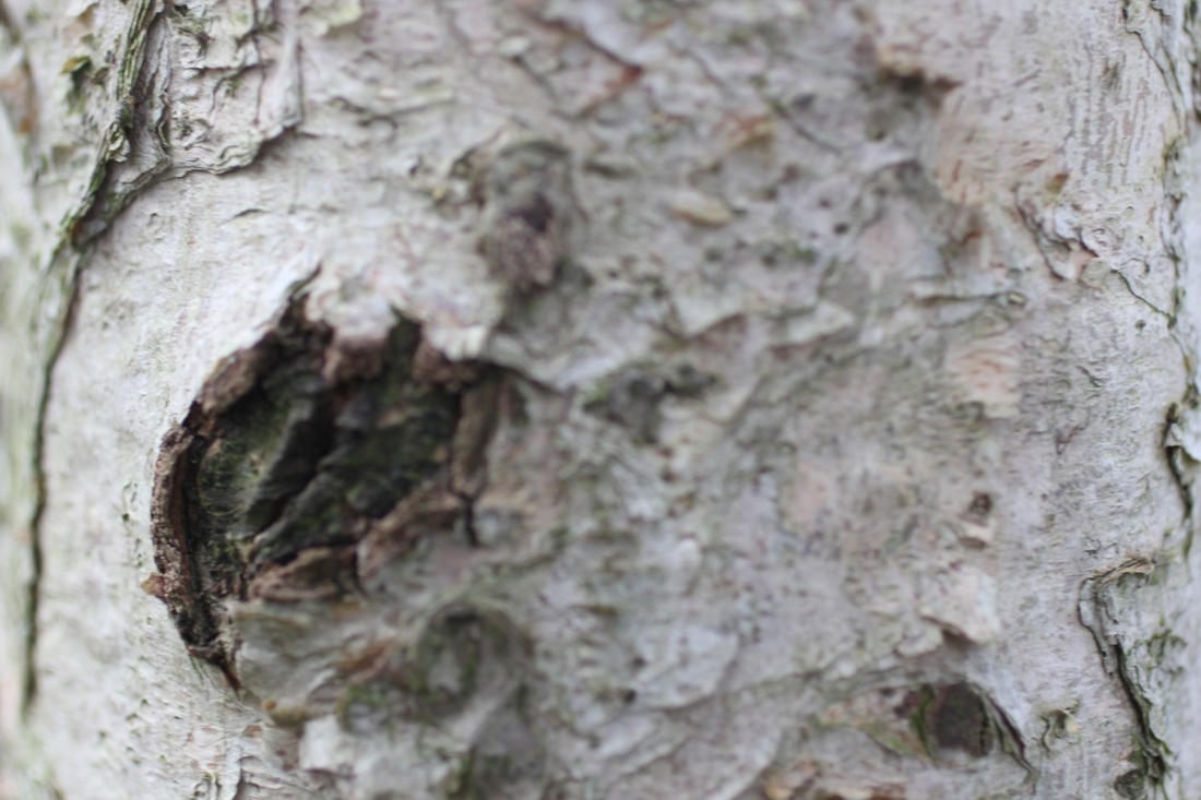
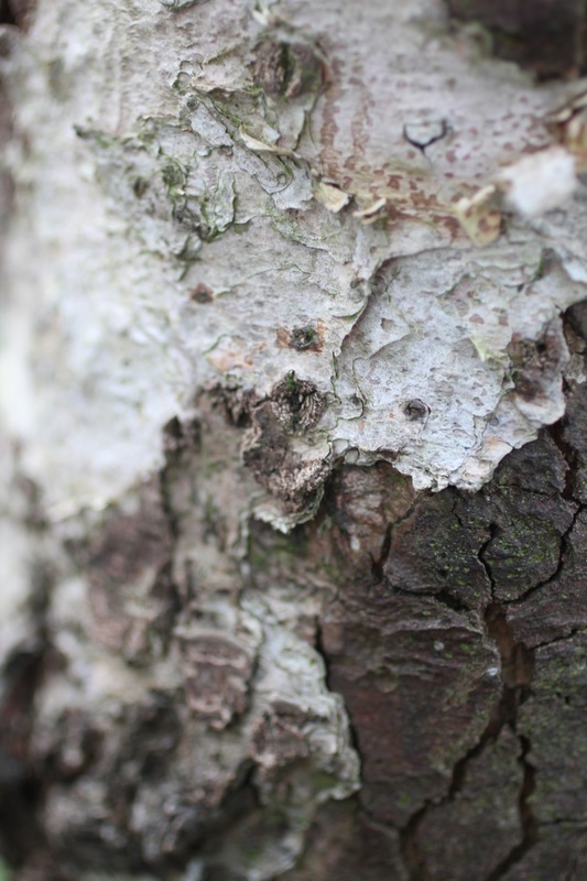
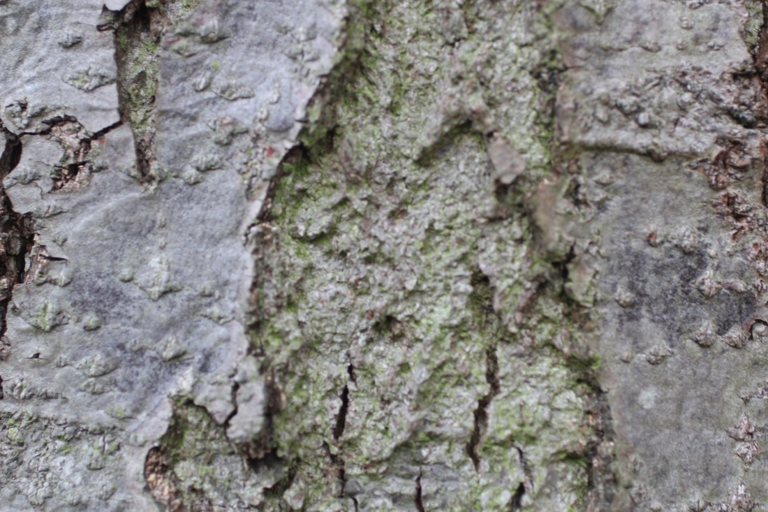
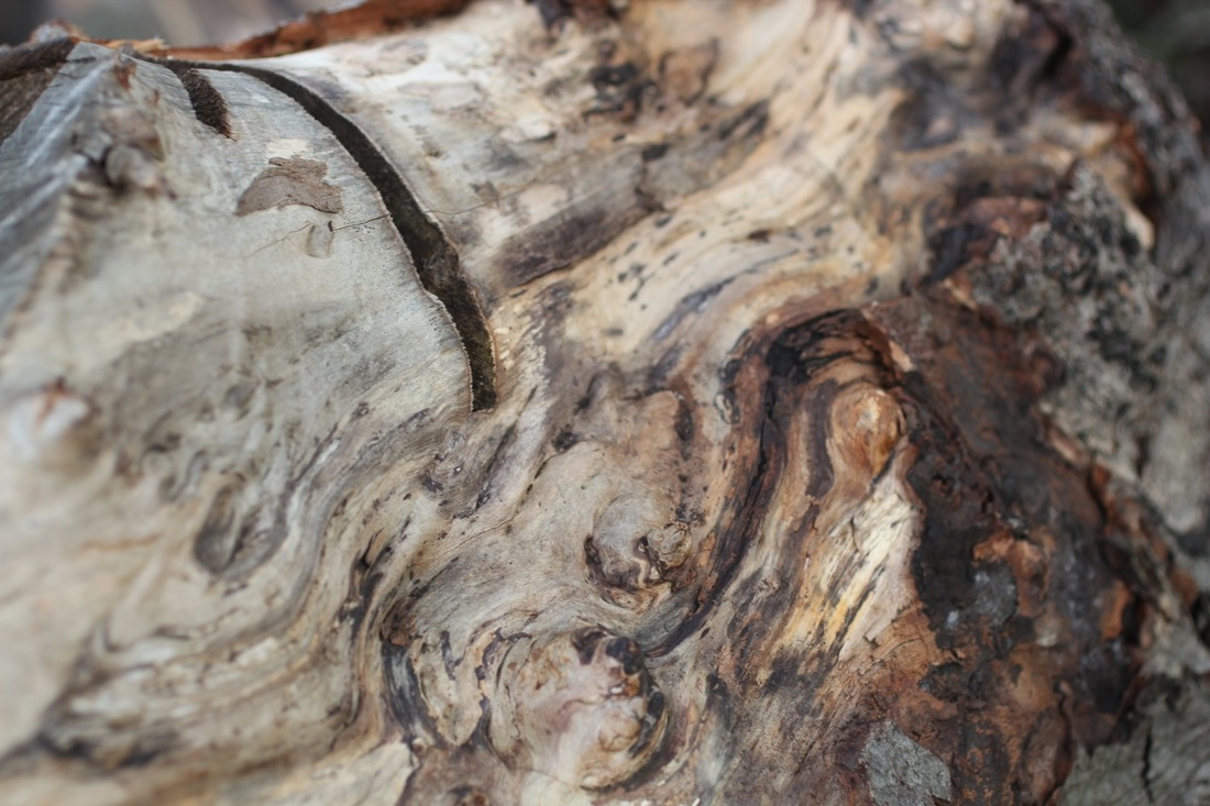
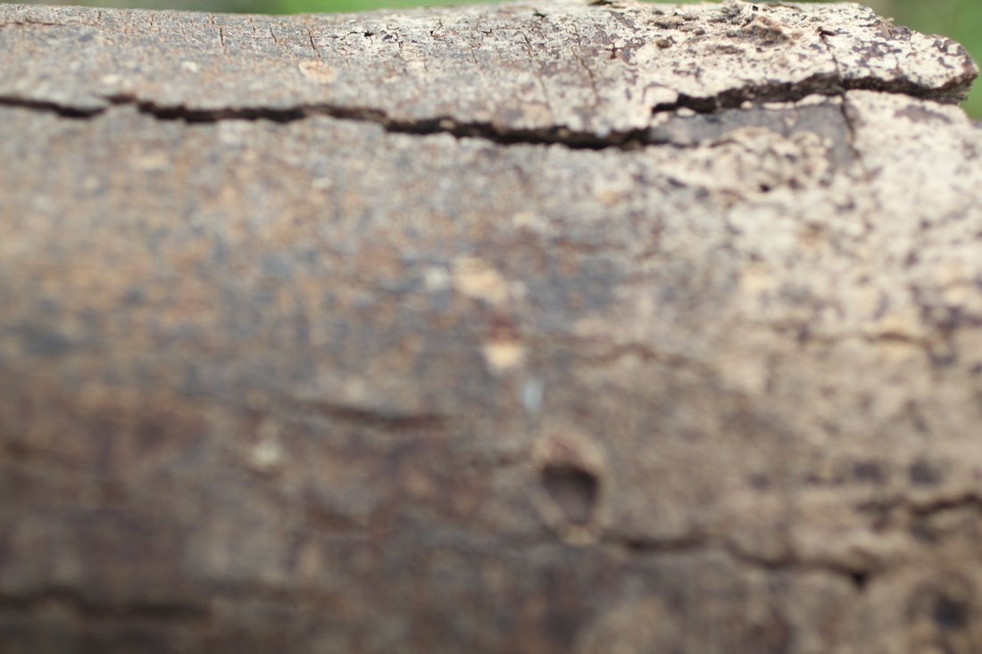
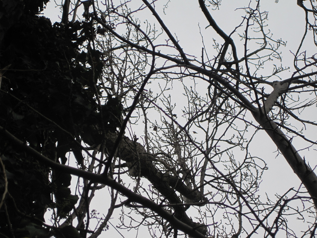
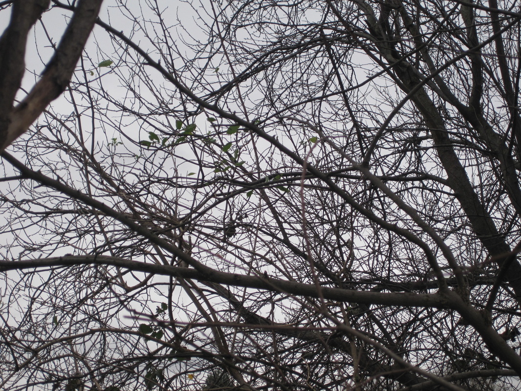
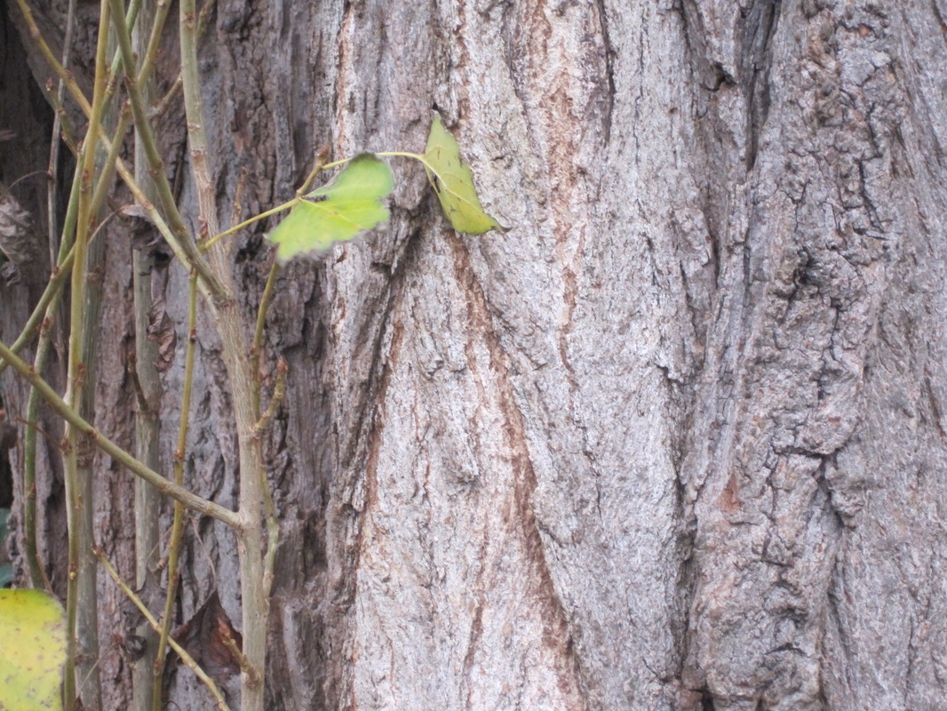
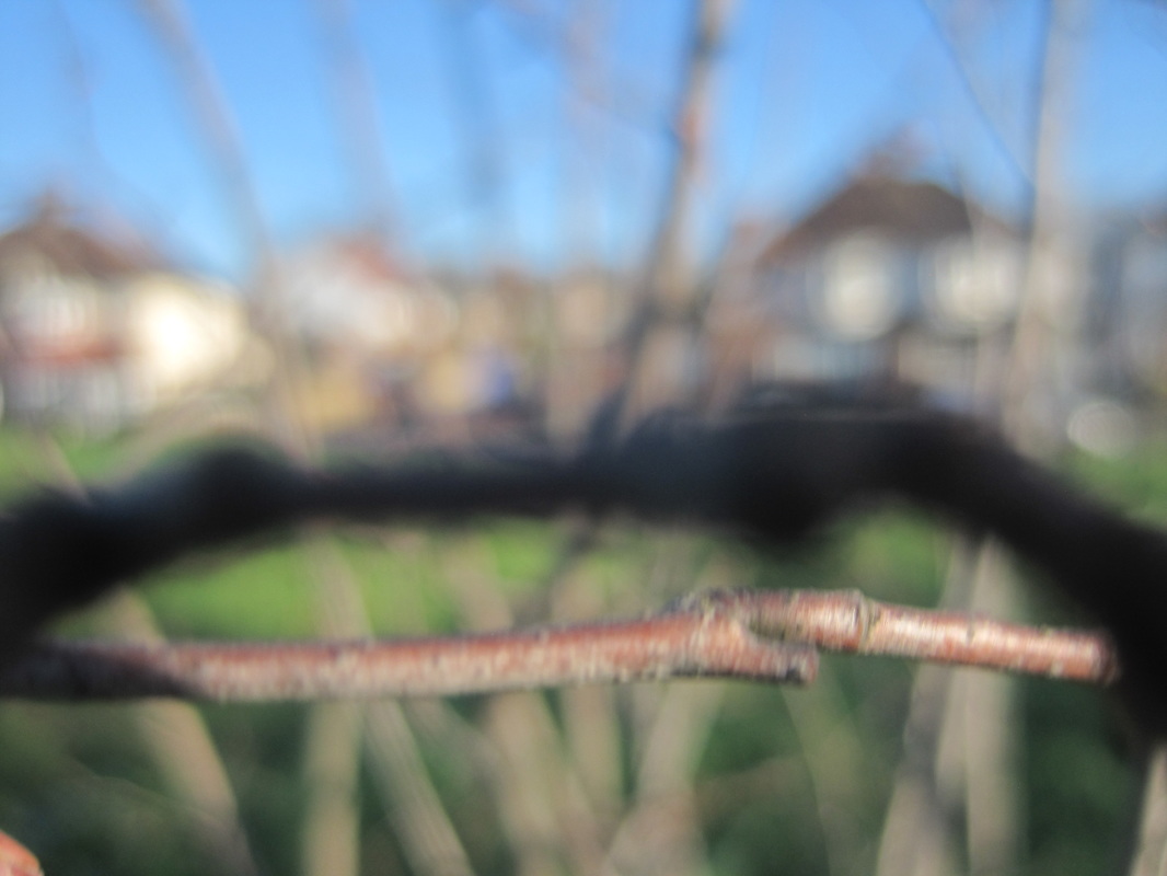
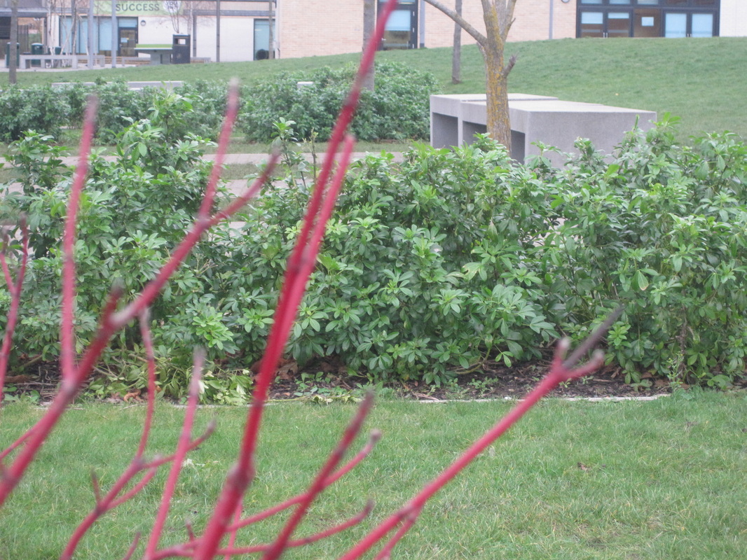
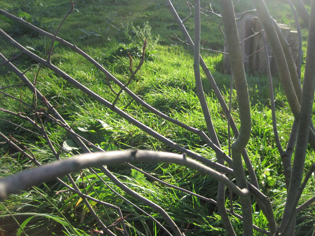
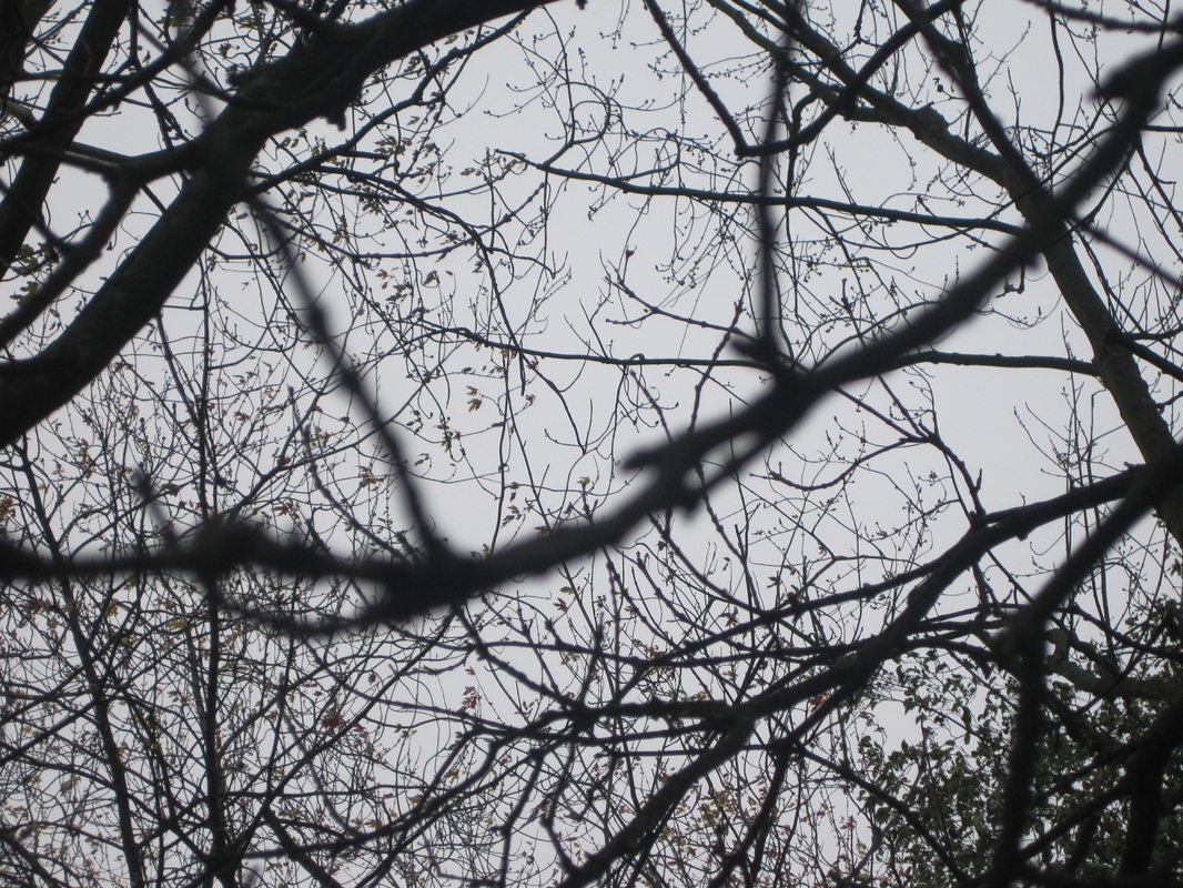
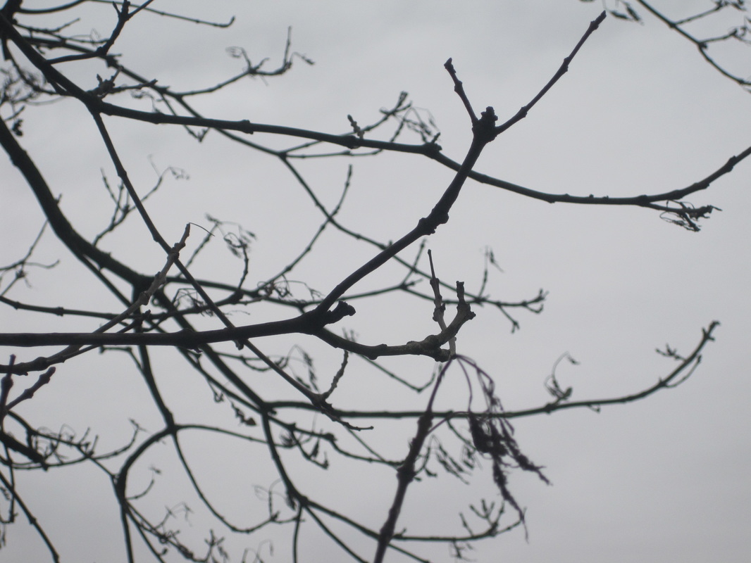
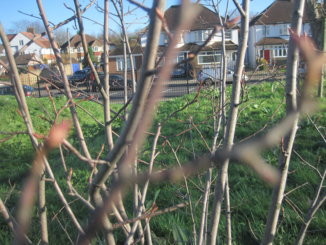
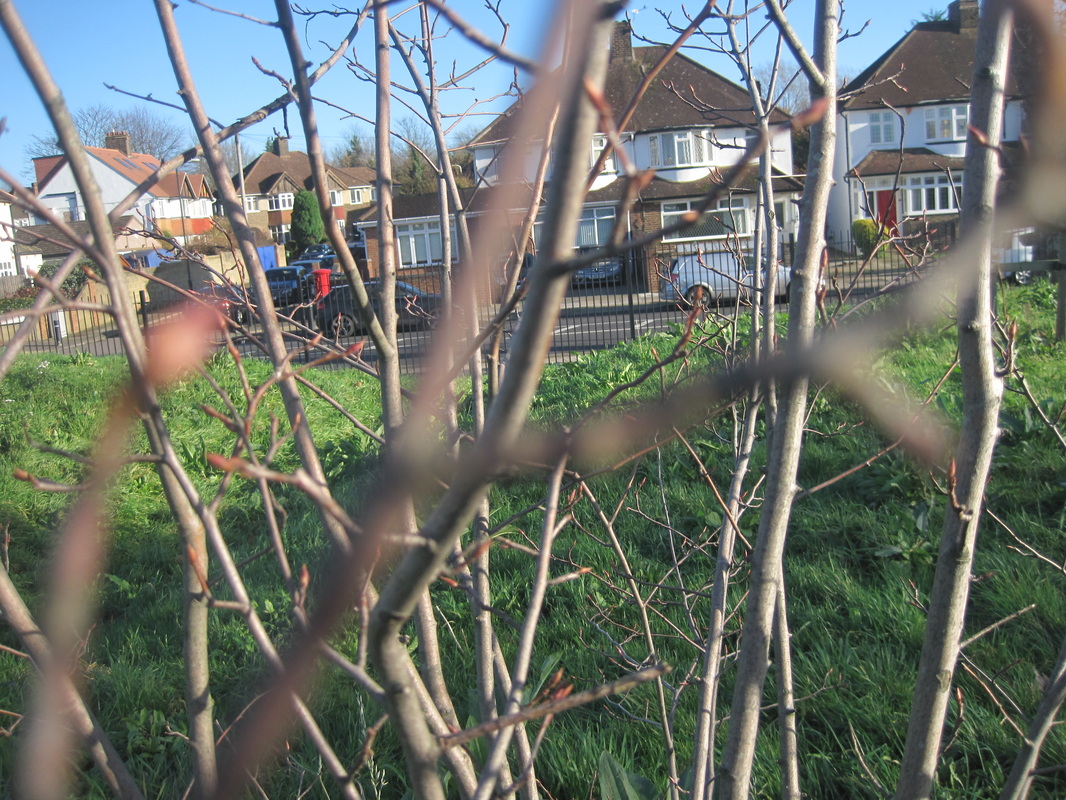
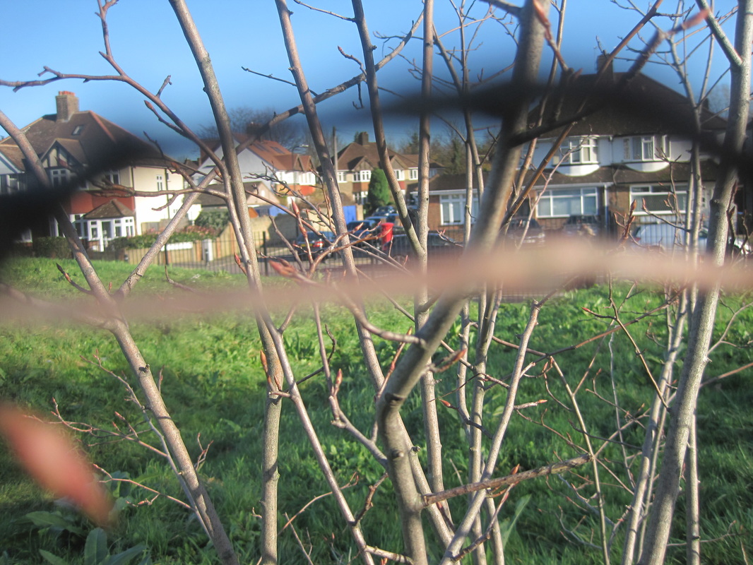
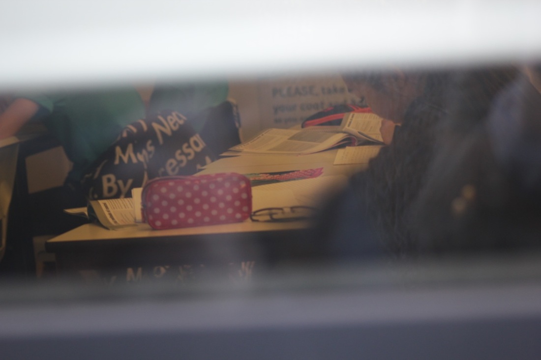
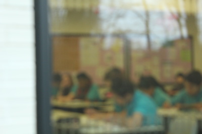
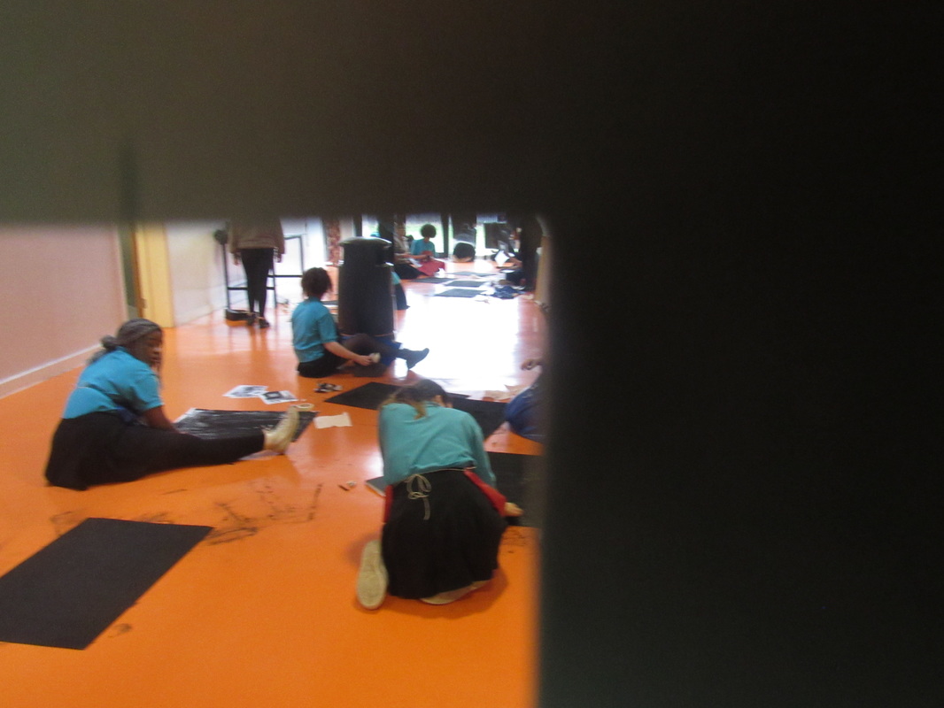
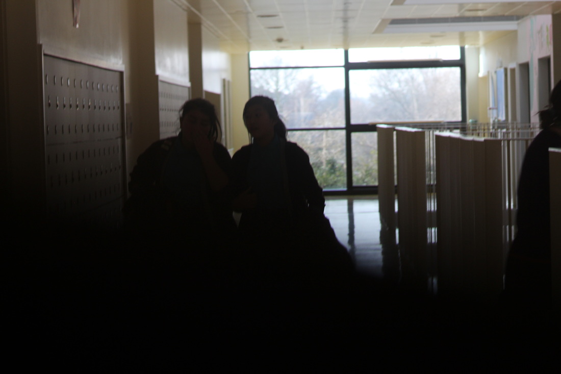
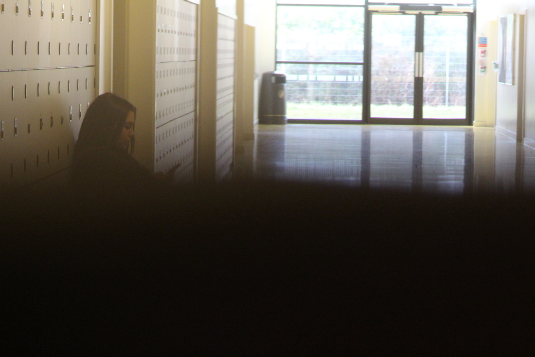
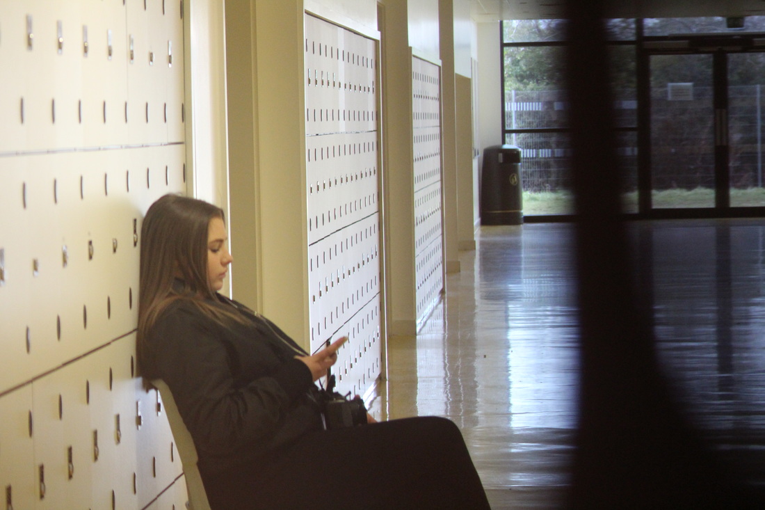
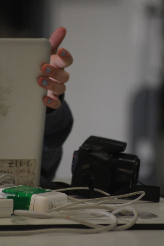
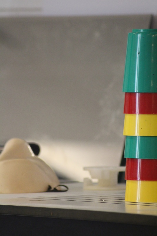
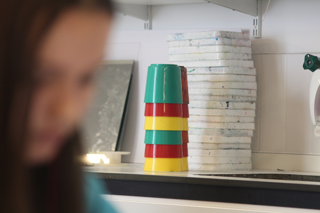
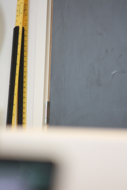
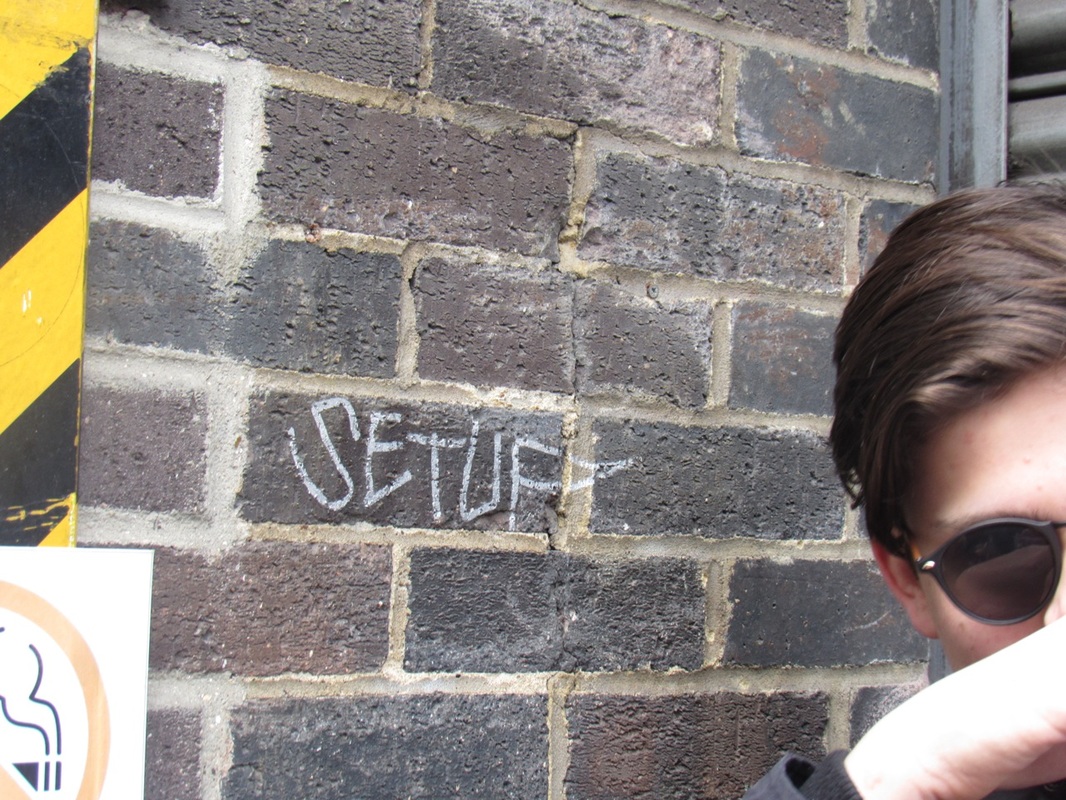
These are some photos I took around my school using abstract as my inspiration. I took them on an i pod using the app Hueless (colour less) that turned your photos back and white which is what most abstract photos are, as it makes it harder to tell what the object is. I found this task hard as I didn't understand the concept of abstract so I didn't know what photos to take.
|
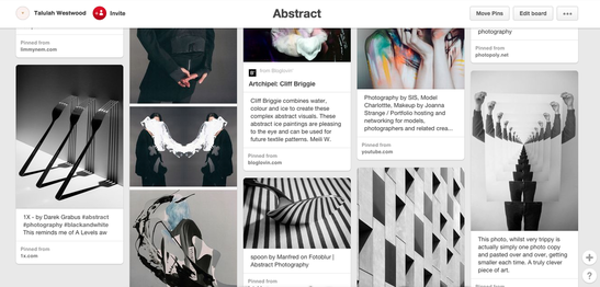
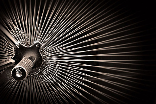
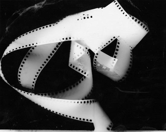
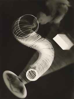
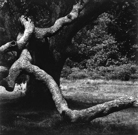
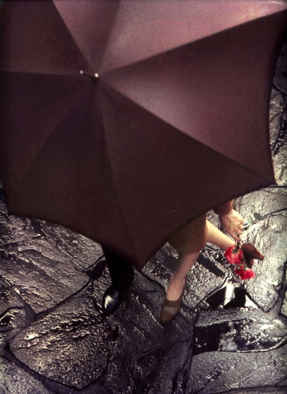
I chose this famous abstract photo because my eyes were drawn to the lines and shapes. My first thoughts about the picture are that it uses a lot of the formal elements. For example, it displays multiple lines and a high contrast of tone. My eyes were immediately drawn to the lines. There all straight and thin. The lines radiate from the middle left of the photo which shows an object which is hard to read. I think the lines give the photo energy as they fade out the further away you go. The lines create the shape of circle, which is another formal element. The shape isn't clear but you van make one out from the lines.This shows another one of the formal elements, shape. The light in this photo fades out to the top right of the photo but is bright in the left part of the picture.
|
|
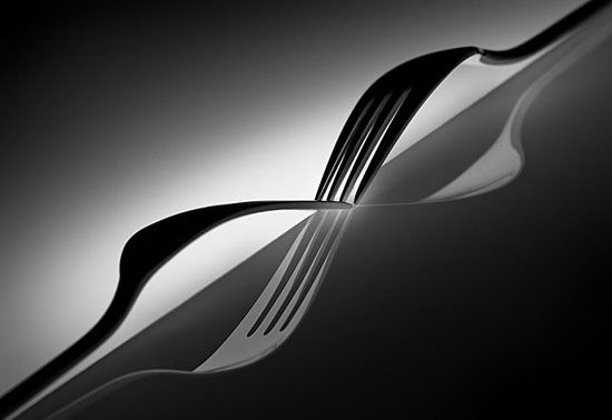
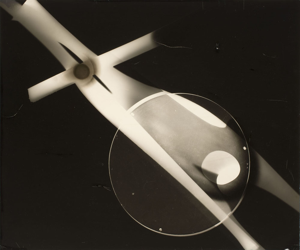
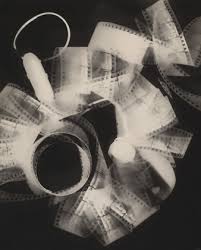
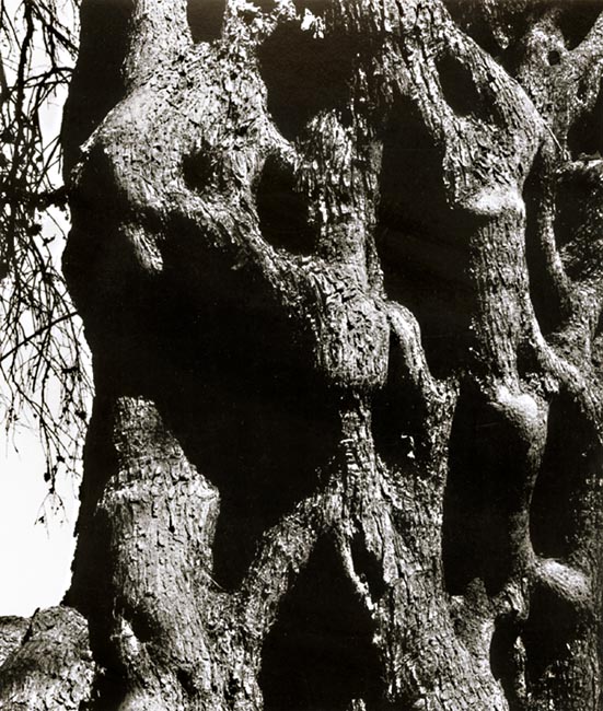
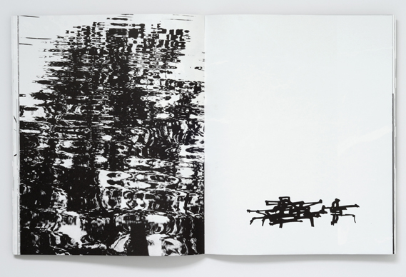
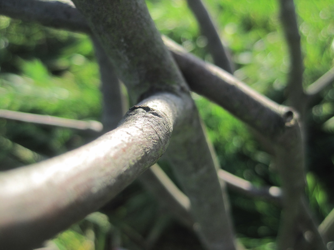
I think this photo is abstract because it has a lot of the formal elements. For example I think the texture would be very smooth and you can tell that from the picture. Also the light is very centred so there are a lot of refections in the picture. Theres is also some repetition where there are two forks but not much. This photo is also slanted which makes the photo harder to figure out what the object is. The picture has more of a focus towards the centre of the picture where as the other one has a focus mainly towards the edge. |
|
Experiment: Photograms
A Photogram are pictures that are made without a camera,There a bit like cyanotypes but you need it to be dark not light. It makes an image because when you put an object on the paper and leave it for 10 seconds. It works because the paper gets darker leaving the shape on the paper when light is exposed.
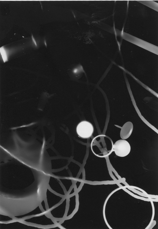
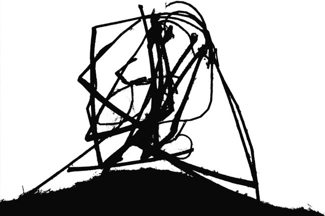
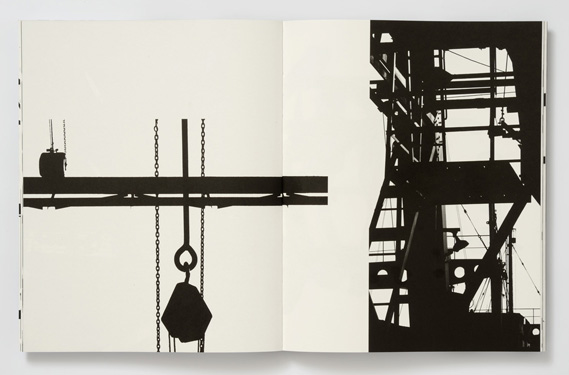
Here are some famous abstract photograms......
Here are some famous abstract photograms......
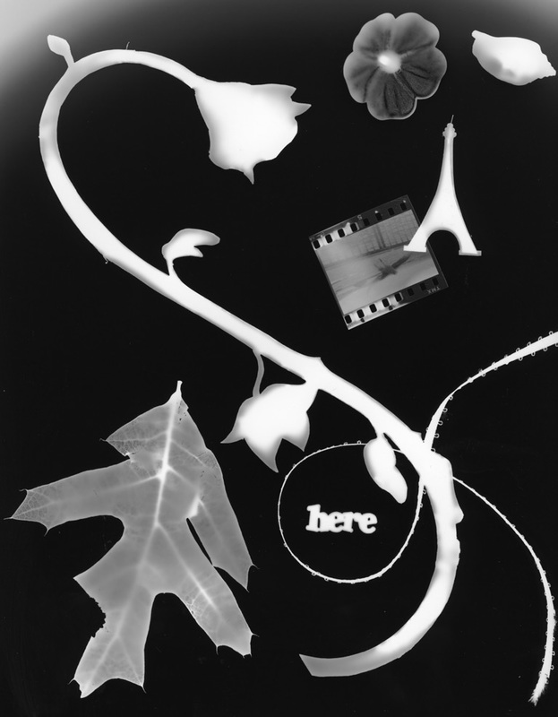
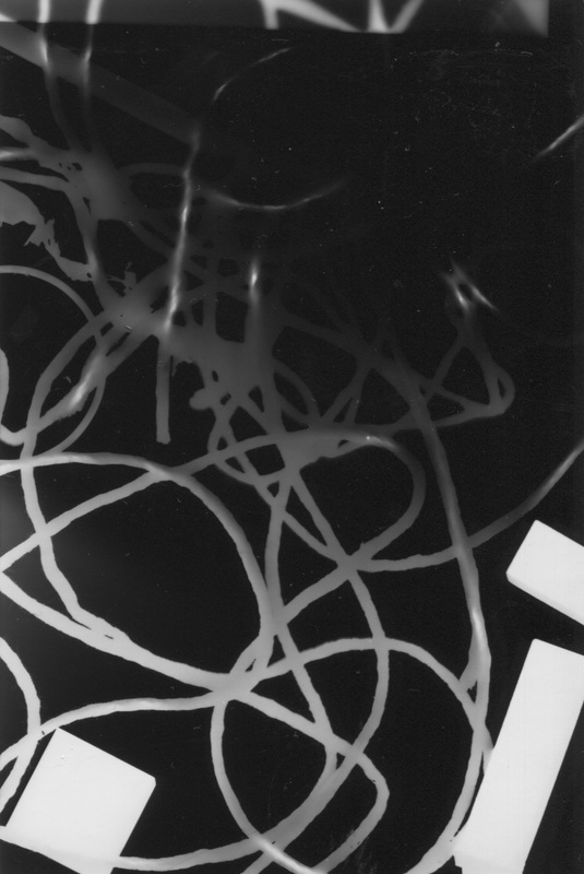
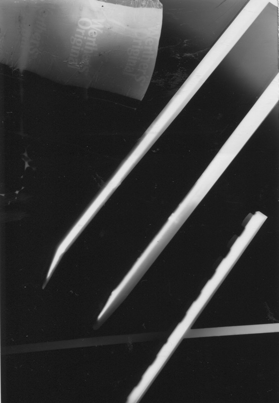
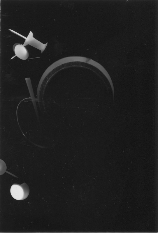
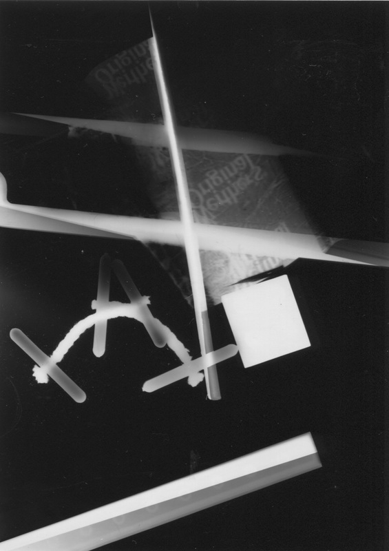
These are some photograms I made using abstraction as my inspiration, I used objects that my teacher provided me with. To make them better Im going to bring in my own objects to get the effect I want and I also am going to leave the light on for a shorter amount of time to make my pictures lighter.
3 ways to make my Photograms better
- I would use more opaque objects because I like the glowing effect.
- I would use bigger paper so I could make bigger pictures and use more objects.
- I would leave the light on for a shorter amount of time so the objects appear lighter.
|
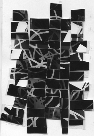
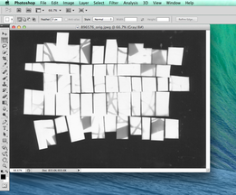
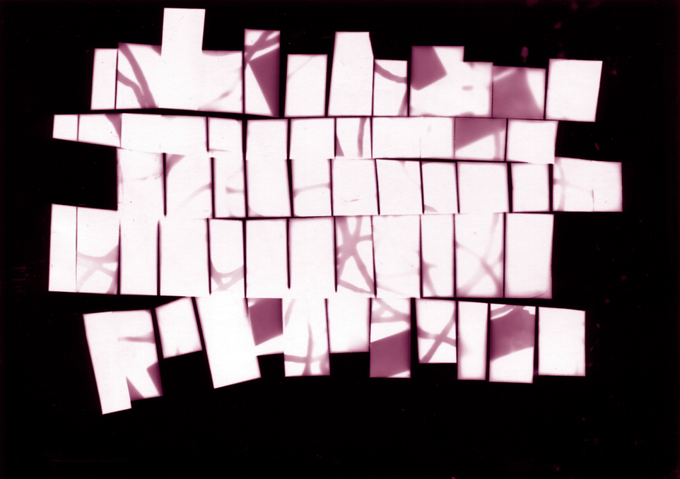
This is my photogram cut up. I did this because the original photo I made wasn't very abstract and I wanted to make a more difficult and abstract composition. I had intentions to go back into the dark room to make another photogram from this photo. I cut the image in strips horizontally and vertically and then stuck them together in a different order with tape. In the dark room Im going to create a positive photo by placing my cut out onto the photographic paper and leaving it under the light for 10 seconds to expose the image. 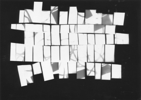
|
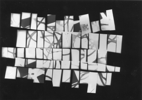
After going into the dark room I created this positive photo by placing the photogram cut up onto the photographic paper and then exposing it to the light for 8 seconds. I don't like how faint and light the centre of the photo is because it don't show all the detail in the photo and Isn't very abstract as there are not clear lines or shapes. I think this happened because I didn't leave the photo exposed for long enough. |
|
After going into the dark room a second time I did the process again, however, I left the photo exposed for 10 seconds (2 seconds longer). This made the centre on the photo come out more and the lines darker and sharper than the other image. I prefer this photo because in my opinion its more abstract and theres more to look at which makes it a more interesting photo. |
|
How to make a duotone
Firstly you will need to upload your photo on to photoshop
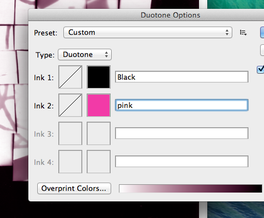
After that label your colour, in this case pink and press select
|
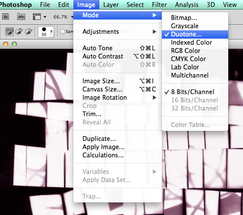
Then you need to select image (at the top of the screen) then click mode and then duotone.
Your image now should have a combination of
black and the colour you have chosen. |
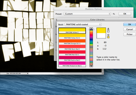
`Then you should click on a second colour and select the colour you want.
|
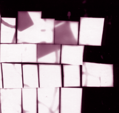
the finished picture
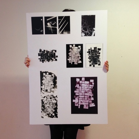
FIRST FINAL OUTCOMEThis is my final piece. I arranged them in the order that I made them to show the process of how I made my final outcome and to show the pictures I made along the way. The first 3 pictures are the photograms I made at the beginning of the process. The 4th one along is the one photogram I chose to cut up which you can see clearly underneath. Then you can see the positive and negative next to that. I really like the positive version of the cut up because it shows the lines clearly and theres a good contrast. After that I experimented with the developer by throwing it on the paper and documented it on my final piece. I then used my negative photo to make my duotone, I added pink to my photogram and really like the way it turned out. |
|
ABSTRACTION RESEARCH:
Ralph Eugene Meatyard
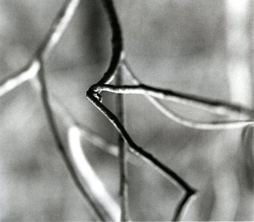
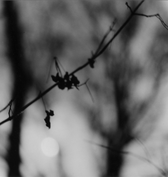
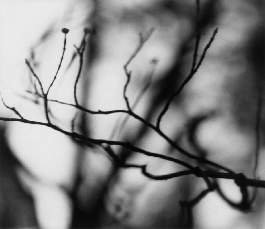
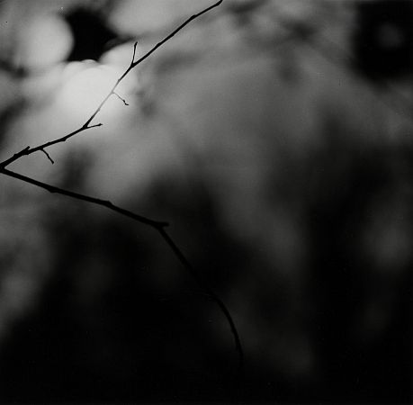
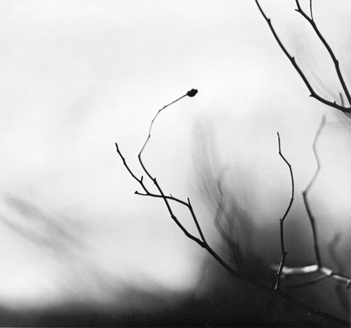
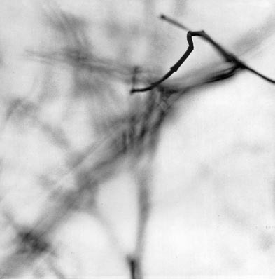
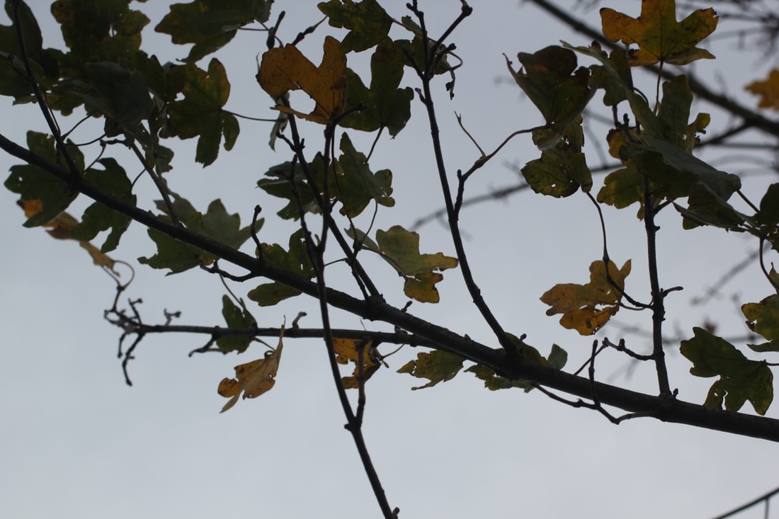
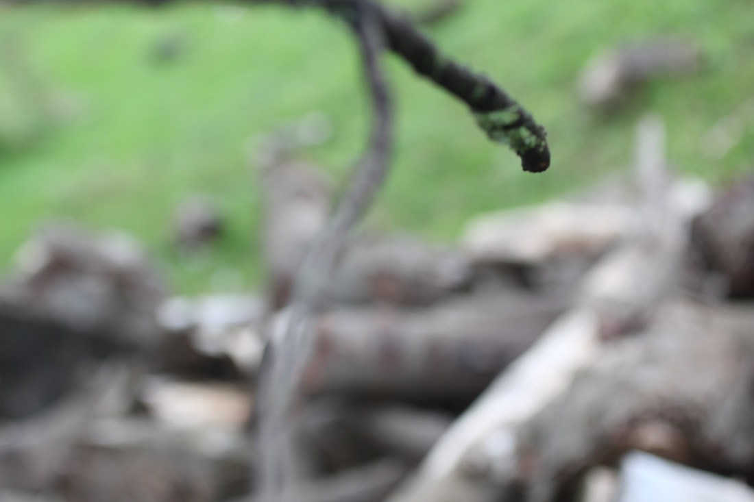
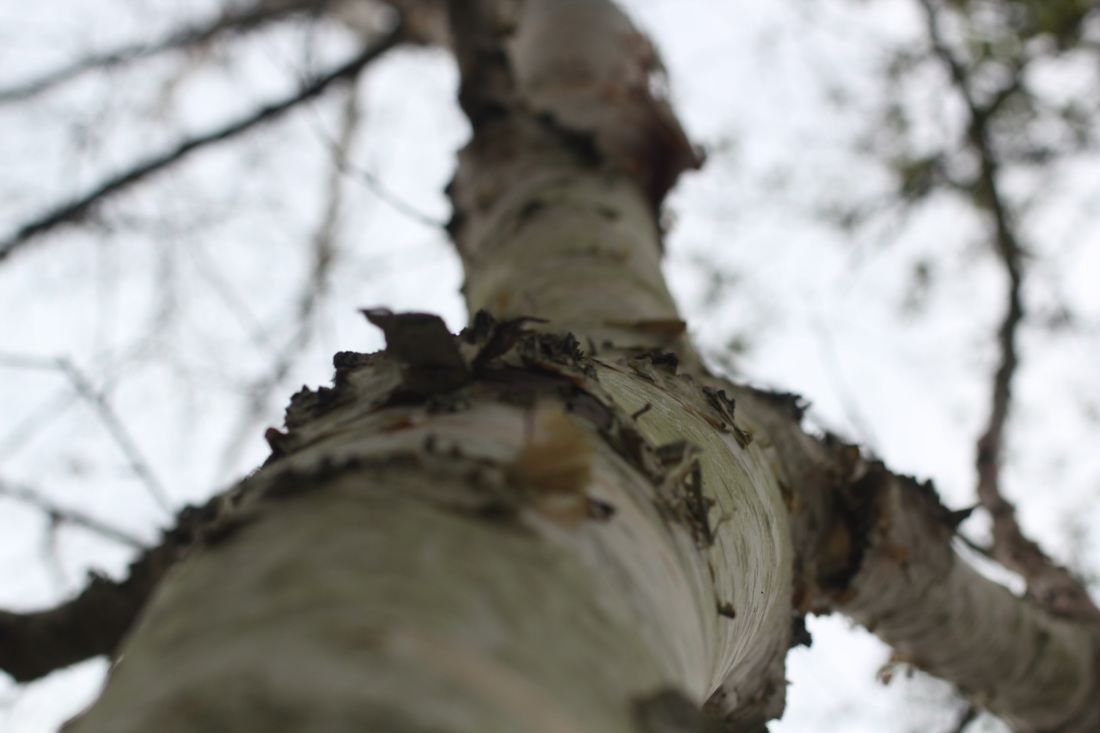
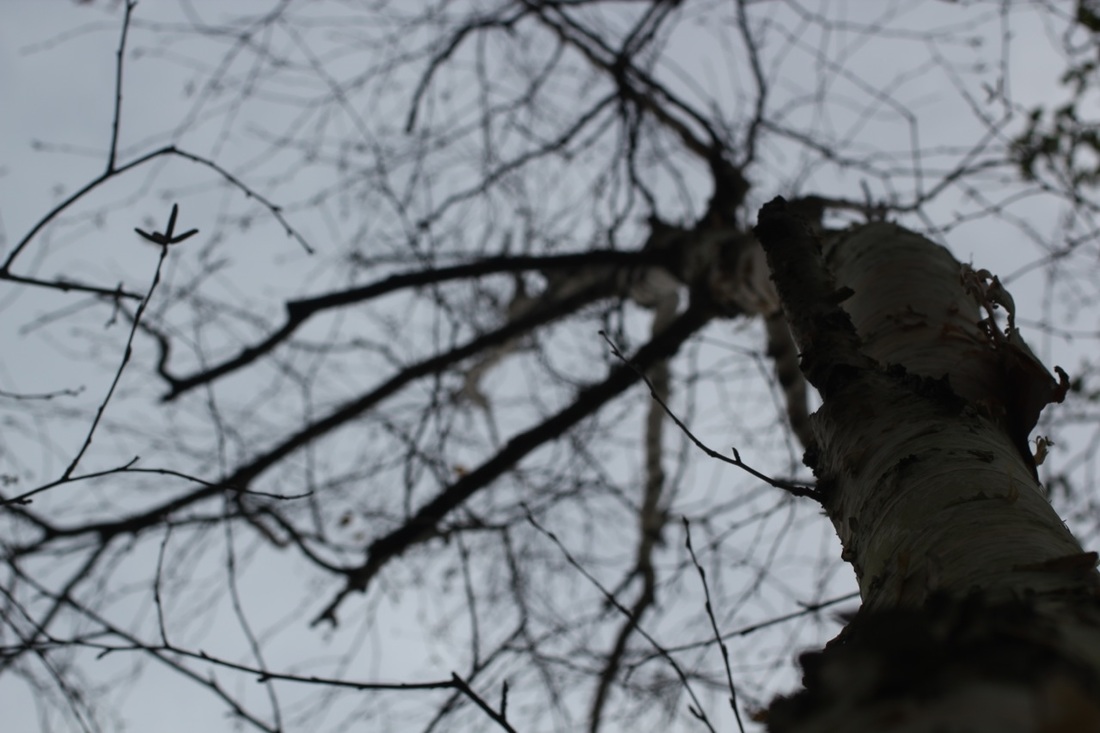
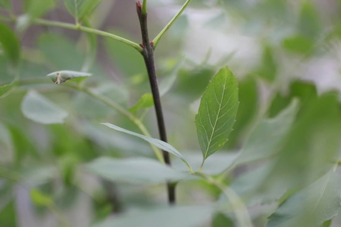
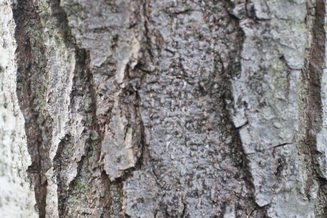
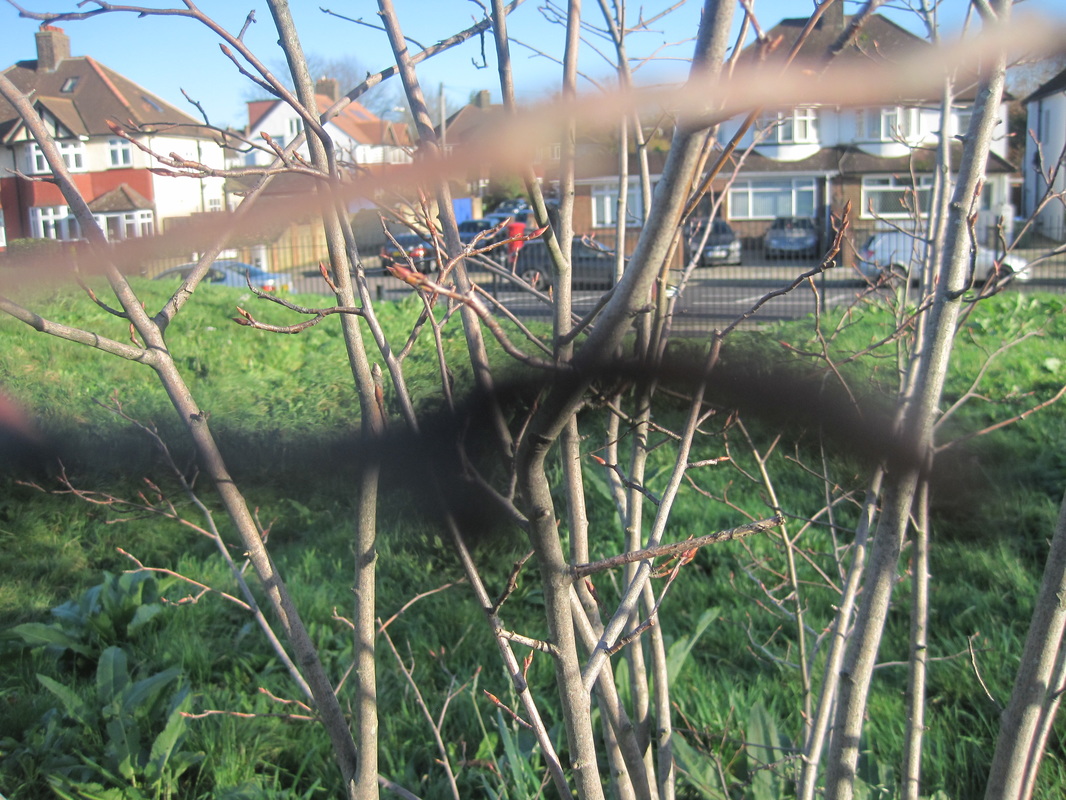
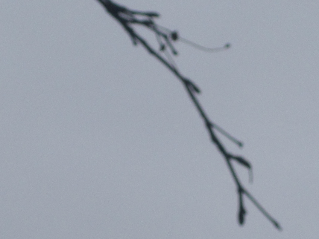
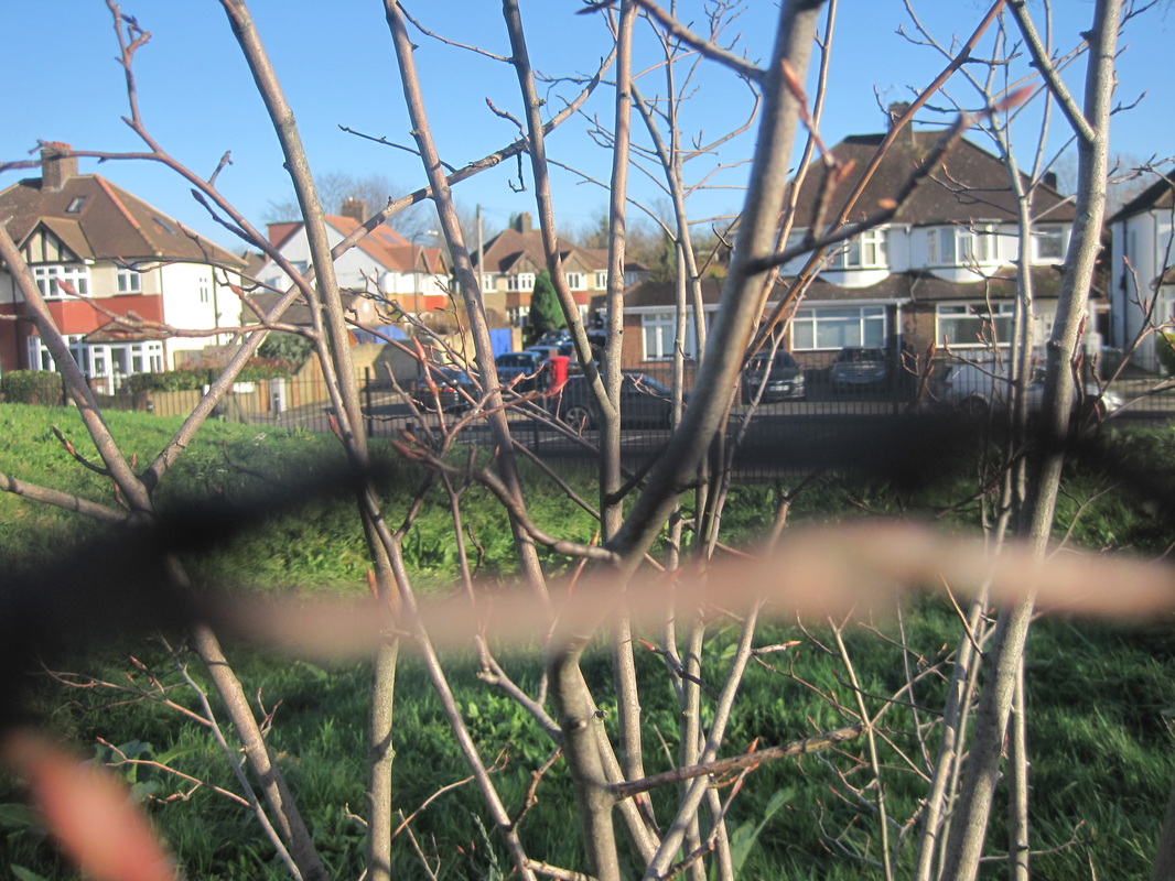
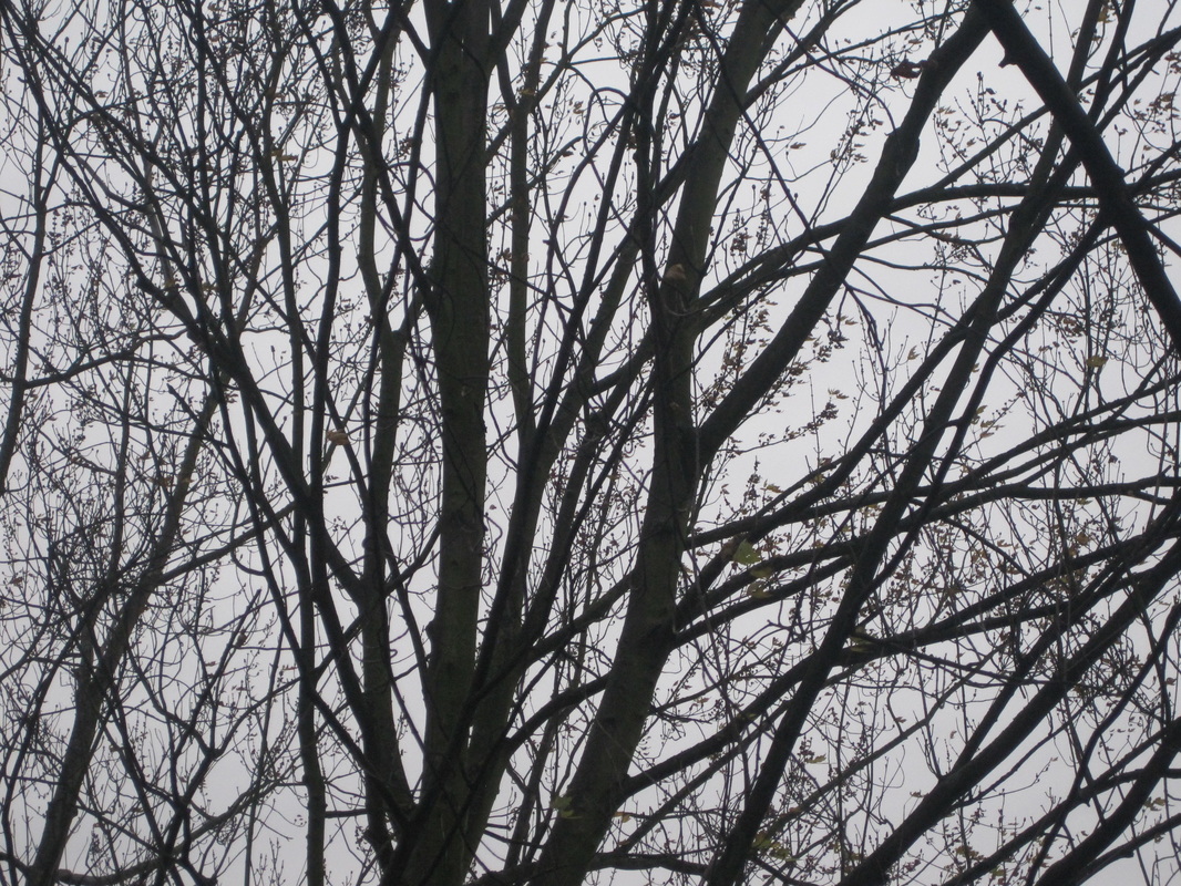
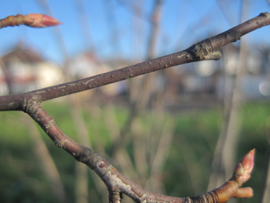
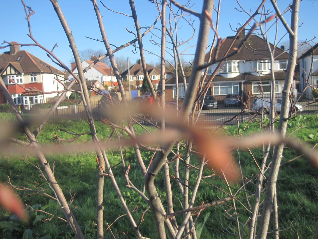
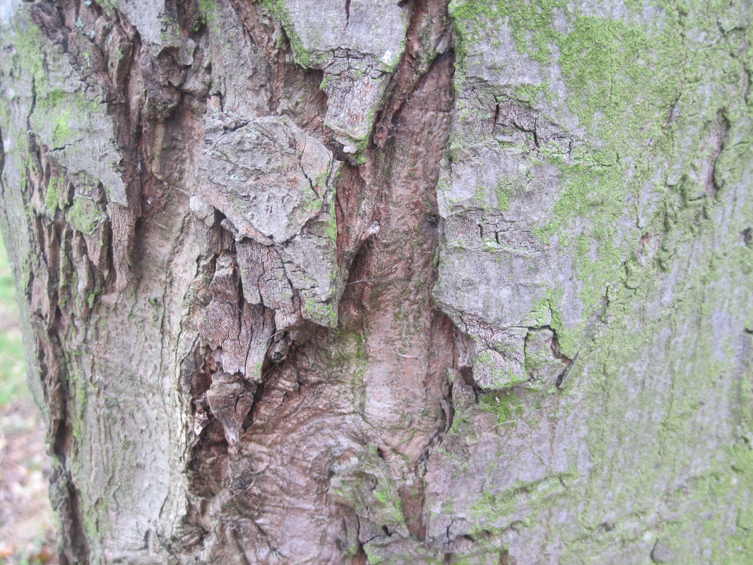
Ralph Eugene Meatyard lived in Normal, Illinois until he married his wife, Madelyn McKinney and they moved to Lexington Kentucky so he could continue his trade as an optician, working for Tinder-Krausse-Tinder, a company that sold photographic equipment. These series of pictures are called 'Zen Twigs' . Meatyard uses dark colours that contrast each other and focuses on one specific of the twig and makes that background out of focus. This means the twig is mostly the focus of the picture.
Aaron Siskind

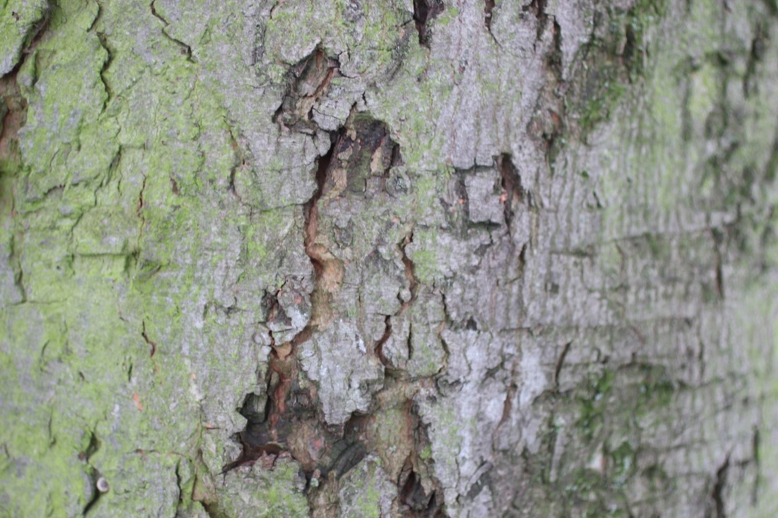
Siskind was interested in photographing textures and surfaces from both natural world and urban environment. He fills his frame with detail and he always has something interesting in shot. There is never something in focus or in the middle of the photo its all filled up. I like his work because I think the photos look very interesting and I would like to try and create something similar.
Keld Helmer Petersen
Petersen was a Danish photographer who had a international breakthrough in 1948 when he published his collection of experiments with shapes inspired by Albert Renger-Patzsch. These are called 22 Farvefotografier/122 Colour Photographs, as a result of his success he became a photographer. In these photos there is a clear contrast between back and white which brings about clear shapes in his photos.
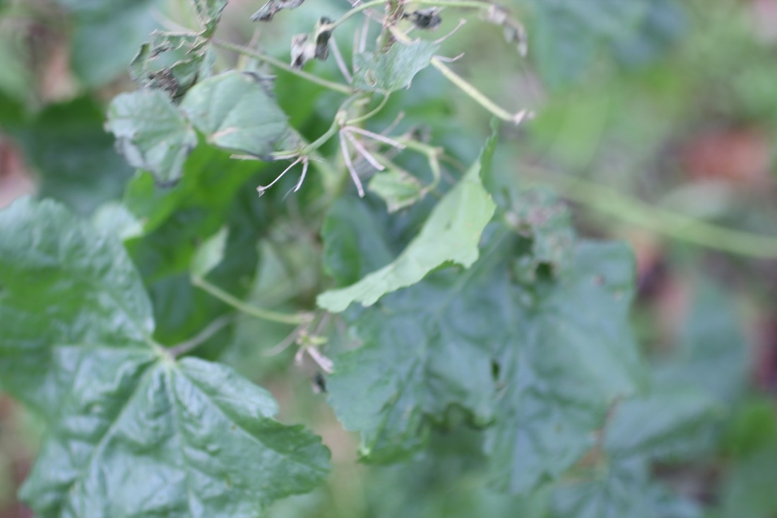
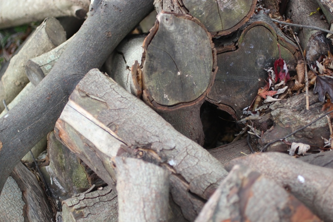
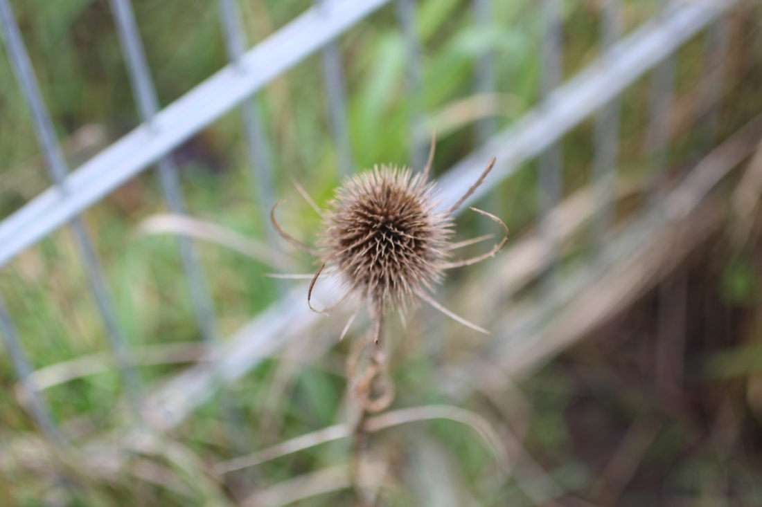
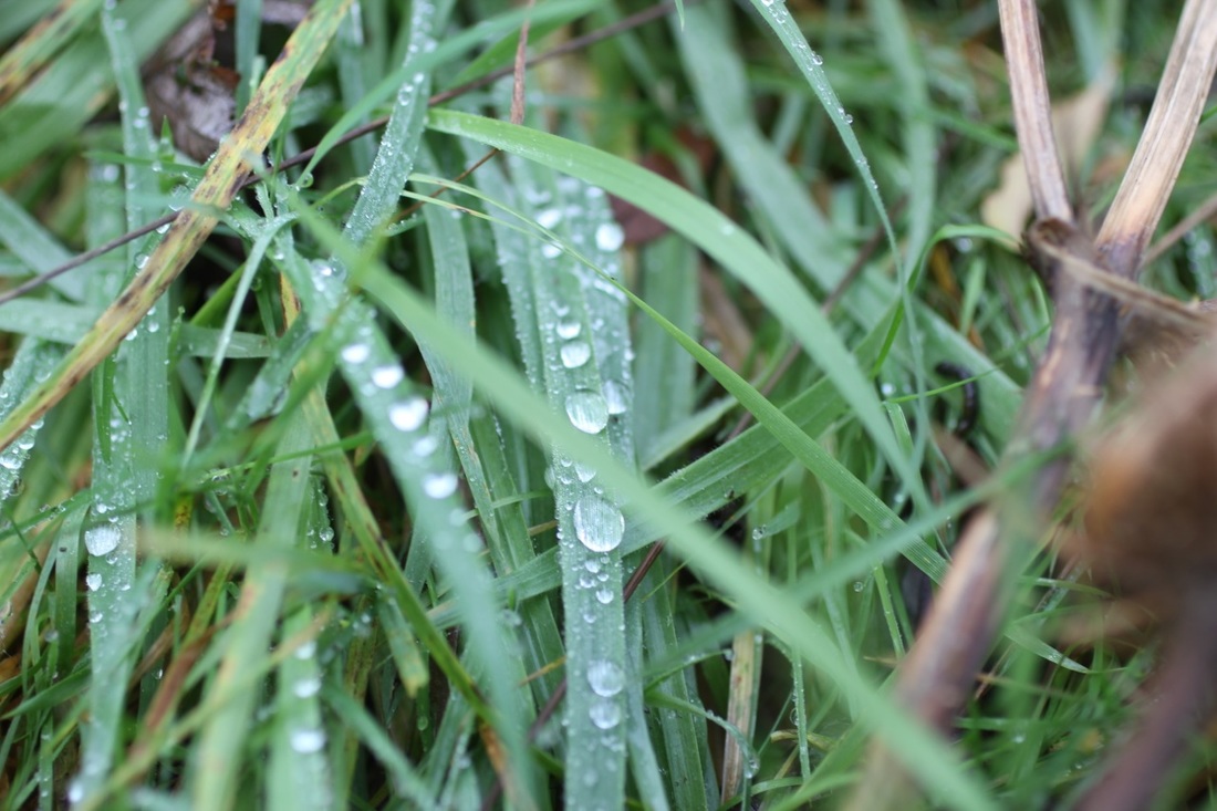
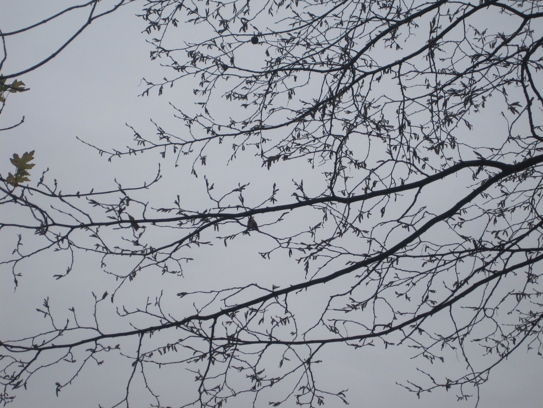
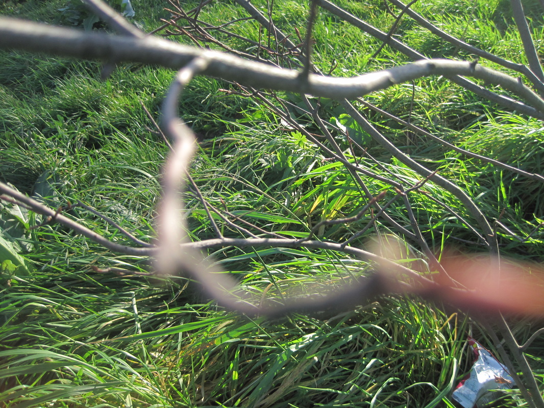
Here are some photos I took using these photographers as my inspiration.
analysing a photo:
|
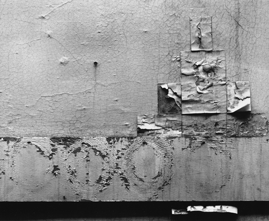
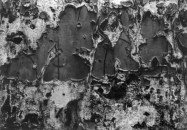
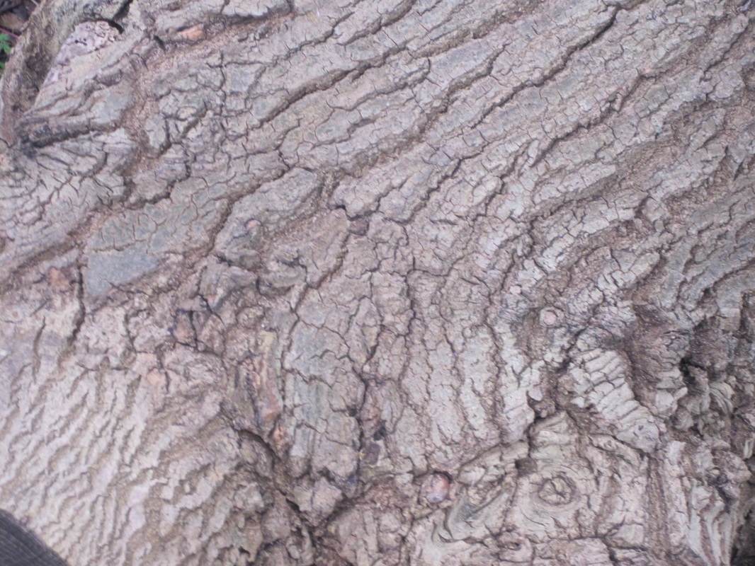
When I look at this photo by Aaron Siskind I can see a range of shapes formed from the tones of the picture. I can see a contrast of tones between white and black, however, the mid tones takes up most of the surface of the image. I would use the word "texture" to describe this photo as it looks very rough and deteriorated. This wall looks very worn, withered and run down which gives it a lot of texture. This photo takes up the whole surface of the frame. This photograph has been abstracted as it has been cropped, this makes people stop thinking about what it is and more about tone,light,shapes and pattern. Also you could interpret this photo in many wyas as it looks like many things to different people, for eampke it could be a tree trunk, a long view of the world or the road. I recognise the dark shaoes that the light produces and curvy lines that are all in different directions. There are many formal elements in the photo that make it as interesting as it is.
|
For example the light creates shapes and makes peoples eyes draw closer to different parts of the image. Also there is no pattern in this image which makes the picture look natural. The picture is quite dark as there a lot of dark tones. In this photo its not the lines that form a shape, Its the tones as most of the central shapes are grey and the others are white and there are black shapes on top which makes them stand out. I think a medium format camera was used to take this photo. This is because this camera uses 35 mm film frame which means he could focus a lot on the detail in the image. I think this photo has been cropped to make it look more abstract.This is because it is a full framed image and takes aways the focus from what the object is and more on the details in it. This photo reminds me of graffiti as the shapes made are similar to bubble writing. The light in the this photo is very even through out the picture. This makes no particular bit of the image stand out and allows the person looking at it not to be drawn to one bit of the photo. This photo is different from real life because it hasn't got a clear meaning and it is also unclear to see what it is.
This picture interests me because of the many ways it can be interpreted I also really like he curvy shapes that are made. In this photograph the central shapes strike me as most interesting. This is because it reminds of writing. It also goes from left to right across the frame as if you were reading it. It also could be graffiti, however, its grey which isn't stereotypical to normal graffiti as its normally bright. The whole photo is dark which allows you to imagine anything, I can also see letters in the photo. For example there is a shape that is normed like an 'n' this could suggest that the wall was ripped in a curtain way. If I could ask Aaron Siskind a question, I would ask him why he cropped the image. Not only id this because i'm intrigued to see the full image but id because I would like to know what interested him about this particular bit of the wall and why he decided to photograph it. If i could give this photo a title I would call it 'deteriorated Surfaces' This is because it says what is happening in the photo and could suggest that the photo could be abstract as things that are deteriorating they don't look how they were originally made and are a bit worn. I think that this picture has a story behind it as all things old do. Also there is no clear idea of what the ripped poster could of been about. This suggest the they have been there for along time,
I think the picture is about how things look over time. And how, as things get older they get less perfect but more interesting. For example if it was just a picture of a wall it wouldn't be as interesting and have as much as story as this photo which has texture and shape and tone.
In Focus: Saul Leiter
5 characteristics that define Leiter's photographs are;
-He focuses mostly on what isn't the subject
-In his photographs there are things in the way
-Most close objects are out of focus
-His photos are like paintings
-His photos are like how the camera see things differently to your eyes.
-He focuses mostly on what isn't the subject
-In his photographs there are things in the way
-Most close objects are out of focus
-His photos are like paintings
-His photos are like how the camera see things differently to your eyes.
These are some of my favourite photos that Saul Leiter has taken. I subconsciously choose portrait photos, I think this is because I prefer portrait formate.
|
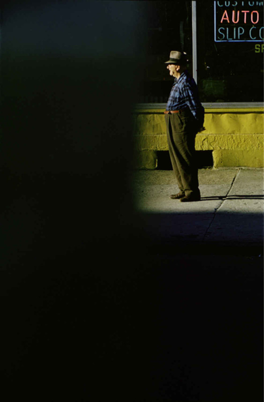
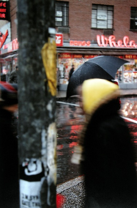
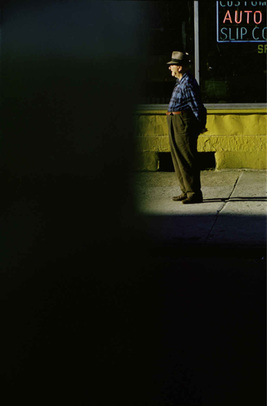
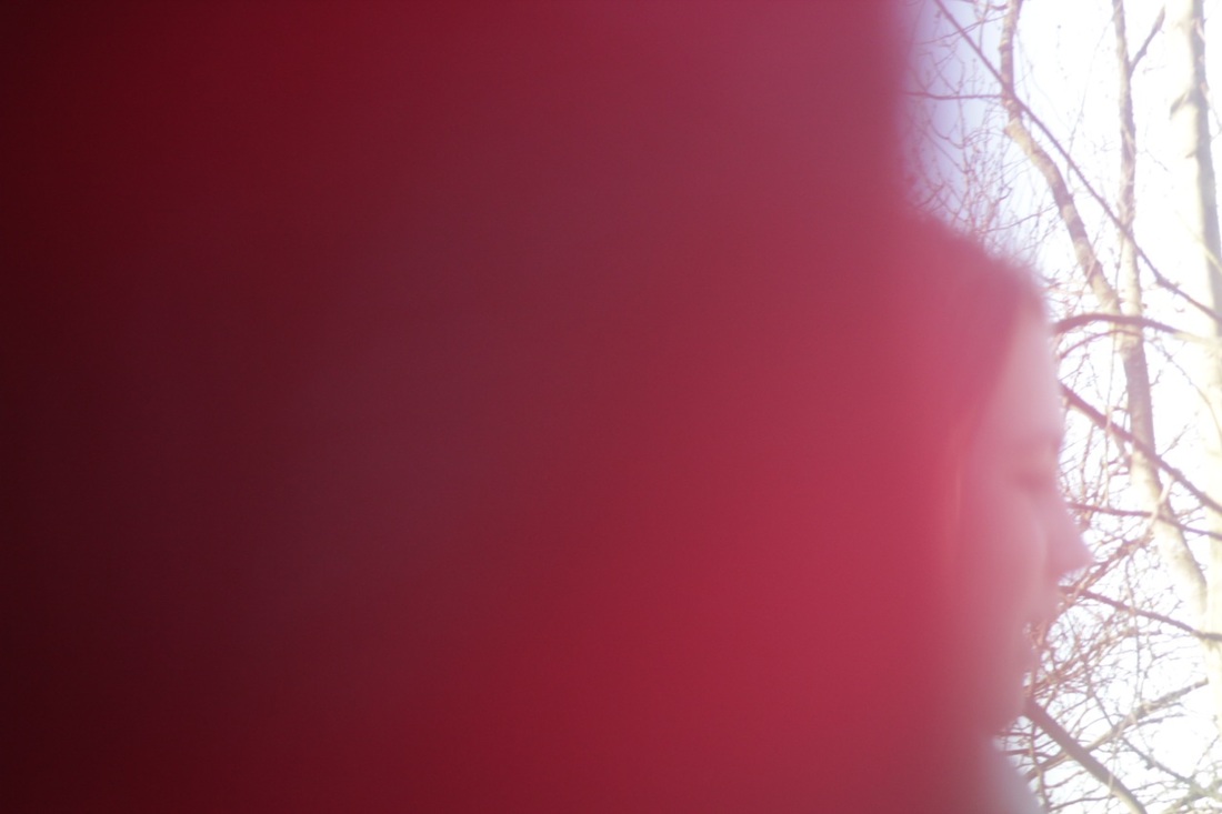
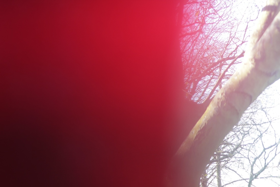
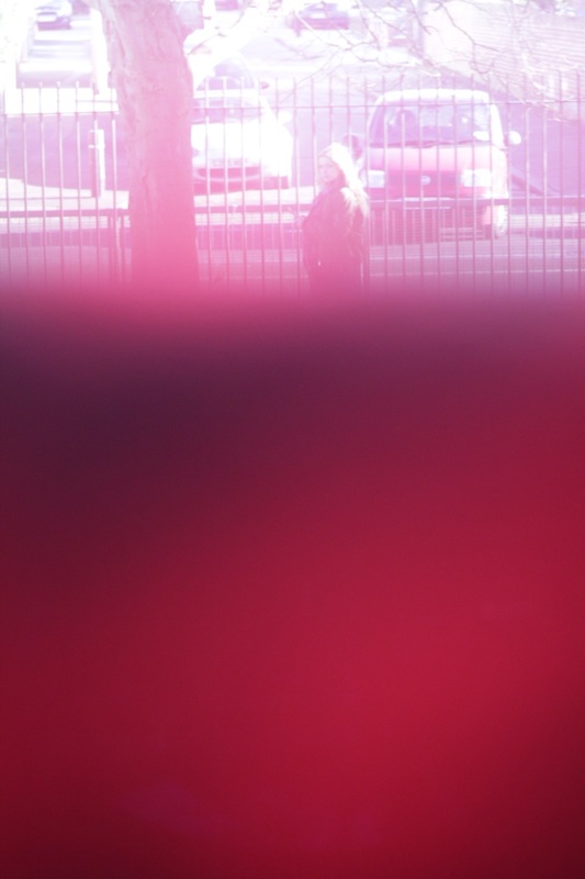
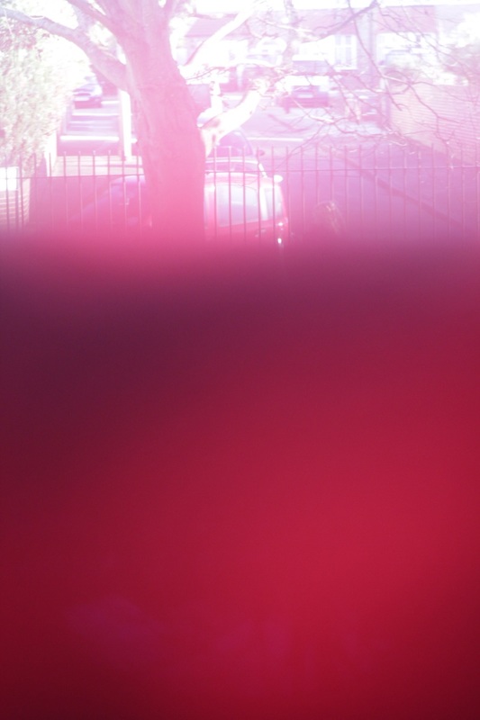
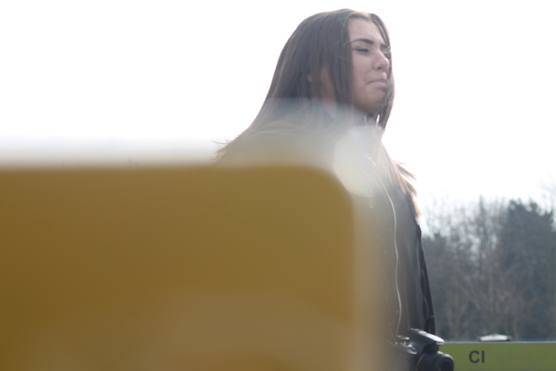
I choose this photo because I find the formate really interesting. This is because he has cut his photo into quarters and only has the subject in the top corner of the picture. This is unusual as stereo-typically you would have the subject in the middle of the picture as it is the main focus of the image. This draws the audiences attention to corner straight away as the yellow is a bright contrast to the black that takes up most most of the picture. Within the picture theres a picture of the man there is a black shop window with a sign in it. This is also another bright colour which makes its stand out., I think Saul Leiter has covered the camera with a black object, maybe a cut out of paper or and weird shaped object, and took the picture only having the man in focus. In the picture of the man the line of the shop window goes through the middle of the picture and the man goes through the middle of the picture also. |
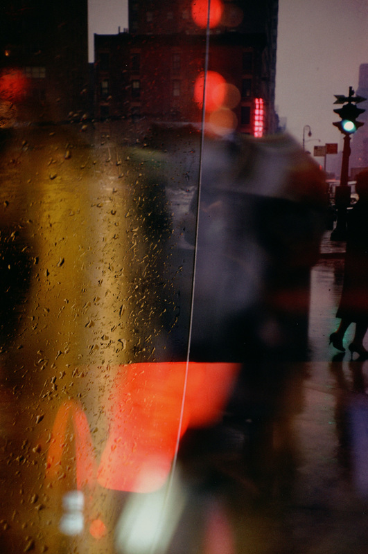
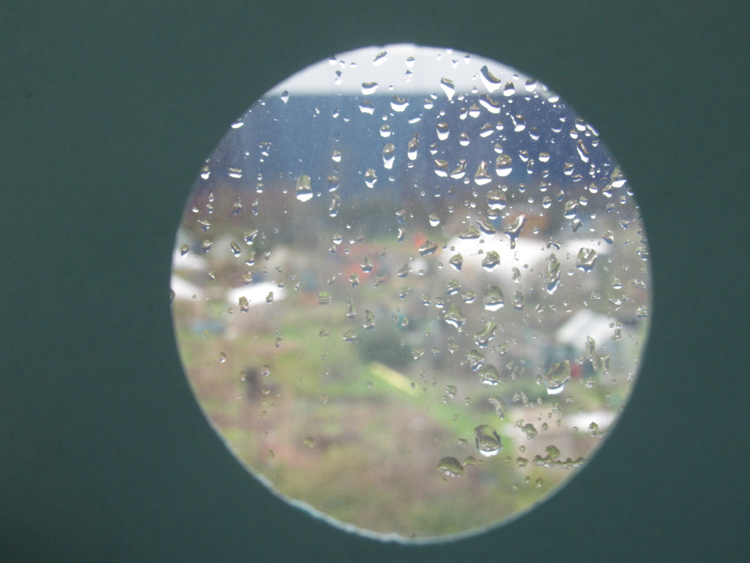
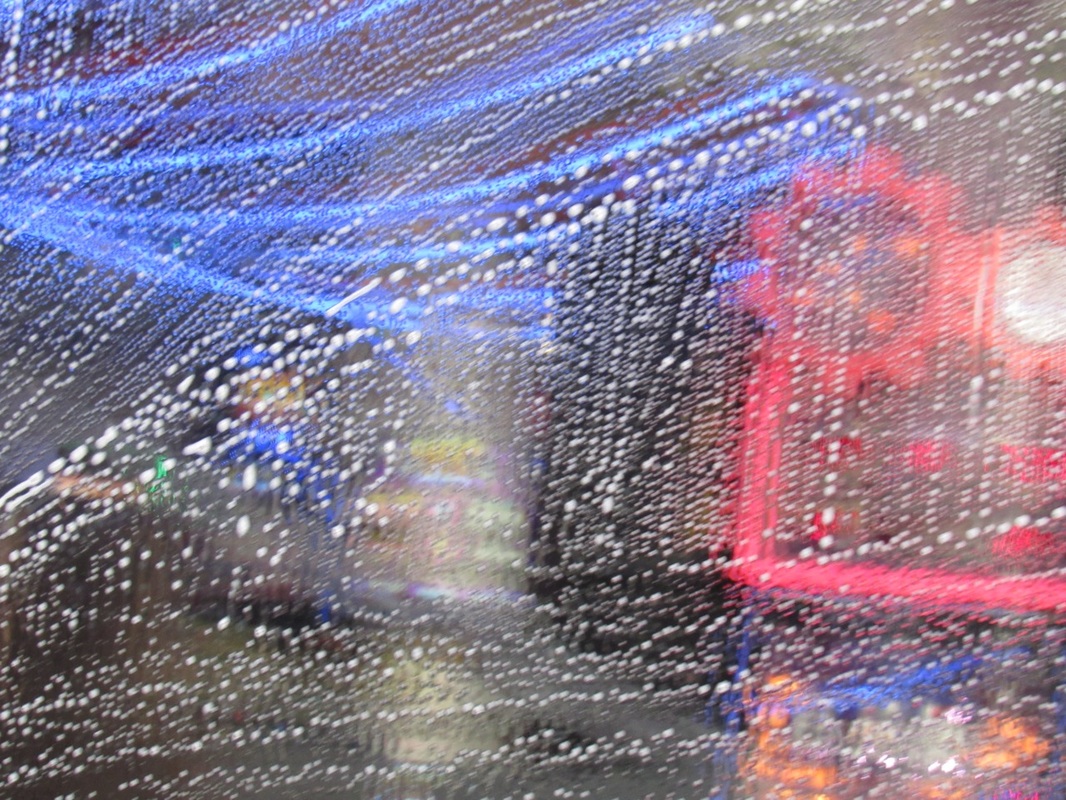
A window covered with raindrops interests me more than a photograph of a famous person
|
-- SAUL LEITER
|
This quote shows how Saul Leiter works as he would rather photograph raindrops as it fascinates him more. This shows that his work is abstract and he doesn't like photographing regular things.
The following images and explanations represent big ideas (Threshold Concepts) in photography. We have been exploring these two concepts in relation to Saul Leiter's work and the theme of abstraction.
The following images and explanations represent big ideas (Threshold Concepts) in photography. We have been exploring these two concepts in relation to Saul Leiter's work and the theme of abstraction.
|
Cameras will see the world a lot more different that we do, photography can give us the illusion that the world is a perfect place and pull us from reality. Really every photograph is abstract in its own way as a photograph isn't the world but a small version of it through pixels. Even if an image isn't an attempt to be abstract then it still is slightly abstract because it is not the real world even if an image isn't edited then it will still be abstract. You could say that photographs are a manipulation of reality but I would say that photographs and just a better version of reality that we should appreciate for its beauty |
|
Photography is very different to every other art form in that you begin with an world with endless possibilities and you make something out of what is there rather than a blank piece of paper. Cameras change the subject of the photograph and no two photographs are the same even if they are of the same thing. Since there is so many things to take into account when taking a photograph but two people could copy one picture with tracing paper and make it look the same even if it would be a copy of something thats already there. |
|
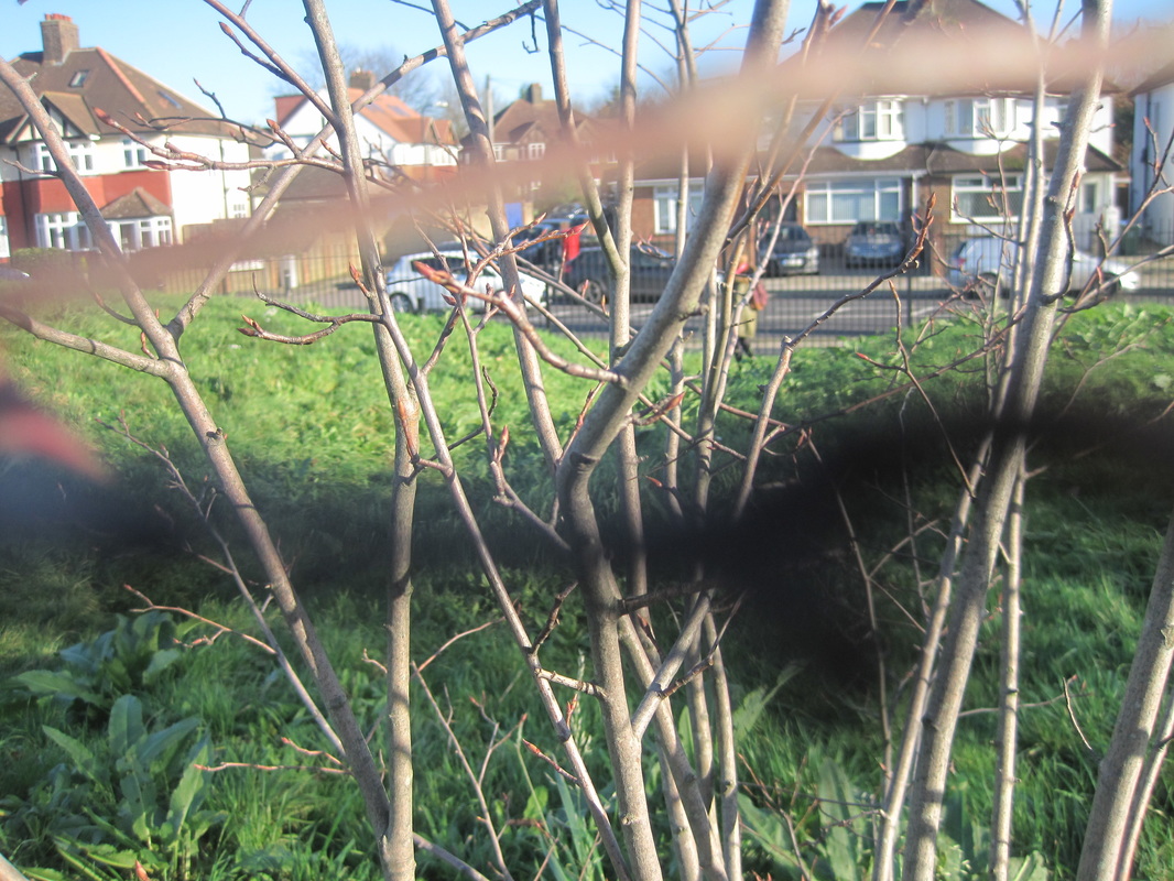
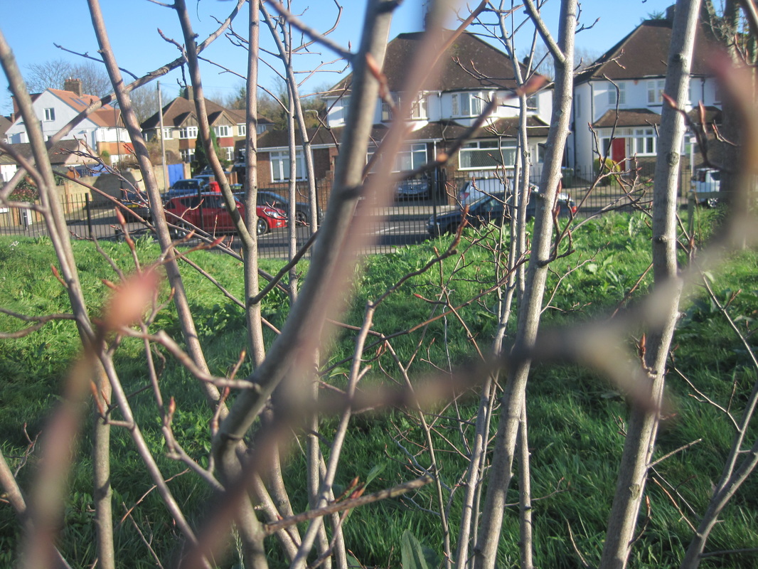
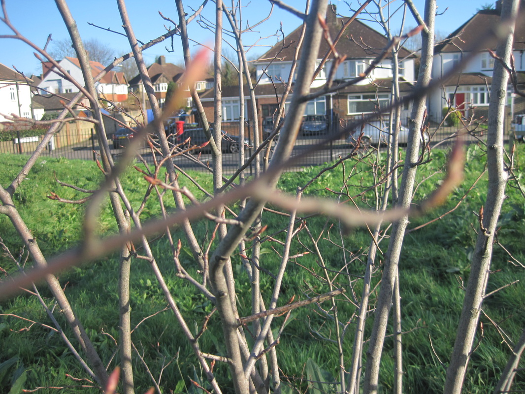
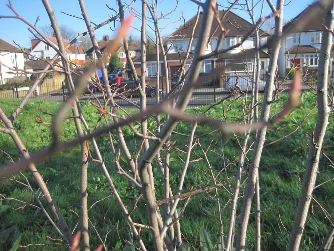
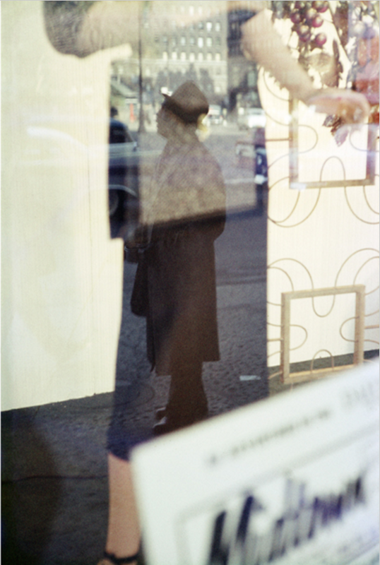
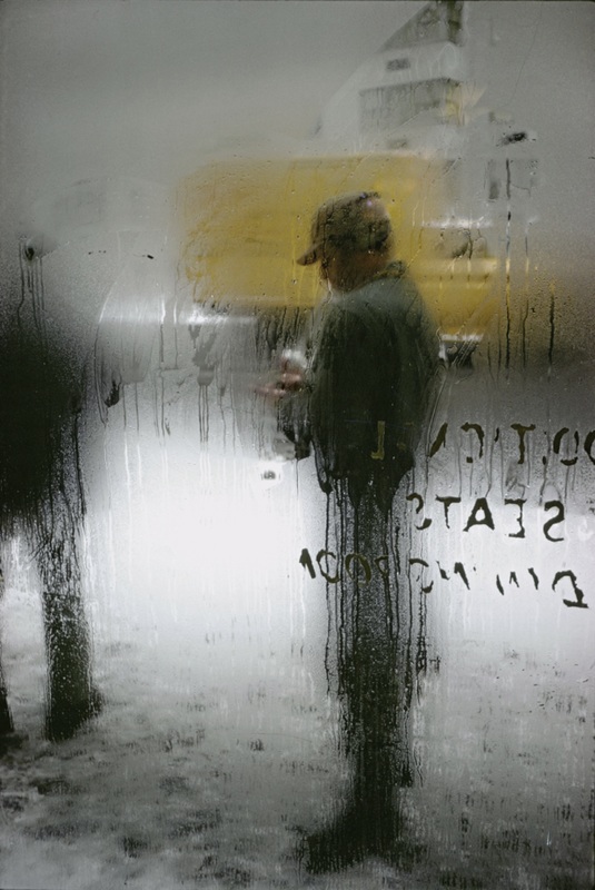
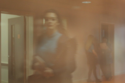
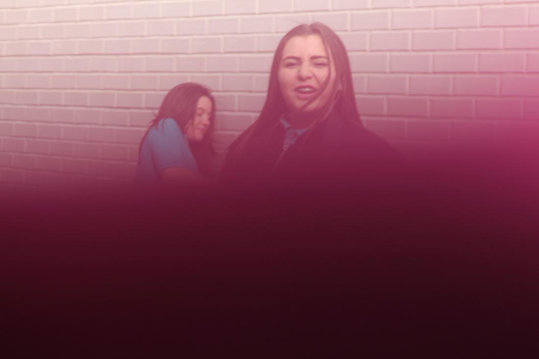
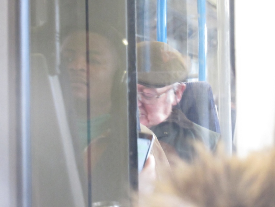
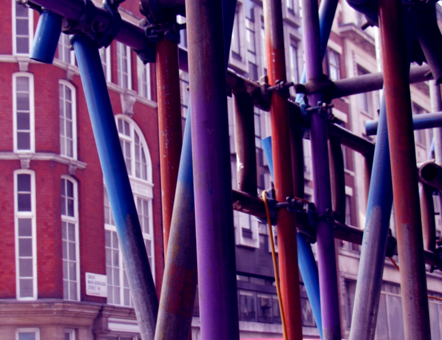
photos I took using Saul Leiter as my inspiration
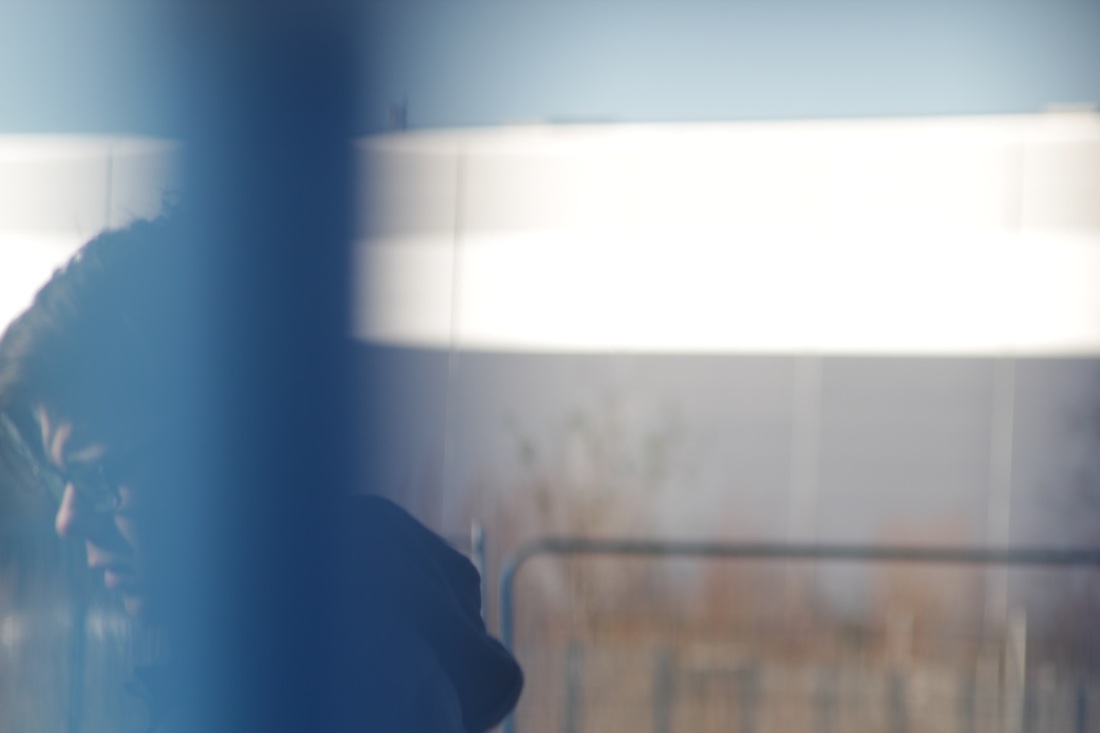
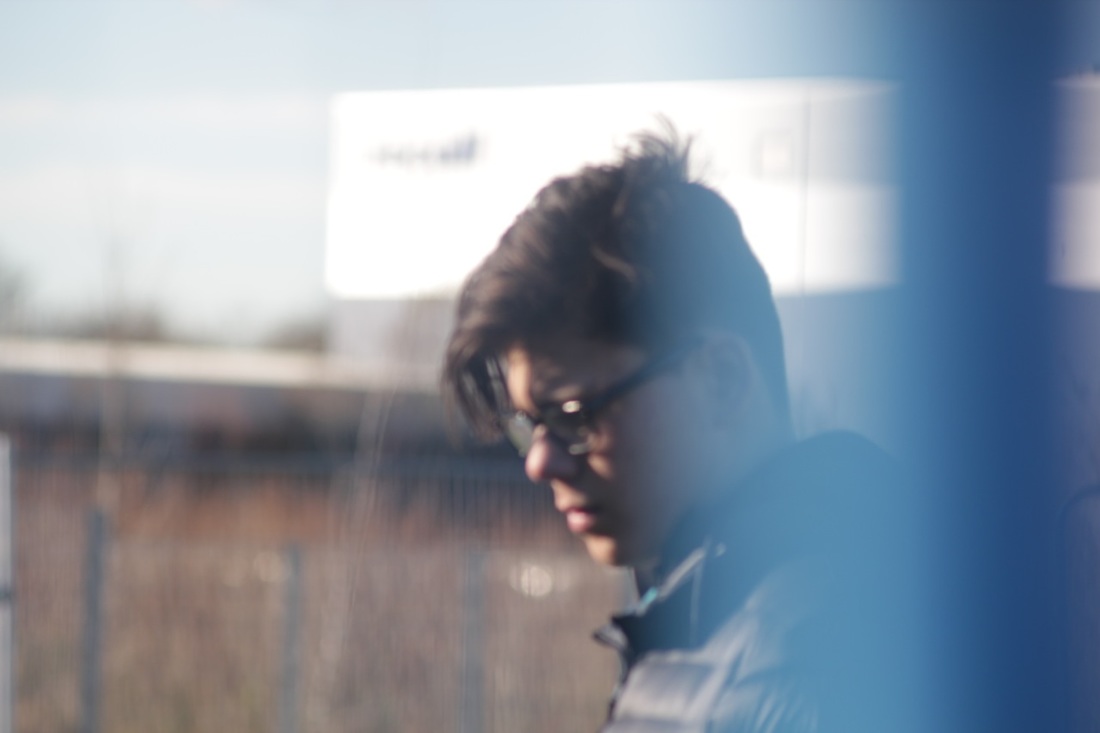
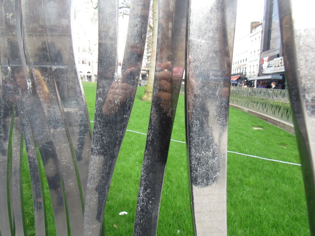
interesting viewfinder
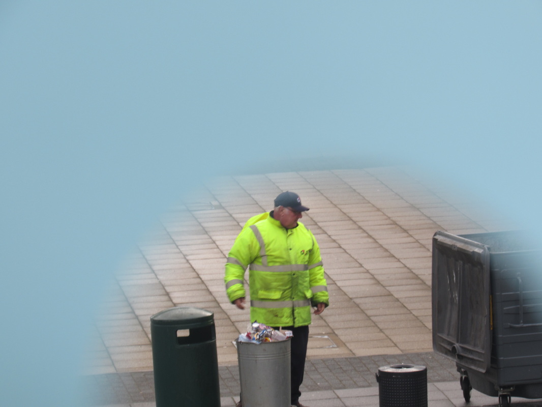
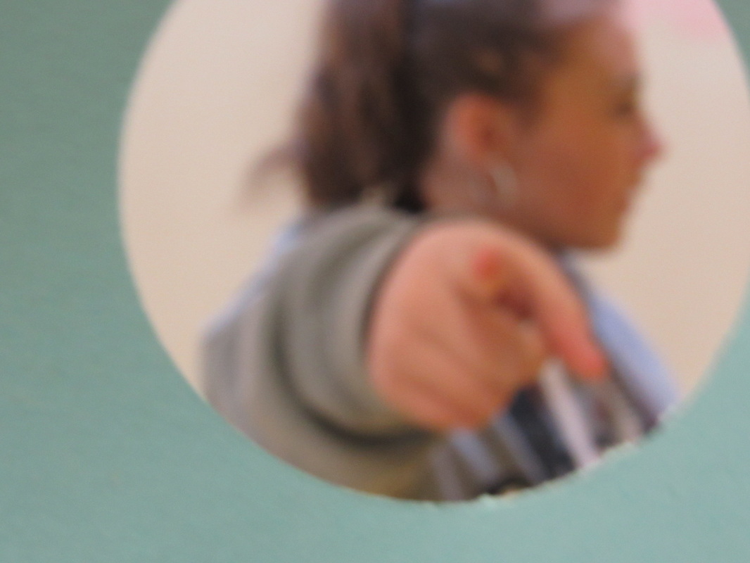
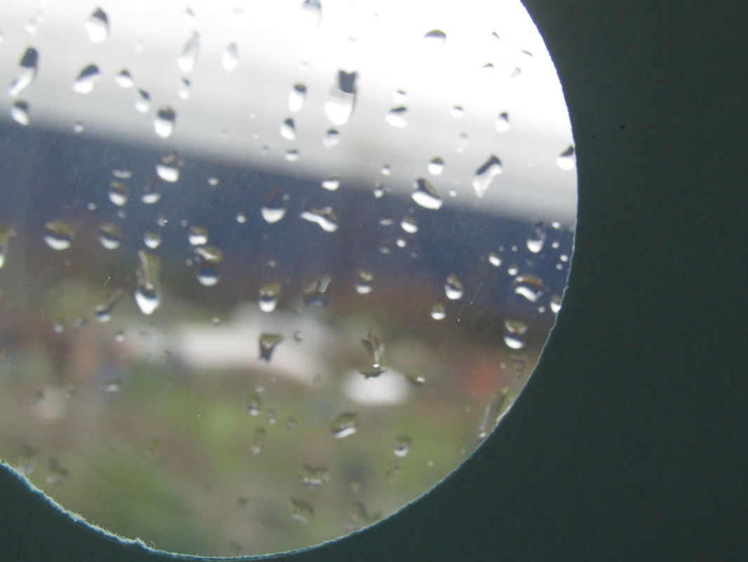
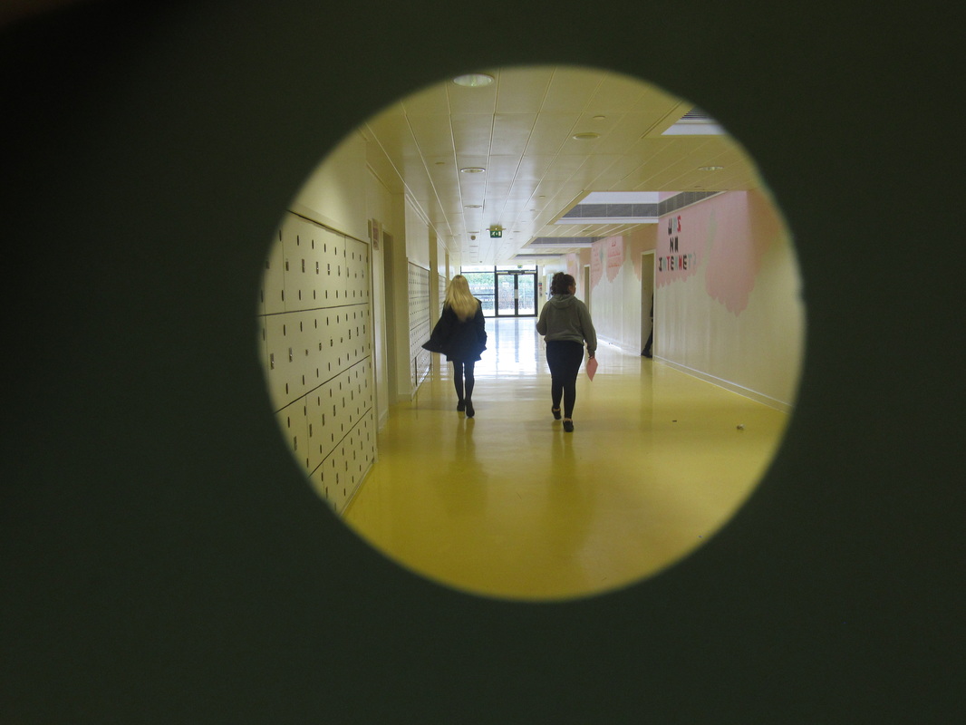
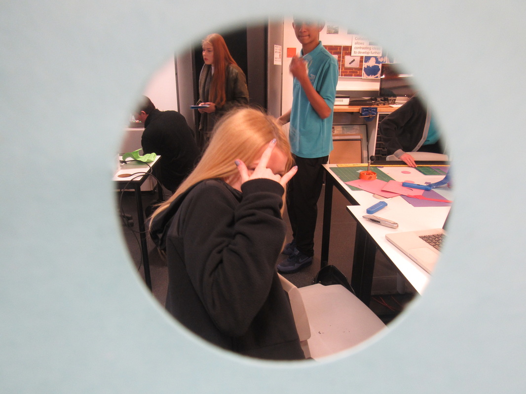
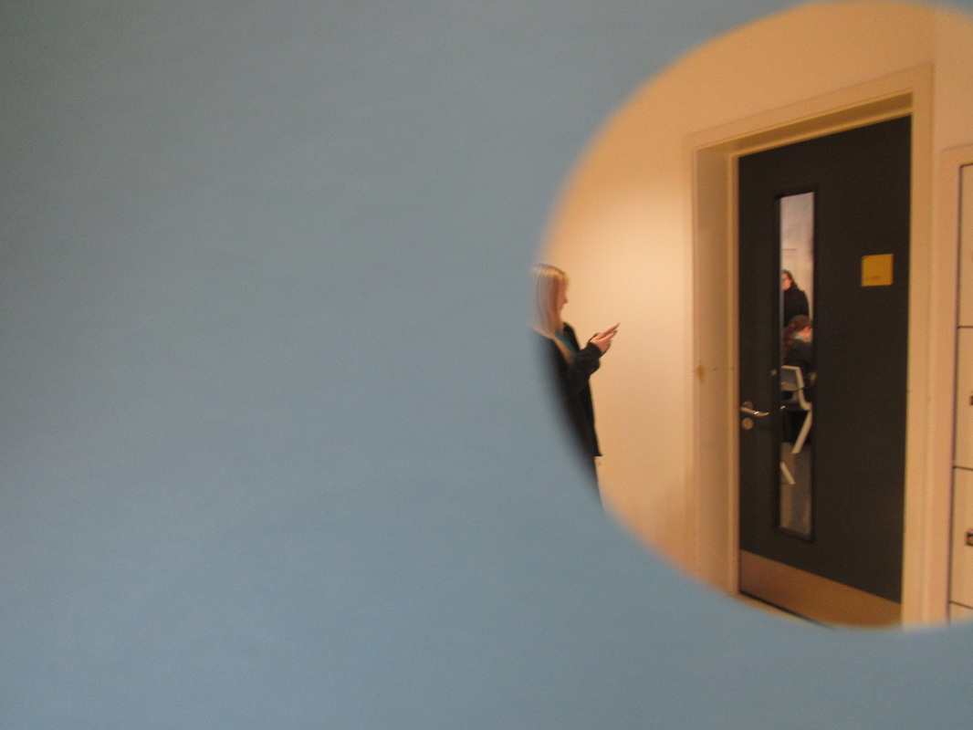
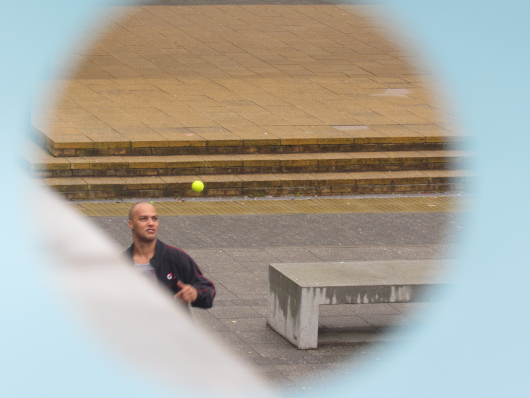
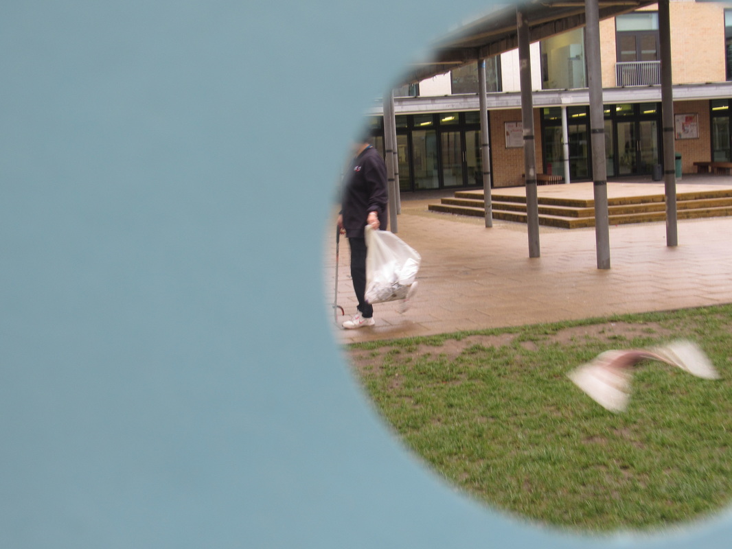
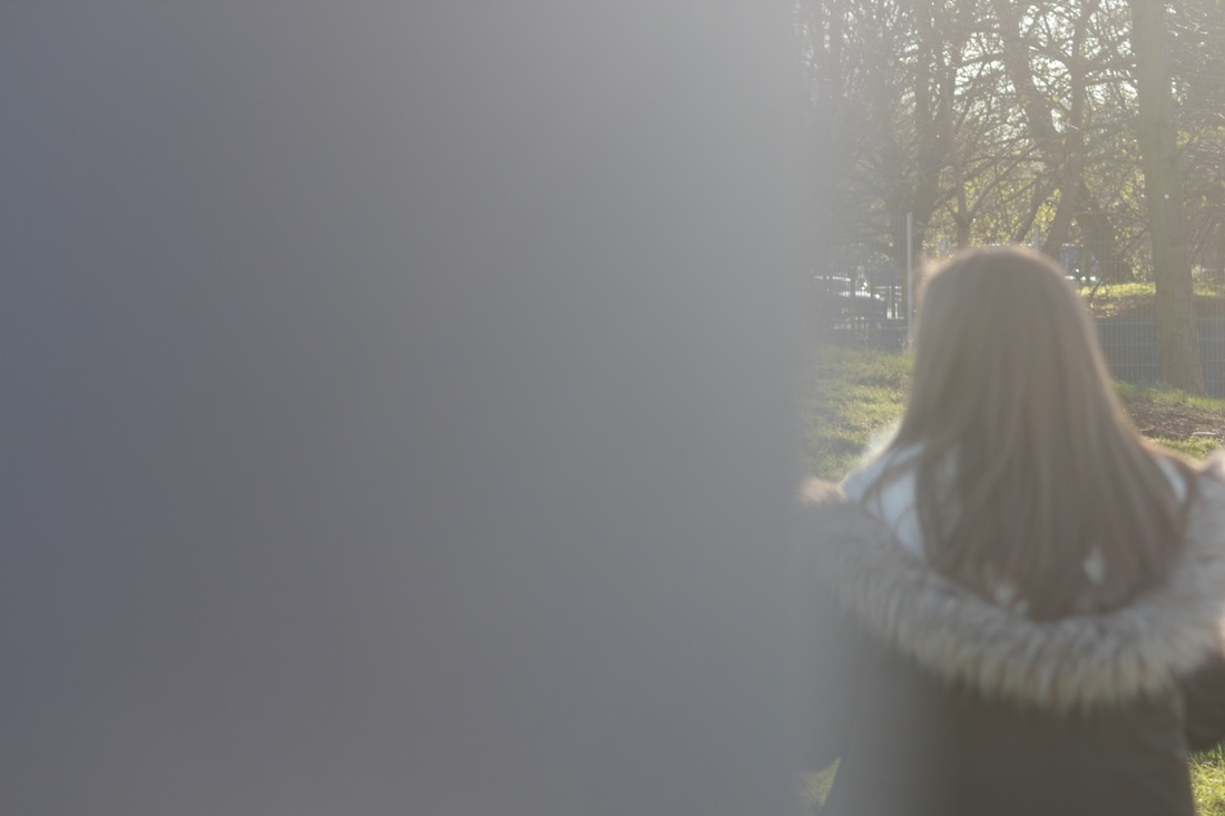
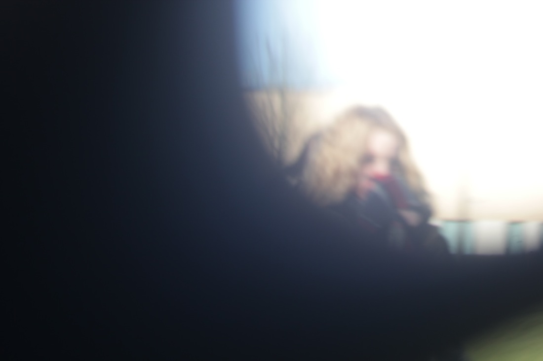
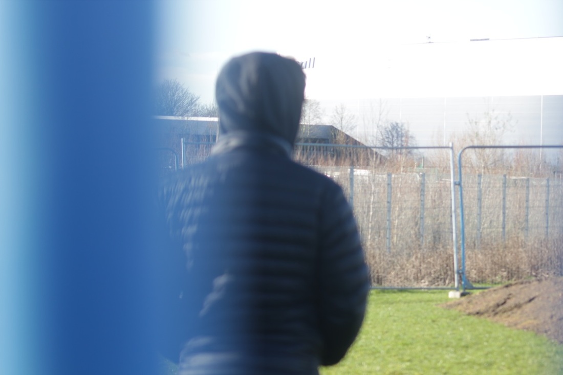
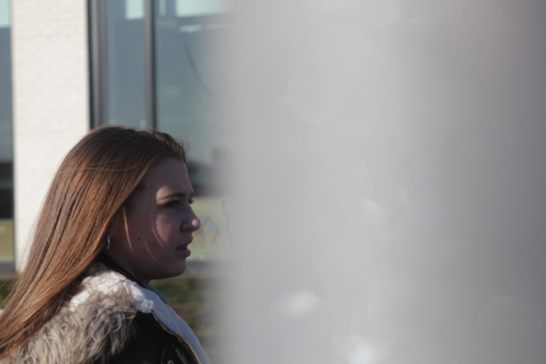
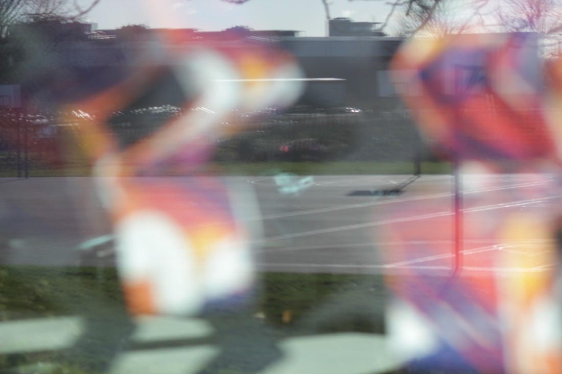
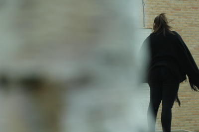
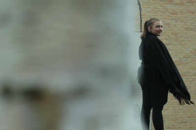
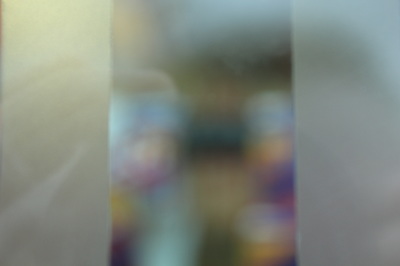
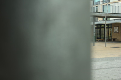
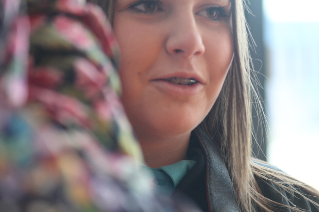
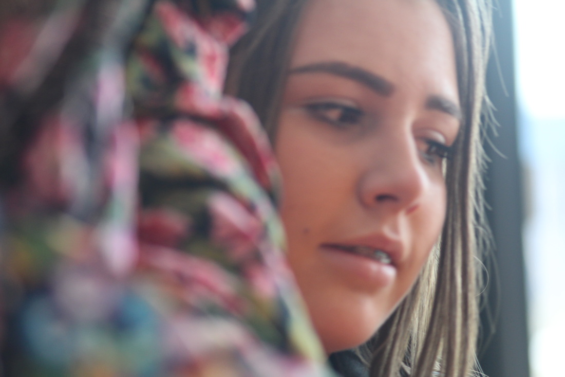
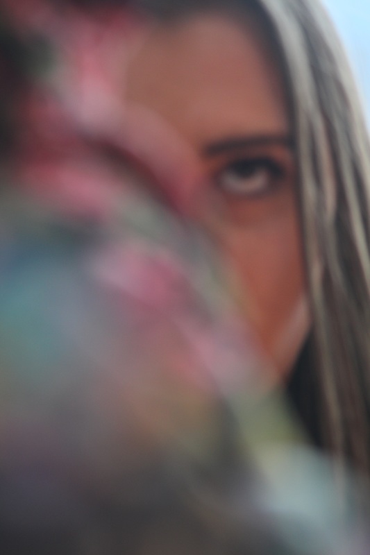
I used Saul Leiter as my inspiration again to take these photos, however, I cut interesting shapes to make a viewfinder. I really like the way these photos came out as I think the photos look really interesting and makes people wonder why some of image is covered. To make these batter I could experiment with different shapes and get the object inside the shape in focus.
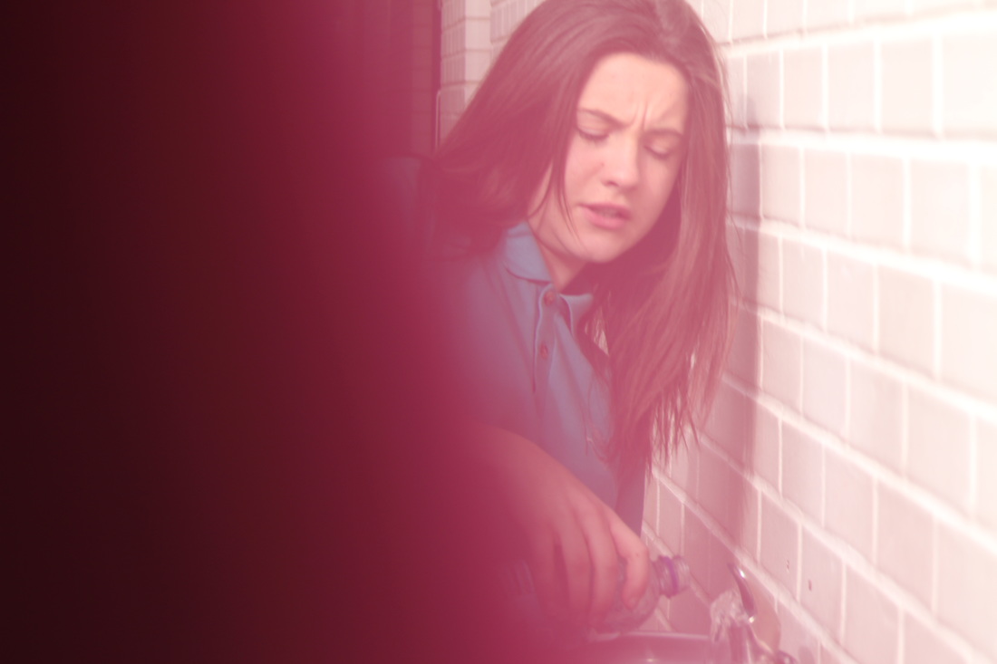


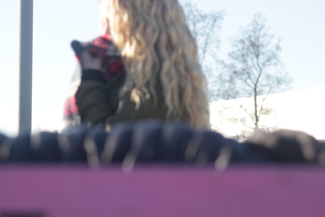
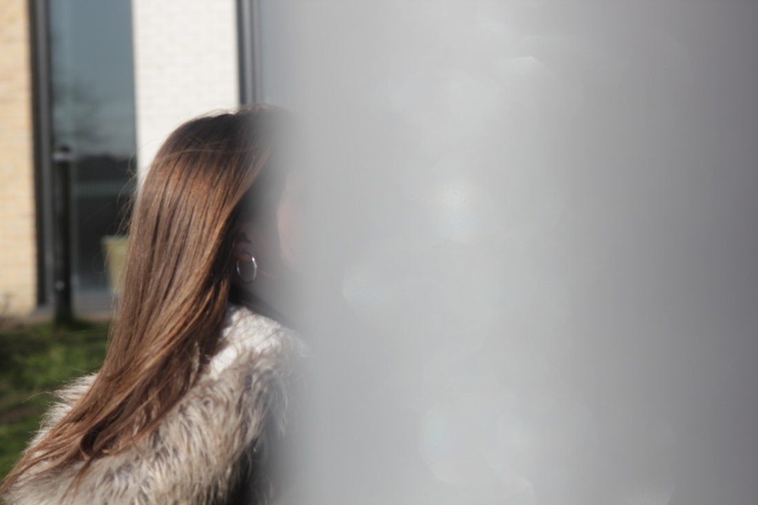
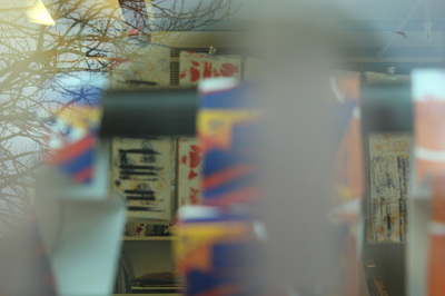
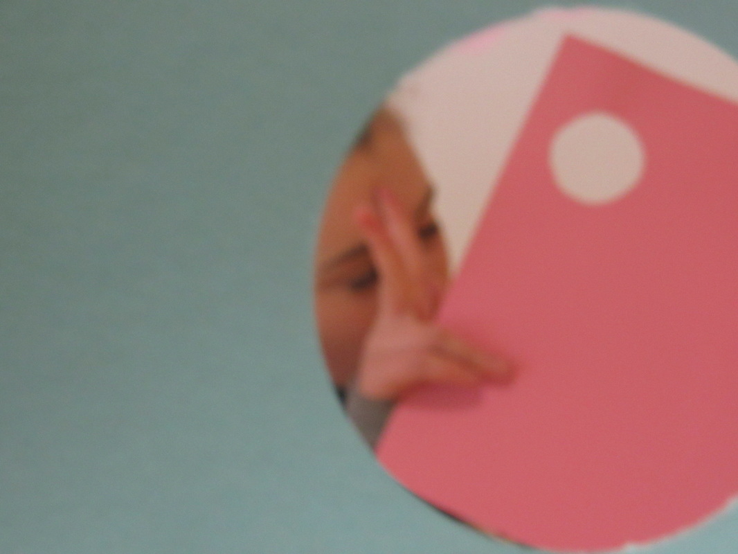
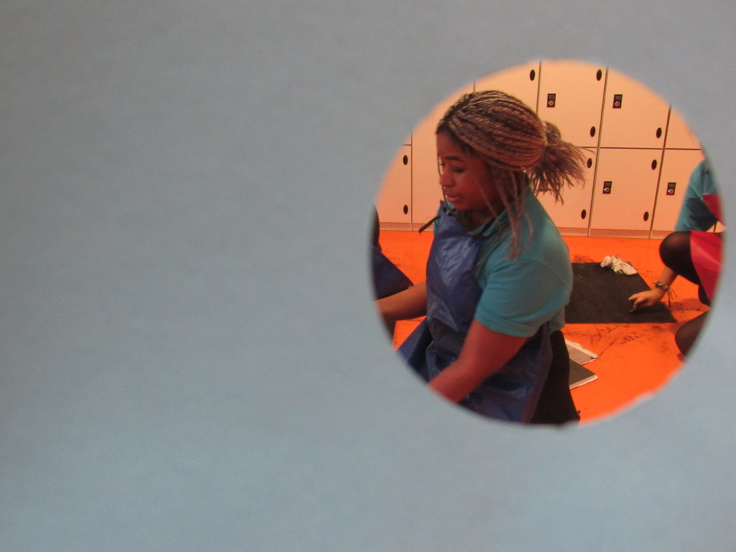
These are some more photos that I took focusing on colour and making abstract photos by covering the viewfinder again, I do like some of these photos but I prefer the method I used before with the card.
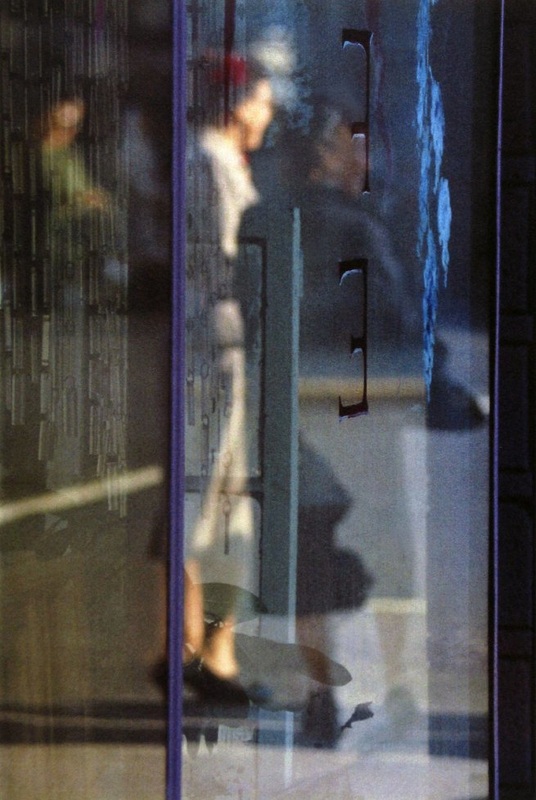
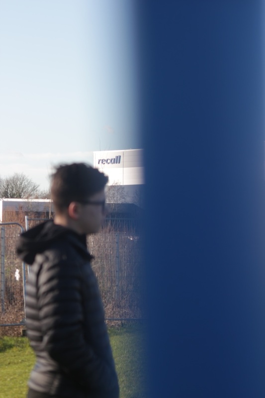
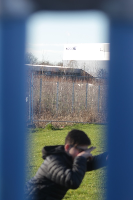
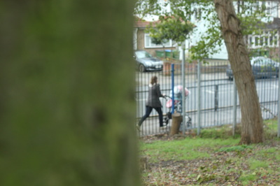
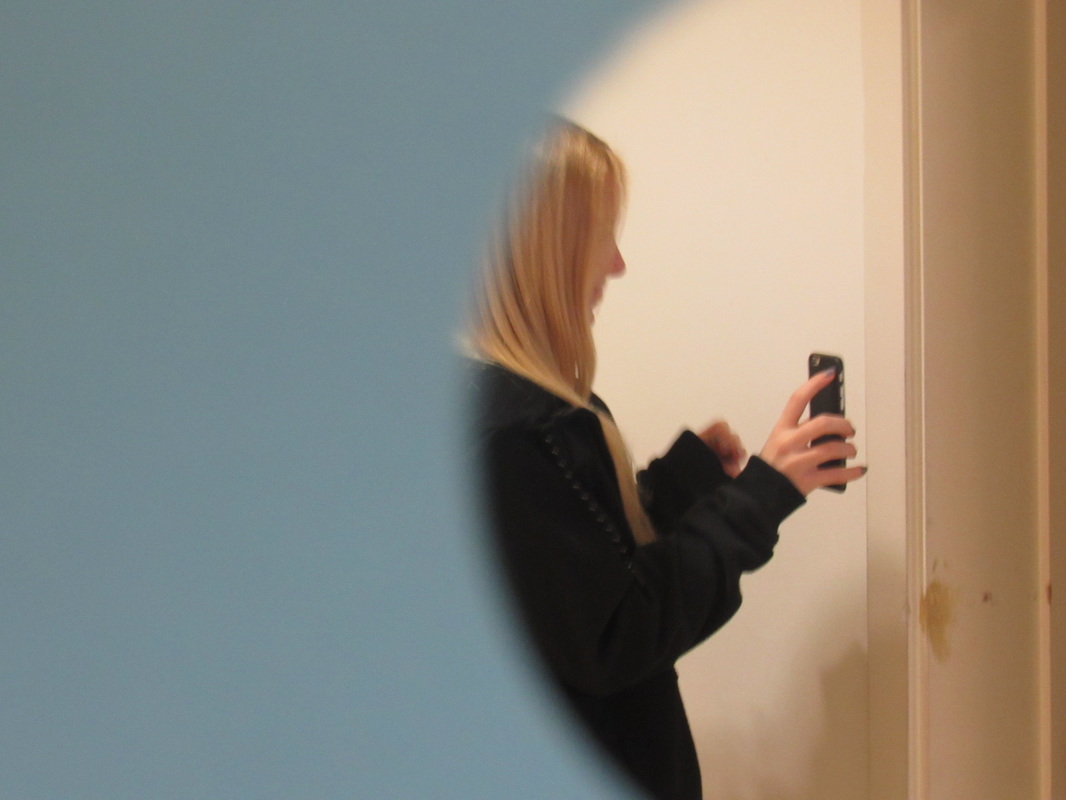
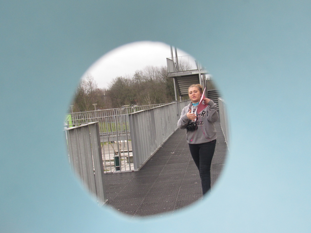
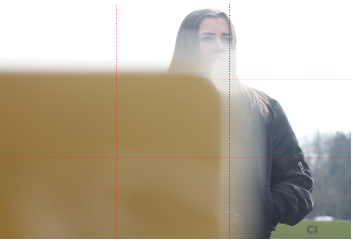
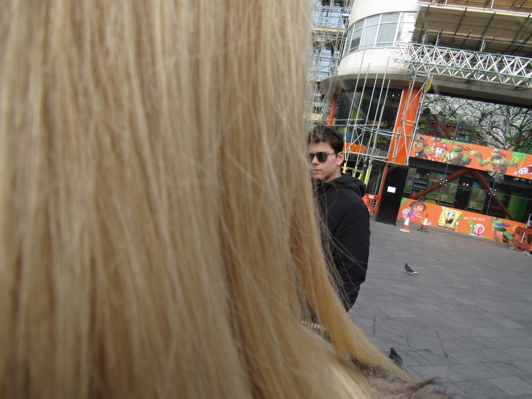
the Composition of my image
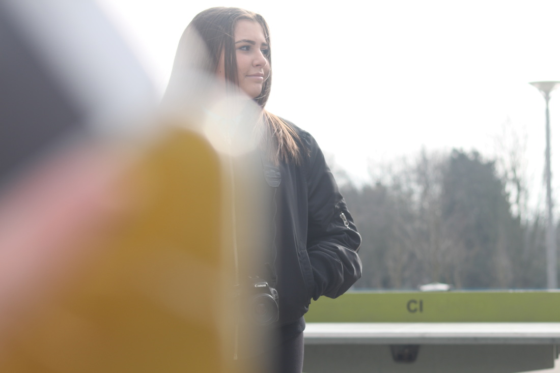
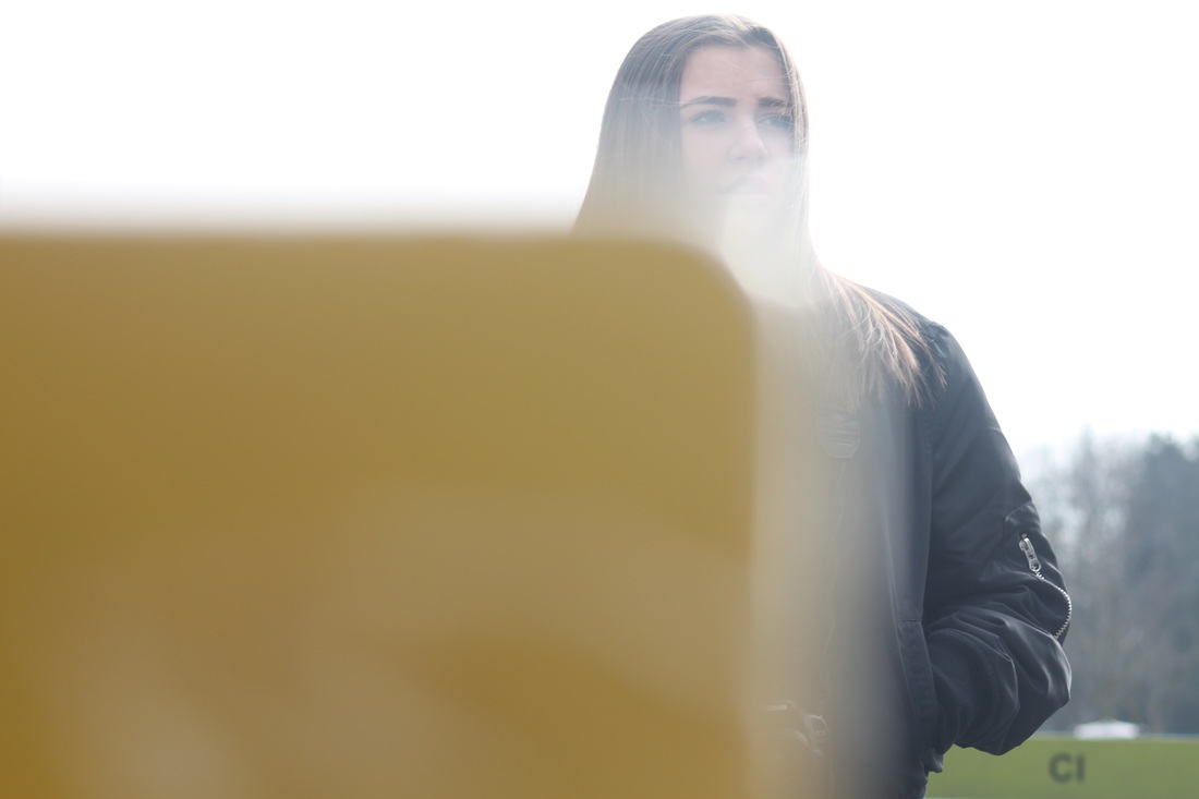
Out of the three my favourite one is the 2nd one because it uses the rule of thirds. Also the yellow object is covering the subject with a clear shape and gives a balanced composition. And the soft edge to the object has a glimpse where it is out of focus ad covering her face which makes it more abstract as you cant see all of the subjects face,
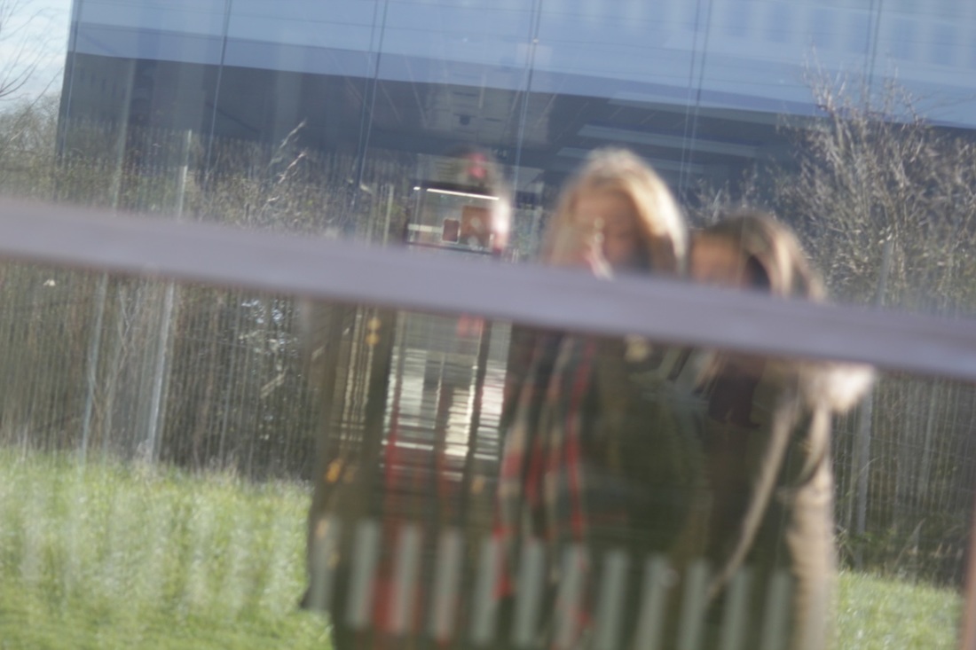
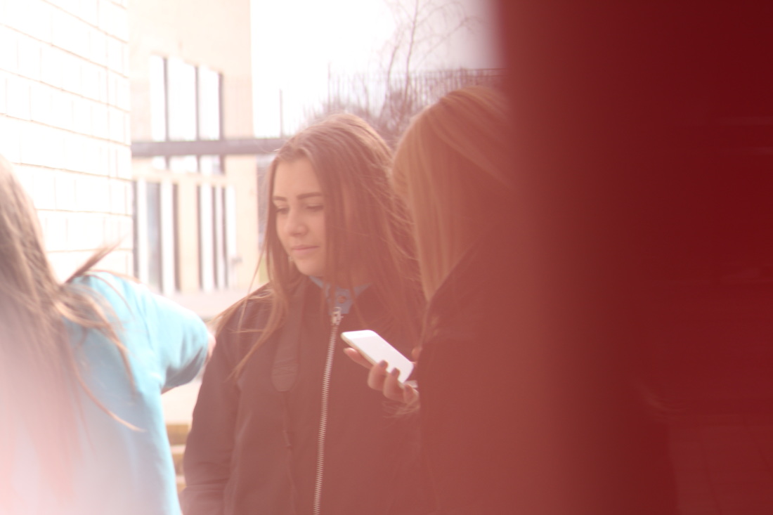
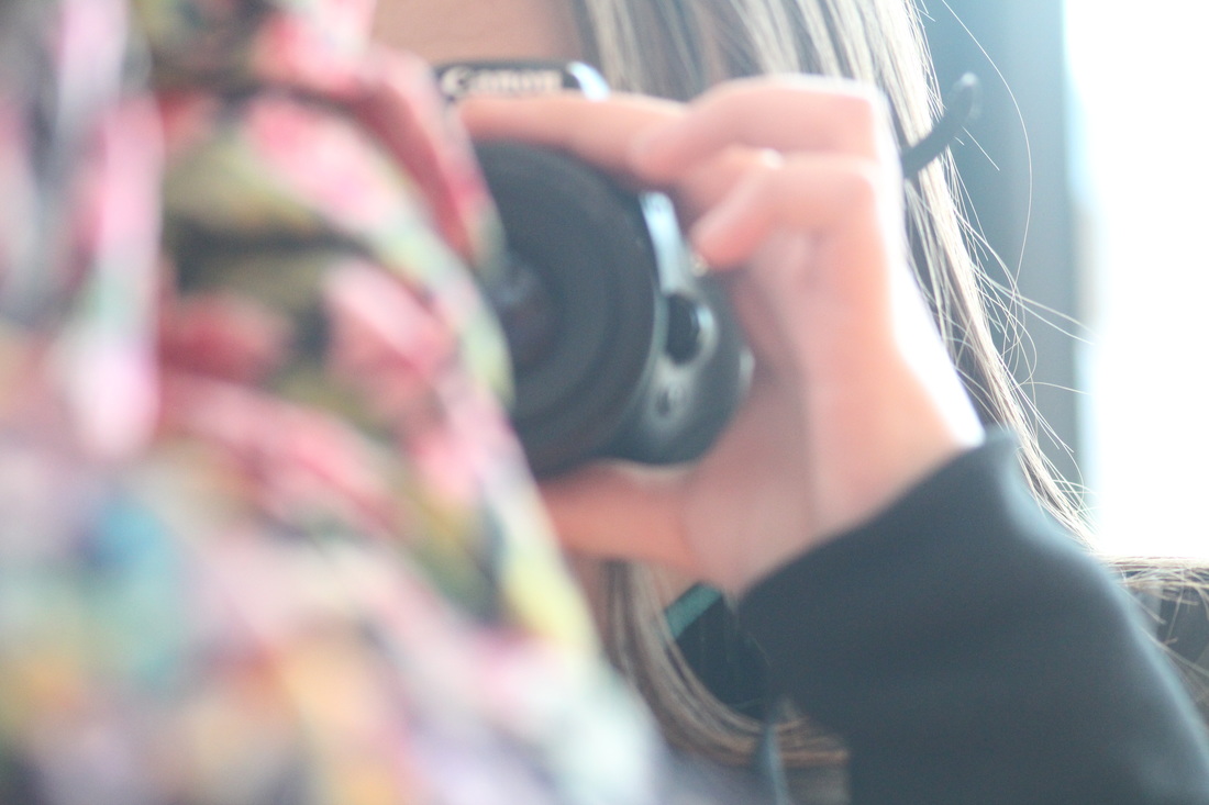
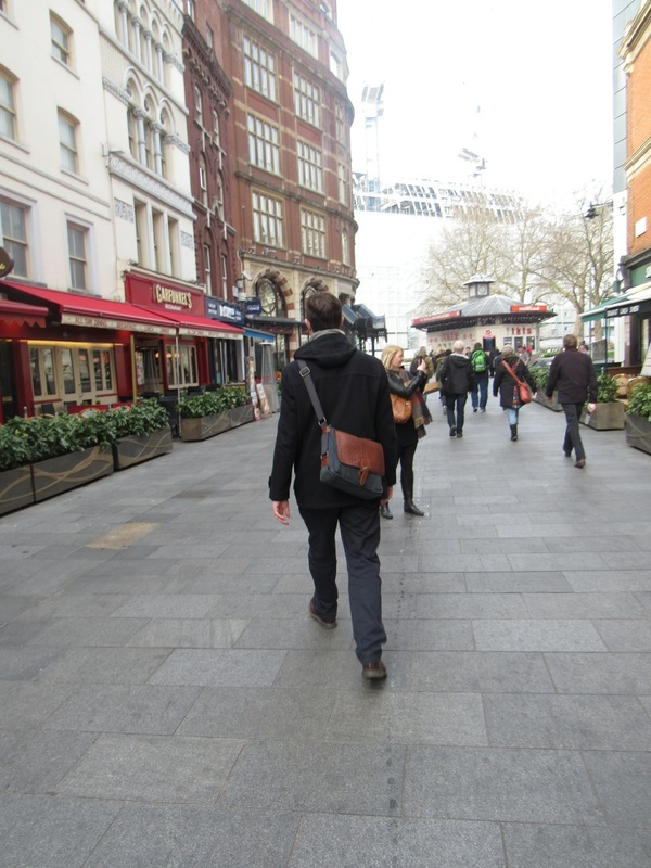
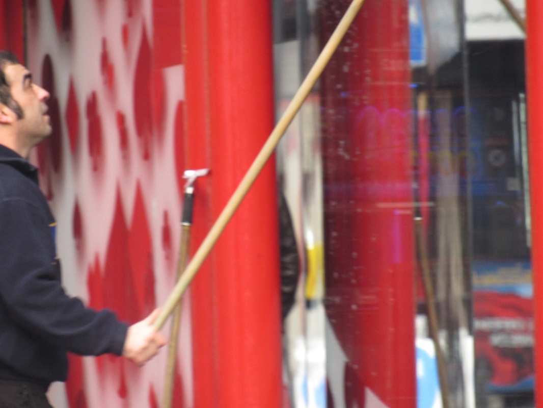
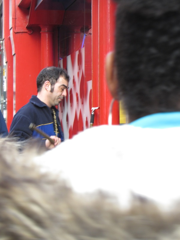
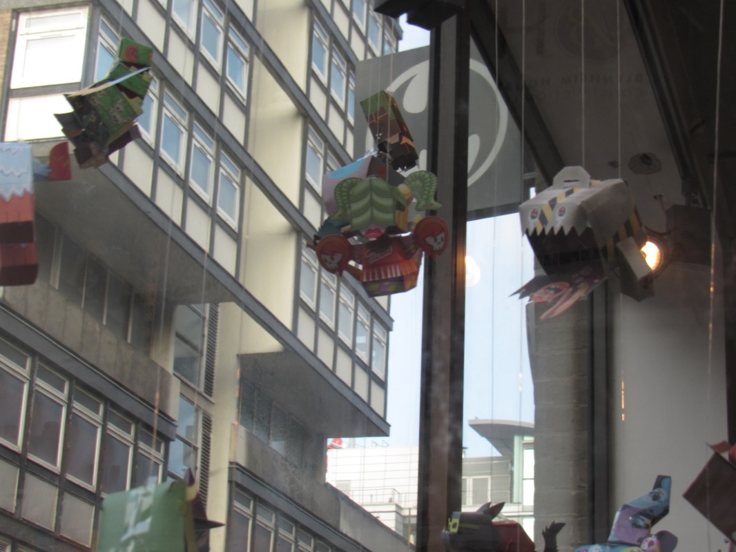
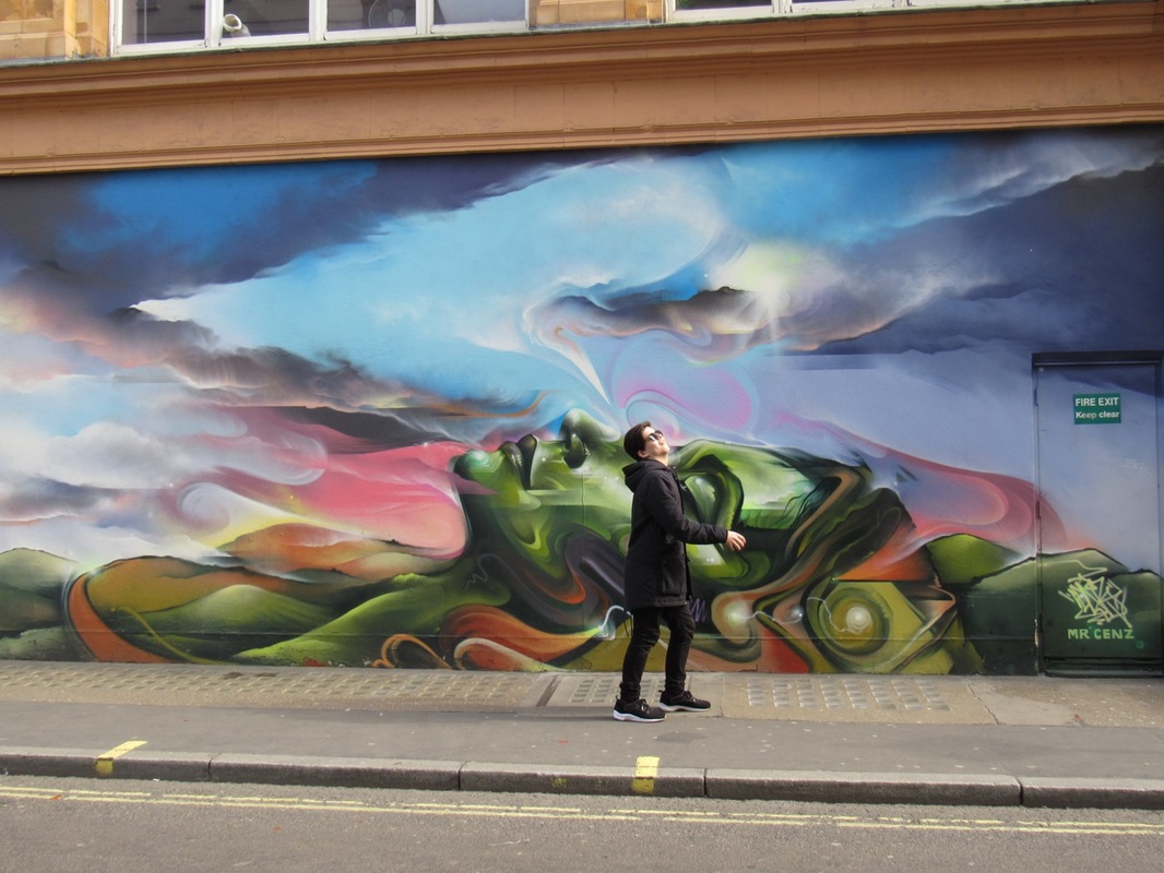
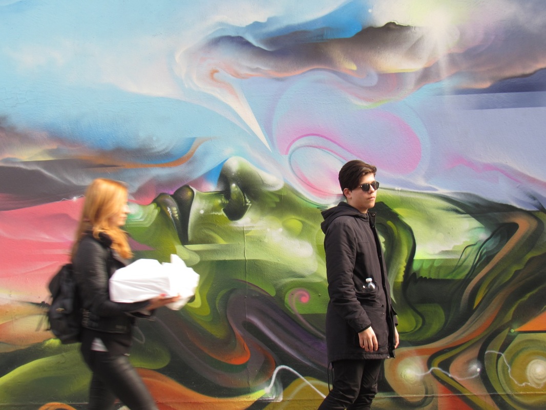
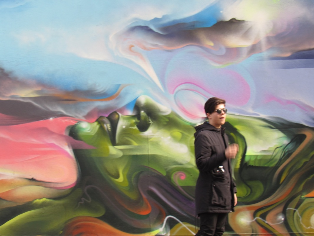
trip to saul liter gallery
Me and my photography class went on a trip to see a Saul Liter gallery. On the way there we took many photos using Saul Liter as our inspiration. Here is a link to his website http://thephotographersgallery.org.uk/saul-leiter-2
Evaluation of the Trip
This is my full evaluation of my experience when I went on a trip to the Saul Leiters gallery and looking at his pictures
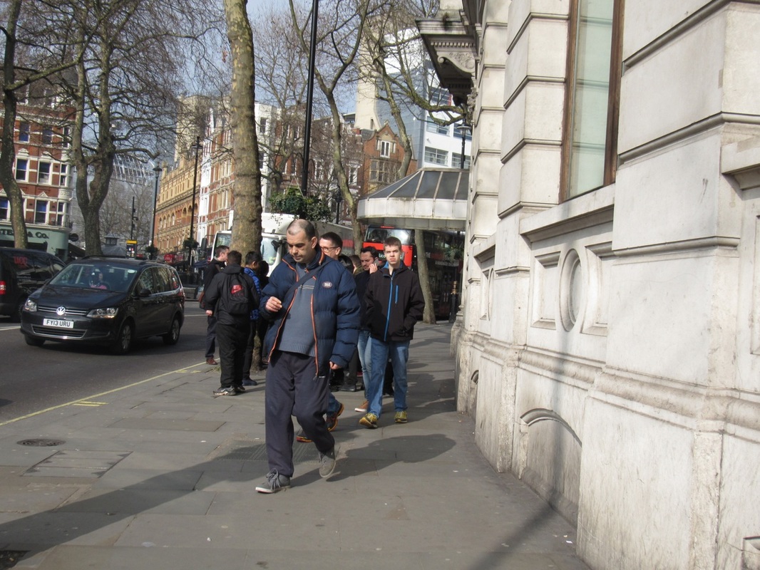
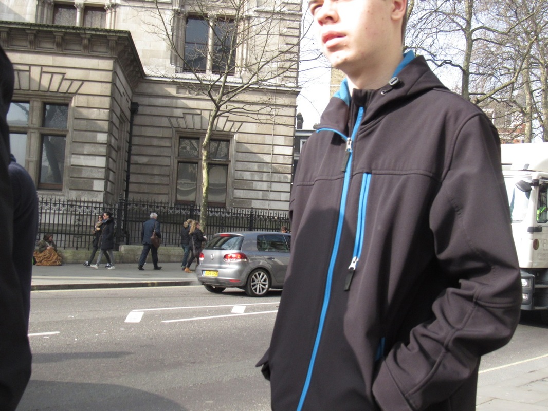
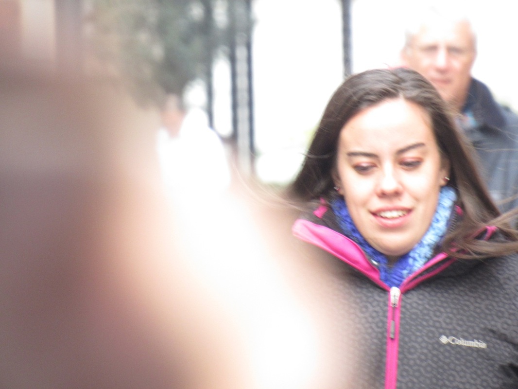
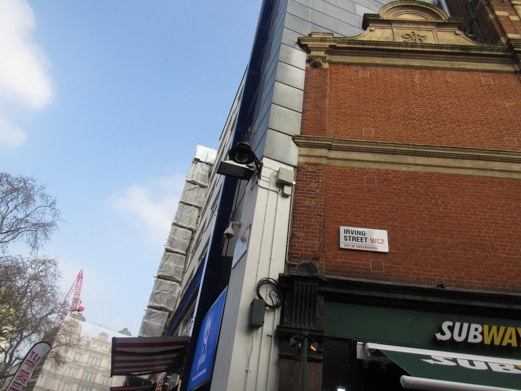
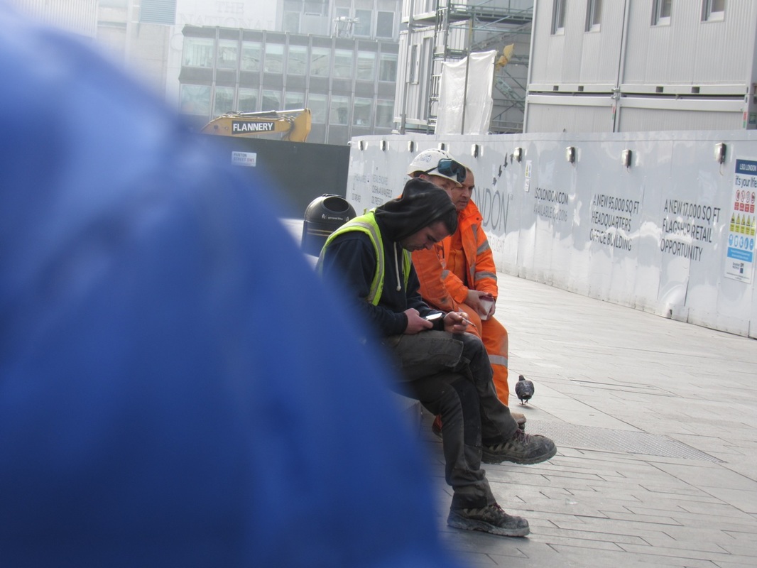
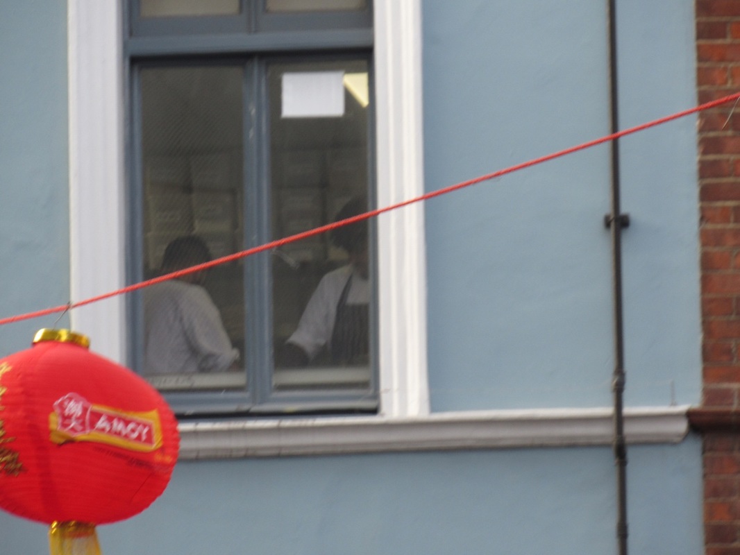
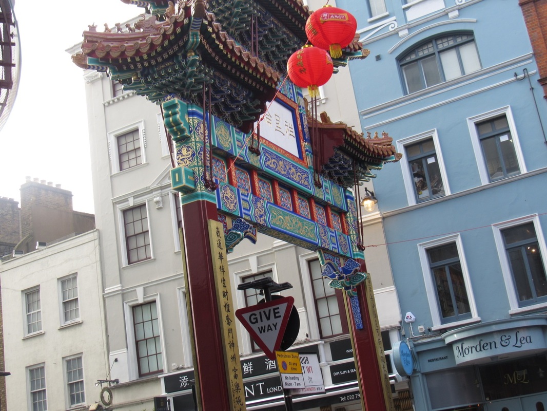
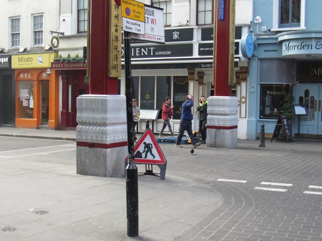
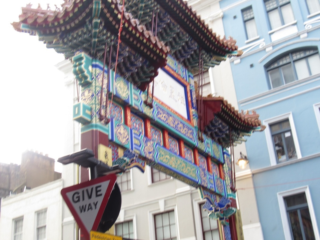
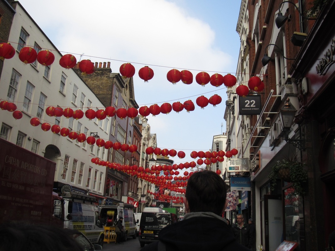
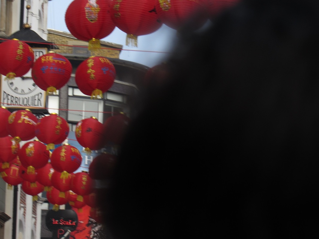
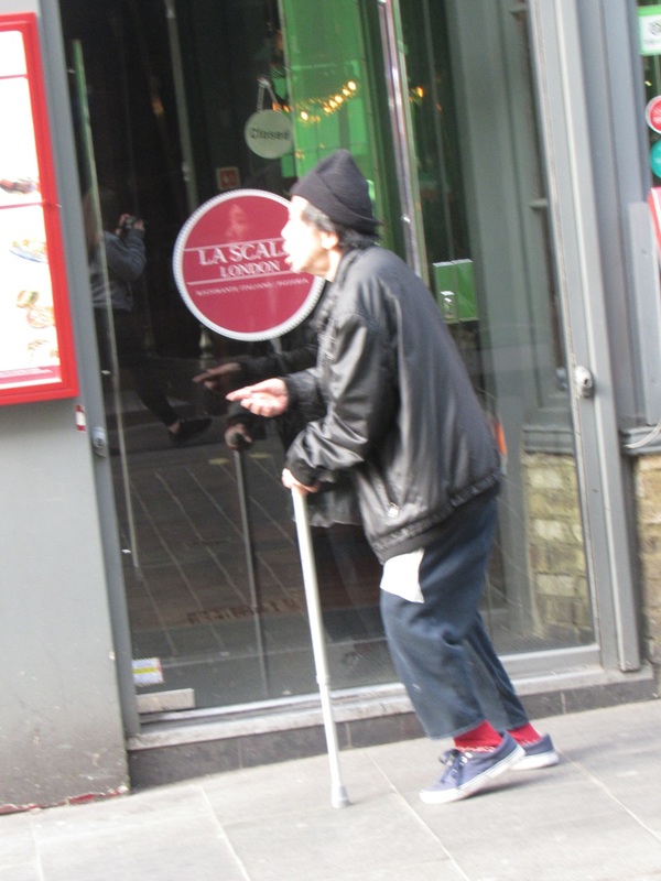
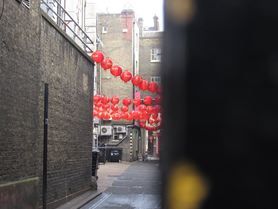
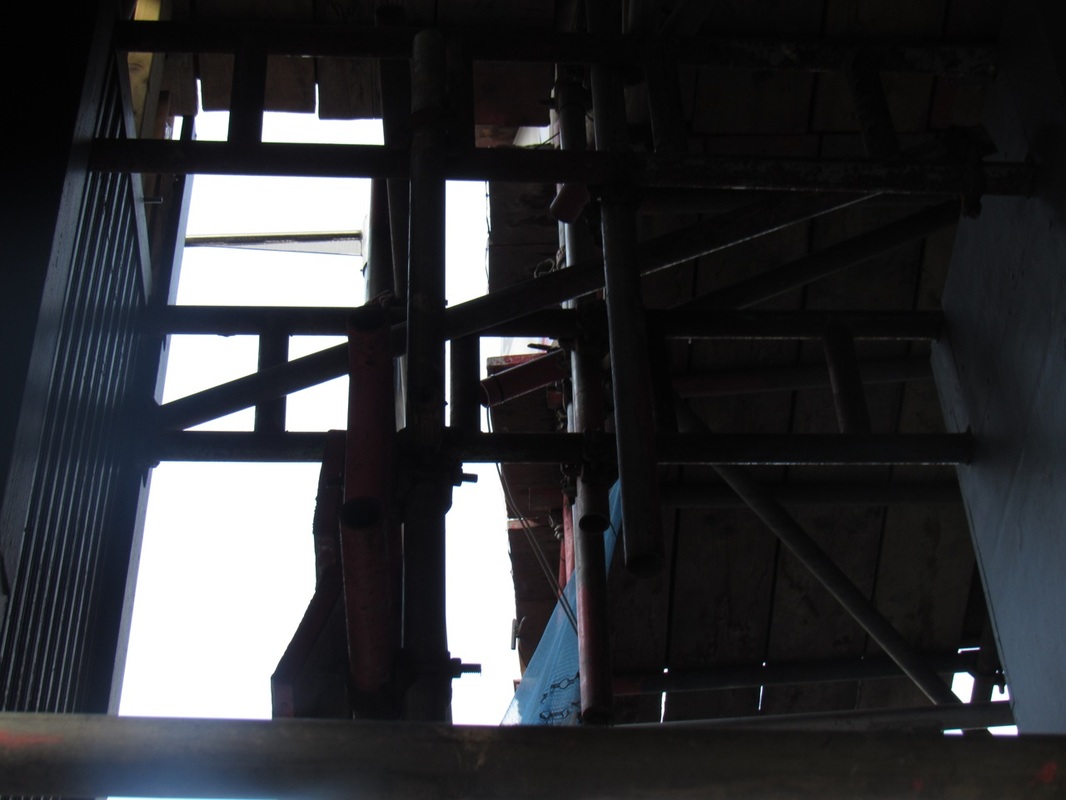
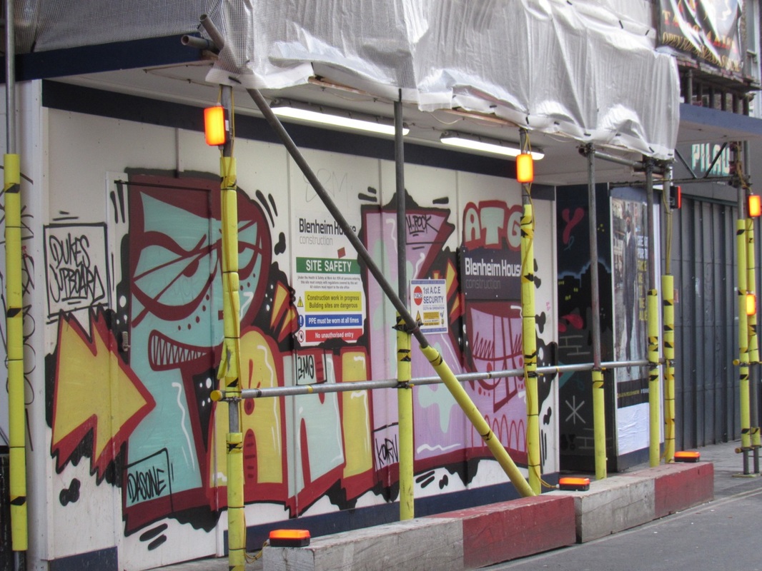
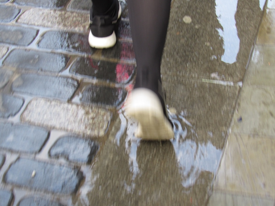
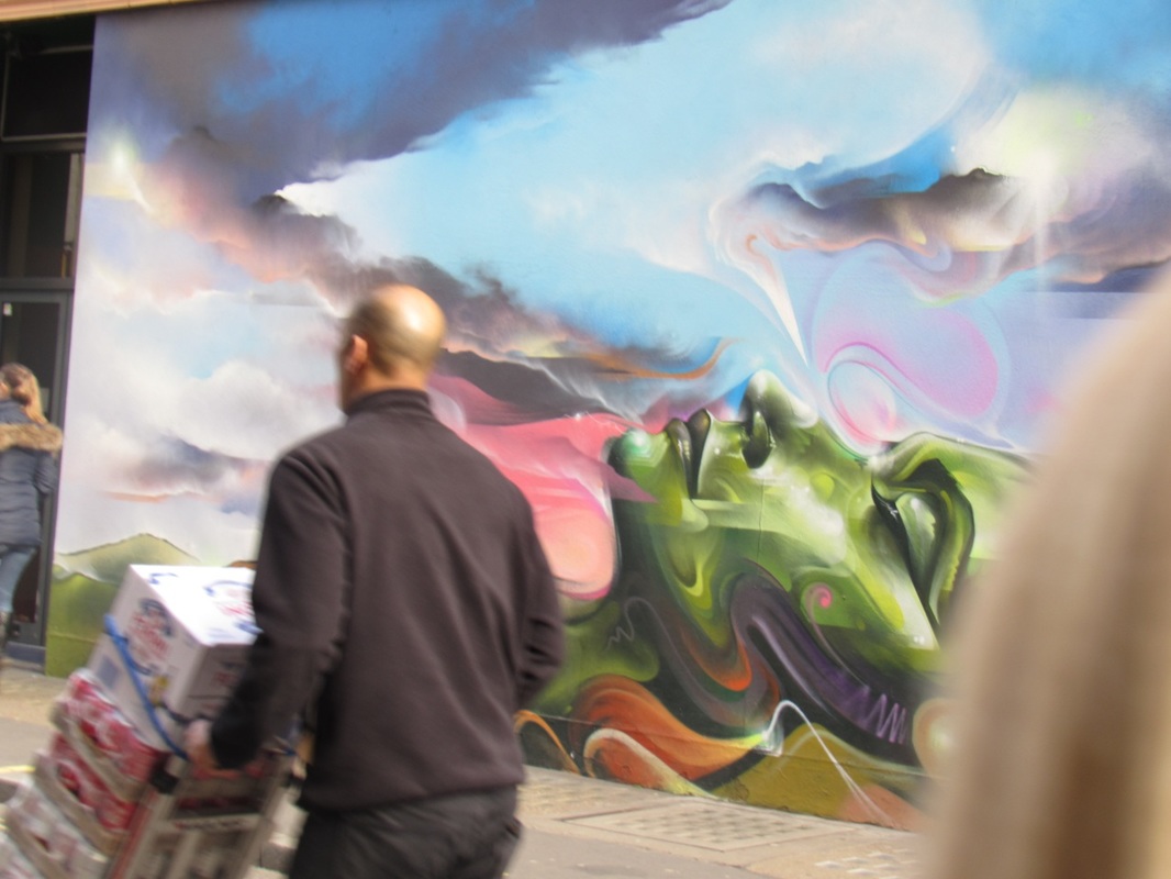
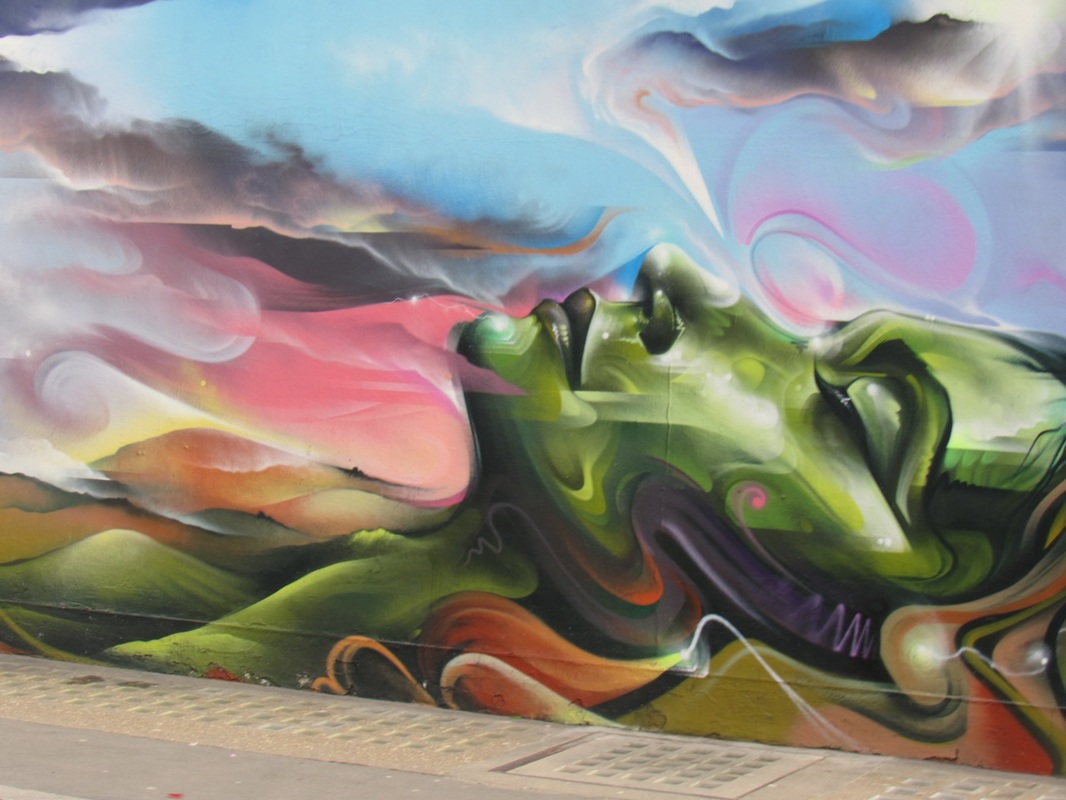
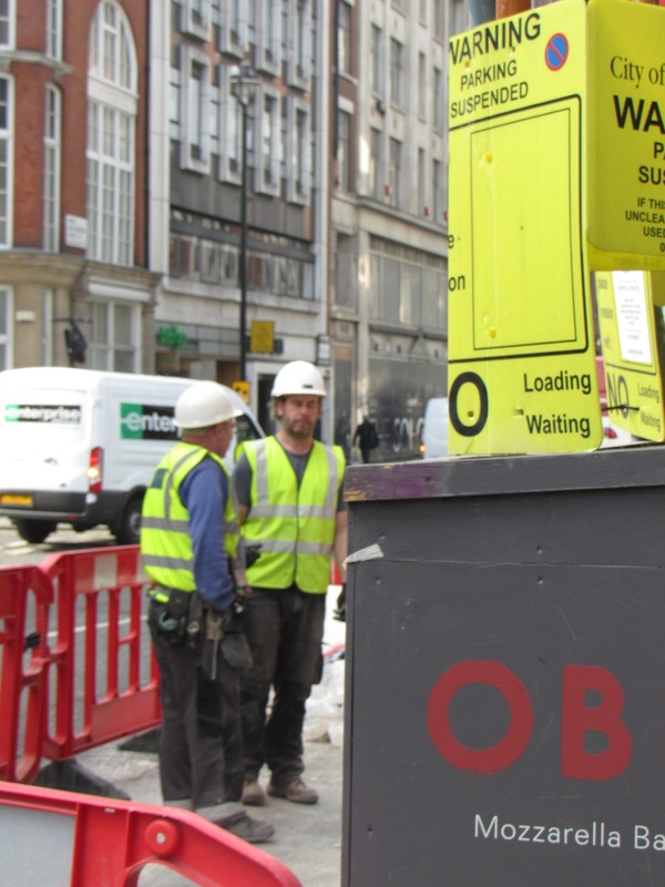
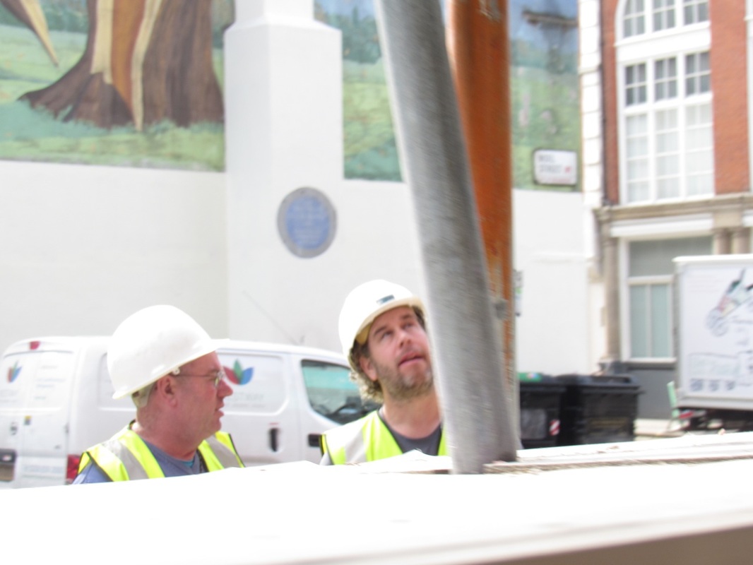
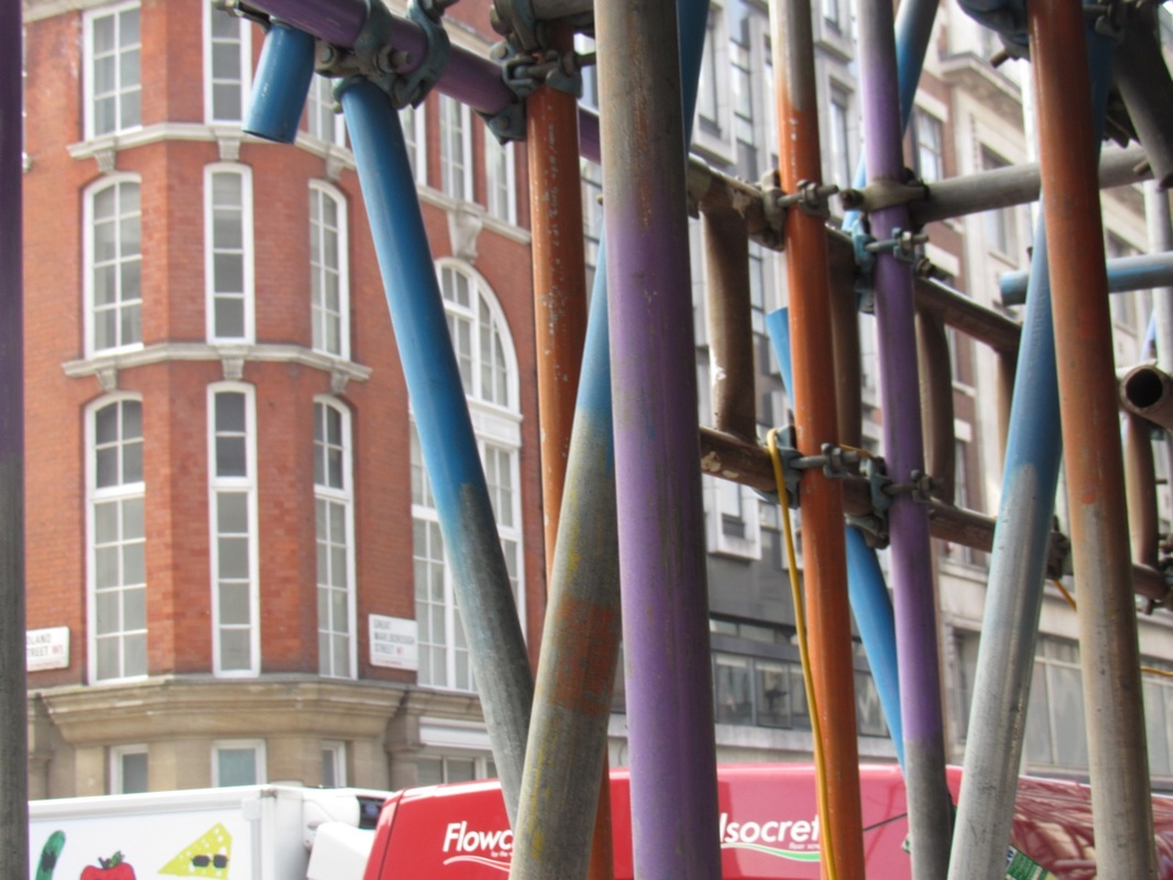
I really enjoyed trip overall as I found it really interesting to see Saul Leiters photos up close. Firstly we took the train up to London taking photos along the way, we walked past many interesting things and being up close to public made taking photos much more difficult. However it also helped make really interesting abstract photos as all my images were different and you can capture different angles of the street. Then we got to Saul Leiters gallery and we had to observe all his photos answering a question sheet about his work. After that we were able to go off around south bank and take photos on our own, I really enjoyed this because we had the freedom to take the photos that we wanted to take and was allowed to go were we wanted. After we met back up with the rest of the class we got the train home walking back through china town. This enabled us to take more photos of things we might of missed before.
The trip was very beneficial as I got to see lots of Saul Leiters photos and it gave me the opportunity to act like a real life photographer taking photos around London. Also it has helped as the photos that I took on the trip I have chosen for my final piece.
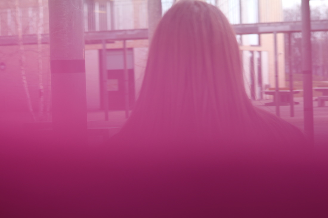
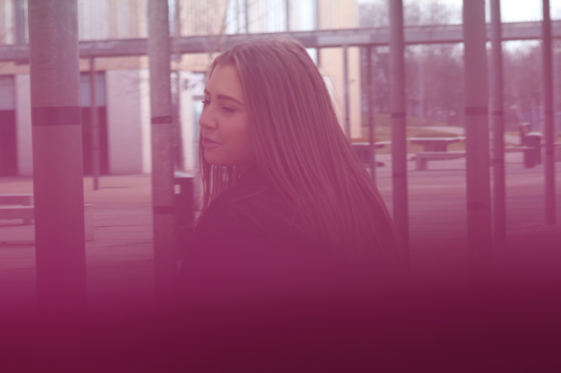
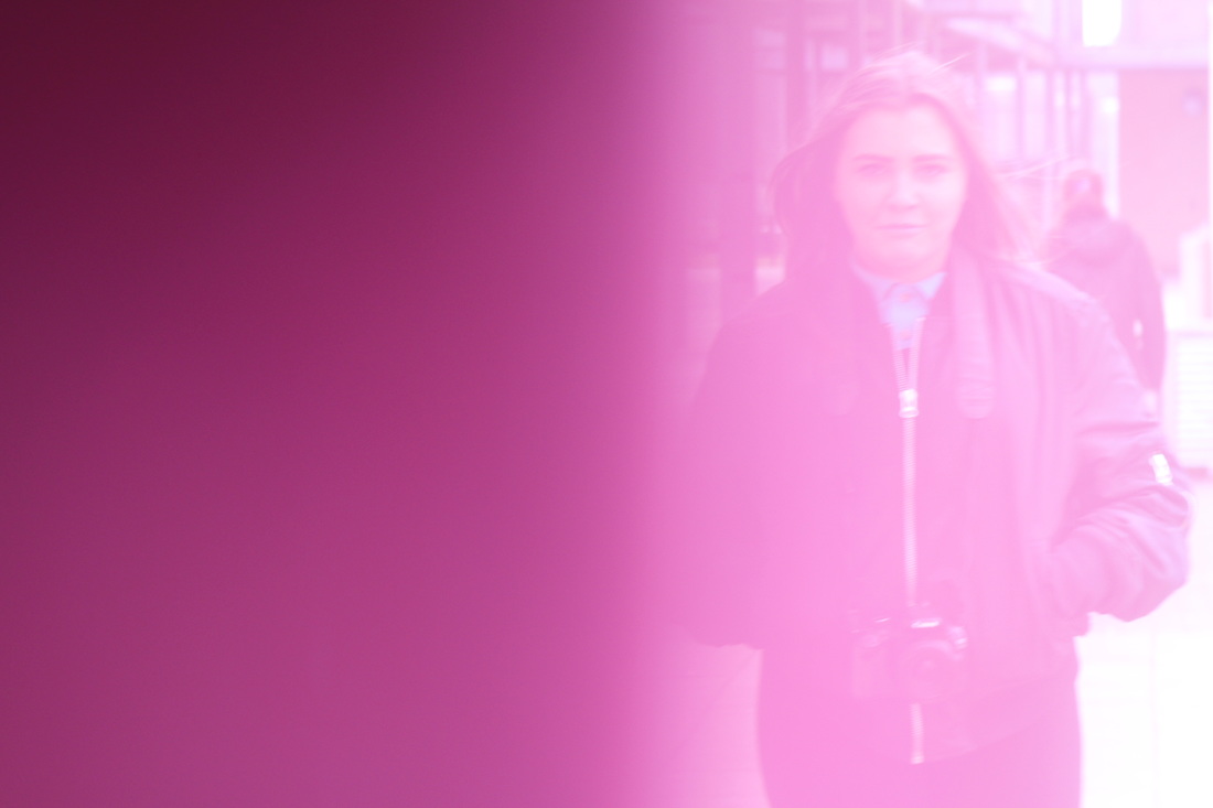
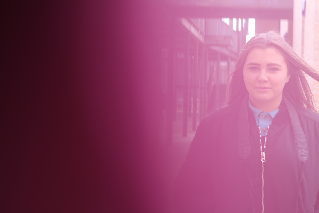
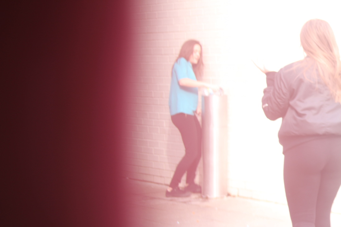
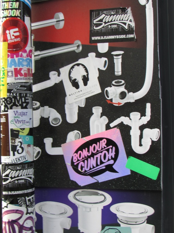
my final piece
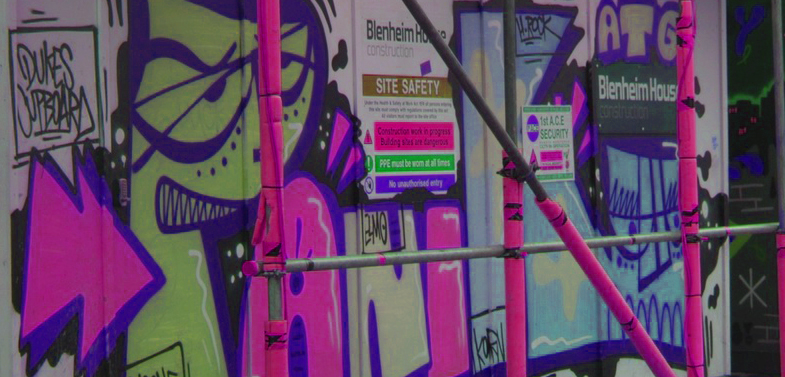
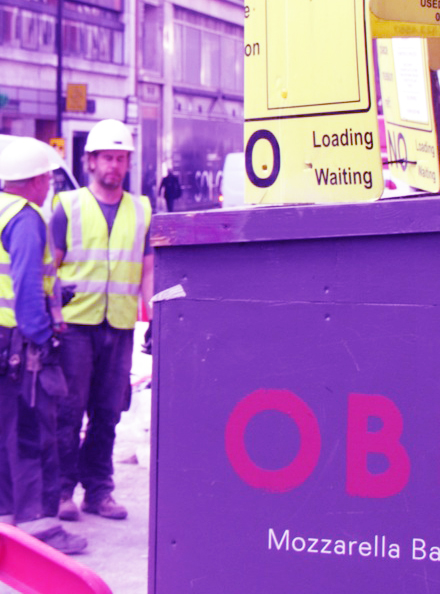
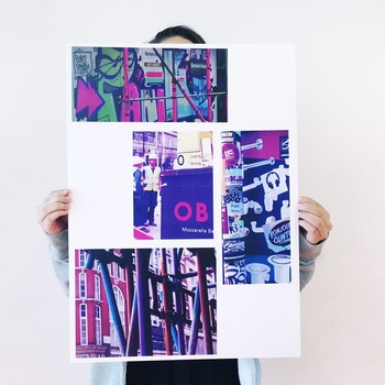
I have chosen these four photos for my final piece and have edited them so they all have the running theme of purple and pipes. I edited them using photoshop by changing the saturation, colour balance and contrast. I did the same to each photo to get the same effect. Overall Im really happy with my final outcome because I like the way it looks and feel proud that I did it. I feel like i've learned a lot whilst doing this project especially studying Saul Leiter as he has shown me how anything can be abstract and how he works behind his camera. He has really influenced the way I take pictures and look at them. I like how I have increased the amount of abstraction by tinting the picture as it takes away from reality even more this relates to the threshold concepts
