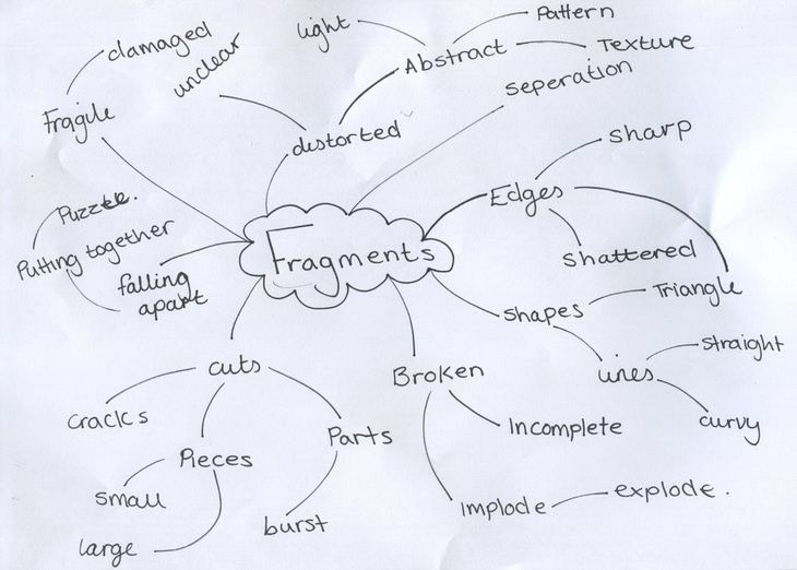
Personal project: Fragments
|
noun
plural noun: fragments
|
|
Why I chose Fragments
I chose fragments for my exam theme because I felt that it would be an interesting theme to explore and that learn something new. There is also many things you could do with fragments and lots of interesting pictures to create. You can also experiment a lot which I thought would be fun and interesting.
I chose fragments for my exam theme because I felt that it would be an interesting theme to explore and that learn something new. There is also many things you could do with fragments and lots of interesting pictures to create. You can also experiment a lot which I thought would be fun and interesting.
karl blossfeldt
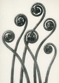
1. why did he take his photos?
Karl Blossfeldt was a sculptor and wanted to record how living things grew. He then discovered he could do this through photographs. He was inspired by living things and how they grow.
2. Describe his photos
Blossfeldt photos are very minimal as there is normally a main object (plant) in the centre of the frame against a contrasting colour in the background. For example the plant would be dark against a white background. He focuses on plants and the way they grow therefore the object in the photo is always a plant. He uses he's photos as document on how plants grow.
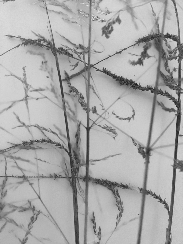
I took some pictures with karl Bloosfeldts picture from his book 'forms in nature' as my inspiration.
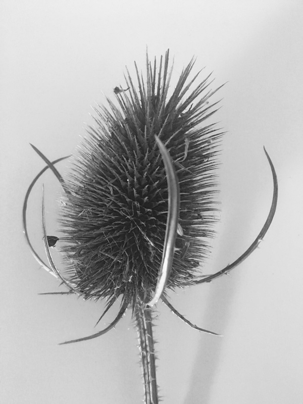
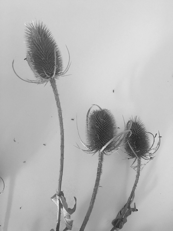
I used my phone to take these photos of these plants against a blank back ground. I then edited them to make them black and white, as karl Blossfeldt did for his images. Personally my favourite image is the last one because I like how the branches at the front are not in focus and then ones at the back are. I also like how it looks like a bit 3D and as if you could go under all the layers of the branches. If I took this again I think I would edit the picture to make the branches a lot darker so they stand out more. I also really like the second one because as the branches are curved it looks like they are blowing in the wind but I took them inside. Also the little seeds that have fallen off make it look like its blowing in the wind and has been caught in a photo.
I used my phone to take these photos of these plants against a blank back ground. I then edited them to make them black and white, as karl Blossfeldt did for his images. Personally my favourite image is the last one because I like how the branches at the front are not in focus and then ones at the back are. I also like how it looks like a bit 3D and as if you could go under all the layers of the branches. If I took this again I think I would edit the picture to make the branches a lot darker so they stand out more. I also really like the second one because as the branches are curved it looks like they are blowing in the wind but I took them inside. Also the little seeds that have fallen off make it look like its blowing in the wind and has been caught in a photo.
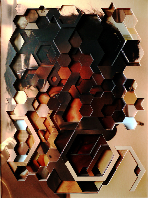
4 photographers related to my theme:
|
LUCAS SIMOES
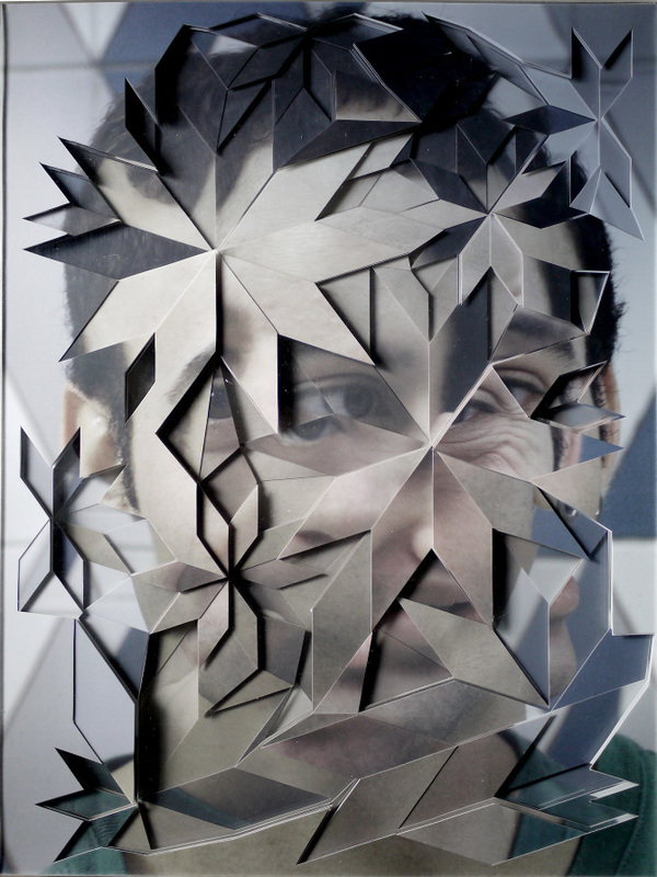
Lucas Simões is a photographer that focuses on Fragments by using the same technique in all his pictures. He takes a picture of something or a portrait of someone on thick card and then either uses a laser cutter or a craft knife to cut shapes or patterns into the picture to create a 3D effect to the picture. Using this technique not only gives your picture definition but creates more sharp lines, patterns and edges that makes your picture more interesting. These photos are also abstract as it takes a while to work out what the subject is. |
|

|
DAVID HOCKNEY
David Hockney is an English painter, draughtsman, printmaker, stage designer and photographer who was an important contributor to pop art in the 1960s. He is considered one of the most influential British artists of the 20th century. He has made many prints, portraits for his friends and stage designs for the Royal Court Theatre. He was born with synaesthesua, which is where you see synaesthetic colours in response to musical stimuli. This has a common underlying theme in his designs for stage sets. He bases background colours and lighting on the colours he sees whilst listening to music. |
|


|
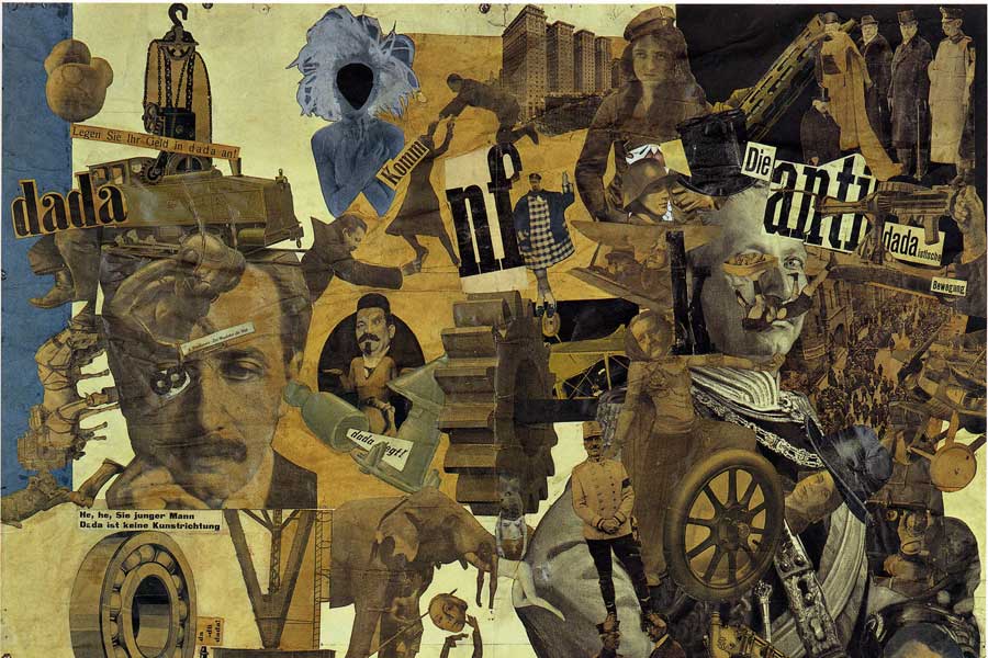
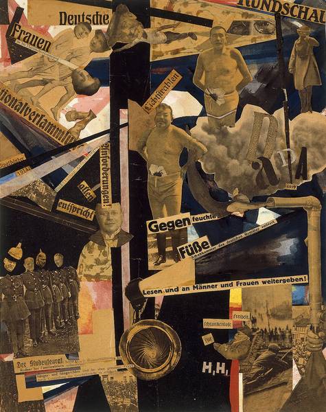
HANNAH HOCH
Hannah Hoch was a German artist who was best known for her work during the Weimar period. She was also one of the originators of photomontages, which is a type of collage in which pictures that are pasted together are actual photographs. Her interest in the topic was hoe the dichotomy was structured, as well as who structures social roles as she was ready to take her place as mans equal. From 1926 to 1935 same sec couples and women were a central theme in her work. Her most used technique was to fuse male and female bodies together, This was in order to give the power of men to women as well as to go against the stereotypical gender actions. |
|
|
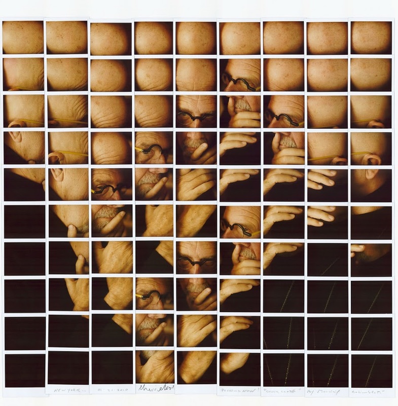
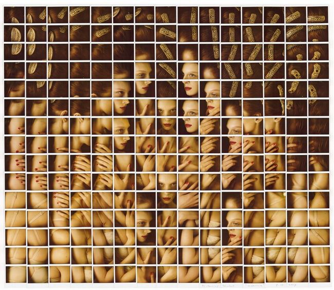
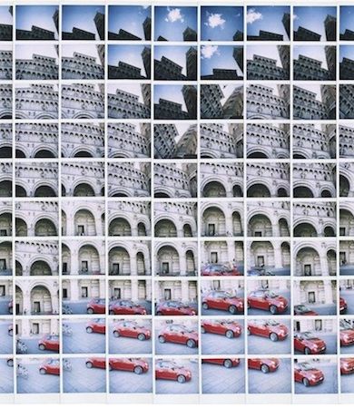
MAURIZIO GALIMBERTI
Maurizo Galimberti was born in Como in 1956 and grew up in Meda. It was in the building sites he worked around where he developed his careful and thorough view with which he would use in his art. He won many photography competitions, even under his mother or his wifes name. In the early nineties he dropped the building family company and decided to dedicate himself only to photography. He published a the book polaroid art in 1995 a book for those passionate about Polaoid. |
|

|
This is a photo by Lucas Simos is one of my favourites because of how interesting it is. There is a clear pattern that distorts the actual image making the central object unclear. I also like how all the colours tie in with each other. The original photo looks red and all the swirls are either red,orange, white or black. The swirls in the image give it a sense of abstraction which causes the person looking at it questions the artist. For example why are there swirls? How did he do it? He uses a lot of formal elements in his photos for example there are many lines, patterns, shapes, edges and tones in this photo. It gives the picture a sense of being 3D. The swirls in the face have a massive contrast to the background because the background is completely still and out of focus, nothings happening. Compared to the main object where there is a lot going on so it will catch your eye immediately and get your attention. This photo reminds me of something that is moving compared to the background which is very still. I don't think the photographer has put a lot of thought into the way the swirls are, I think that he's done it very randomly to see what the outcome looks like and he's going to learn from his mistakes and make the next photo different because there are many photos with the same idea as this using the same technique. The most interesting part of this picture is obviously the mans face as it creates a sense of mystery but also looks very appealing on the eye. |
dafna talmor
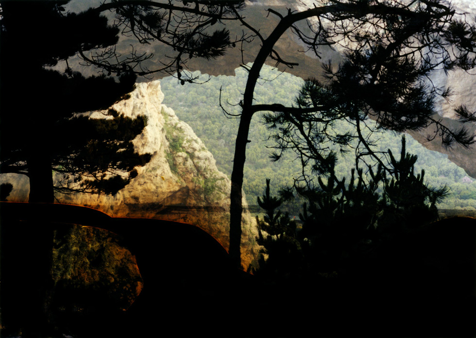
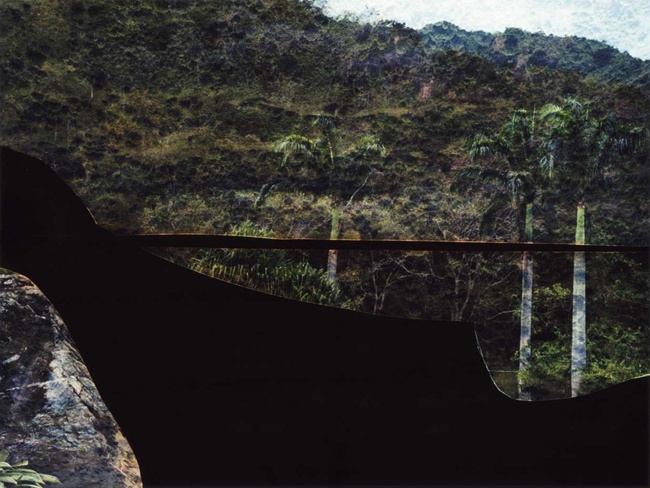
On the 19th of october the artist/photographer Dafna Talmor visited my school, Thomas Tallis. We will had a 3 hour workshop with her making different and abstract pictures on slide and afterwards will then display them with a projector. We had no idea what the final outcome would look like until we projected it which meant we had to change and distort the image until we got a final outcome that we liked.
I have noticed that Dafna Talmor has a continuous theme of nature through ought her photos, but they all have a little twist towards them, for example all of her photos look like they are paintings, this makes her photos unique and creative.
I have noticed that Dafna Talmor has a continuous theme of nature through ought her photos, but they all have a little twist towards them, for example all of her photos look like they are paintings, this makes her photos unique and creative.
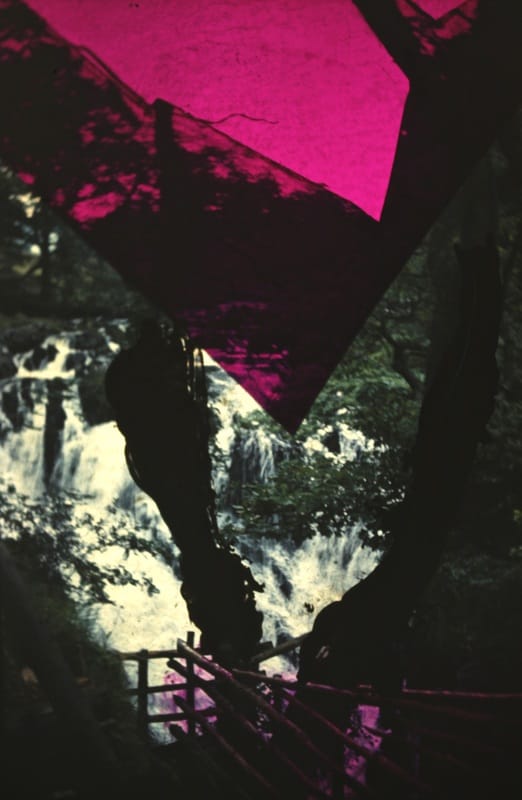
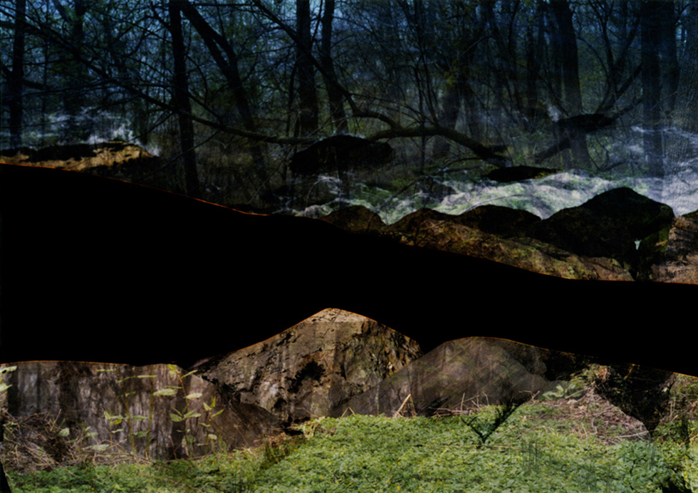
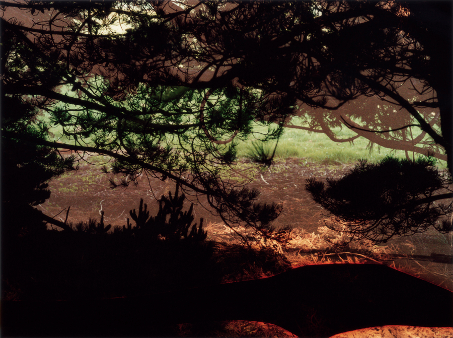
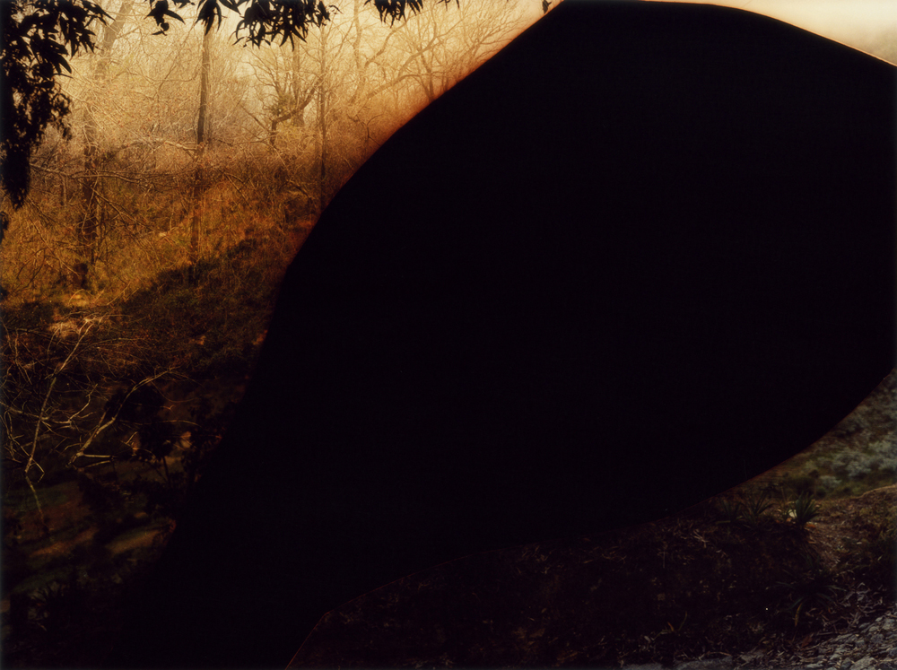
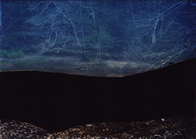
Dafna Talmor gave us the pleasure off visiting our photography class at school, we had a 3 hour workshop making photos similar too hers. She gave us tiny little slides with pictures of different things which we had too completely destroy, for example we had to draw, paint, cut, stick, rip ,do possibly anything too these photos to see what the outcome would be. These are my final outcomes of the Dafna Talmor project, I dislike my slides because I do not think that they are very creative they just look destroyed. On the other hand my favourite slide is the last one mainly because of the burst of bright colour shaped in a triangle giving the slide a certain effect , this graps the viewers attention. It is a contrast from the darker colours that are in the original picture which make the image look more engaging and brighter. When you first look at it you are drawn to the colour as its the brightest part of the photo, however, as you look closer you start to notice the little details like the waterfall ing the background for example. I also feel like the pink colour that I put onto the picture has a calming effect on the image esspeacially as there is a waterfall in the background. My least favourite image os the second one this is because I dont like how the tape I put on the picture had it look. If I was to do this again I think I wouldnt cut any of the photos and just add colour to them.
First final outcome
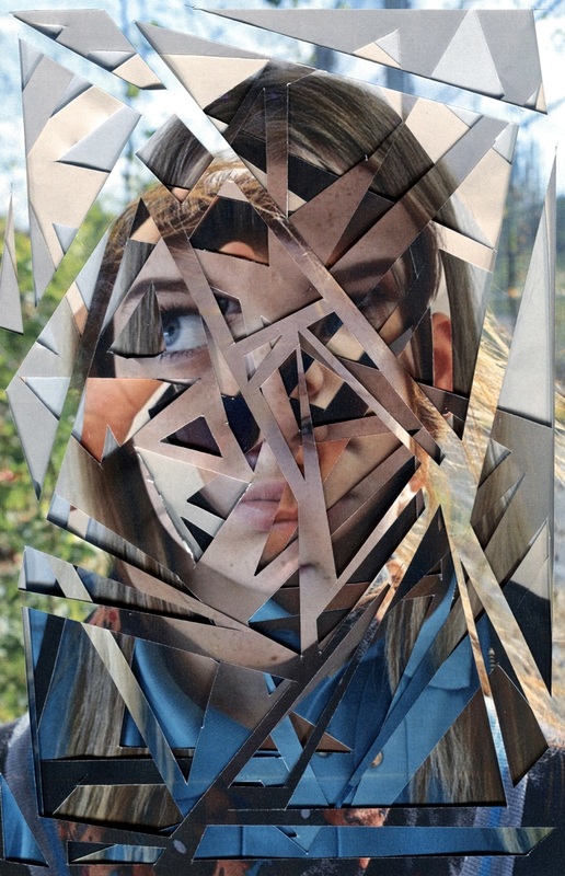
I took these pictures of 5 of the students in my class with the idea to cut up all their faces and mount them on card, then I was going to place them on top of each other giving them it whole photo a 3D feel.
|
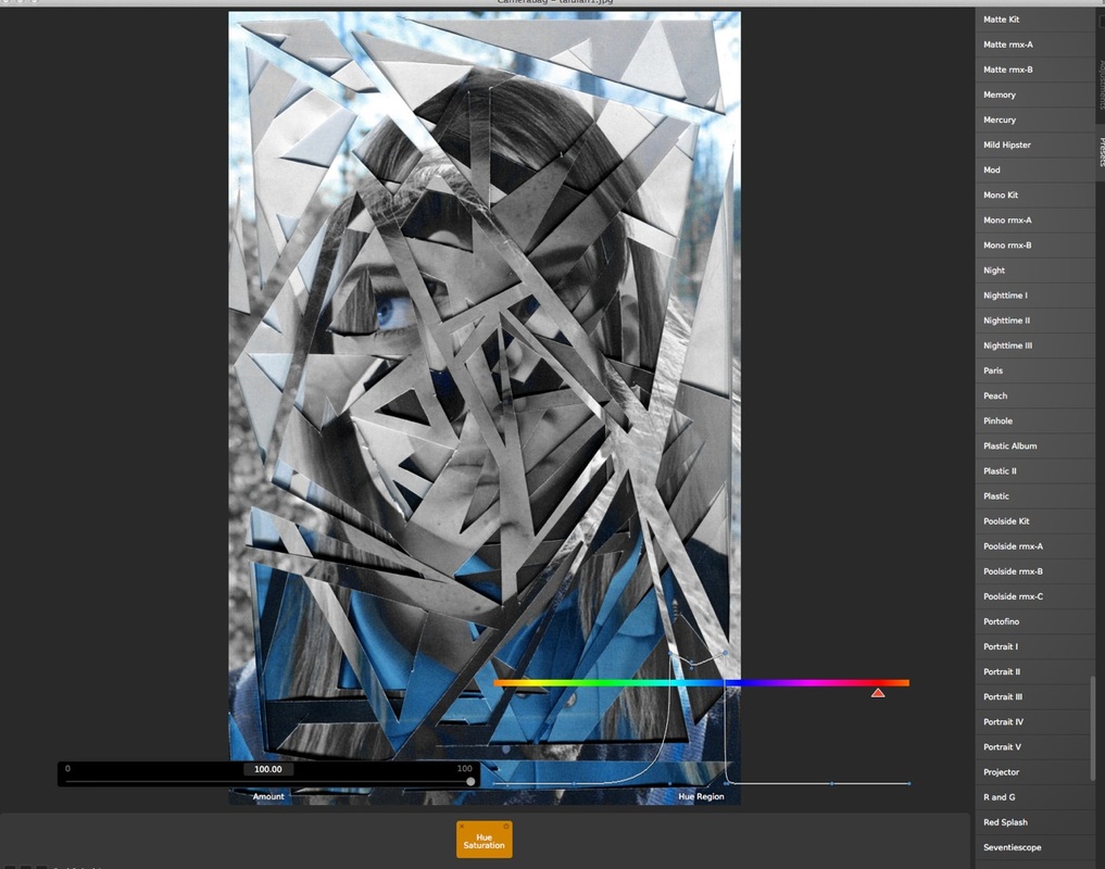
This my first final outcome that I made using the pictures I took of my class mates. I then cut up each picture apart from the last one. On the first image I cut large shapes in order to be able to see most of the picture behind it. I did this to all my images cutting smaller shapes and less of them as I went through. I then placed them on top of eachother and this is how it turned out. I really like it and I think it portrays fragments very well. Orignally I wanted to put each photo onto board however, I really like how it looks as one photo. If I was to do this again I think I would try out my orginal idea and use the same person with different facial expressions to create the idea that the person is moving. I edited this photo using a app called photo edit studio to make the lines and cuts bolder and more sharp giving the photo clear shapes and making the fragments clearer. |
|
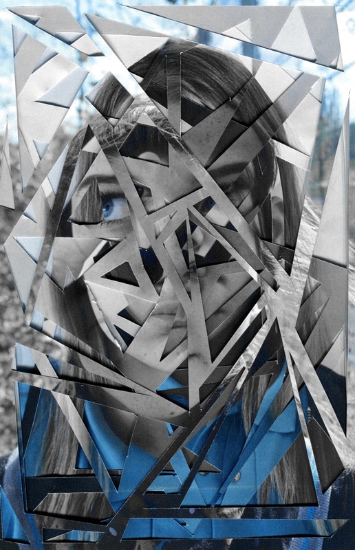
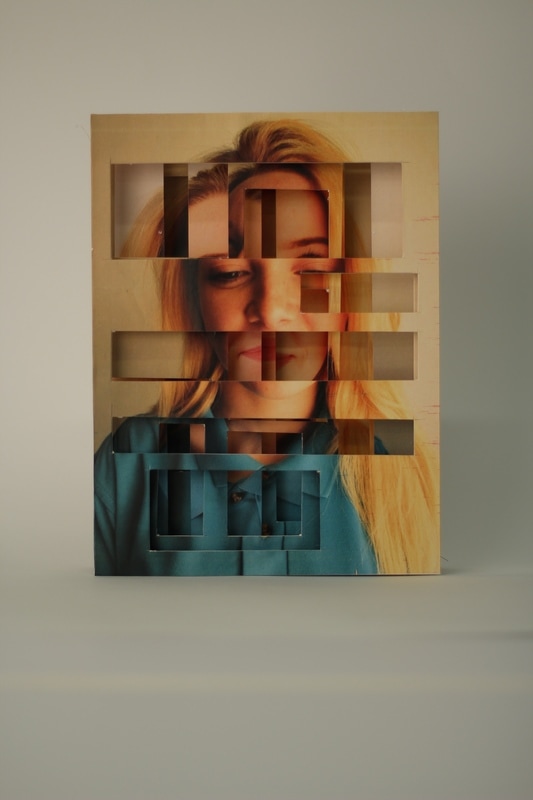
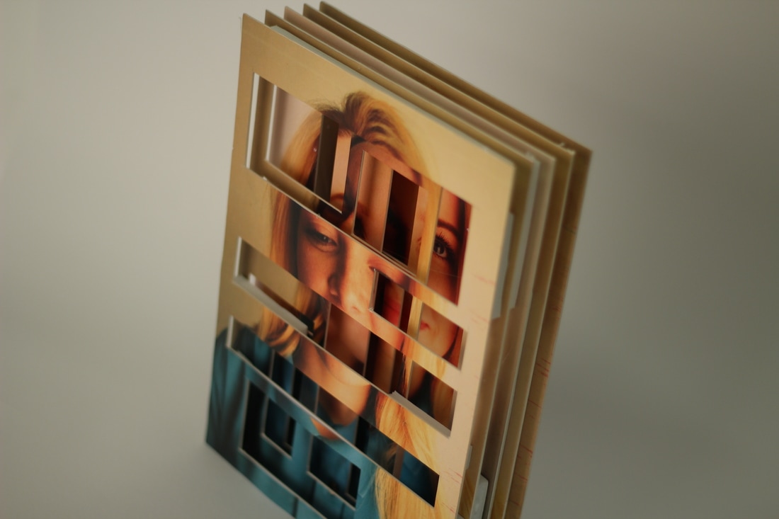
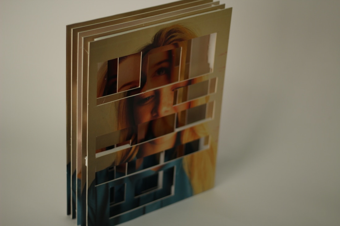
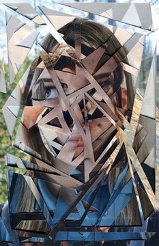
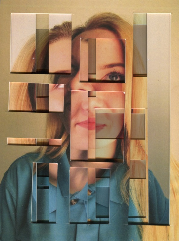
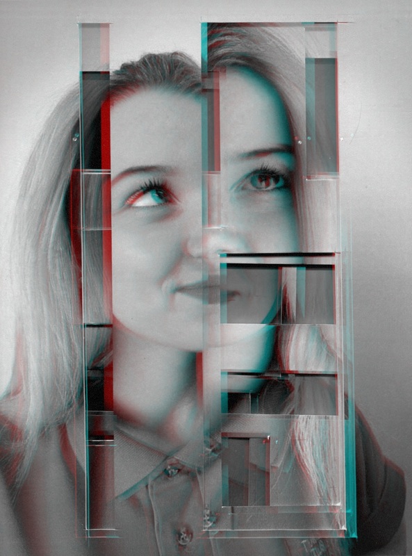
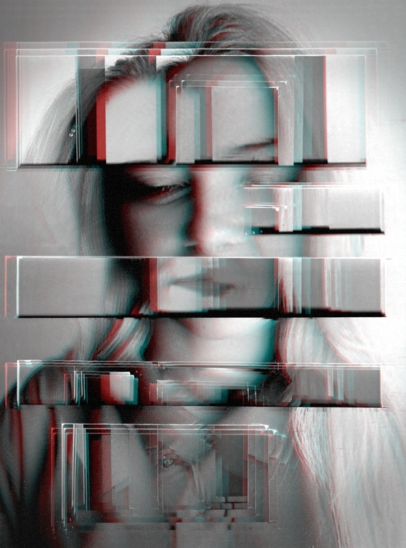
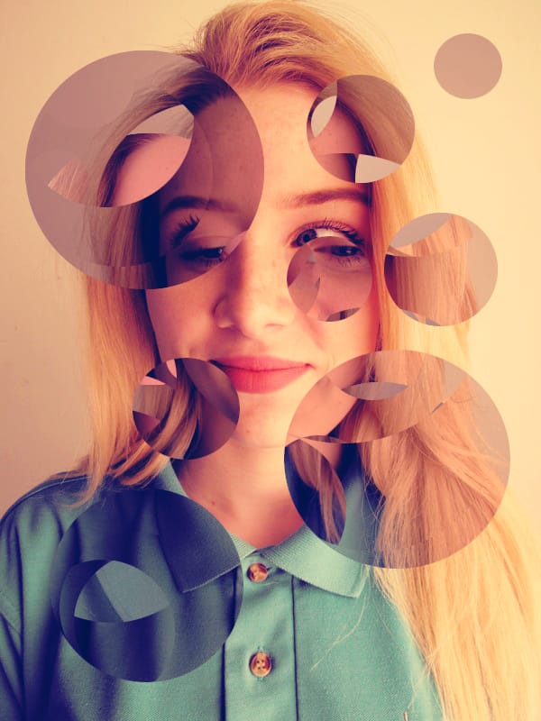
These are my second photos that I took to create the same idea as my first final outcome, however, I got one of my classmates and took 6 photos of her instead of 6 different people. This way it looks like her facial expressions are changing and that she is moving.
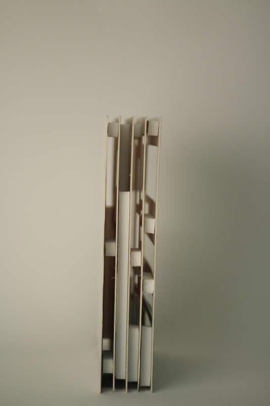
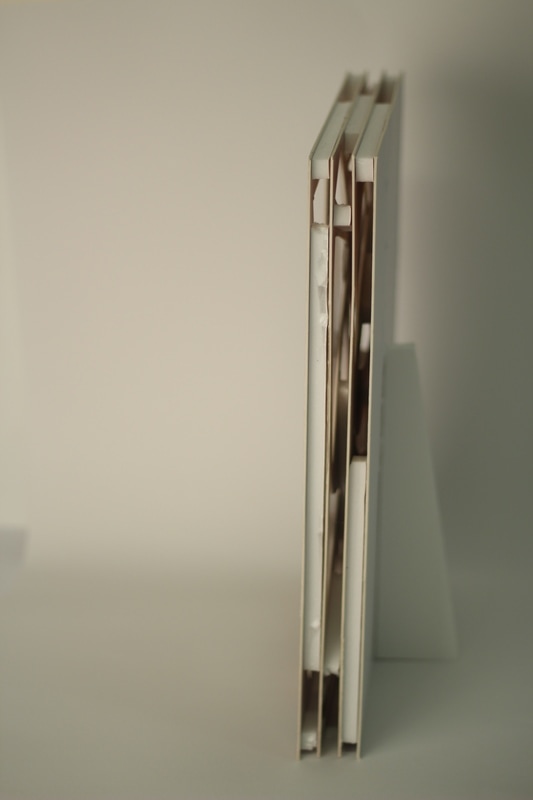
After taking these photos I then mounted them onto board, I then cut rectangles into each one. I then put each one on top of eachother and this what my final outcome turned out like in different orders.
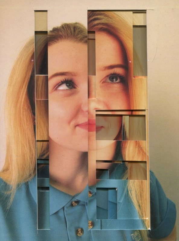
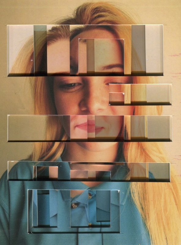
My favourite one is the last one because in each rectangle there is more layers and shapes inside the actaul rectangle. After mounting these on board I put them on top of eachother in different arrangements then scanned them. My favourite one is the last one because I like how the cuts or fragments in the image are all on top of eachother, also the shadow gives it dimension and it makes the 2D photo look more 3D.
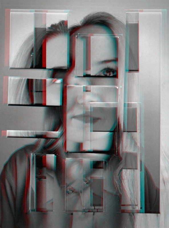
I really like how this final outcome turned out esspeacially the last picture. This is because the effect that I have put on it makes it look even more distored and abstract. My least favourtite picture is the second one because of the way I have arranged the layers there is not many holes therefore the picture dosent look as 3D.
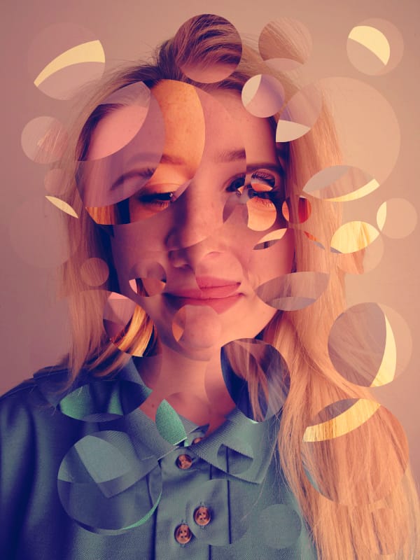
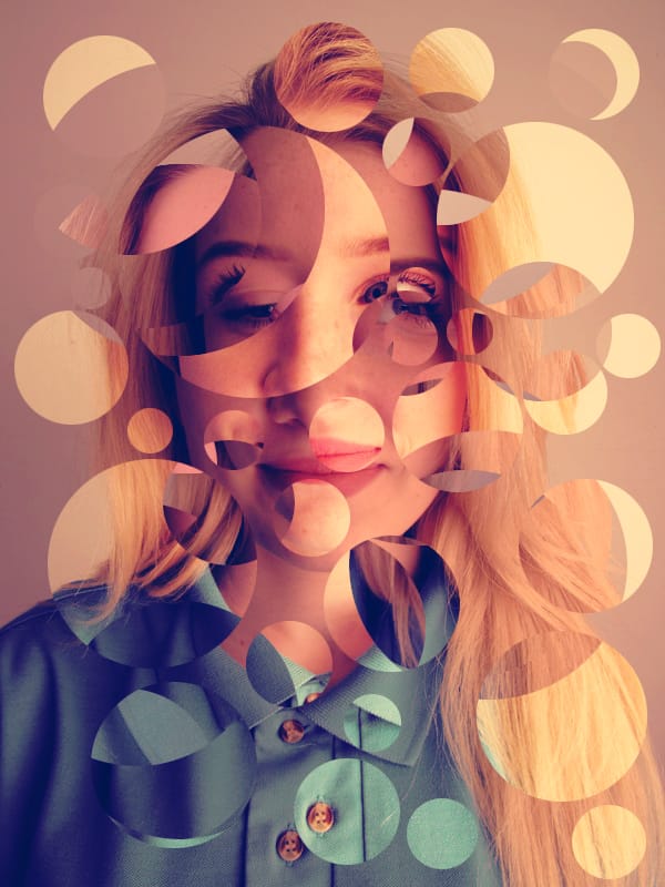
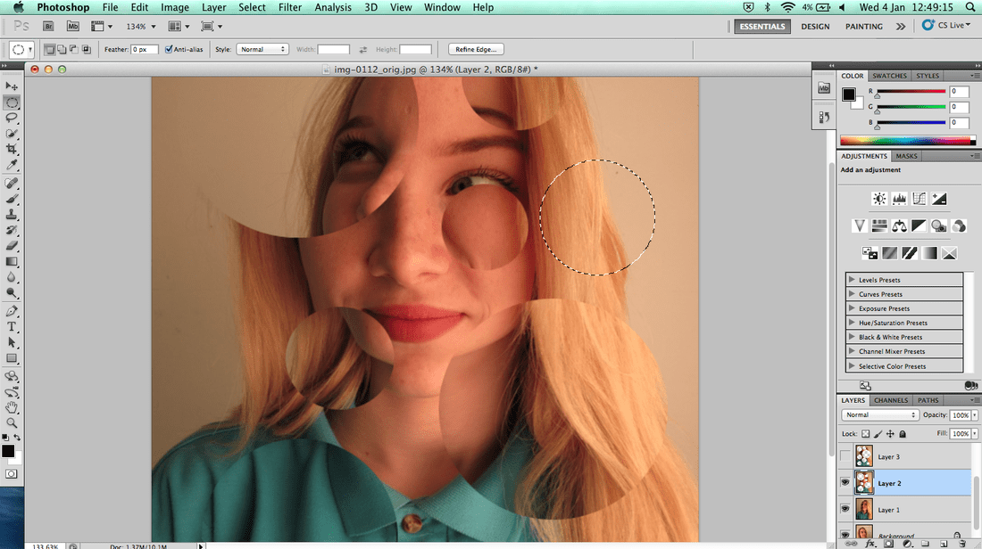
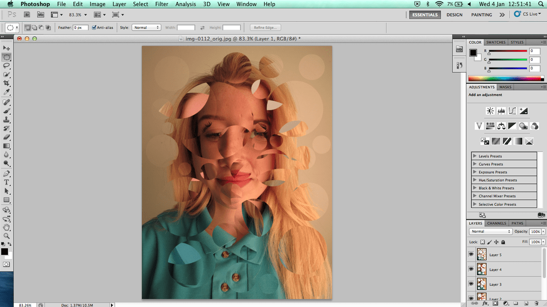
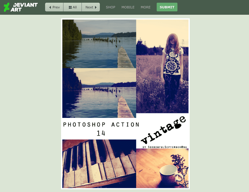
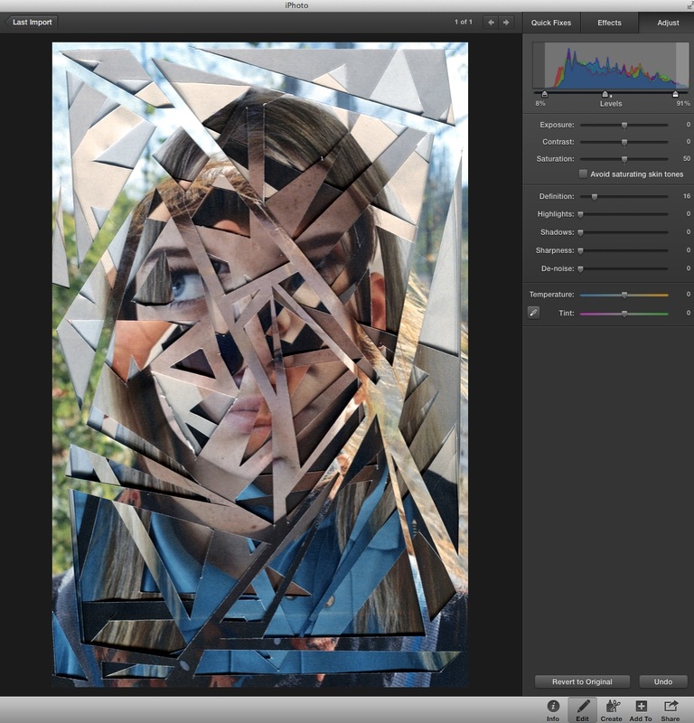
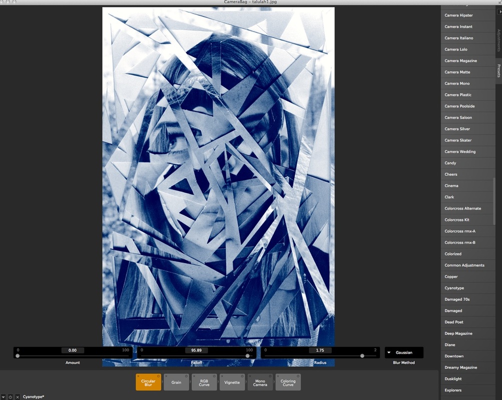
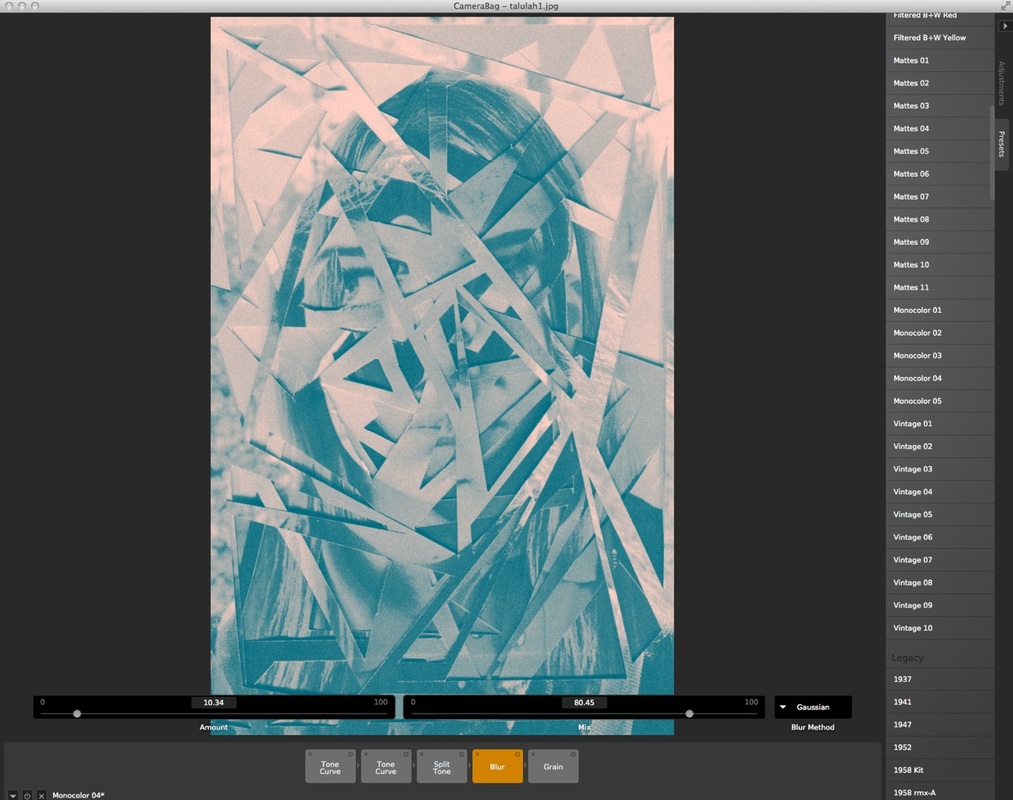
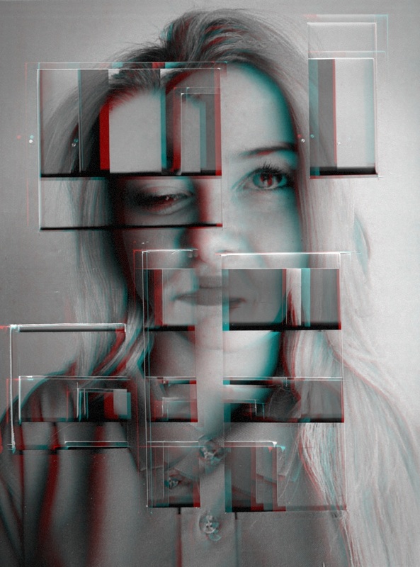
I put the same 6 images of my classmate into photoshope and did the same process digitally. I used circles on photoshop as it is easier to use differesnt and more complex shapes as its hard to cut them by hand. I used the circle tool and highlighted where I wanted ot to go, I then deleted it which revelled the photo that was on the layer behind it. I then rpeated this process for all the pictures apart from the last one. I then downloaded a effect called vintages and used this action on my photos. I really like how the pictures turned out as its another way of doing the idea that I had origanlly and its better because you get more complex and different outcomes then if you would do it by hand.
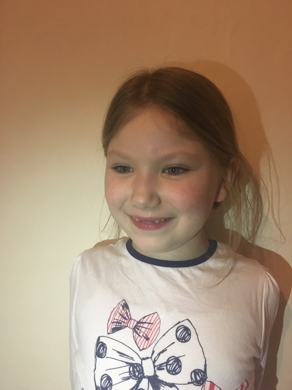
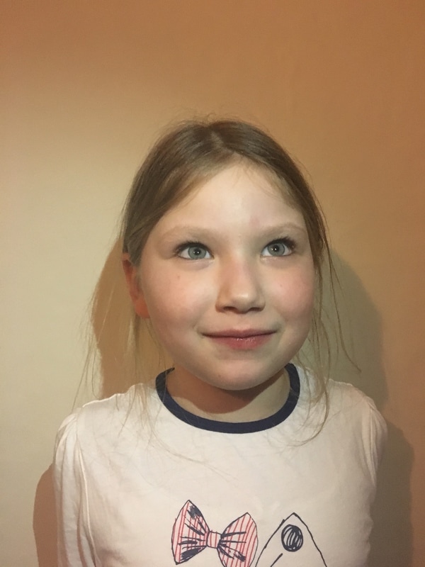
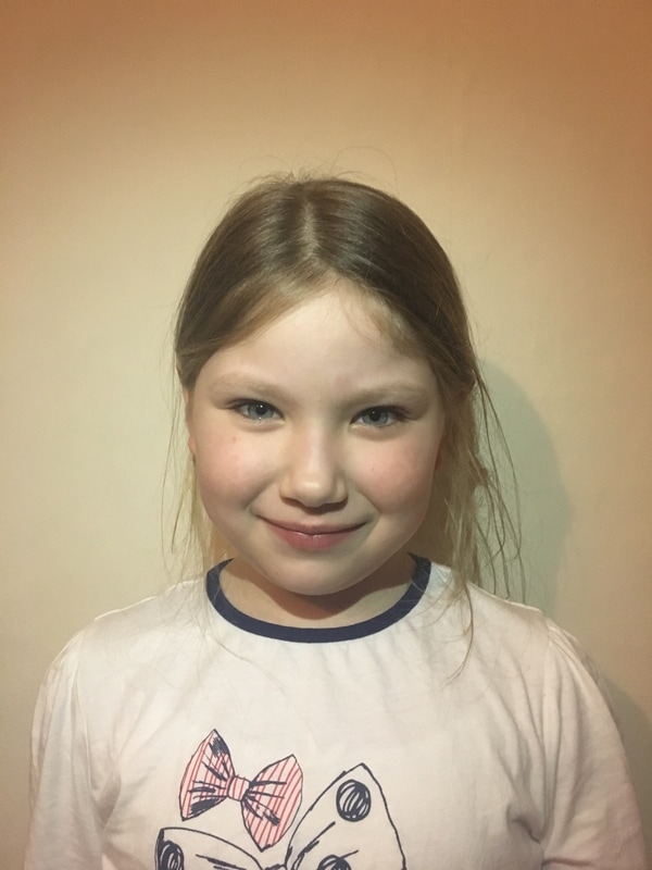
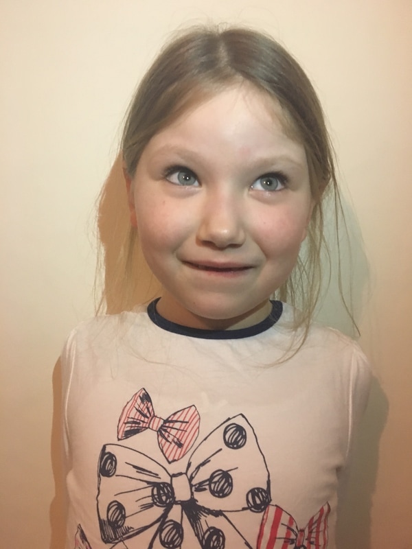
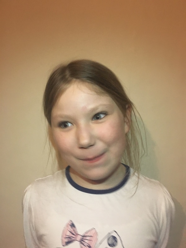
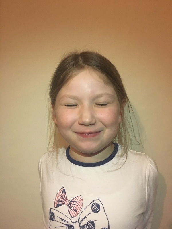
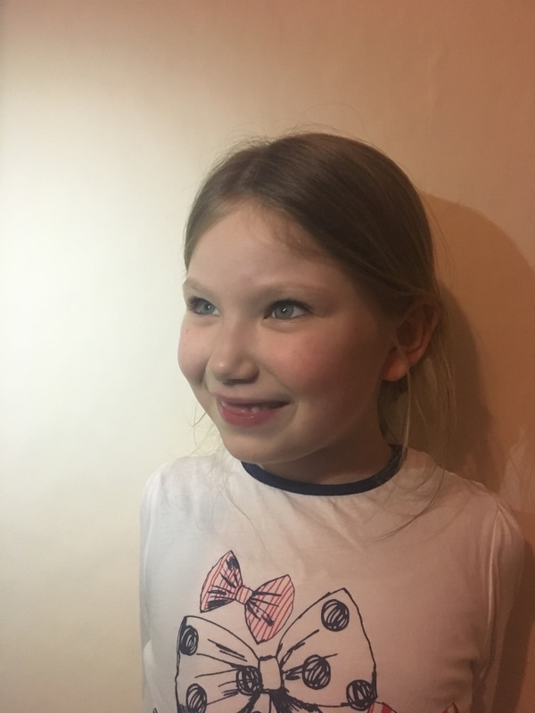
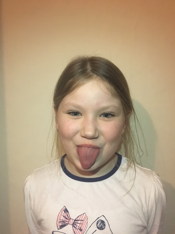
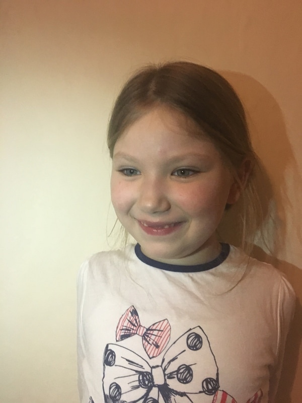
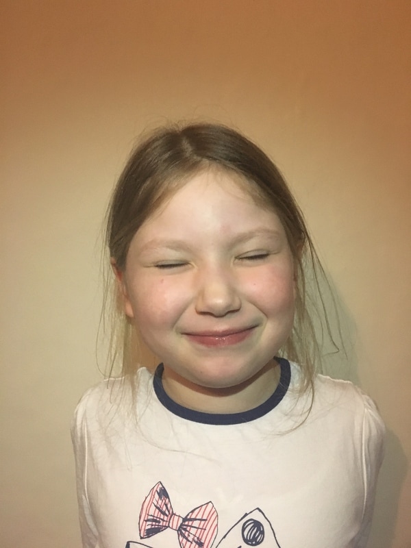

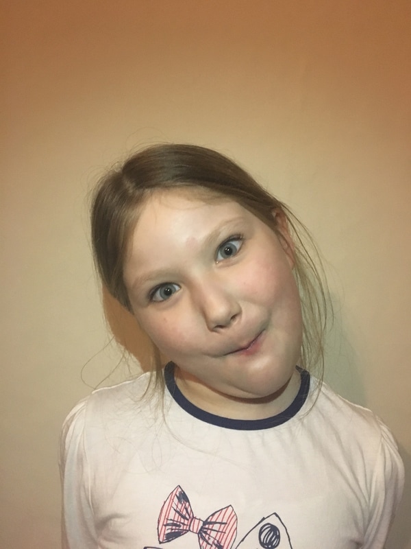
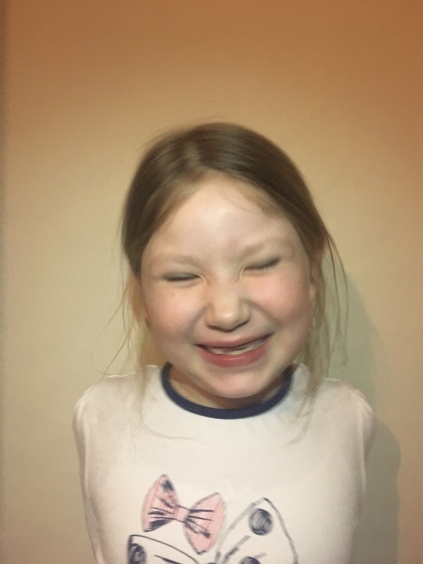
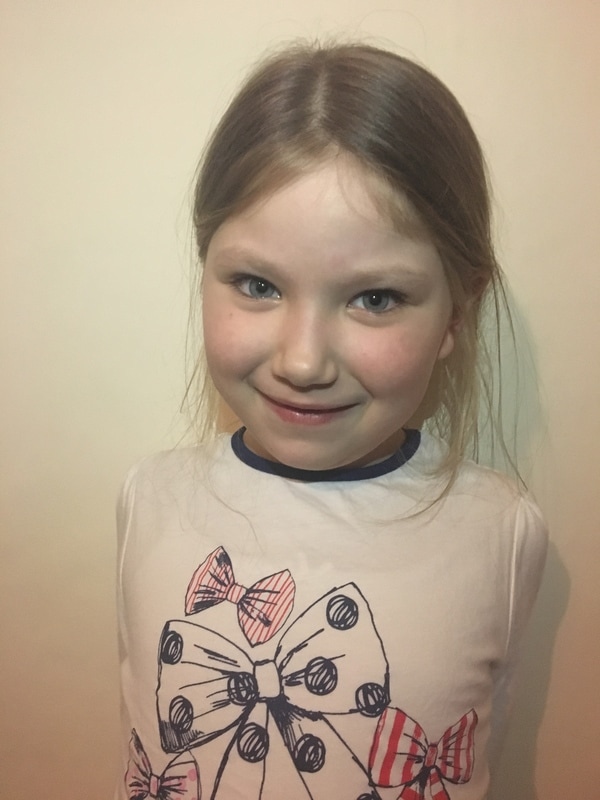
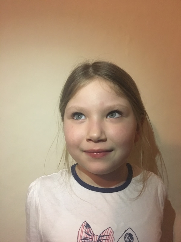
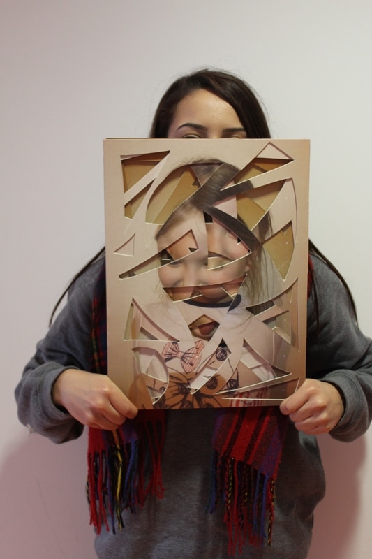
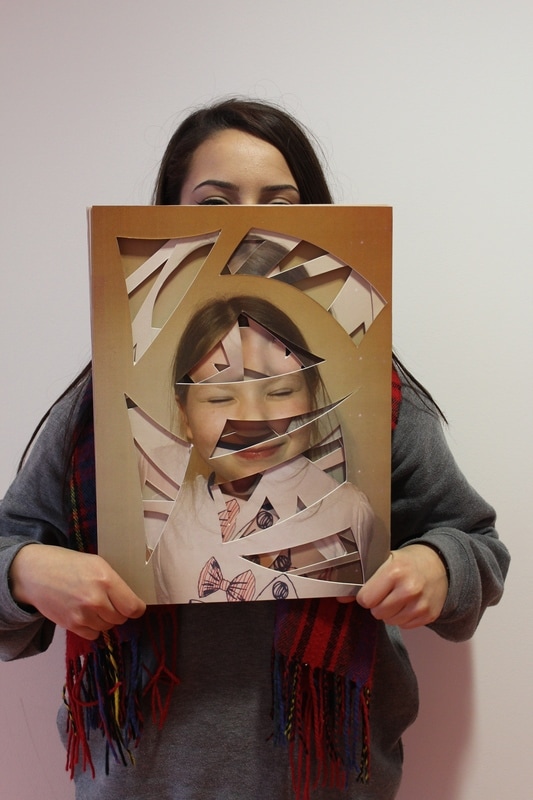
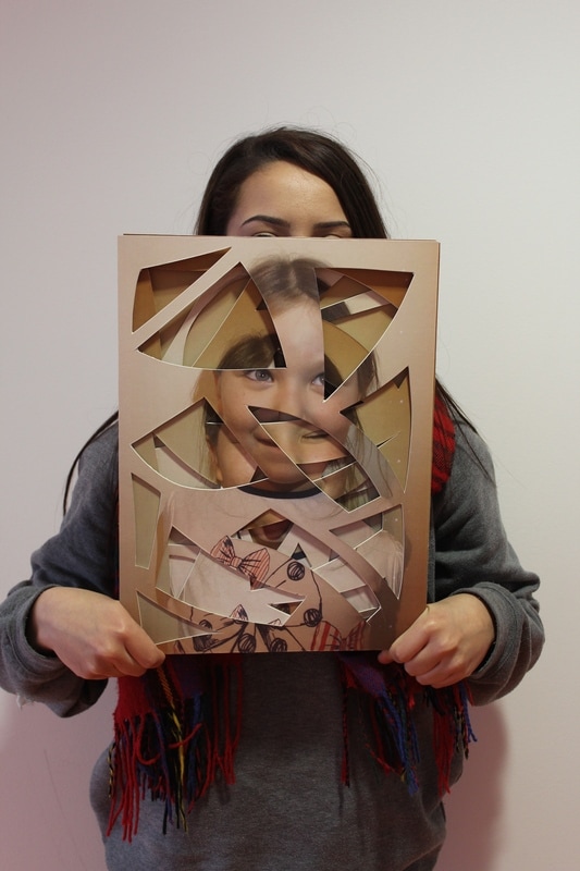
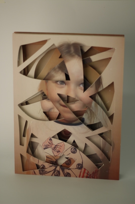
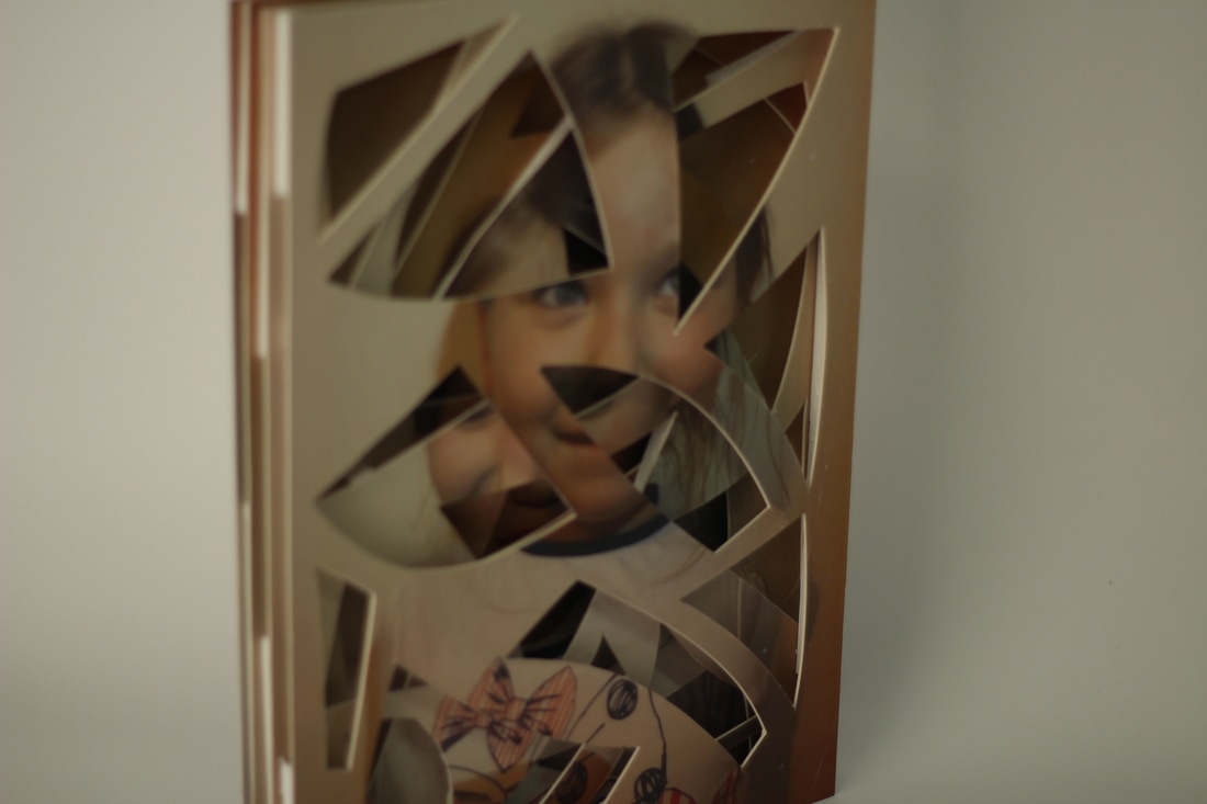
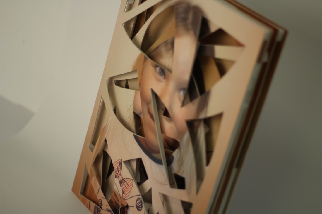
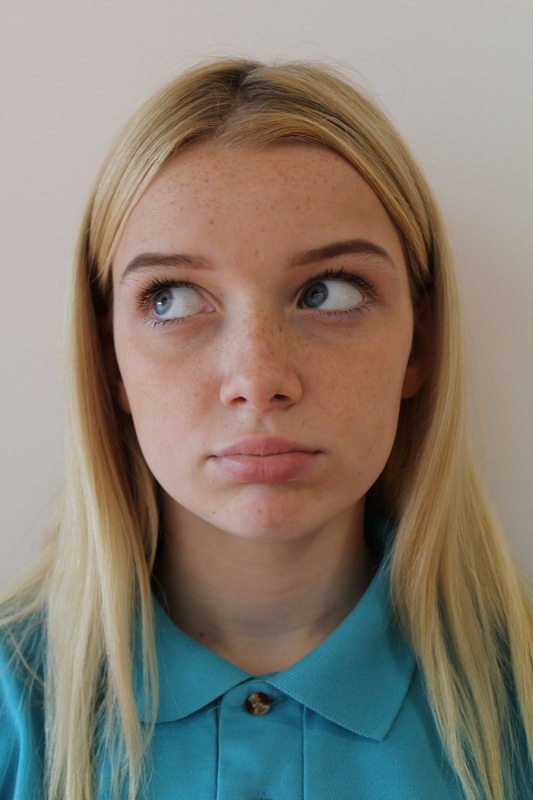
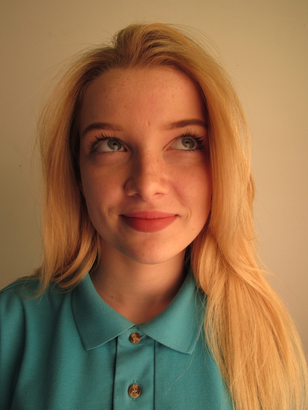
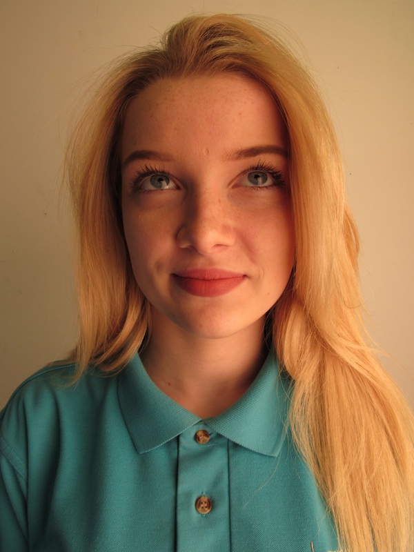
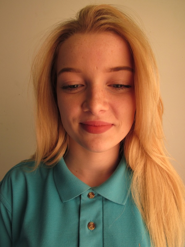
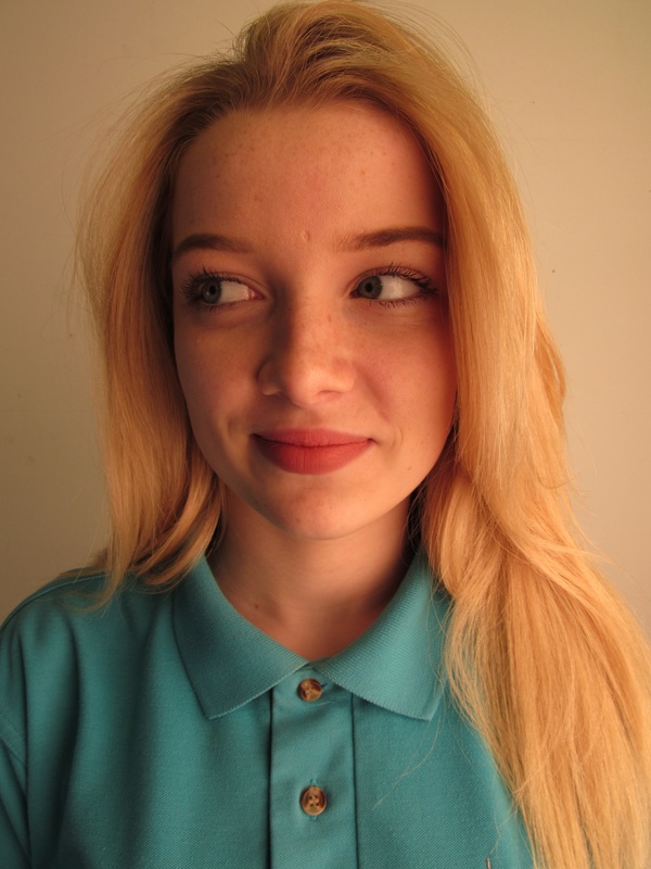
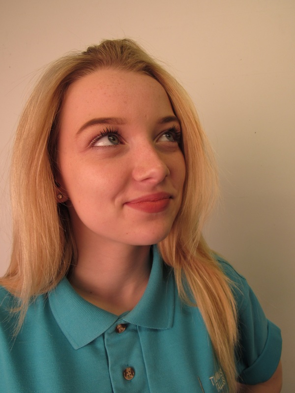
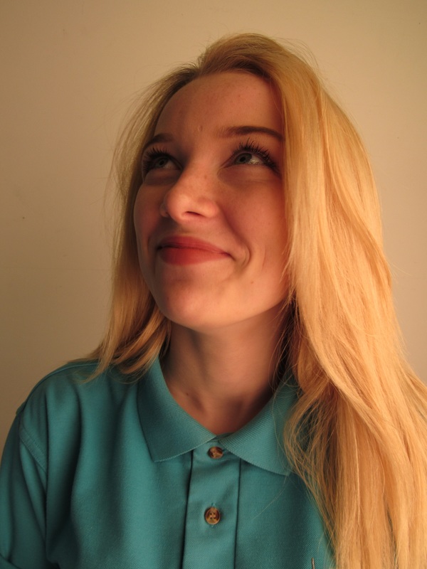
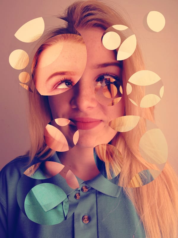
I took these photos of my little sister to use in my lastest photography project which is based around fragments, I am going to pick at least 4 pictures and mount them on board, then Im going to cut large shapes into each on individually as I did before. I am going to print them on A3 paper to make the final outcome bigger.
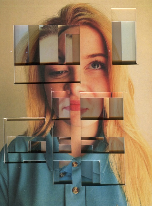
I choose 4 of the following photos to use and then printed them out as an A3. I then mounted them onto board and cut random curved shapes into them indivally. I had no plan or certain way of doing it, it was completly random. This means my final outcome was made by chance. I then arranged them in different ways to see which one was the best. Personally I prefer the last one as the eyes in the face make it clear that it is a face and the shape and big cuts show the other photos which are behind. This gives the photo dimention. I also really like the first one because it looks like shes moving due to the direction shes looking in and the cuts I made are going the same way, this makes it look like her head is moving.